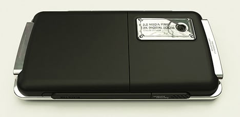
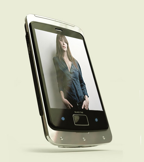
Since Apple’s iPhone was such a runaway success, the entire mobile phone industry has been playing catch-up with the pocket wonder. Jonathan Ive’s (Apple’s Chief of Design) minimal flat black screen design has instantly become a gadget icon and seems to be the inevitable future of mobile phone designs for everyone looking to grab market share. The problem with this design direction is the very limited aesthetic potential. How many ways can you reinterpret the flat black touchscreen screen? Well designer Jaren Goh has done a pretty decent job of putting his own spin on this movement with his “Basic Tab” mobile phone design. He has masterfully taken softer side out of the iPhone silhouette and gave it a more edgy, masculine appearance. His clever use of red translucent materials mixed with chrome harkens more retro future funk sci-fi creations like 2001 A Space Odysseys “HAL 9000” and the Cylons on Battlestar Gallactica.
Designer: Jaren Goh
Texts from the designer:
The heart of the design for this mobile phone does not lie on the technological advances it had in it. It lies on being a normal phone and was designed to complement our fashion and the way we dress and not to evoke too much technological gadget traits.
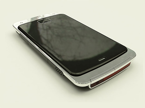
On the front lies a lush wide black screen and nothing else to steal anything away. The screen resides on a metal slab to add volume and a premium touch to it.
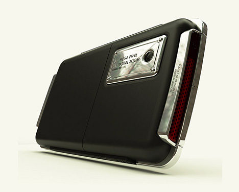
Perhaps a better way to show how this design correlates to fashion is the camera tab on the back. Instead of having it looking like camera shutter or lens cover. It was designed using features found on handbags and fashion accessories that is so everlasting.
