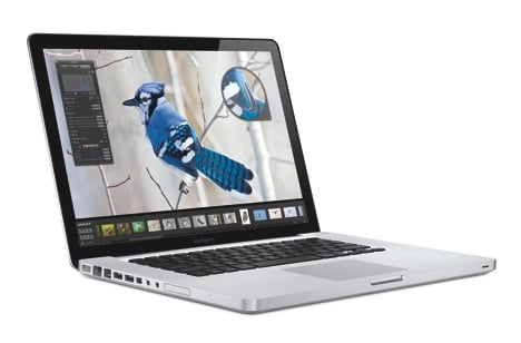
Apple’s top of the line professional, portable workhorse was finally updated. Gone is the all aluminum, silver keyed lappie that set that standard for so many companies to follow. Enter a new design carrying over Apple’s current design aesthetic – silver, black, and glass. Because there are already 101+ reviews about the new Apple MacBook Pro, I’ll keep ours succinct. Here’s the Yanko Design MPB (as I’ll refer to it from now on) review, quickstyle.
Design and Build
In a nutshell? It’s thinly solid. How is that possible? Chalk it up to Apple’s laser cut manufacturing technique that carves the shell out of a solid block of aluminum. They’ve actually been using the tech for quite some time but this is the first time on an entire product. The result is a notebook computer that doesn’t flex or creak, no seams. Holding the new MBP and the old MBP is worlds apart. The new one feels like a tank without the bulk. Not to be anti-American but it feels like solid Japanese engineering with luxurious German production values.
That Very Shiny Screen
The screen is a HUGE departure from the old MBP. It’s glass meaning it’s super shiny. Some may hate that. I personally love it. The glare doesn’t bother me since I do most of my design work away from sunlight. Contrast ratio is on par with high-end HD TVs with the richest of deep blacks. It’s totally LED now so we’re talking instant on/off with no warming and cooling of colors, not to mention being more power efficient.
Buttonless Mouse Actually Has Buttons
Apple, for all intents and purposes, hates buttons. They would kill every single button if they could, unless you realllllly needed them. It’s always exciting to see what “feature” Apple removes with each design iteration because so much is focused on what they don’t have as opposed to what they did – and for some, removing the trackpad’s only button was a bit premature. I disagree. The new trackpad is huge and is made of glass. For serious, it’s glass ya’ll! Like its iPhone counterpart, multi-touch is now an integral part of trackpad technology. All that single, double, triple finger tapping and swiping along with pinching and zooming are there. Contrary to misinformation, the trackpad is a button – a giant button(s). It gives and flexes in the corners to simulate mouse clicks. You can even program how these “buttons” work with finger gestures for optimal control. It’s a little hard to explain, or maybe my 6 AM tea hasn’t kicked in yet, but you just have to try it to get it. In practice I found it no different from old trackpads. IMO, the new trackpad is a win.
Ports
Yep, it’s got ’em. Same as the previous MBP except the full DVI port is now a mini-display port so you’ll need a converter which Apple sells for $20. They’ve also axed Firewire 400 but you get a whole mess of USB ports and 1 Firewire 800 port.
High Tech Thingamajigs Inside
A first for the notebook industry, Apple is using NVIDIA’s new GeForce dual chip sets. Yes there are actually two graphic chips in there, the GeFore 9400M and the 9600M. You can choose which one to use via a preference change but the full power of the chips are not exploited – at least not yet. There is talk that Apple is hard at work with a software update that’ll enable both chips to offload processing tasks from the main CPU. Decoding and encoding HD graphics will rival expensive $5,000 workstations. Even tho it’s currently “crippled”, one chip alone is able to blow thru even the most graphic intensive games on the market.
Oldies but Goodies
The iSight cam is still there cleverly hidden behind the glass bezel. The keyboard auto illuminates, and the speakers are much bigger, fuller sounding. Some real bass in it now.
Off The Grid
Battery performance from my experience is tragic on every notebook computer. Even Sony’s purported 7 hours are a far cry from the 4 hours with every setting turned down. The MBP is no different. It gets about 4 hours with intensive use and I have no doubt it could hit Apple’s quoted 5 hours if you were to stick with just light web browsing and typing. Lithium-ions just aren’t improving fast enough. We should really be getting 10-24 hours out of our portables by now.
No Longer Burns Me
Lets be real, the old MBP could slowly scald you if left on your lap. That thing got HOT, often times so hot, my palms would sweat. The new MBP is no cooling marvel but there is marked improvement. It gets “warm.” That’s to be expected from an all metal computer. 3 hours on my lap felt uncomfortable but nothing I couldn’t handle.
Expensive
Base price is $1,999 to $2,499 for the top of the line 15″. Both come stacked with plenty of ram and hard drive space and you can even opt for a 128 GB SSD, but that’ll tack on $500.
What we liked:
- Beautiful design, incredibly well built. A luxury machine.
- The LED display is insane. It’s crisp, vivid, and the glass makes images pop.
- Incredible graphics power. Spore played smoothly with all settings set to maximum.
- Love the trackpad. Buttons be damned. Gestures are where it’s at.
- Even thinner than the old MBP! Soft beveled edges and rounded corners.
- Speakers are fantastic. Good bass response. Makes watching movies a better experience.
What could be improved:
- Battery life, enough said.
- No Blu-ray drive option.
- A little pricey. Just accept that you’re paying not only for design but Apple’s incredible suite of included applications.
Designer: Jonathan Ive, Apple
The unboxing

