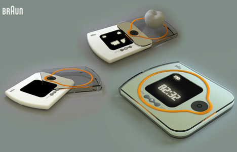
The simplest of devices need love, too. Here Emir Rifat Isik’s done some nice love for the kitchen scale. Three buttons, a flashy orange ring, and light, bright display screen. With so few features, each bit must be perfect and precise. Does this make the cut?
Behold the intense description of this apple weigher by its designer, Emir Rifat Isik:
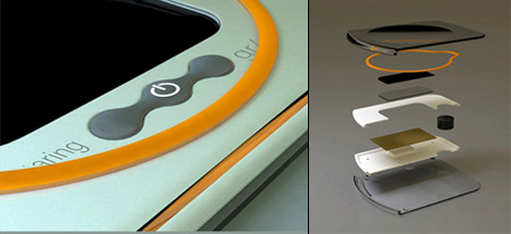
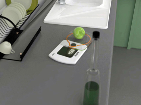
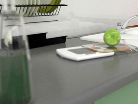
The body functions as a measure when it is taken out from the weight panel. It can tare, show the time and make gram/cal exchange. It provides smaller space for storage that weight panel and the body are pulled through each other. It facilitates weight process and interface usage that control panel and weight panel are placed apart. The aim is to provide maximum usage facility in minimum space. By means of sensory mil weight, it measures the moment of the approaching surface and exchanges it for unit of measurement. Interface consists of three buttons and at the sama time these buttons are used to set the hour data. When the part on the lower panel is to be folded, it is positted on the coaxial gap on the acrylic part. The orange-coloured circle is a visual complement that ensures us placing the things to be weighted on the very middle point.
Surely simple and nice to peek at.
What features make an epic scale?
Designer: Emir Rifat Isik
