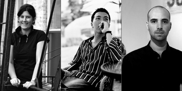
It’s the perfect setting to bring out the Sorapot, brew some tea, get comfy and interview designers. Easier said than done, establishing yourself in the cut-throat design industry takes a lot of grit and determination. Not everyone can accomplish a fan-base as fast as Joey Roth did; his Ceramic Speakers are a pre-booking hit! Alissia Melka-Teichroew of byAMT achievements are marked with her fluidity in design, especially her Tree Hooked Hanger & Meng-Hsiu Ho’s design acumen is evident in his realistic iterations.
In this two part series catch these young designers get candid and talk about their inspirations, work ethos, design perceptions and much more. Discover how diverse great minds can be!

What one product in the history of design do you wish had your name on it?
Alissia Melka-Teichroew: This is always hard, to only have 1 product to choose from. Especially since I am not very interested in the products that we use on a daily basis and more inspired by objects, situations, spaces, etc that make us feel something and make us think and wonder and hate or love, basically provoke us to go beyond our daily routine. Things that might change your perception of things. I am not per-se inspired by products that we use daily and are usually more amazed by fashion, art, music and in a way concepts that people have created. Thoughts that they have turned into something that others can experience and feel for themselves. Like the below “products” I admire:
1) Hussein Chalayan’s Afterwords Collection (2000)
2) Philip Starck’s Teddy Bear Band
3) Radi Designer’s Fabulation, lampe, Paris 1999. Also the Fabulation Lamps in an installation at Fondation Cartier in 1999 (it was incredible to see in real life!).
Meng-Hsiu Ho: Moooi’s Dear Ingo Lamp designed by Ron Gilad. Designer Ron Gilad transformed an assemblage of conventional incandescent task lights into a retractable multilamp chandelier as an homage to Ingo Maurer. It is a very smart and modern chandelier.
Joey Roth: Nothing- designs are such an intimate product of the designer’s personality that anyone else’s work would be an awkward fit with my name on it. In terms of the design I most admire: the Dia: Beacon by Robert Irwin.
How have your design processes and the way in which you view design changed over the course of your career?
Alissia Melka-Teichroew: Design started for me as a long process of flushing out a concept to slowly becoming a more tangible object or other form of tangible output. Over the years I have had to learn to shorten the conceptual part or perhaps speed it up and go into the tangible realm of the design sooner. Learning more about actually giving form (meaning: being more aware of shapes and proportions and how it affects a design and the clarity of the piece).
In general I believe the process has to speed up, like a fast forward on a movie or a cassette tape. Learning how to think ahead more and faster.
Meng-Hsiu Ho: At first, we just wanted to make designs which we have interests and passions in. We should not make a product which we think is good or interesting only. We neglected to take the consumers’ point of view into consideration. We didn’t ask what the consumers want. After getting some experience and feedback from the market, we then acknowledged the importance of delivering a product that suits the market demand. We then adjusted our design process to combine our original ideas with the consumer demand.
Joey Roth: I’ve always been interested in conga drumming, even before I got started with design. I wanted my first product to be a transparent conga made from an acrylic or polycarbonate shell with a clear polymer head. Now I want to design a conga made from the most distressed,
dirty, craggy wood topped by an animal skin head with the fur still intact. Design makes me want to get away from design.
Do you find it difficult balancing commercial awareness with your own inspiration?
Alissia Melka-Teichroew: This is often difficult, but over the years has become easier in a way. I now understand quicker when something has commercial potential or when it should remain a more exclusive. This has been a balancing act since moving to the US more than seven years ago, which I have been trying to embrace as a learning experience over the years.
Meng-Hsiu Ho: It is very hard to find a good balance between market and our own inspiration. However, we are a design house based on market orientation. We fully understand design is not just art. An artist can create artworks only for satisfying his own temptation, but not a designer. A product should be accepted by customers in all aspects. Design will carry out its value only when the customers start to use it. Therefore, we value the feedback from our distributors, retailers and end-consumers on the early stage of design process. We take their opinions into account and see if it can further enrich our designs.
Joey Roth: The kind of products I’m interested in creating would actually be less commercially successful if I “sold out” and dumbed them down for a wider market. My products naturally interact with people who love design, and I would lose these people if I compromised my intentions.
Selling the things I design, talking about them with other people, and building the frameworks that support their entry into the world are just as much a part of my design process as giving form to a new idea. There would be no inspiration without commerce.
Summarize in three words your work ethos?
Alissia Melka-Teichroew: Perception, playful, graphic.
Meng-Hsiu Ho: FUN, FUN, FUN
Joey Roth: Think, work, work.
Do you feel beautiful objects in the home can be continually inspiring or do they lose a sense of being precious the more they’re used?
Alissia Melka-Teichroew: Yes, I believe beautiful objects in the home can be continually inspiring and continually make you happy. Obviously beauty is personal, so what one person finds a beautiful object another might hate.
Usage of an object makes them more valuable at times. The usage shows a history, it shows memories in the form of a change to the object as it originally was purchased/received.
Meng-Hsiu Ho: The definition of beauty will change from time to time. A design that might have seemed beautiful in the past might look horrible now. However, a classic design object will not be replaced when time changes. Classic so called classic is because it crosses the limit of time and space. In whatever circumstances it can relict the pureness of the design. Although our current design may not be classic, our goal is to provide different fun and interests from our life experiences and childlike ideas. We hope we can make our dull life become more interesting.
Joey Roth: Well-designed objects should become more precious the more they’re used. Unfortunately, modern objects, specifically technology objects, tend to be made with glossy plastics and delicate controls: they look progressively worse each day that they’re used. These products are never as valuable as they were the moment they were removed from their packaging, and seem to be designed with a willful ignorance of dirt, scratches, and dust.
This approach isn’t just sustainably irresponsible- it limits the depth of connection that the user can feel with the object. I work with materials like stainless steel and birch plywood because they wear in beautifully, like a good pair of shoes or jeans. Objects are born as identical siblings, but become individualized through their owners’ patterns of use. This one of the most beautiful, imperative interactions in the world of product design. Products that ignore inevitable patina are only half-designed.
Alissia Melka-Teichroew of byAMT


