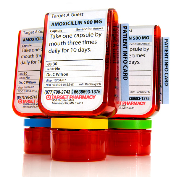
The first decade of the 21st century has been frequently accused of lacking coherence. Ironically, coherence emerged as one of the prevailing themes of some of the decade’s most important design work. Target’s Clear Rx bottles—hailed by IDSA’s esteemed jury as the standout Design of the Decade receiving a gold award and it’s designed by a student no less.
The story of the ClearRx begins in the frail hands of a grandmother who misunderstood the labeling on a pill bottle and took the wrong dosage of prescription medication. That mistake made her ill and inspired her granddaughter—then a master’s candidate at the School of Visual Arts (SVA)—to ask simple, yet powerful questions about what had been taken for granted as the acceptable way to store and distribute medicine.
Deborah Adler—the granddaughter/grad student—identified several problems with existing pill bottle designs. Why were so many different styles of labels used? Why did information about the drug provider so often trump information about the drug itself? Why was the type so tiny? Why were so many factors unwittingly conspiring to increase the risks associated with taking prescribed drugs?
When Adler completed her SVA thesis in May 2002, she had arrived at a solution that changed a long-neglected form factor and fundamentally overhauled the communication design of the pill bottle. She produced a compelling prototype that offered a safer, more usable means of storing and distributing medicine—but it was still just a prototype.
Adler’s original Safe Rx design raised almost as many questions as it sought to answer. Would it satisfy all of the mandates laid out by the Food and Drug Administration (FDA)? How would it change the workflow of the average pharmacist? Could any single company effectively deploy the design as a business solution?
Target, of course, chose to become that company, and it has been rewarded pretty handsomely. Since the ClearRx launched in 2005, Target’s pharmacy business has experienced double-digit sales increases. That return followed an investment in design—and a very thoughtful commitment to the design process.
After Target engaged with Adler, the company coordinated resources to develop her prototype as both a product and a system equipped to serve the product. It hired Sonic Design’s Klaus Rosburg, IDSA to shape the industrial design process. He joined Adler and Target’s native design team to reimagine the bottle design so that it would achieve all of Adler’s original communication design objectives without upending Target’s supply chain or adversely affecting the work of its pharmacists.
A D-shaped bottle designed to be read more easily evolved to become a wide, flat container capped at the bottom to create more space to communicate with the user. The original design featured an unusual semicircle cap that would have faced difficulty obtaining child safety certifications from the FDA. The final design encountered no such problem.
Color-coded labels aimed at personalizing the pill-taking experience were not feasible given the expenses associated with installing and maintaining color printers, but the need for personalization was paramount. Consequently, the team developed a cheaper, equally effective personalization system featuring six primary color rubber rings that attach to the neck of the bottle.
While Adler’s original information hierarchy remained largely unchanged as the SafeRx morphed into the ClearRx, she did tap her mentor, Milton Glaser, to help redesign instructional and warning graphics to be consistent with the intentions of her information hierarchy.
Along the iterative path, Target’s technology services, pharmacy team, pharmacy operations, pharmacy training and marketing team were tasked with figuring out how the product would be produced and handled. Target upgraded its CRM and point-of-sale IT systems, leveraged its pharmacists to create new workflows and exploited marketing to explain to consumers the new ways they would interact with their meds.
All of this may sound like something of a creative miracle—and it is, to a degree. The story of Target’s ClearRx also represents some of the most elemental and very best design practices: identify a consumer problem, develop a solution, scale the solution to make it compatible with your business and collaborate with all the appropriate stakeholders to bring that solution to market.
In this case, a designer with a superior idea initiated a complex process to deliver a solution that made a quantum leap in clarity for a business and the consumers it serves. The Target ClearRx was, according to Design of the Decade Chair Chuck Jones, FIDSA and his fellow jurors, the finest example of design that was realized during the first decade of the 21st century.
Design of the Decade is hosted by IDSA. You can view the other winning entries here.
Credit: Deborah Adler, Klaus Rosburg of Sonic Design, Patrick Douglas, Matthew Grisik
