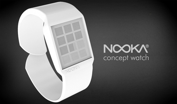
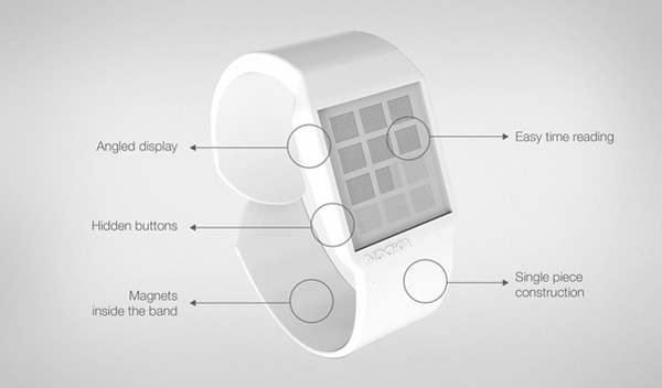
Whenever a concept comes into our box, I can usually make a quick decision as to whether or not it’ll make it to the blog by giving it a once-over. But when it’s a concept inspired by and designed for an international brand, my immediate response will either be harsh or laboriously complimentary. Fortunately this concept falls into the latter. I know Nooka and its head henchman Matt Waldman so I can say with certainty, this concept watch takes the Nooka DNA and twists it into something new. Kudos.
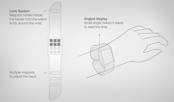
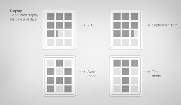
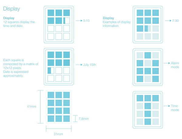
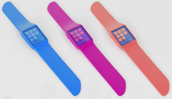
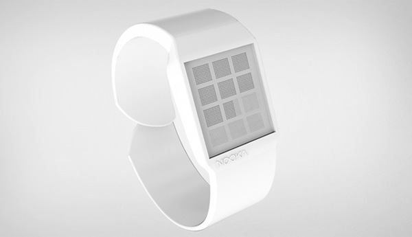
Nooka is a dichotomy with their minimalist aesthetics accompanied by some of the most complicated time faces. It’s a place where art, design and logic meet. If you don’t have an affinity for at least two of those pre-requisites, you’re never going to understand Nooka. Designer Mario Troise does. This watch is minimalist, elegant, futuristic, easy to make and forces you to think of time yet in another visual way – this time made of up twelve boxes each made of up single pixels. Love or hate, I think it’s definitely Nooka.
Designer: Mario Troise
