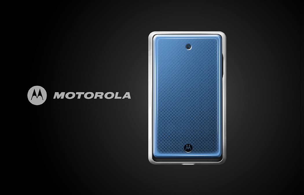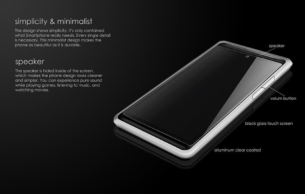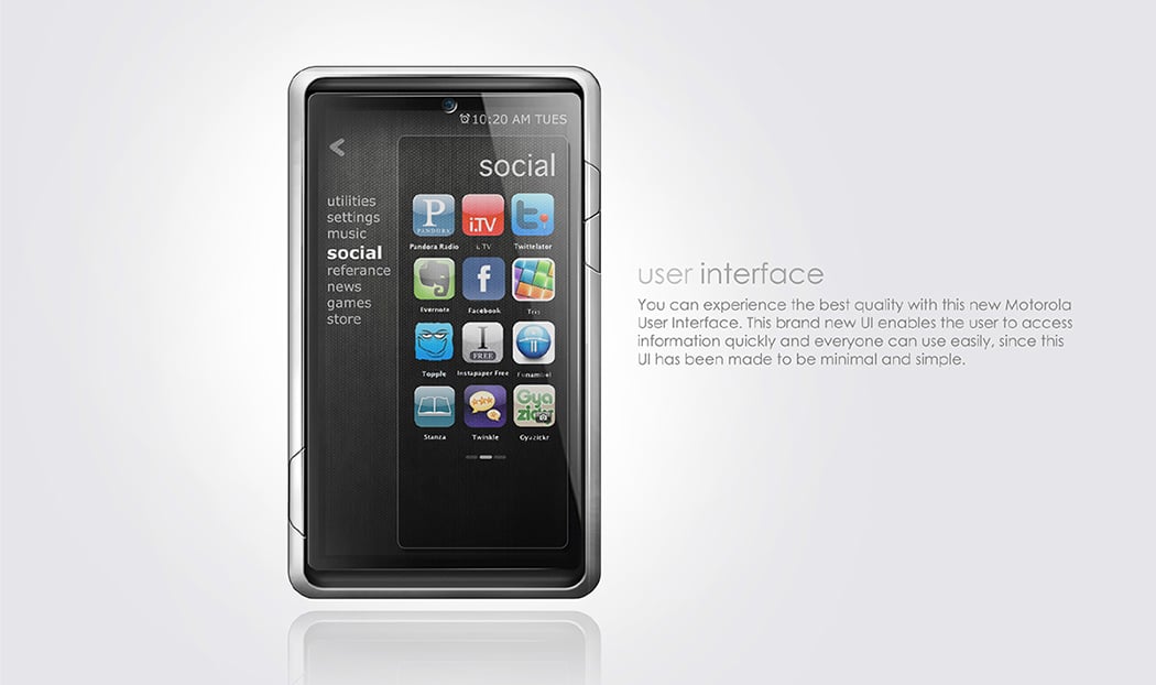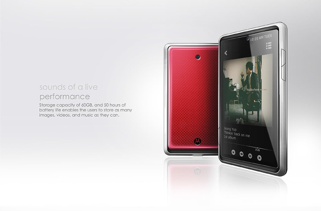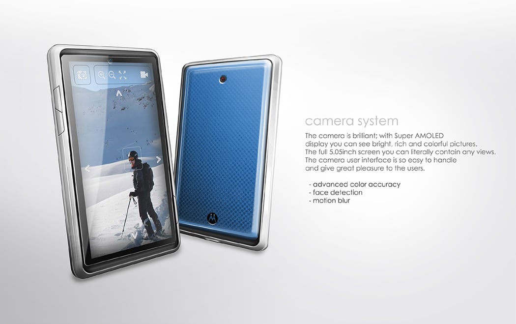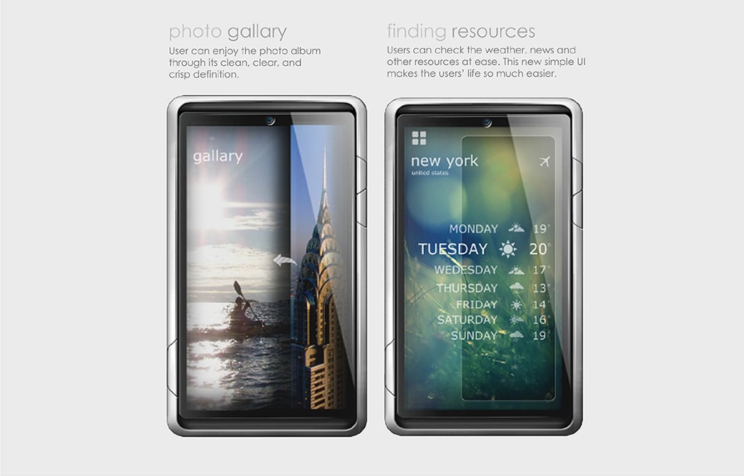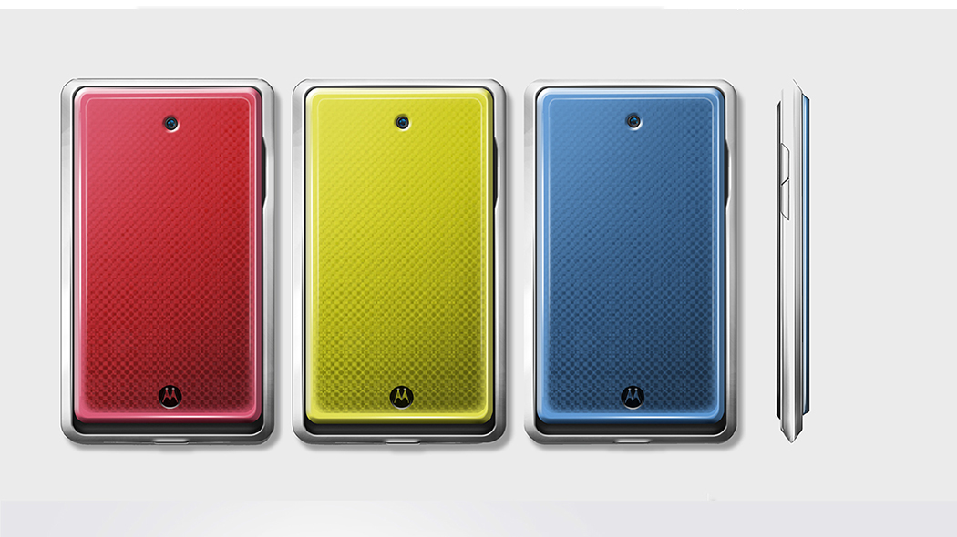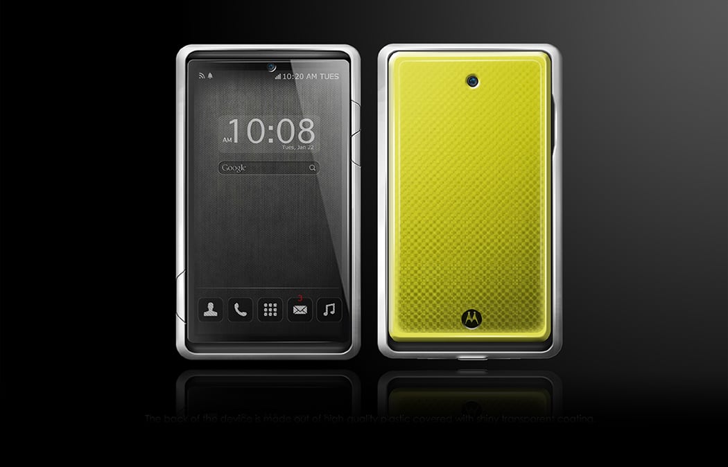
I feel we should banish the word sleek from our dictionaries. Enough is enough. I don’t want a razor thin phone, I just want one that does a marvelous job. This Motorola concept smartphone really explores a new aesthetic that makes a phone functionally superior while giving it some body (because we end up putting thick protective cases on our thin phones anyway… stupid humans). The screen is pretty much edge to edge, but is surrounded by a thick metal bezel that almost makes it look like the phone is wearing a protective armor.
I love the fact that the phone’s outer metal bezel really acts as a defining element for the phone visually. Buttons on the bezel really stand out, and can easily be pressed without fumbling. Even the speakers are in a recessed spot between the phone’s inner body and outer bezel, giving it a beautiful character.
Designer: Steve SH Kim
