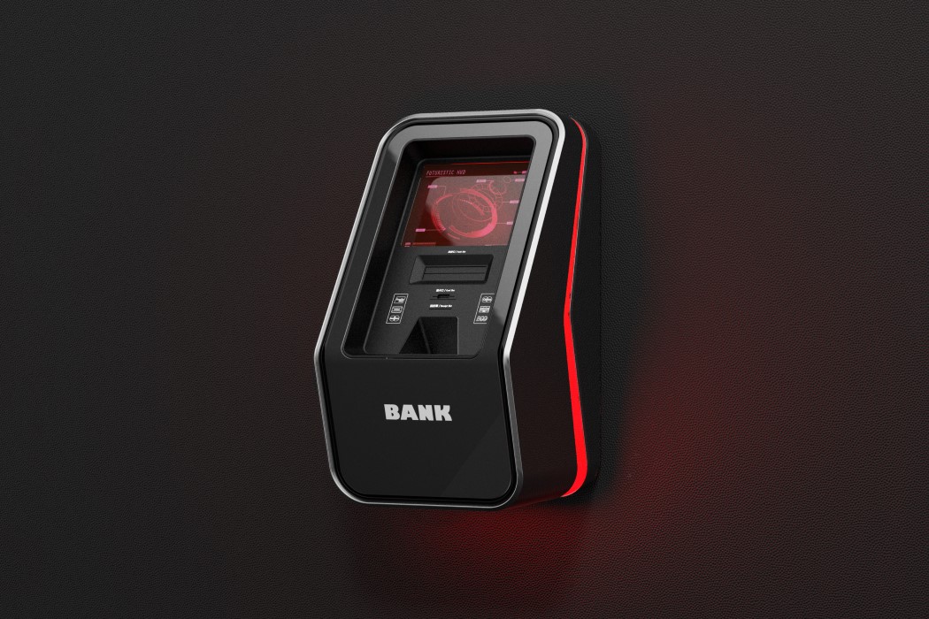
By far some of the worst user experiences in my life are the ones where I’m holding my ATM card, trying to extract money from the automatic teller machine. The ATMs still use Windows XP, in case you’re wondering why their interfaces are so messed up. Interfaces aside, even the design language for ATM kiosks seems so archaic, it’s time they were updated.
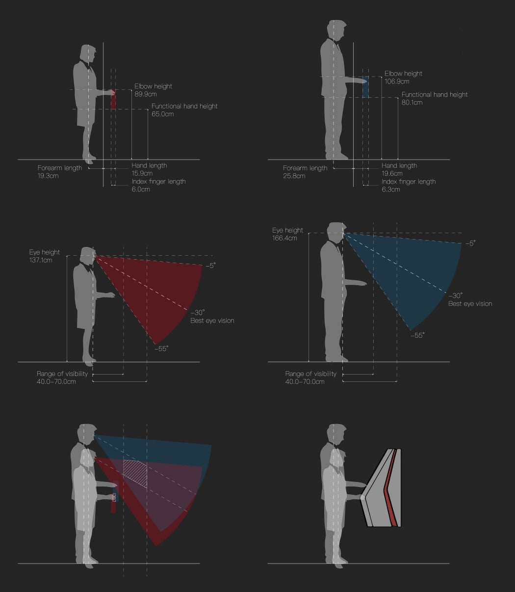
These new ATMs are called Man-Machine ATMs. That’s because their machine design is based strongly on human proportions, making them an ergonomic delight. You can see the study down below, showing why they’re designed the way they are, so that no matter what your height, the screen is well in your cone of vision, and the card and cash slots perfectly angled and placed for your arms to reach them.
They take a massive upgrade on the design front too, with matte anodized metal finishes, like our smartphones, exuding a sense of class and style. The red LED strip on the side helps one locate the ATMs in the dark too. Plus they give the machine a rather amazing looking halo. Wouldn’t it be wonderful though if the LED changed color? Imagine the color turning green when it dispensed cash!
Designer: ZhangZexin
