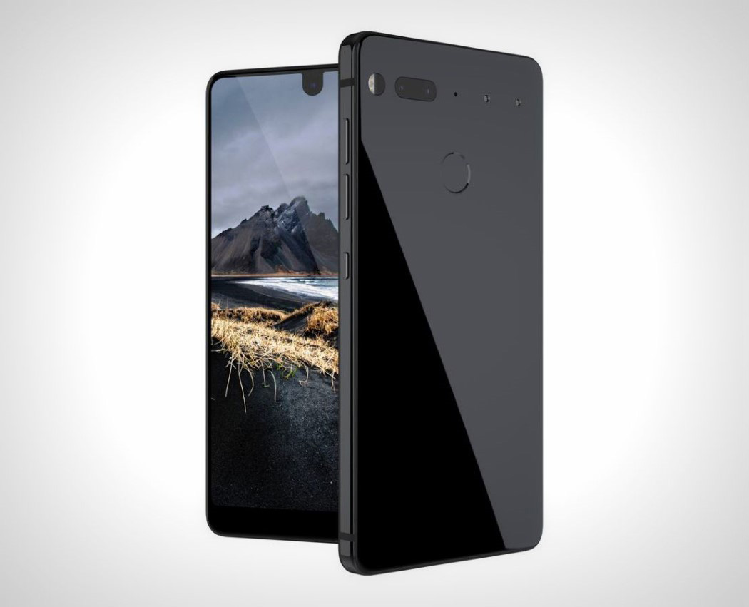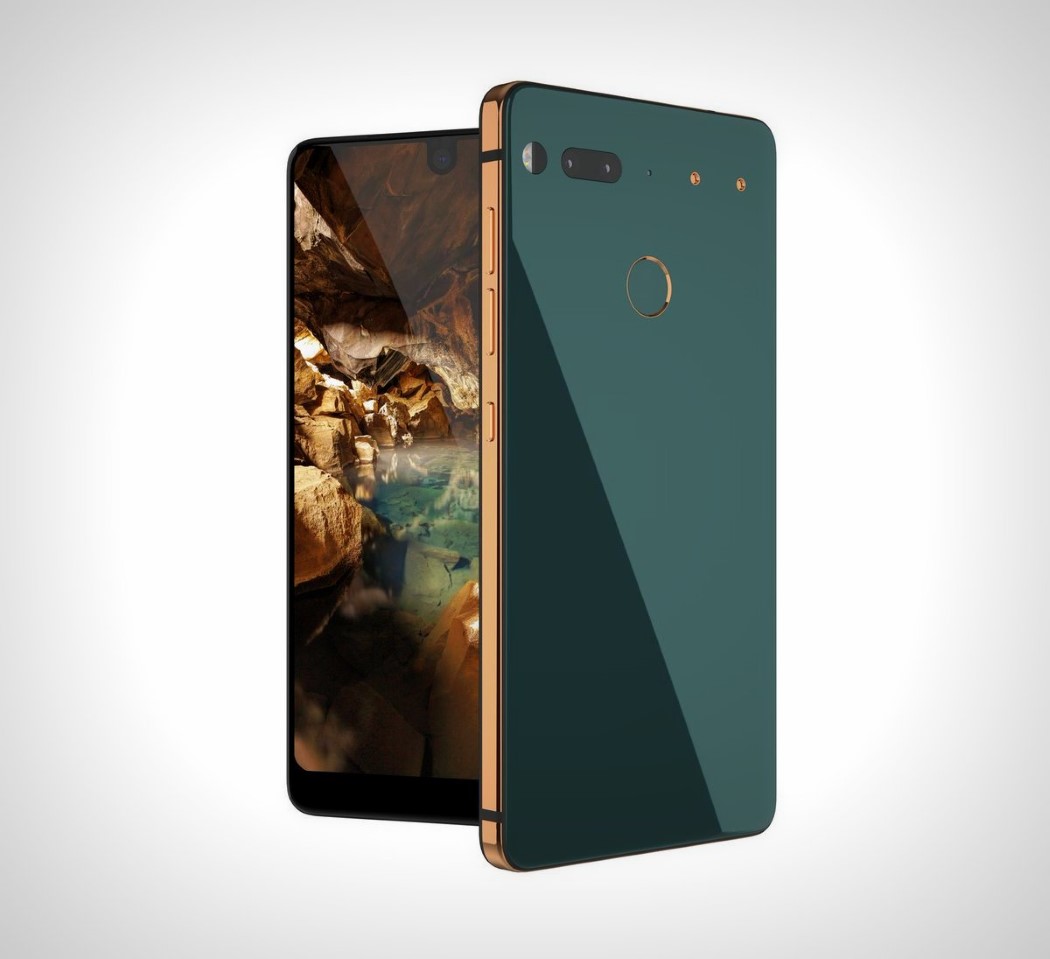
Earlier today we were introduced to the Essential Phone. Andy Rubin departed from Google after having “made” Android, to work on this phone and things have been pretty much under the wraps until today, when the phone was officially unveiled… and boy, what an unveiling!
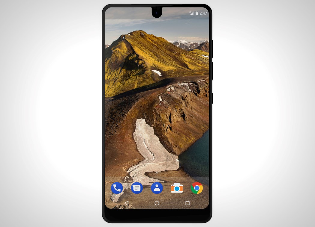
The Essential Phone looks like one of those crazy Coroflot/Behance projects done by some student with the screen stretching from end to end. Undeniably, all these crazy concepts are labeled as iPhone concepts for the year 2020 and so on. However, the interesting bit is that the Essential Phone isn’t a concept. It exists! Designed with a screen that’s hard to wrap your head around, the Essential Phone’s front face literally has a screen wrapped around all of it! That’s right. Virtually no bezel. In fact, the screen even comes with a small indent, allowing the front facing camera to sit proudly on the top of the phone. This is, the Essential Phone.
With the Essential Phone’s rather futuristic aesthetic, we have a rather strange conundrum on our hands. Ask yourself one thing. Would you buy this phone? I for one wouldn’t, and my answer would pretty much unlock a Pandora’s box, but let’s leave that for later. Strangely, like I said, the Essential Phone looks too futuristic for me, and you may have noticed that products that are too futuristic, seldom catch on (Jog your memory… Microsoft did the tablet way before Apple did). Look at the world of Concept Cars for instance. Every year, automobile companies push themselves to release “conceptual” car models that are good to look at, but not to own. Even though their aesthetic is admired on Facebook, reposted on Instagram, favorited on Pinterest, we don’t see them as cars that would “fit” on our roads, and honestly, maybe that’s exactly the problem with the Essential Phone… and it’s a rather fascinating problem. The phone is way too aesthetic or way too groundbreaking to be acceptable.
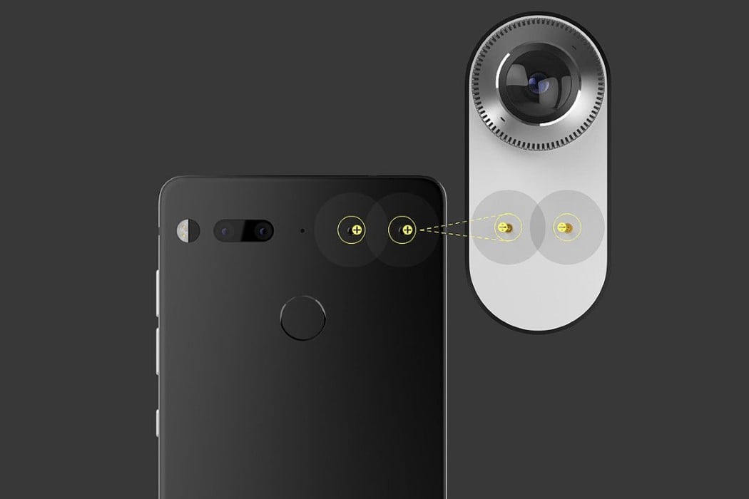
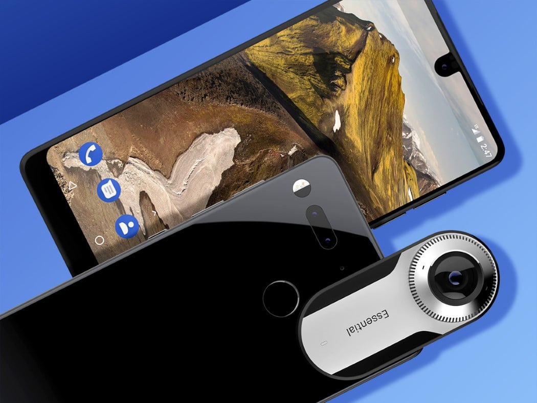
Moreover, the phone dapples with modularity (yet another tech direction that’s way to ahead of its time… Google ditched the Ara project, remember?) by putting magnetic connectors on the back that allow you to snap a 360° camera onto the back of the phone. It also ditches the headphone jack, a move that Android isn’t too keen on adopting. The phone will retail at $699 later this year and I’m interested to see if I’ve been proven wrong (Andy Rubin states that this phone will sell in a limited capacity due to technological constraints), but I’m more interested on seeing if the phone’s presence creates a ripple the way the phone’s announcement has. If I’m right, it’ll just go to prove that there’s a fine line between the kind of design we love to admire, and the kind of design that we love to own. Thoughts?
Designer: Essential
