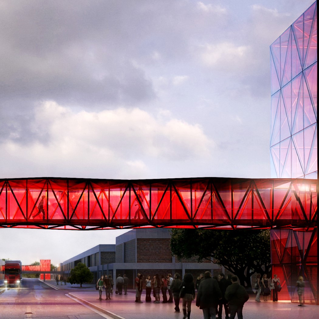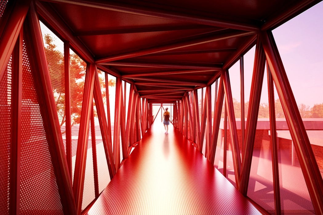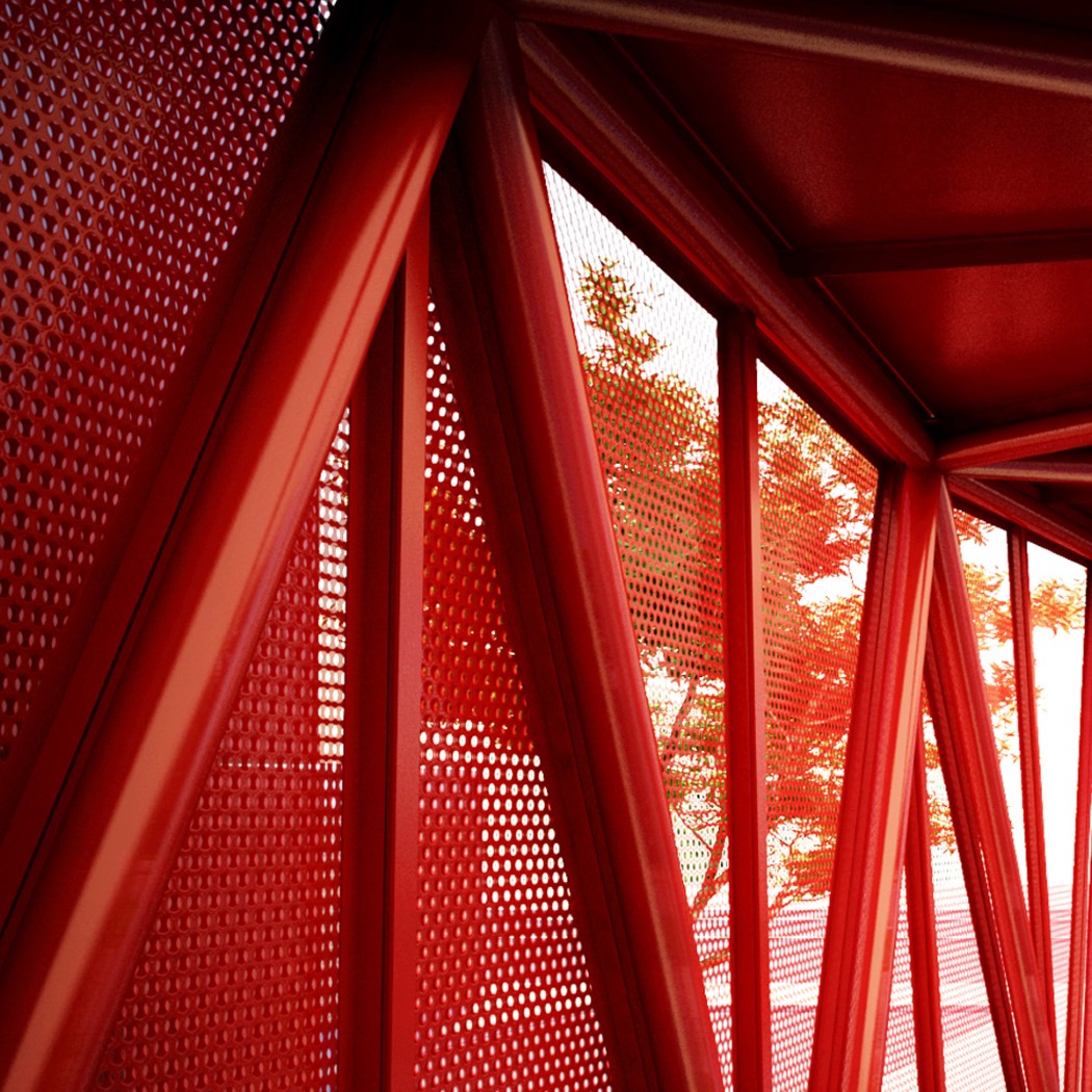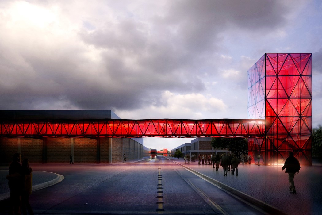
It would be much too literal to shape a chocolate museum like actual chocolate, wouldn’t it? So designer Ricardo Canton decided to capture the allure and instant mouth-watering attraction of chocolate (or any candy for that matter) in his architectural style for the Nestlé Chocolate Museum. Borrowing from the rigid nature of chocolate candybars, the museum’s very entrance and the sky-bridge that follows pretty much nails the brief by looking absolutely lick-worthy. The choice of red seems fitting too, given that red is one of Nestlé’s brand colors!
Designer: Ricardo Canton
