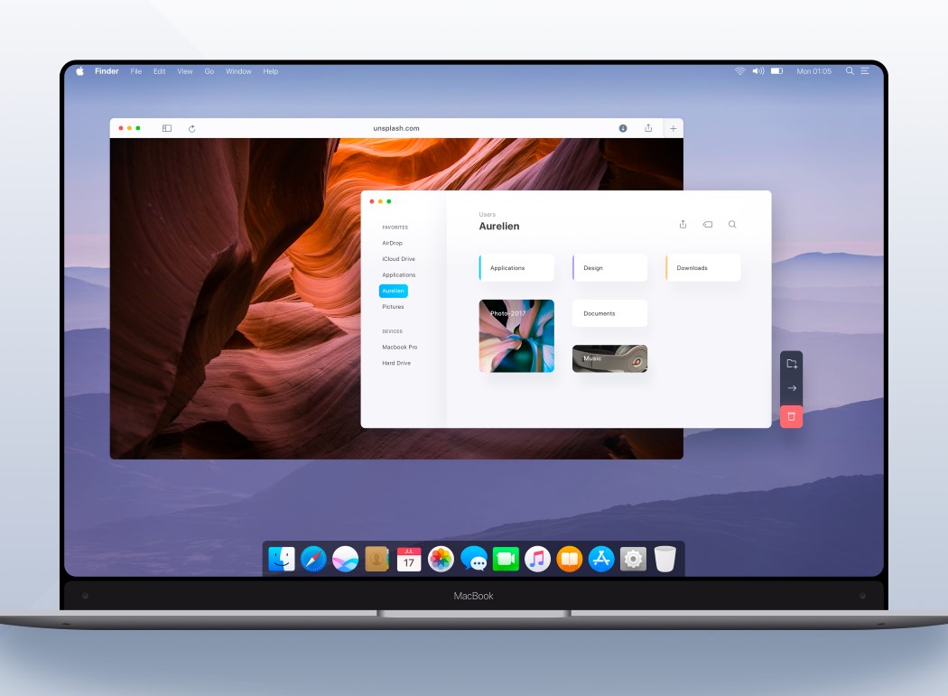
I’m excited and also a little sad to present to you Aurélien Salomon’s vision of the Macbook. Excited because it does such a marvelous job of streamlining Apple’s two product and experience lines (the desktop and mobile lines), and sad because this is purely conceptual.
Following the latest smartphone trend, the Macbook also opts for a charming bezel-less display. Obviously, it has no notch, giving it an edge above the iPhone X, but it looks drop-dead gorgeous. However, it retains the familiarity of the notch with the way the start-bar at the bottom eats into the desktop wallpaper. Rather clever, no? If you notice, the screen is a rounded rectangle too, rather than the boring straight lines most computer screens have. Also, forget the Touch Bar, because this Macbook is the first that comes with a touch display, and a good thing that it does, because Aurélien Salomon’s vision for the MacOS mimics the iOS 11’s styles, allowing anyone who’s owned an iPhone to be able to work their way around the Macbook with ease. See what I meant when I said the concept streamlined Apple’s two product lines?
Yes, it’s sad that this isn’t Apple’s vision, but it’s still rather beautiful and if there’s an Apple Exec out there sitting and looking at this post, I’d like you to take some notes, and give the designer a cookie!
P.S. Brownie points if you can spot the Webcams. Yes. Both of them!
Designer: Aurélien Salomon