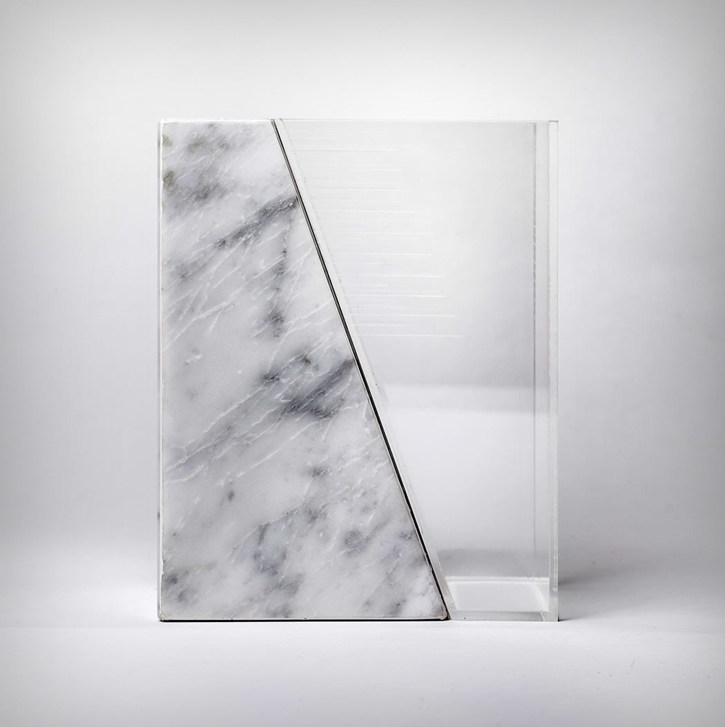
Lately, we’ve questioned the appearance of a lot of things. Shavers, IoT Devices, Air conditioners… or rather, we’ve asked the question “Why not make it look different?”. This deviation from a product’s ‘category code’ (or the need to homogenize designs of a certain category so users can identify them better) opens up a new world of design where a user’s experience remains unchanged or enhanced by a product that looks radically different in an attempt to break the mold.
Take for instance the Half-Half kitchen scale, which was designed in a way that can be best described as a parallel universe kitchen scale. Made out of glass and marble, the scale is designed to complement the kitchen beautifully (it uses its space and the space’s materials wonderfully as inspiration), rather than standing out as an appliance screaming for attention. Designed to be a perfect square when not in use, an elegant diagonal cut along one face gives the product its character while allowing for the glass receptacle to be moved upwards. Markings on the glass container allow you to gauge the weight of the items you place inside as the glass container lowers itself, the heavier it gets. I for one would love to have a Half Half scale in my kitchen, not because it does its job, but it does so with sheer panache!
Designer: Constantina Sfakianakis