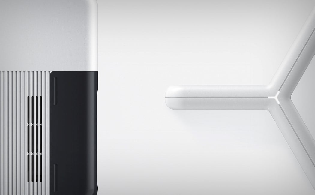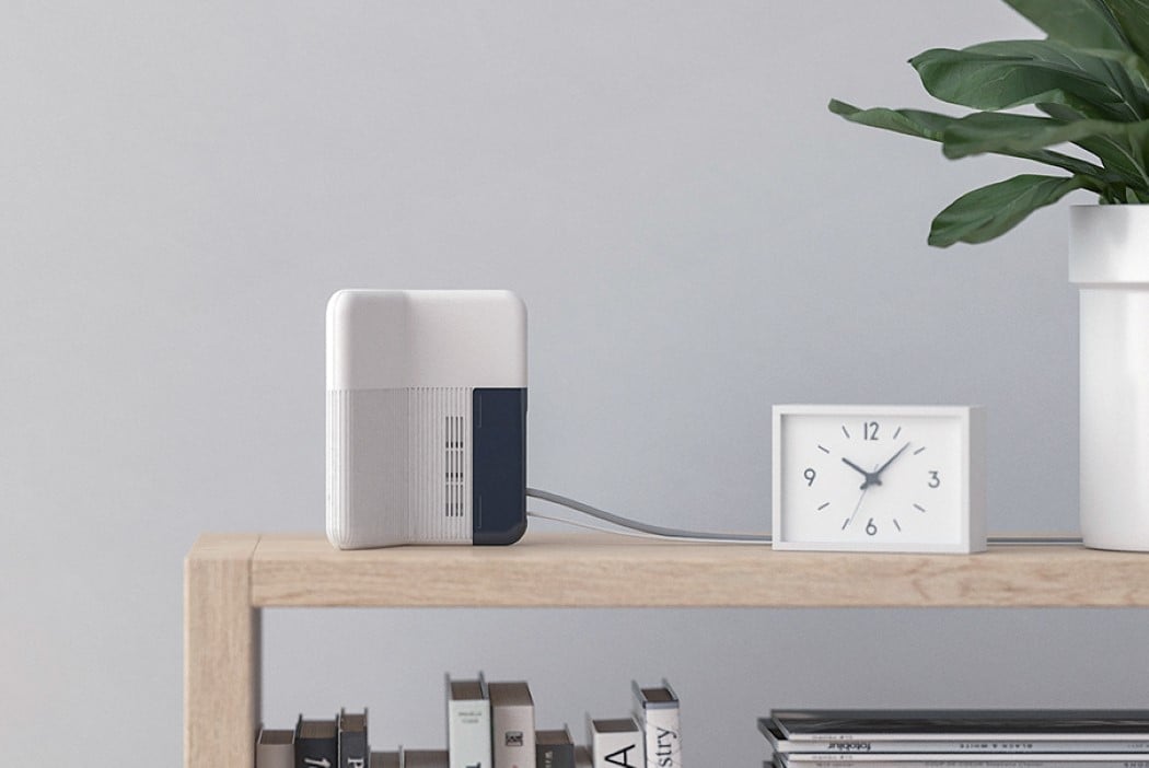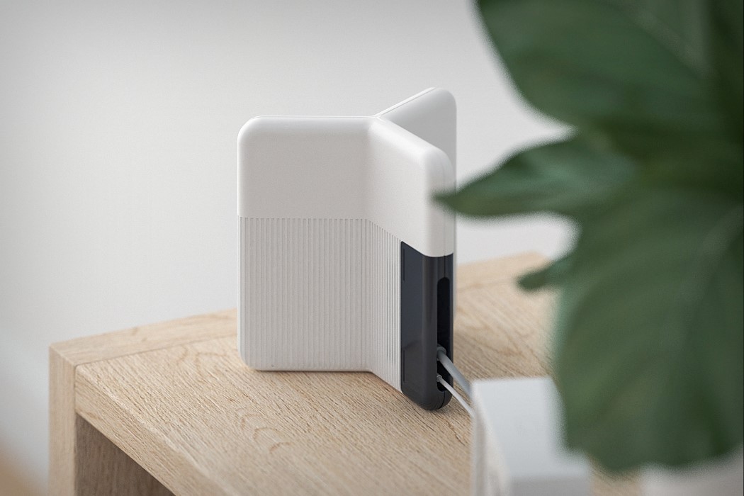
I’m not sure if the design of the router was inspired by the Y sound in the word Wi-Fi, or if it was just a happy coincidence, but the result is a pretty neat looking router that does a smart job of disguising its antenna inside the router’s body, also resulting in a shape that looks unique and balanced, both visually and literally.
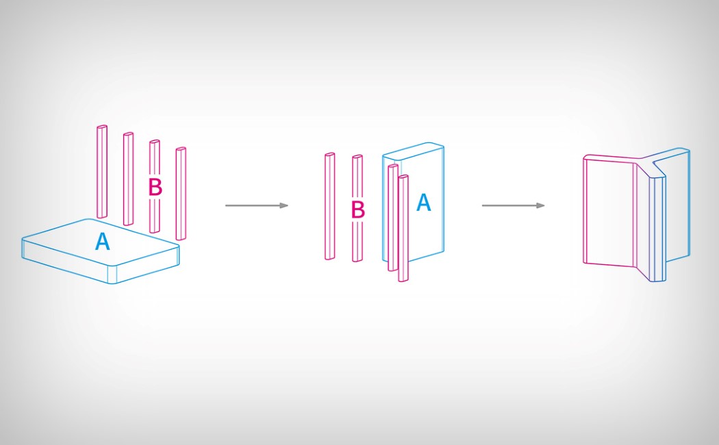
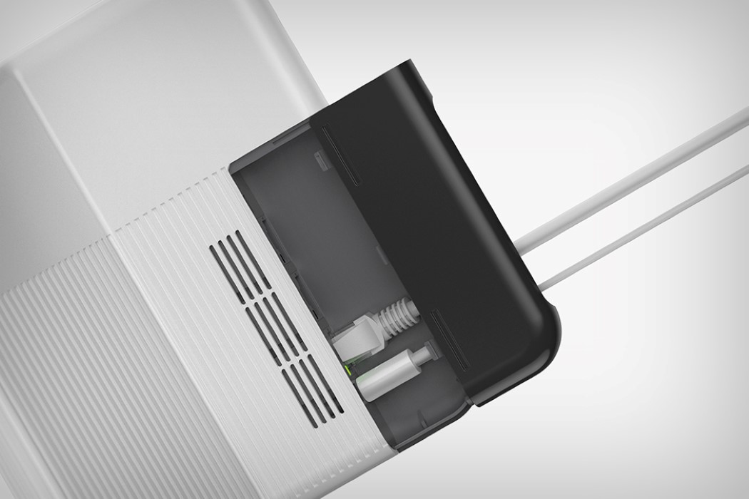
Jiu Shi believes the presence of the antennae make the router look robotic and unfriendly, and with how heavily dependent our smart homes and AI products are on routers and Wi-Fi, it makes sense that the router too has the demeanor of a friendly, helpful, internet device. Scroll down a little further and you’ll see how Jiu Shi redesigned the box+antennae setup to arrive at the Y shape. While this new shape does occupy much more space (especially when shipping), Shi’s design can actually be pulled apart and shipped as a put-it-together kit that takes barely any amount of time. The resulting design conceals the ugly antennae as well as the jacks/ports/connectors within the body of the slick, classy, dual-colored router. A clean, smart wi-fi router for a clean, smart home!
Designer: Jiu Shi

