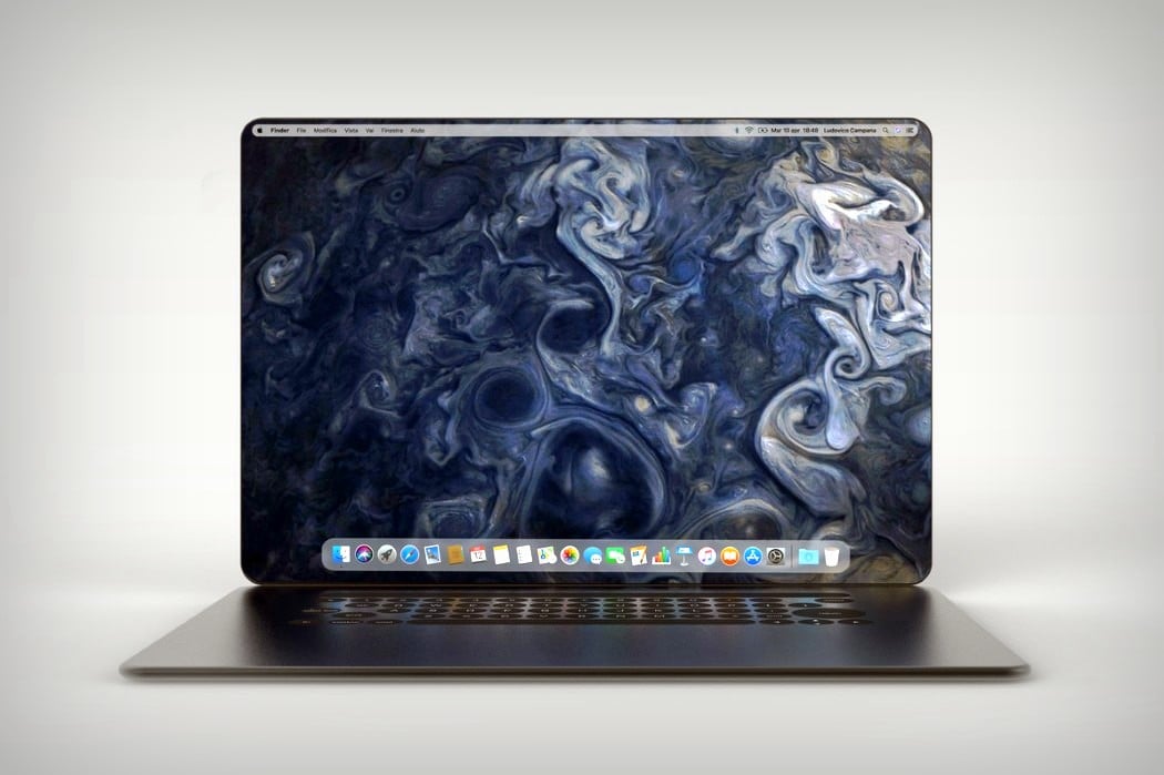
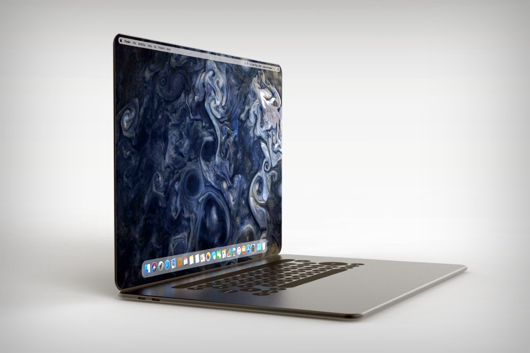
Aside from the addition of a touch bar, the removal of a whole bunch of ports, and the omission of our favorite light-up logo, the MacBook hasn’t seen much visual change in the past decade or so. Unlike the more popular iPhone, the MacBook has siletly gotten thinner and more powerful, while overall looking the same, and designer Ludovico Campana thinks that the laptop desperately needs a redesign. His reference point? The iPhone X.
The iPhone X makes a great reference for a redesign, because that’s exactly what it was. An overhaul of sorts that focused on new features, the removal of the rather iconic home button, and the introduction of the bezel-less display barring the one notch. Ludovico’s MacBook redesign takes similar routes, and rather appropriately christens itself the MacBook X. Featuring a body that’s curved, rather than wedged, the MacBook X does a hat-tip to the iPhone, and looks less susceptible to horrible denting given the lack of a sharp edge. It also explores a more expansive display that has those incredible curved edges and absolutely no bezels. The absence of a notch means there’s no webcam on the MacBook X, which does raise questions, but none too serious, considering this is purely conceptual. Look down at the bottom half and you’ll see the touch-bar is still there, sitting above what I can only say is a keyboard that feels much too different. Deviating from the regular square-keyed board, Campana’s MacBook concept takes on a circular key design, much like lofree’s Four Seasons keyboard, which I honestly have conflicting opinions about, but then again, conflicting opinions are all too common in the domain of consumer electronics… aren’t they?
Designer: Ludovico Campana

