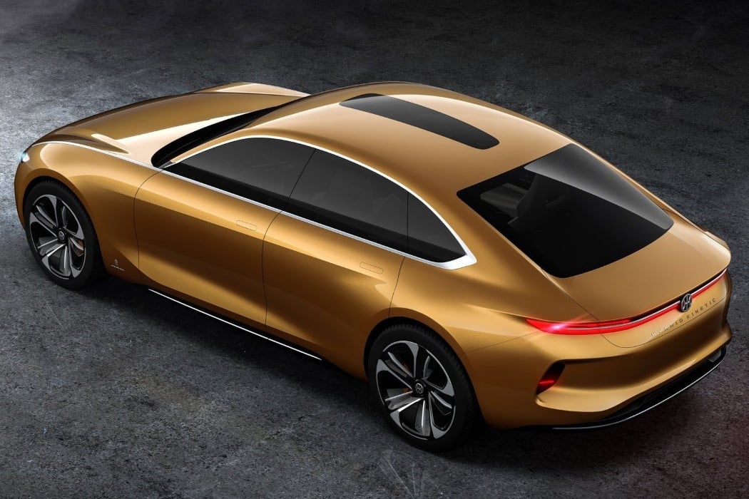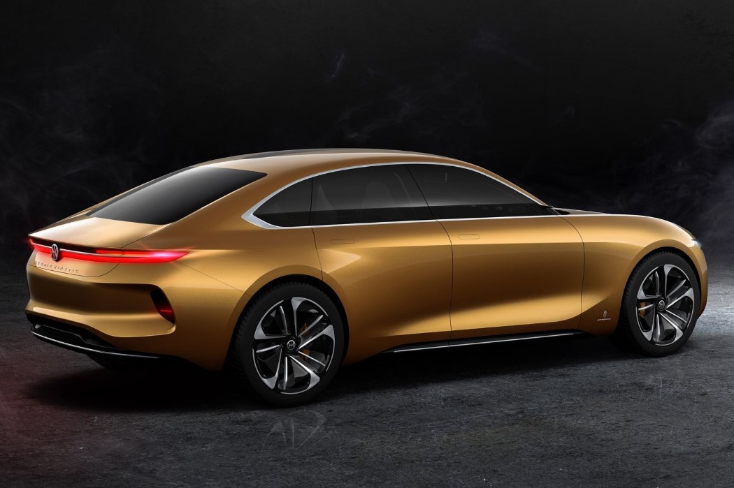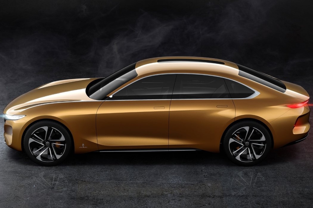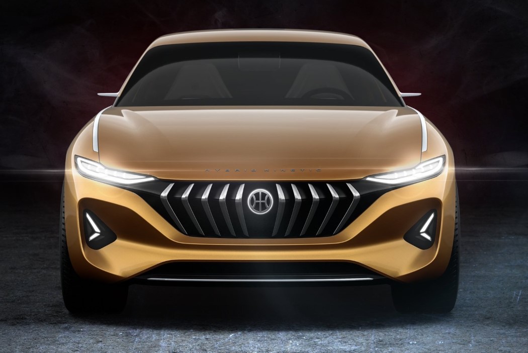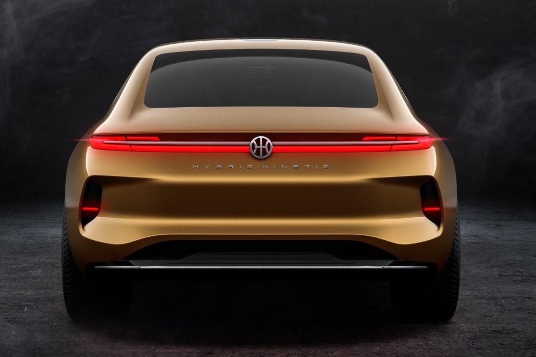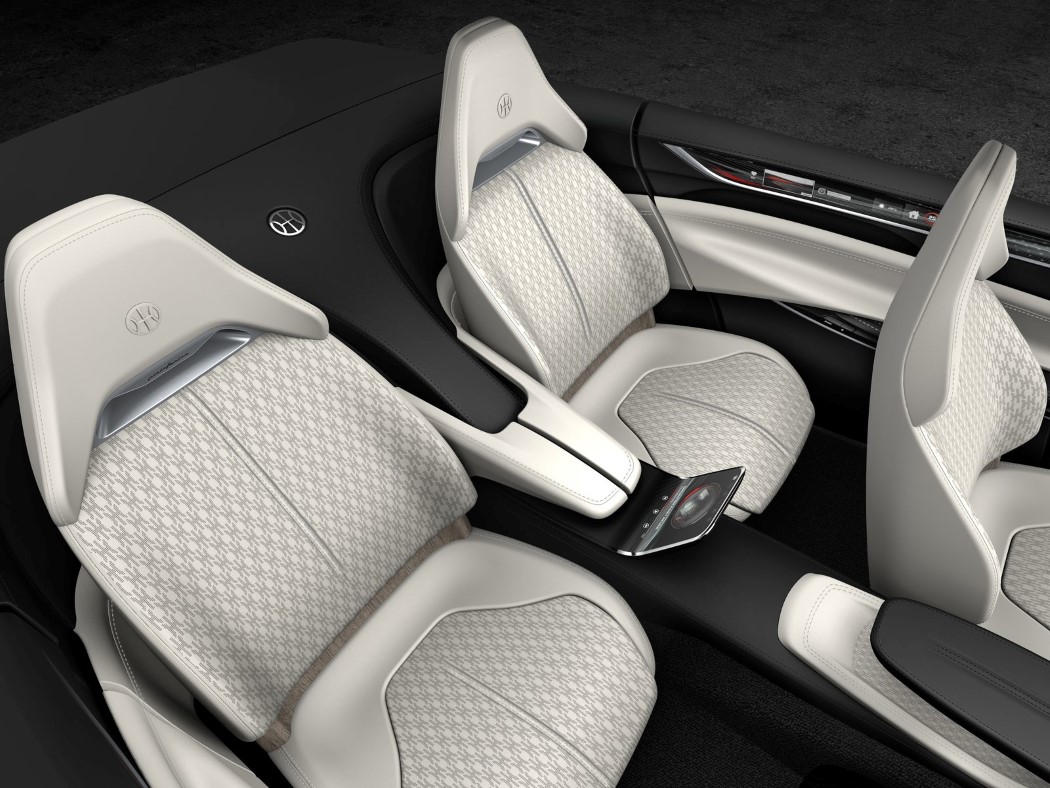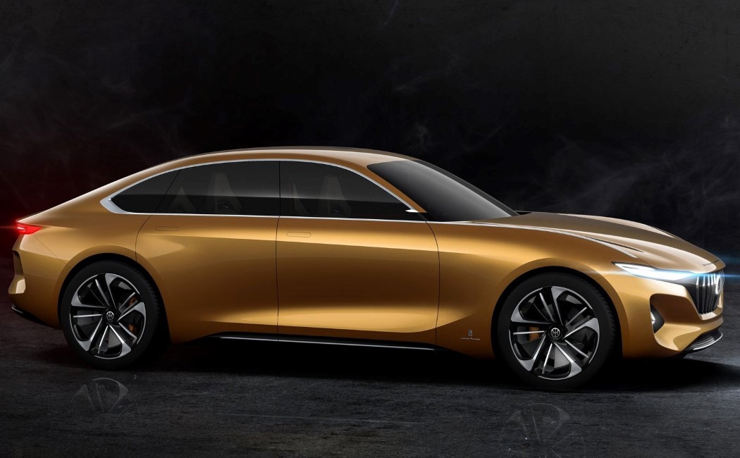
I wouldn’t really call it minimalism, as much as I would cleanness and straightforwardness, but the Italian automotive design powerhouse is channeling an aesthetic that isn’t necessarily Italian, but feels more of a blend between German and Japanese. Its collaboration with Hybrid Kinetic resulted in the H500 sedan concept… a car that’s pristine both on the outside and inside.
The H500 is equipped with the cutting-edge technology developed by Hybrid Kinetic for the traction system, with battery and electric motors capable of going from 0 to 100kmph in 4.7 seconds but what I truly find alluring is its outer body. Made to look less ground-breaking and more sensible, the H500’s design is clean, crisp, and doesn’t shock or surprise you, but rather reasons with you. Even though it’s an electric car, it retains its grill on the front, giving it an aggressive Stalin-esque mustache look. The rest of the body, however, tries to retain a smooth sensible look, with little drama, and subtle curves carving the car’s exterior (something we saw in the H2 Speed concept too). All details on the exterior don’t add to it, but blend right in, whether it’s the skylight on top that looks more like a racing stripe than a window, or the handles on the doors that stand flush against the car’s body… giving the car a clean exterior, which rather well complements the fact that the car’s zero emission nature, making it clean in more than one way!
Designers: Pininfarina & Hybrid Kinetic.
