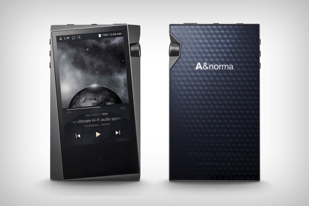
(Continued from title) And that’s saying something, especially after this year’s onslaught of notched phones. The screen, tilted a little less than 10° anti-clockwise seems like a great idea in theory, but can result in massively divisive opinions in practicality. The idea behind the tilted screen was probably to give you a gradually thickening bezel, while not compromising on the screen size. The thickened bezel then plays host to the fat volume knob, a design detail that is intended to stand out in function above the rest of the controls. It also means less accidental screen-touching when held with your right hand.
Feature-wise, the A&norma SR15 (not a really catchy name, but it isn’t for regular music listeners either) is a great player with exceptional audio reproduction. It has a quad-core processor, letting it play incredibly heavy audio files with relative ease, and bit-for-bit support for files up to 24-bit/192 kHz (Tidal streams at 16bit, 44.1kHz). Being a dedicated audiophile’s listening device, the A&norma SR15 comes with a MicroUSB port, for charging and file transfer, a balanced 2.5mm jack and a 3.5mm headphone jack for your conventional listening purposes, and even sports Bluetooth 4.1 for wireless listening. The screen is a touch-sensitive one, although its tilted nature also results in a tilted UI, which I personally am vehemently against, but each to their own, I guess.
Designer: Astell & Kern
