It’s unlikely that companies like Apple or Facebook will ever foray into designing home interiors, but a little wishful thinking never hurt anybody. In this post we look at conceptual bedrooms, designed with the language and characteristics of 6 of today’s technology giants.
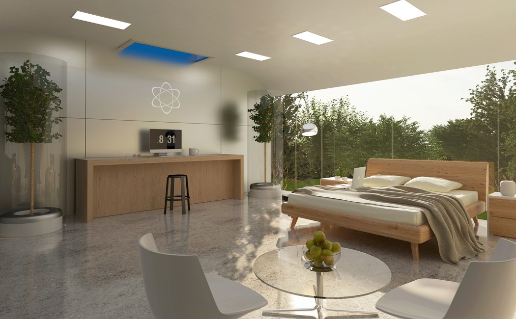
Right above is the conceptual Apple bedroom. Looking like someone cleared out an Apple Store and put a bed in there, there’s something very pure and pristine about the interiors. Undeniably Apple, right? Designed to look sensible and straightforward, the room comes with a white interior, a full sized window (or should we call it a bezel-less window?!), and even trees within glass enclosures. Elaborate, opulent, yet clean. Ahhhh!

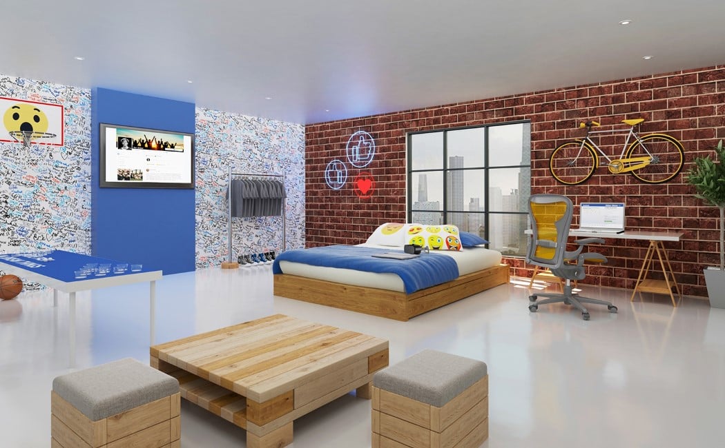
Then comes Facebook’s bedroom. Using blue to bring a fun-yet-not-garish vibe to the bedroom, the interiors make use of signature facebook elements, from FB reactions, to neon likes, wallpaper made of personalized messages on the left, to even a literal brick wall on the right that reminds you of the time when you “would write on peoples’ walls” on Facebook. Oh, and I love the cheeky wardrobe in the corner with the grey tees!

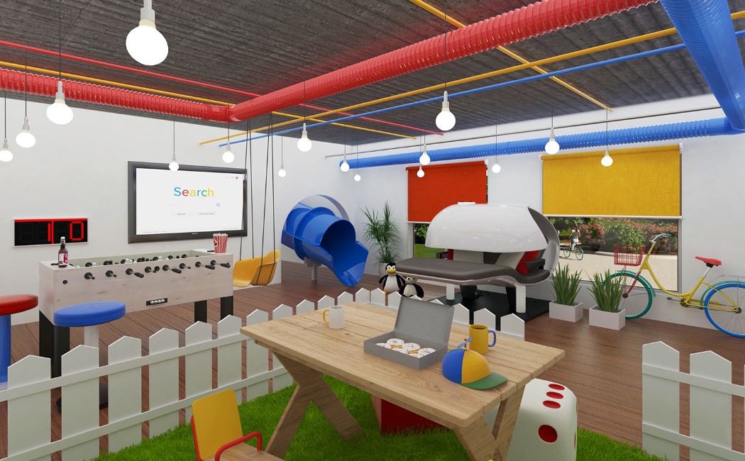
Everything about Google’s bedroom screams fun. Using Google’s brand colors and going completely nuts with the decor, the Google bedroom is more fun and vibrant than an environment conducive to sleep. Swing, slide, foosball table, and a literal faux grass playground, you’re much more likely to work from home in the Google bedroom.
The Netflix bedroom takes chilling very seriously. A TV with a home theater, stocked refrigerator, lounge-sofa, and a bed that looks oh-so-inviting, you’re bound to stay in bed and binge-watch your favorite shows. The interiors look quite like a theater with low-key lighting and the use of red gives it the signature Netflix flavor. Points if you notice the colorful lights near the window that do a hat-tip to Netflix’s Stranger Things!
Snapchat’s bedroom perfectly captures the whims and fancies of its young demographic. Ridiculously adolescent, the bedroom comes in Snapchat’s shade of yellow, balloons and streamers everywhere much like Snapchat’s flamboyant filters, and a hammock for a bed. Oh, there’s a photobooth too, given how Snapchat and selfies have such a strong relationship!
Lastly we have Spotify, a company so devoted to music that it makes sense the bedroom echoes that feeling too. With graphiti on the wall that literally screams MUSIC, wall-mounted records, a live-karaoke wall that displays lyrics (with 16 speakers on each side) complete with two microphones, and a light-up dance floor, the Spotify bedroom sets the perfect mood for a bedroom party. Besides, you can turn things down a notch too and bust out some sweet tunes as you head to the circular Spotify-logo-inspired bed!
The above 6 bedrooms do a pretty spot-on job (maybe too spot-on) of taking the ethos and characteristics of the 6 tech giants and translating them into spaces… a design exercise by the name of Product Semantics that we’ve covered in great detail in the past. There’s no guarantee that these spaces will ever exist, but it’s a wonderful design practice to familiarize oneself with brand languages, product languages, and learn how you can use them to make products (and in this case, spaces) look like they belong to a certain brand family. Hey designers, could we see a few more? Microsoft, Instagram, Whatsapp, Twitter, for starters??
Designer: Compare My Move