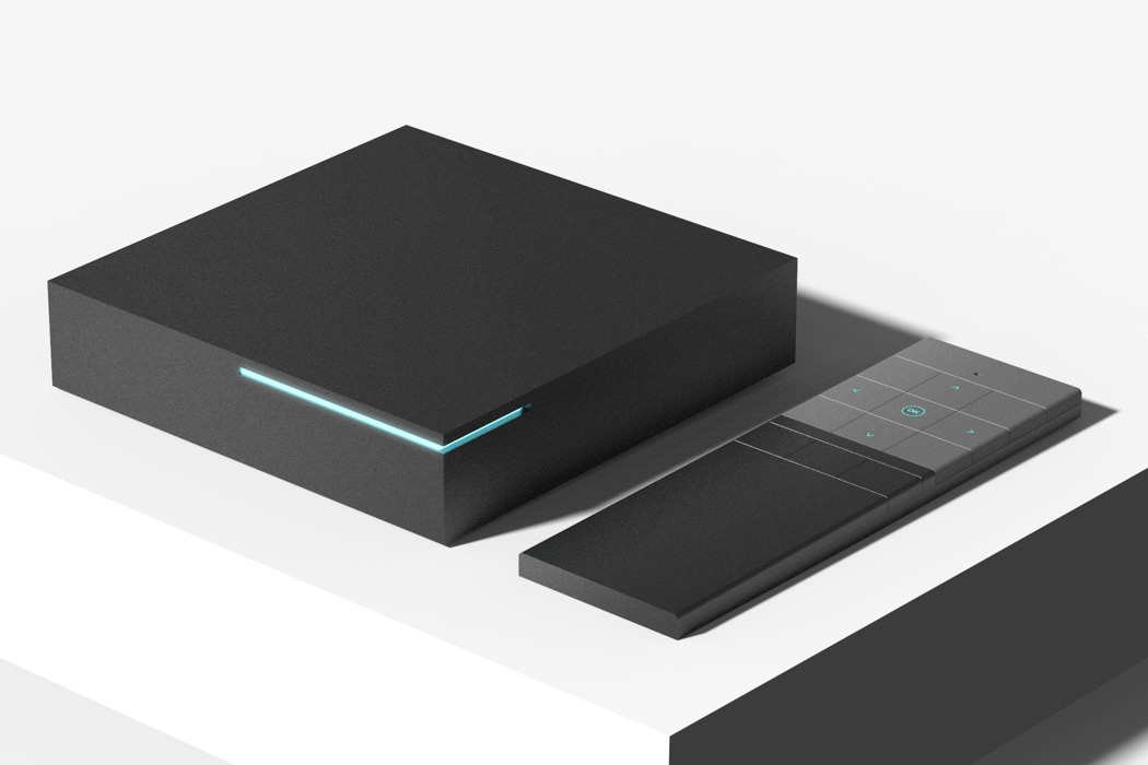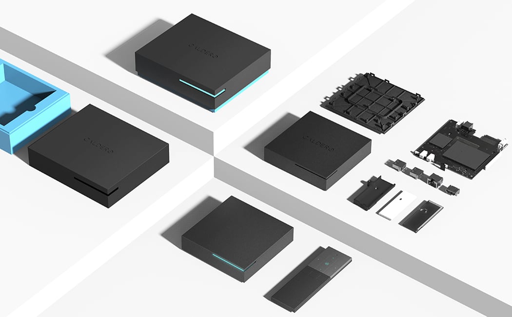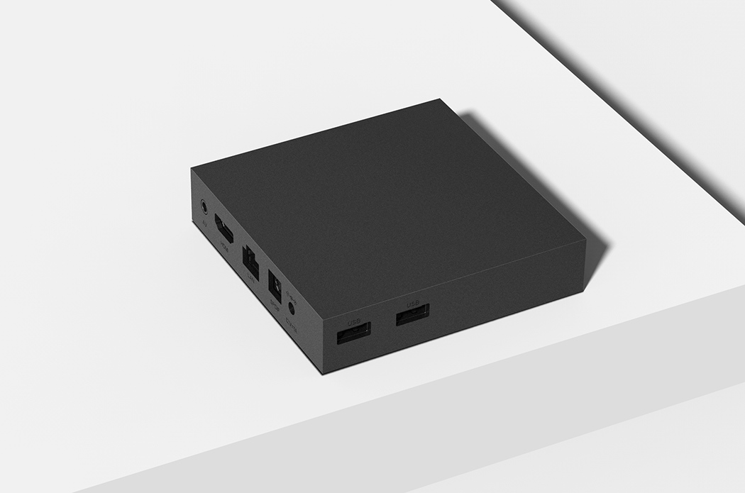
The Edge is Android’s answer to the set-top box. Users can connect to a treasure trove of content and entertainment from the comfort of home with one sleek, powerful package. Still awaiting details on performance, we can speak to its standout aesthetic that takes on an edgier form that its competitors. You won’t find any buttons or flashy logos, rather, this minimalistic rectangle sports only a single LED accent light that indicates its status. The remote control is equally void of frill but features at least twice as many buttons as an Apple TV. Of course, we’re not complaining because everyone knows just how tricky that remote can be to operate! With its simplistic UI and easy-to-operate control, its aim is to make the overall navigation and entertainment experience as seamless as possible.
Designer: Haoxiang Hu

The main challenged faced in designing this product where achieving the balance between a broad market appeal and being able to be identifiable in a crowded market.
The TV box market is very crowded with very similar designs, small black boxes, this is because the industry is very conservative, and everyone just wants to fit in and be discrete. Conversely, a lot of broadcasters use images of their products to promote their service and therefore require a distinctive design.

Another significant issue is that of cost. The cost of this type of consumer electronic product is heavily subsidised by the broadcaster and therefore costs need to be minimised to increase the rate of return on investment. At the same time a broadcaster will want to create an impression of quality consistent with their brand and therefore the design must appear to have a quality finish. Another factor in the cost is the cost of manufacture and assembly, the design needs to easy to produce and quick to assemble.
The final challenge is that the design must work as a functional piece of electronics, it needs to meet international safety and EMC regulations, it needs to have good Wi-Fi performance and it must not get too hot.
The challenges are then, it must look the same as everything else, but a bit different. The design must be cheap but look high quality and it needs to function reliably as a sophisticated piece of electronics.
The design focuses on a simple minimal user interface, the removal of buttons and the reduction to one LED for status indication is a very different approach to broadcast box solutions. Previous generations of designs have tried to provide the user with full navigational control of the UI via the front panel and multiple status indicators duplicating the functionality of the remote control. By removing this duplication, the design is simplified, cost reduced and the poor UX of cheap buttons is removed. Tradition remote control designs have tried to use short cut keys to access different features of the UI, which has resulted in designs consisting of 40-50 buttons. The focus for the design UI has been moved to the remote control, where the intention is again to simplify and reduce. By reducing the number of buttons, the box UI can be made a lot more flexible and dynamic.