Design is a highly subjective field, wherein the individual’s design sense is a high contributing factor to the final product created by the team. It is important to vet the candidate in a manner that ensures the time spent of the employees in the process is not a waste. The key here is to be focused and decisive – if you are not quite sure about the candidate, then just let them go!
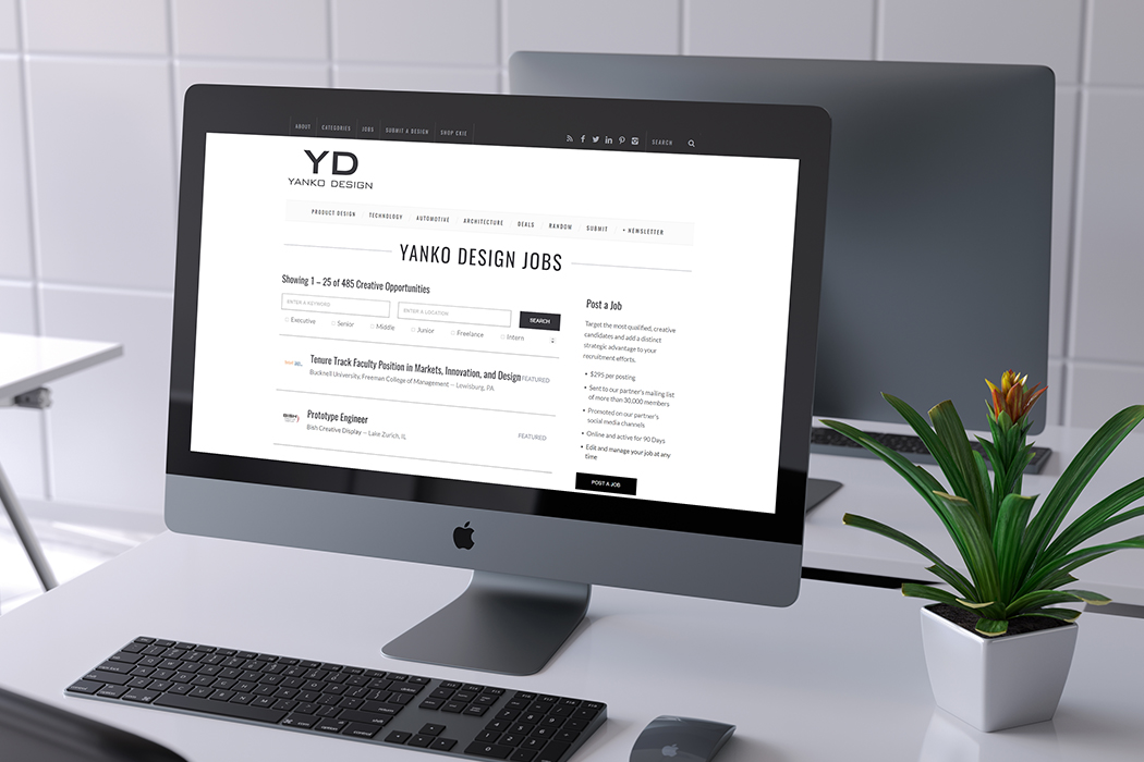
(Psst! Having trouble recruiting a designer? Yanko Design Job Board will connect you to our targeted product designer demographic)
The first 2 parts of this series (read: Part 1 & Part 2) spoke of the innovative and detailed process that gets a candidate invited to the Buzzfeed office for a personal interview. So in the finale of the series, we walk through the schedule of that grand day and how they interact with a candidate at that stage. Plus the little things they do to ensure that the person who joins them has a seamless experience instead of the usual new job anxiety.

When I first transitioned into management I had less confidence in my own ability to make hard decisions. I’d find myself torn after the screening process. Perhaps the candidate did very well during the portfolio review, but there were several red flags in their screen on collaboration. I was often tempted to invite them to come on-site anyway. I figured that in these situations a second opinion from the hiring panel would help me make the ultimate decision. Unfortunately, more often than not this resulted in more false positives and fewer offers. It was an inefficient use of everyone’s time including the candidate. An on-site interview is not a tie-breaker; it’s purpose is not to help an undecided hiring manager make up their mind.
Today, in order to bring a candidate on-site, the team members involved in the screening process need to feel confident that the candidate would receive an offer after the on-site round. If after two screens and the optional design exercise we still don’t have the evidence we need to inspire confidence, it’s as clear a signal as any that it’s time to move on.
So what is the on-site interview for, if our minds as hiring managers are mostly made up during the screening process?
The on-site loop allows us to get the perspective of adjacent disciplines that designers need to work closely with, like product and engineering, as well as supplemental feedback from additional members of the design team. It’s also an opportunity for the candidate to meet and assess the people they would be collaborating closely with if they were to join the team.
Our interview panels are composed of at least five people in addition to the hiring manager: two designers, one product manager, one engineer, and one front-end engineer. We try to keep our panel size small, not only to be conscious of everyone’s time, but because it facilitates trust within our team. A candidate shouldn’t need to meet every individual designer on the team, nor should every designer need to approve of them. This is the benefit of having consistent, documented hiring criteria. The benchmarks remain the same regardless of which designer is or isn’t on the panel, enabling the designers to trust each other’s best judgement.
What’s In A Loop
Interview loops consist of a portfolio review with the entire hiring panel, followed by 1:1 interviews with individual members. Two of these interviews are design exercises that make use of a whiteboard. For these, as well as our front-end exercise, it’s less about solving the problem or coming up with The Best™ solution in a constrained amount of time, and more about giving us insight into the candidate’s thought process and approach to problem solving.
We also realize how taxing these more performative interviews may be if done in succession. So when scheduling on-site interviews we try to alternate the order of ‘exercise’ interviews with ‘conversational’ interviews to avoid burn out during the already nerve-wrecking interview process.
Here’s what a typical on-site interview loop might look like:
We feel strongly about setting up candidates for success, and we actually want the people we bring in for interviews to do well. Many companies optimize for current employee performance and setting their people up for success. Yet when it comes to hiring, many companies place the burden on the candidate to ‘prove themselves’ against sometimes unrealistic odds. We prefer to start with the assumption that the candidate already meets our expectations, if they’ve made it this far. Our interview loop is less like a series of tests with increasing difficulty and more like a typical day at work: one in which you may work on some design projects, talk to your product and engineering peers, and present your work to stakeholders.
How We Evaluate Designers
I also recently updated the evaluation rubric we use in design interviews to better align with our role expectations, which we use for performance and leveling conversations with existing designers on the team. The previous scorecard reflected eight different categories, some of them redundant and not always applicable to the role, the candidate, or the interviewer. We’ve since narrowed our evaluation criteria to five categories:
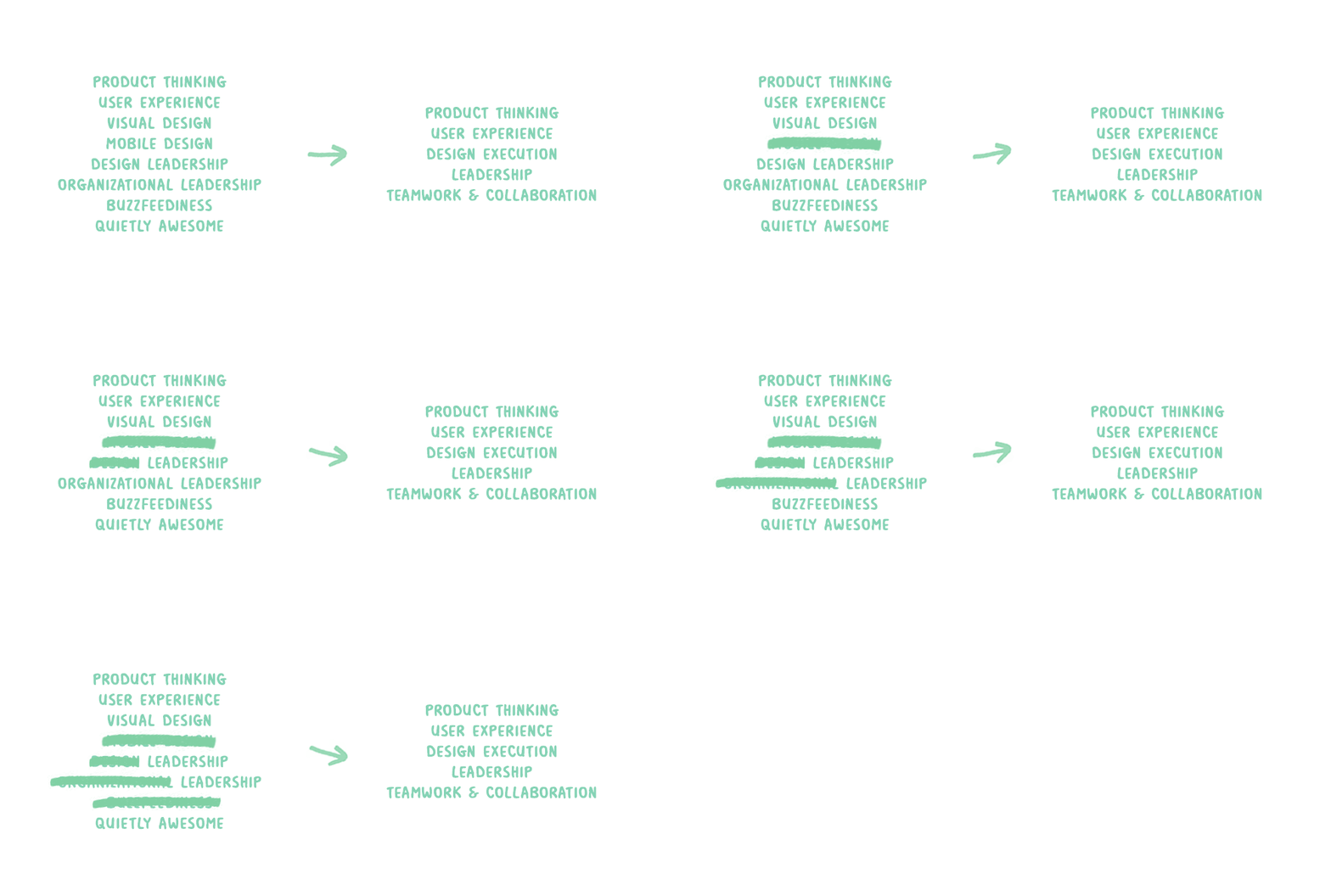
Another goal of mine when redesigning our rubric was to make sure the criteria we used to review candidates also reflected the debrief discussion that happens in person. Looking back at historical data, there were some candidates who scored very well against our old rubric but were still not extended an offer. On the other hand, there were candidates with mixed feedback that did receive one. I realized the discrepancy lay in the level of the role (senior vs mid-level vs entry level), which was not well reflected in the previous evaluation criteria.
In Greenhouse (the recruiting software the entire company uses), the default scorecard template forces interviewees to rate candidates on this perplexing scale of iconography:
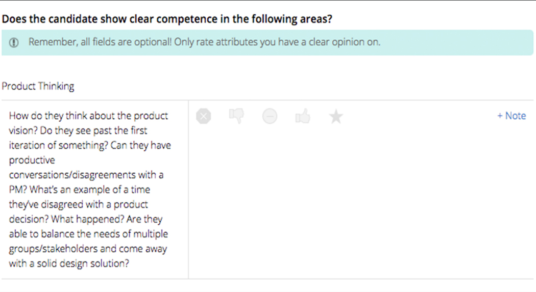
This translates to strong no, no, neutral/not applicable, yes, and strong yes.
I felt strongly that we shouldn’t ever need to select “neutral” or undecided. The argument for it being there is that there are times when an interviewer may not have enough information to form a conclusion. I believe this is symptomatic of how deliberate an interviewer is during their time with a candidate. To address this I always direct people to Hubspot’s excellent write-up about their hiring process, which I think succinctly sums up the goals of an interview:
Decide if the candidate should work at your company.
Make the candidate want to work at your company.
You should try to make every question and statement work to accomplish one of those goals.
“Strong No” also seemed unnecessary for us, because our screening process was designed to identify any “strong no’s” before they even make it on-site. That leaves us with a rather binary “yes/no” scale on the scorecard, but what was happening in our debrief discussions was much more nuanced.
Instead of a confident yes or no, most of our conclusions were conditional. For example, “if s/he came in as a mid-level designer I’d say yes, but if we’re expecting a senior designer, I’d say no.”
As a result, we changed the scale on which candidates are evaluated to reflect our design roles: associate, mid-level, senior and staff. Each level is assigned a value between 1 and 4. If we have a role that we believe requires mid-level experience, a candidate should need to score above an average of 2 to receive an offer. While I think this is a more objective way to evaluate candidates than a binary scale, it also provides room for nuance. If a candidate averaged out at a 1.8 but shows the potential to learn and ramp up quickly, it would still be reasonable to extend them an mid-level offer.
Offers
So let’s say we have a candidate that did well during the in-person interview, and we’d like to extend an offer. Our leveling assessment from the interview also informs where the candidate would fall in our established salary bands, which determines their cash compensation offer.
We do not negotiate compensation offers on the Product Design team, nor do we offer signing bonuses. Instead we give candidates our best offer upfront. This is part of an effort to ensure compensation is consistent across the entire design team, and is fair to folks who aren’t comfortable negotiating. The result is fewer discrepancies between people doing the same work at the same skill level.
Onboarding
Onboarding is the connective tissue between the interview process and the candidate’s experience as a full-time member of the team. We recently laid out a roadmap detailing what a product designer’s first week should look like. From personal experience a few of us on the team noted that when we first started at BuzzFeed, we had a lot of downtime that we weren’t quite sure what to do with. We wanted to alleviate this by giving new designers tasks they could complete at their leisure during their first week, such as simple exercises to introduce them to Solid (our CSS style guide) or the task of writing a BuzzFeed post in order to become familiar with our CMS. We also created an interactive checklist for managers detailing tasks that need to be completed leading up to the new designer’s first day.
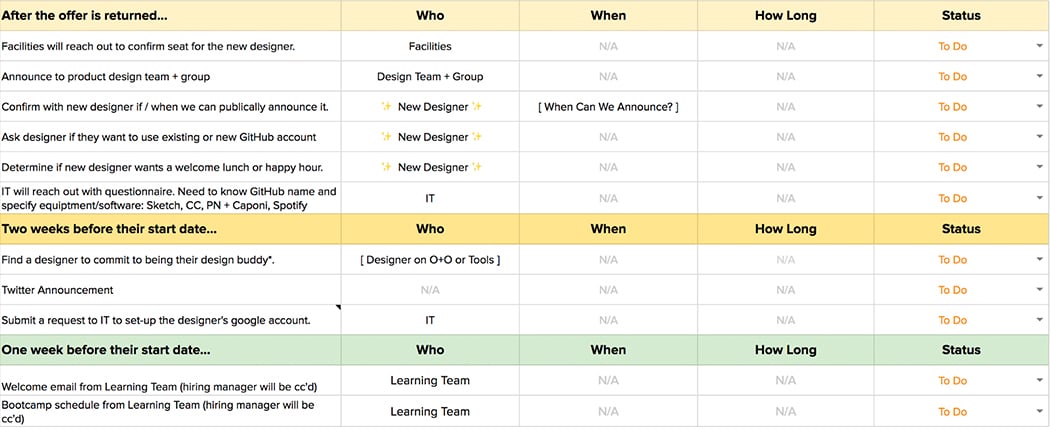
Ah, another spreadsheet to add to my design manager portfolio.
Another important part of the onboarding experience is social opportunities for the new designer to meet the team, particularly team members who weren’t involved in the interview. Aside from welcome events, a small thing we’ve recently started doing is putting together a collaborative Spotify playlist for the new designer to listen to during their first week. Obviously, “Gather the Crowd” is a required opening title to the soundtrack.
We’ve done a lot over the past two years but there are still many opportunities for improvement. Some areas we’re working on next include how to best train and educate our interview panelists. Interviewing well is an exercise in good judgement and decision making?—?and those are skills that extend their value beyond recruiting.
It goes without saying that what works for us may not work for every company. Larger design teams hiring at scale may understandably need to offload more of this process to their recruiting and HR partners. Maybe one day we’ll be in that boat too. But for now, taking responsibility for the end-to -end hiring process has allowed us to quickly grow our team, stay connected to our industry at large, and keep ourselves accountable for our process being 100%. By being so involved in hiring I’ve gotten to meet so many talented designers. Whether or not they end up at BuzzFeed, they’ve helped us shape and improve our process and I hope we’ve been able to make the typically intimidating process of interviewing a rewarding experience for them as well.
The original write-up by the Buzzfeed office can be found here.

