In keeping with Johann Wolfgang von Goethe’s description of architecture as frozen music, this post is quite literally a playlist of the best architectural designs from 2018.
A part of A’ Design Award and Competition‘s winner list, these buildings are awarded for the uniqueness of the project, social impacts, environment friendliness, energy utilization, and other project-specific criteria. Ranging from conceptual designs to residential units, to spas, offices, museums, and retail spaces, the A’ Design Award covers architecture in its entirety, aside from a wide roster of other design categories. Not only does winning an A’ Design Award look great on an architect’s resume, it also brings a lot of repute and focus to the work, uplifting the value of both the designer and the design!
Architecture remains one of the most popular categories at the A’ Design Awards, receiving entries by the thousands each year. Here are a few favorites that captivated our souls this year!
If you’re an architect looking to participate in the A’ Design Awards 2019, click here to register. Hurry! The regular deadline ends on 30th September!
Lè Architecture by Aedas
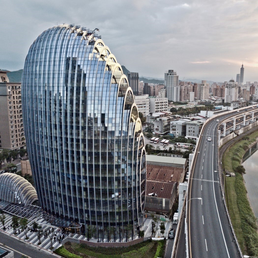
The design for Taipei Lè Architecture draws inspiration from the shape of the river pebbles. The unique source of inspiration translates into a form factor that’s definitely eye-catching and adds an organic, iconic symbol to Taipei’s skyline!
Jewel by Wanda Commercial Planning & Research Ins
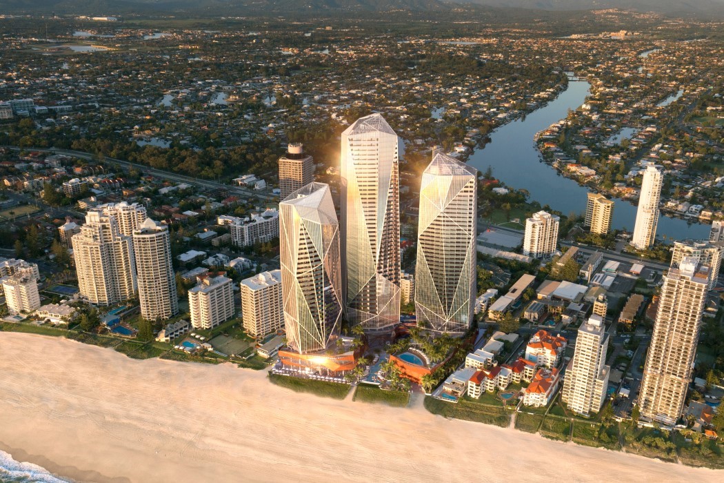
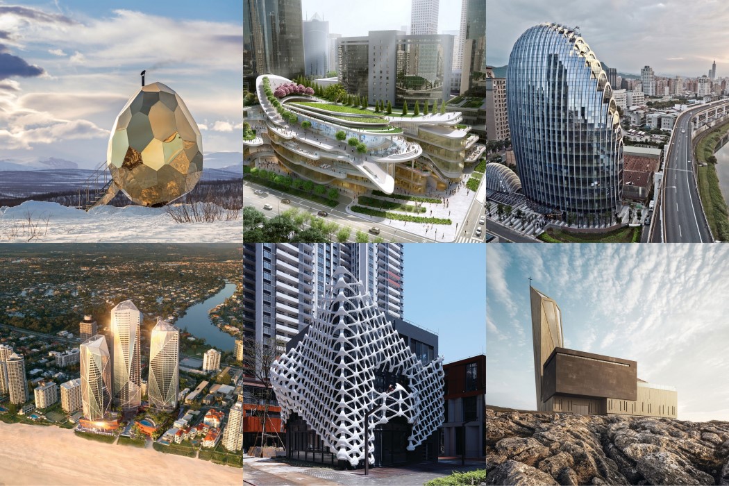
If the Lè Architecture was inspired by the soft forms of pebbles, the Jewel took inspiration from the diametrically opposite crystalline forms. The building employs sophisticated facade technologies to ensure shading from sun and shelter from the wind, delivering a five-star green star building, that is both visually dramatic and sustainable.
China World Trade Center Phase 3C Retail by Andrew Bromberg
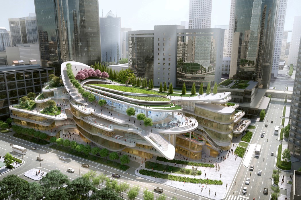
The retail area of the China World Trade Center was made to do two things. Provide a space for retail therapy, and be a place so visually attracting and memorable, you’d be motivated to go there and spend as much time as possible. I guess it checks both boxes!
Symbiotic Towers by Zayad Motlib
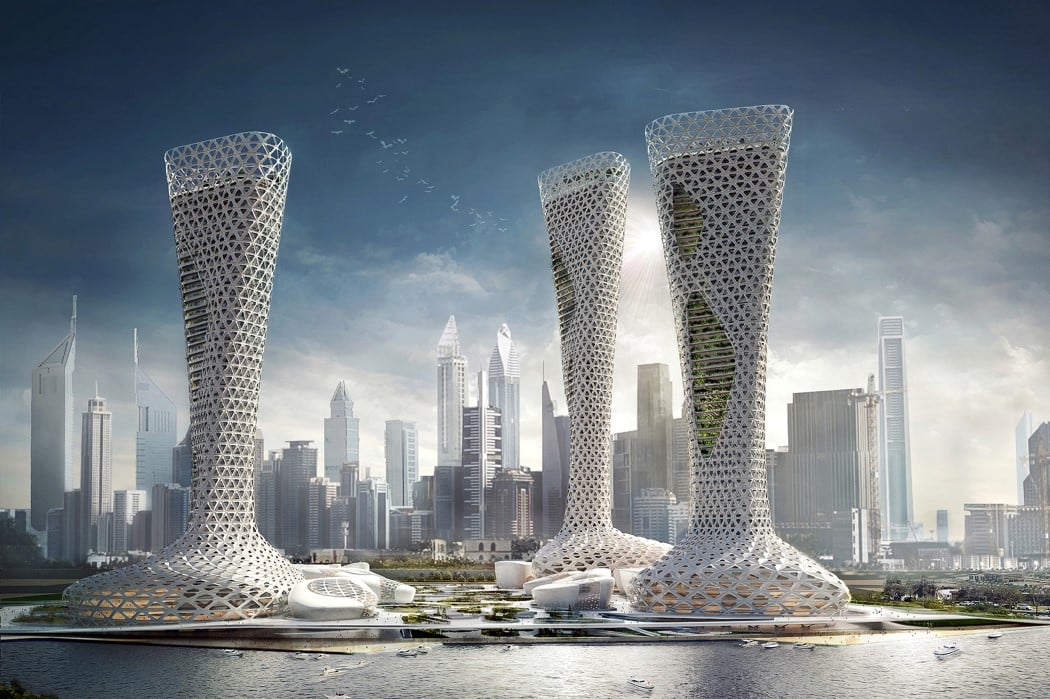
Designed for the arid climate of Dubai, the Symbiotic Towers rely on their unusual shape and the integration of greenery to create an environment that is both shaded from the harsh sun as well as capable of generating natural coolness, therefore relying less on artificial air-conditioning. The three towers host a lush, greenery-filled shopping plaza at the base, with office spaces, residential spaces, and hotels on the top.
Arachne by Lei Yu
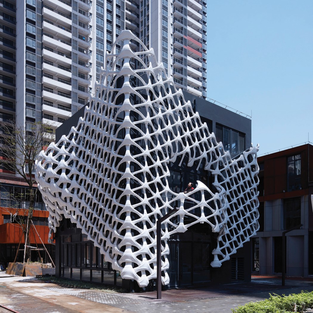
The Arachne isn’t a building as much as it is a facade, and what’s interesting about it is the fact that it’s entirely 3D printed. Created to uplift and redefine an ordinary looking building, the interwoven lattice structure was draped on the building’s front, creating a dynamic facade that’s great to look at and instantly memorable. It looks even better when lit up!
Church in Hardangervidda by Aryan Ron and Arman Ron
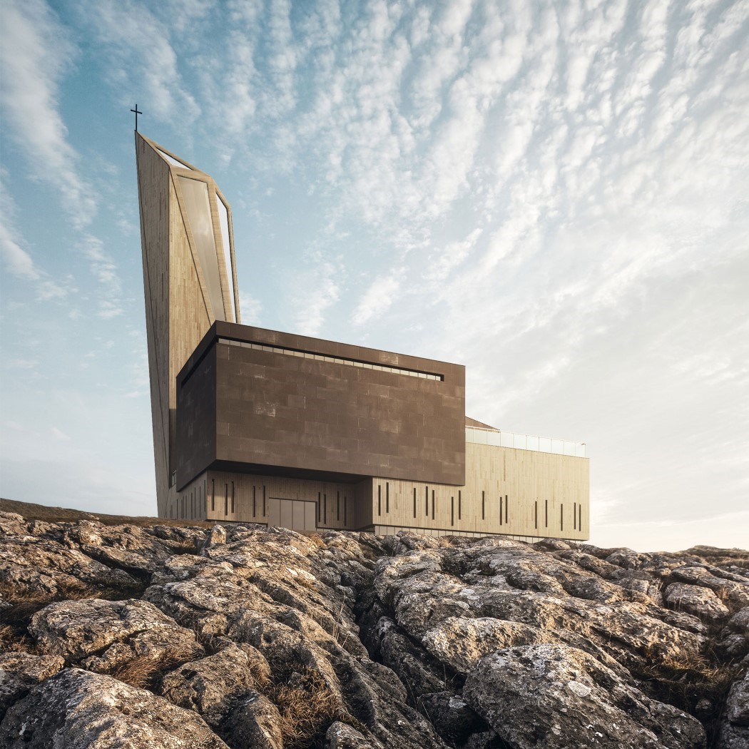
Showing that religion must clearly evolve with time and space, the church in Hardangervidda boasts of an aesthetic that is highly contemporary, rather than the archaic gothic construction we see being used in churches and cathedrals. It still sticks to the tradition of having the steeple and the cross at the top, but does so in a way that’s much more modern, hoping to be more relevant to the younger generations.
Zeytinburnu Sales Office by Arkiteam Architecture Company

Located on the coast, and inspired by waves, the Zeytinburnu Sales Office comes with a design that looks like a wave caving in on itself. Looking quite like Hadid’s Heydar Aliyev Center, the Zeytinburnu building boasts of a similar, curved style that’s oh-so-memorable, and creates a building that looks different from every angle!
Winspear Concert Hall by Andrew Bromberg
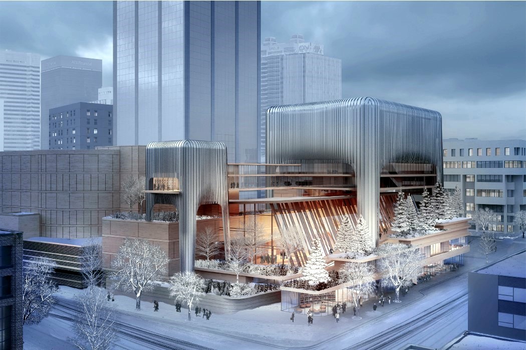
Built as an extension to the existing Francis Winspear Centre for Music, the extension houses a concert hall, an additional studio and several educational spaces that are intended for a variety of user groups to provide appropriately sized and acoustically treated venues for community engagement and educational activities. The way the extension is designed goes particularly well with the rest of the hall, adding an ornamental element to it that especially comes alive in the winter as it looks like the building is covered in sleet and snow!
Solar Egg Public Sauna by Futurniture and Bigert & Bergström
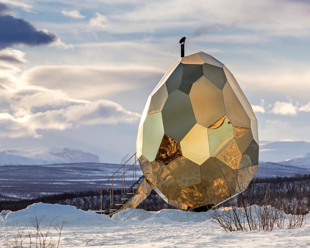
A symbol of youth, nourishment, and vitalization, the egg was perhaps the most perfect form for the Solar Egg Public Sauna. With stainless golden mirror sheeting on the outside, and a faceted form, the sauna mirrors the serene landscape around it, but looks as golden as the sun does (a fitting metaphor, because it’s so hot on the inside). The inside has a wooden construction with a heart-shaped sauna stove at the center, radiating heat, and making for a fitting design detail for something that looks like an egg on the outside!
Impressed? Inspired? Go ahead and grab a spot for your own designs at the A’ Design Award and Competition! Click here to Register Now! Hurry! The regular deadline ends on 30th September!

