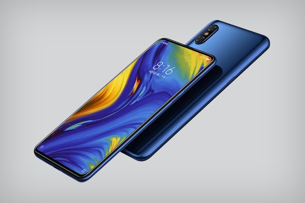
The third phone to do away with the notch (coincidentally also the third Chinese brand to follow this trend), Xiaomi’s Mi Mix 3 was designed to push boundaries… or rather push bezels. With the first two phones designed by Philippe Starck showing the world how much we could extend our screens, the Mi Mix 3 now finally does away with the notch, the chin, and the bezel in entirety.
The Mi Mix 3 comes with absolutely no sign of a notch, as the camera gets mounted on a sliding component at the back (much like Oppo’s Find X). The camera module, however, isn’t motorized like the Find X. It slides when you apply pressure, much like phones from over a decade ago, and Xiaomi hopes that this sliding action becomes a sort of fidget-feature that keeps you playing with the phone. Whether the sliding mechanism can take such wear and tear is still something worth testing. It also means that a #bendgate would essentially cripple the sliding mechanism.
However, I’m sure Xiaomi’s done their homework because the Mi Mix 3 is, and I scarcely use this phrase, hella desirable. With a glorious 6.4 OLED on the front, dual cameras in both rear and front-facing areas, and a whopping 10GB of RAM, the Mi Mix 3 knows exactly what kind of phone it wants to be, and has all the big flagships in its crosshairs… especially with its price range of $430 to $750.
Hey competition. Why don’t you ‘slide’ over?
Designer: Xiaomi
