The Nest has, for long, been the thermostat to beat all thermostats. Its simple, no-nonsense, tactile design courtesy Tony Fadell and team was honestly an eye-opener. A massive outer-rim dial that turned, a circular screen which displayed exactly the information you needed and nothing more, and a backside that did a revolutionary job of organizing wires in a way that no one ever did before, the Nest thermostat has been, for a better part of the last decade, the best thermostat on the market. It’s time, however, for the Nest to move over.
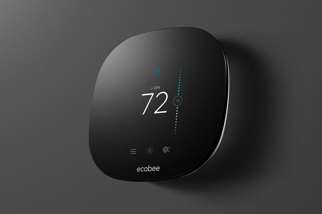
Ecobee’s thermostat is a simple, black slab of glass that sits on the wall, begging for less attention than the Nest. When the display behind the black slab comes to life, you’ve got a touchscreen panel that you can work to adjust the temperature and humidity in your room. a slider allows you to calibrate the temperature to perfection, while the temperature itself is displayed to the left of the slider in a large font that’s light yet easy to read. You’ve even got the humidity value written in subtext above the temperature, and touchscreen buttons at the bottom to toggle other functions. The Ecobee reinvents the thermostat for the touchscreen-loving generation. Even though tactile dials a-la-Nest will always be a personal favorite, it makes sense to shift to touchscreens, only because they’re so widely accepted today.
Designer: Ecobee