It is said that first impressions matter. We spend hours going over every facet of our product design, trying to achieve the perfect version of it. And in all our efforts, we often skip out on one aspect – the packaging! The way we first see or greet a product is the moment we form our initial perception of it. This first moment is like a first date, you either hit it or miss it! But unless you do hit it, you may not get this chance again. To help you define the packaging better, the write-up below by Tabatha Johnson walks you through 12 tips that will help you craft the perfect packaging for your amazing product.
Looking to hire a talented designer? Post a job with us to source the best talent for your requirement.
Want an amazing internship or job opportunity? Check out YD Job Board to work at some of the best design companies in the world.
Designing a product is only the first step. No matter how great your shampoo smells, people won’t pop the lid and give it a whiff if the bottle doesn’t make them want to pick it up first. One of the easiest ways to get your product to sell itself is through attractive product packaging design.
But what makes great product packaging? Read on to find out twelve of the top tips for designing creative product packaging that does the job right.
1. Clarity
Consumers are bombarded by products whenever they enter a store. When someone picks up your product, they want to find out two things: what it does and who makes it. If they can’t answer both in four seconds or less, which is usually the maximum time anyone will spend looking at a product, they move on to the next item on the shelf.
Part of making sure a customer understands what your product does is choosing a font they can actually read. Using all capital letters makes it harder for our brains to compute the information we are seeing. If your font is too swirly or fancy, customers may misread your label, which can be a career-ending mistake.
You also need to keep the font size in mind. If the text is too small, your customers might miss crucial information about your product. If the text is too big, the packaging can become loud and crowded.
2. Simplicity
Keep it simple. Trying to cram too much information onto your product’s packaging will remind customers of how they felt when they had to read chapters out of their biology textbook: bored and confused.
This also goes back to clarity. If all your customer can see on your product packaging is the listed benefits, but not your company name or the name of the product, you’ll be missing out on the possibility of future sales.
3. Honesty
Your product packaging should represent what your product is and does. People can smell a salesman from a mile away and they can tell when packaging is overselling the product it contains. If your packaging shows something completely different than what is found inside, your customers won’t be happy.
A creative workaround for this problem is making part of your packaging transparent.
4. Authenticity
This tip may sound the same as honesty, but it’s different. In this case, the focus is on what your brand represents. This should come through when you sit down to design your product’s packaging.
Your brand is different from every other brand trying to sell the same thing, so let that show in the design of your product’s packaging. If your brand’s mission statement is about connectedness, you could incorporate a tear-away postcard into the packaging, so your customers can stay connected with their friends in a unique way.
5. Shelf Impact
This tip generally applies only if your product is available in a physical store, but it could still have an impact in an online shopping scenario too. The way products are presented and organized in stores means that your product will likely end up in a sea of others that also claim to do the same thing.
Your product needs to stand out from the others on the shelf. But how do you make it do that? The first rule is to know your competition.
If the other top-selling brand of raisins only uses red packaging, maybe you make yours in green instead. Another strategy that can work is to mimic your competition so closely that consumers will not notice when they pick up your product instead of theirs. This can backfire, though, so think it all the way through first.
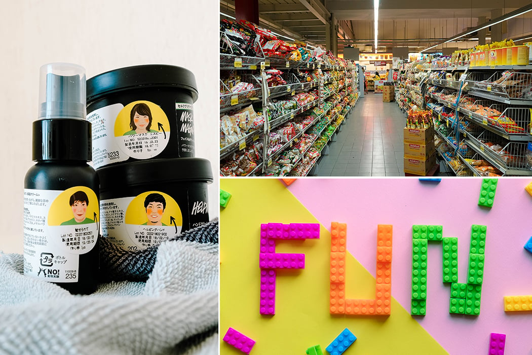
6. Make it Fun
Including creative, fun ideas and even some humor into your product packaging design will not go unnoticed or unappreciated. This invites consumers into the product and gives them a feeling of familiarity.
One company designed tea bags that look like t-shirts that also included a hanger design, so the teabags could easily hang on the edge of a mug. This design makes the product easier to use and is also sure to give customers a chuckle and keep them coming back.
7. Special Editions
Creating special limited editions of your packaging for a certain event or theme is one way to boost short-term sales very quickly. This tactic relies on consumers’ likelihood for impulse buying. This works around the holidays and it can be co-opted for big sporting events like the Olympics too.
8. Trends
In every industry, trends are what keep innovation alive and are necessary for the longevity of the market. While it’s true that trends fade with the times, they’re also circular and tend to come back around time and again.
While being able to predict the upcoming trends is a skill, everyone is able to keep up with trends as they appear if they’re paying attention.
9. Think about the Customer
In the many rules of product packaging design, the focus is often on how to grab the customer’s attention, but now we’re challenging you to think about the customer in a different way. Think about the way the customer is going to use your product. Is your custom product packaging design intuitive with how the product works?
Is your product good for only a one-time use, or is it something to be used over and over? If it’s only meant to be used once, make sure the packaging is easy to get into and dispose of. for disposable items is also worth bonus points for the eco-conscious consumer.
If your product is something that’s used over a long period of time, make sure the packaging is durable and will maintain the quality of the product inside. Even if they love the product, if your lip balm dries up after four uses, customers won’t repurchase it.
Something consumers have questioned for years is why cereal boxes are not resealable. This trend has yet to take off in the breakfast market, but when it does, consumers will know that the change was made with them in mind. There’s nothing a customer appreciates more than packaging that is both aesthetically pleasing and functional.
10. Easy to Carry
If your packaging is overly bulky, include handles or grooves to help with ease in carrying it. If your product is fairly small, make sure your packaging isn’t too slippery, so users aren’t dropping it. Unless your brand has a monopoly on the market, customers won’t stick around if they have too difficult a time handling the product.
11. Rule Breaking
This tip may feel like a copout, but trust me, it isn’t. When you’ve mastered the art of design for product packaging, you’ll begin to see that not all of the rules apply all the time. While these are all things to keep in mind, breaking the rules can be a good thing. In fact, breaking the rules is what will turn your brand into a trendsetter instead of a trend follower.
Following trends is a good place to start and break your way into the market, but once you’re an established presence, finding ways to break the rules of conventional product packaging design is what will set your product apart.
Whoever thought about flipping the ketchup bottle upside down was a genius and changed the rules of food product packaging for the rest of time. They still worked within the conventions of the product market, though. You can be sure that no one is designing square condiment bottles any time soon.
12. Look to the Future
The best brands keep their eyes on the prize: expansion. Leaving room for your brand and product range to expand and grow is key for your business’s long-term success. So, remember this when you’re designing your product’s packaging.
That is not to say that you can’t be extremely specific when you’re designing the product packaging for a certain product. It just means that you need to be able to make variations to the design when your brand inevitably creates new products in the same line.
We may never know exactly what it is that makes customers pick one brand of something over another, but following these rules when you’re thinking of custom product packaging design can give you a head start over the competition.
The original write up by Tabatha Johnson here.
Our endeavor is to increase efficiency and speed by connecting you to your ideal candidates. Yanko Design has curated Industrial Design followers for the past 15+ years, and we know these are the best match for your company. To recruit now, Post a Job with us!

