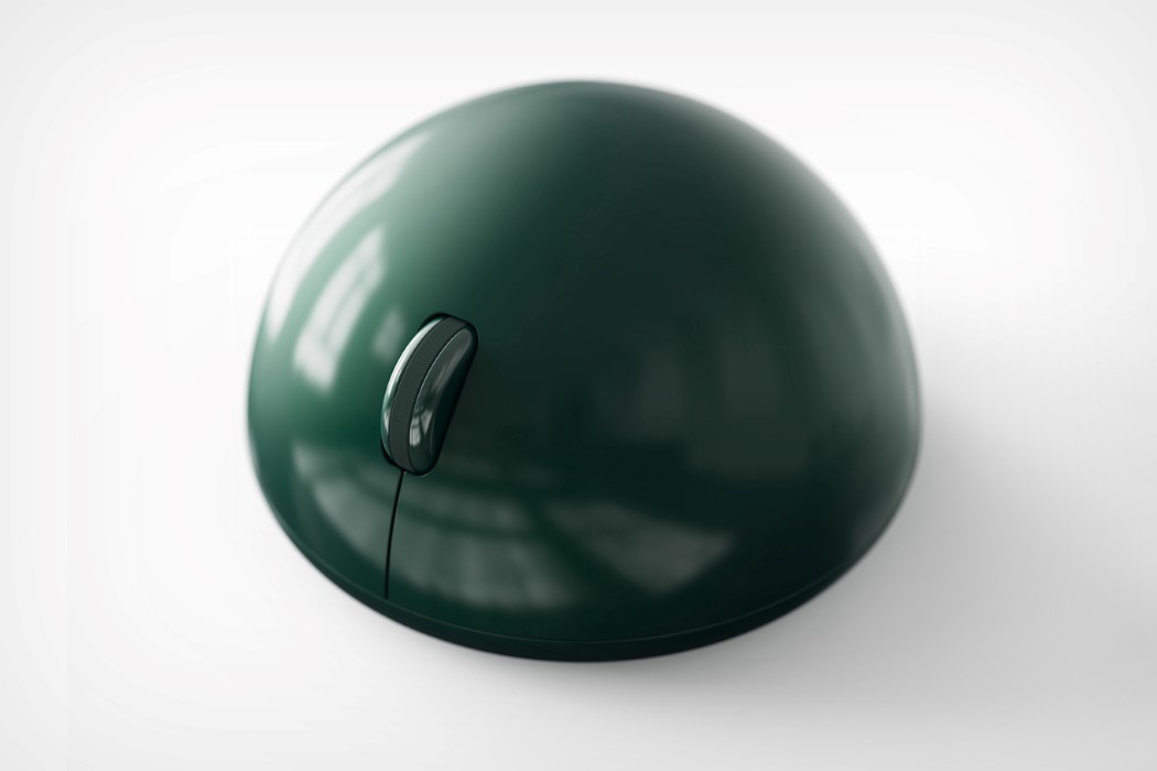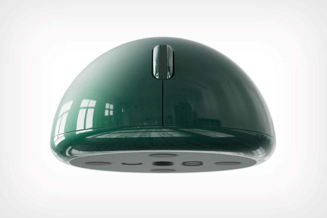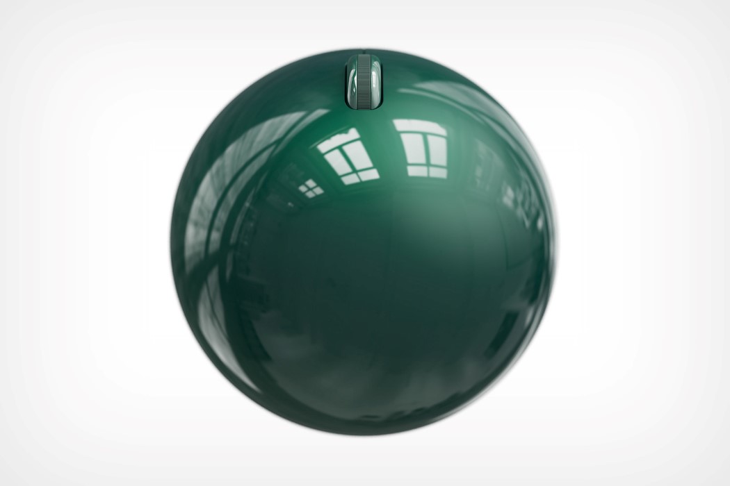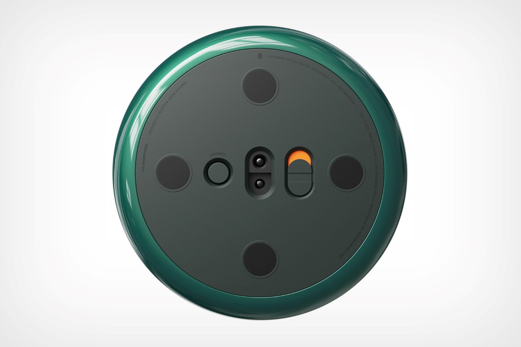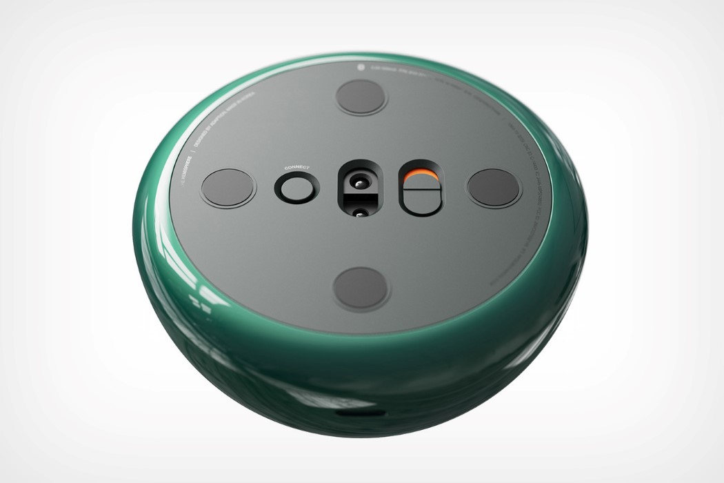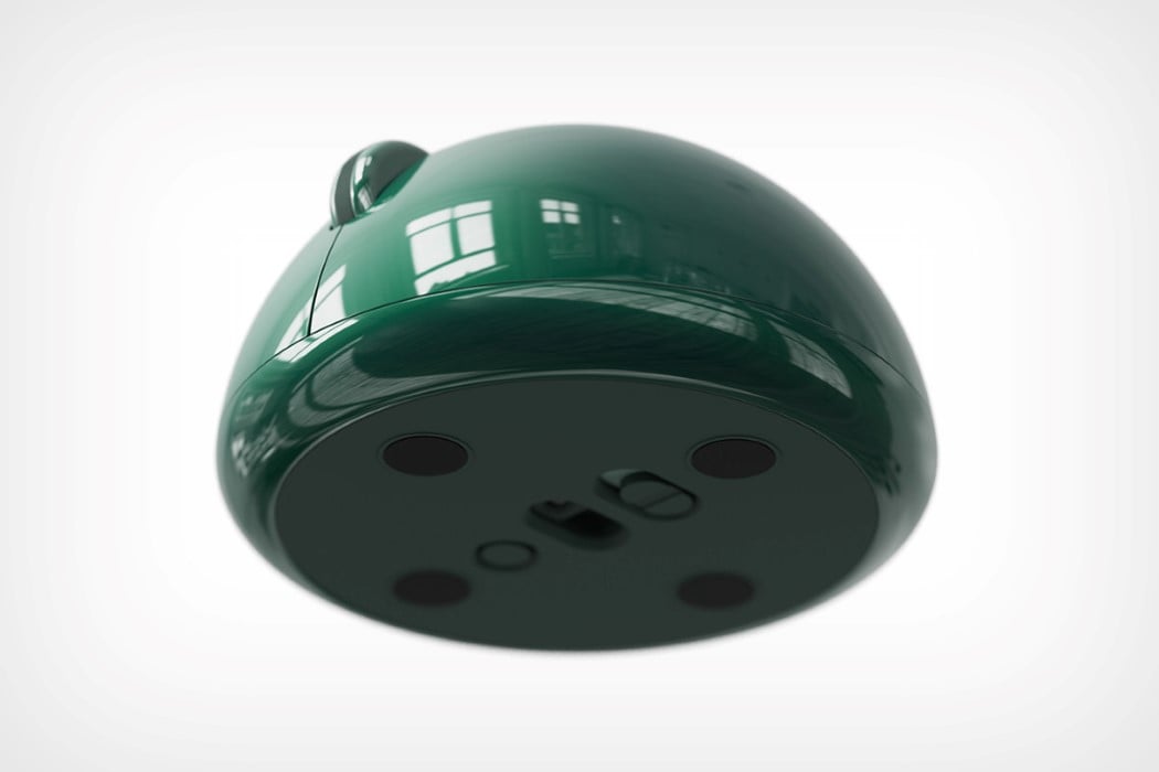
Look at the Hemisphere and tell me it isn’t adorably eye-catching. The mouse’s name pretty much tells you all you need to know. Its design is a perfect hemisphere, unlike most organically-designed computer mice, and features the standard two click buttons and a scroller, but laid out in the mouse’s half-sphere design.
The mouse has, for too long, been bound to ergonomics-influenced design. I am, by no means, bashing ergonomics, but different mice appeal to different people. There’s no one-glove-fits-all design for computer mice. The Hemisphere takes advantage of that. Much like holding a cricket or tennis ball, the Hemisphere’s half-spherical construction feels comfortable yet sort of radical too. Plus, I can’t get enough of that glossy green finish!
Designer: Deokhee Jeong for Render Weekly
