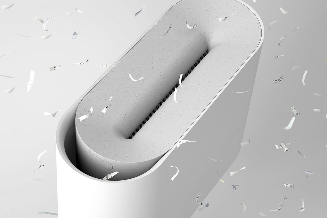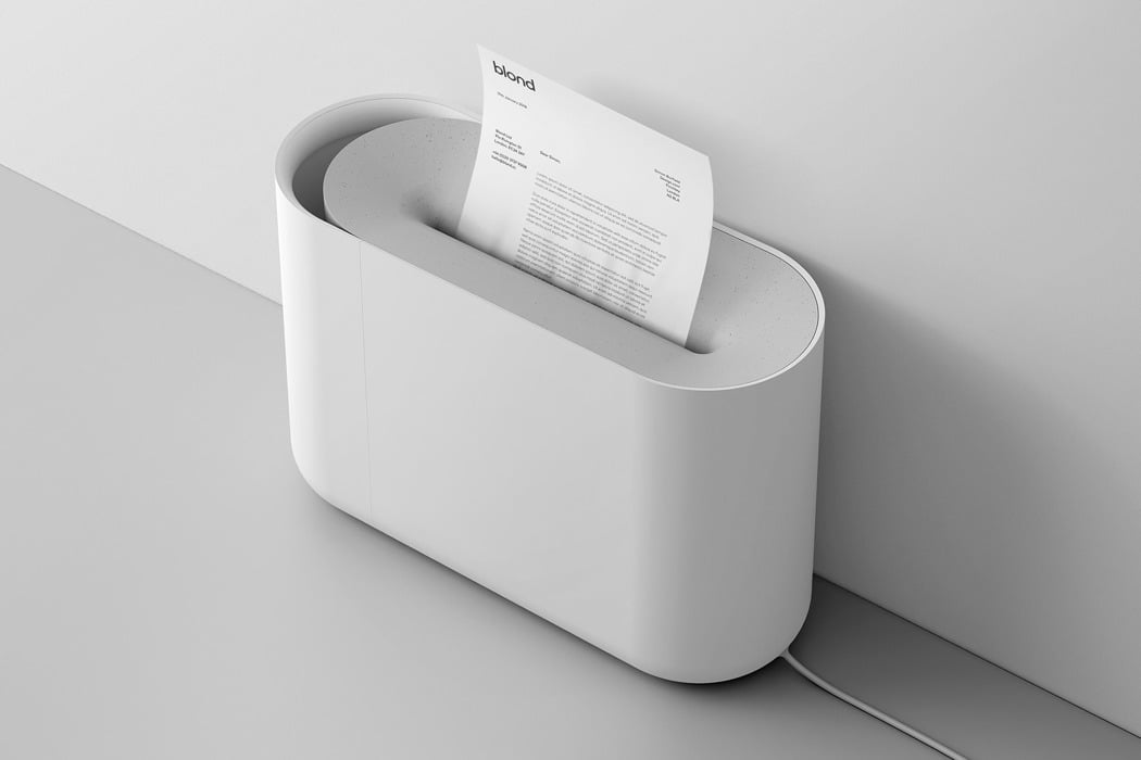
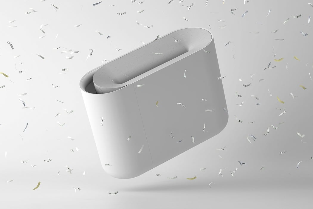
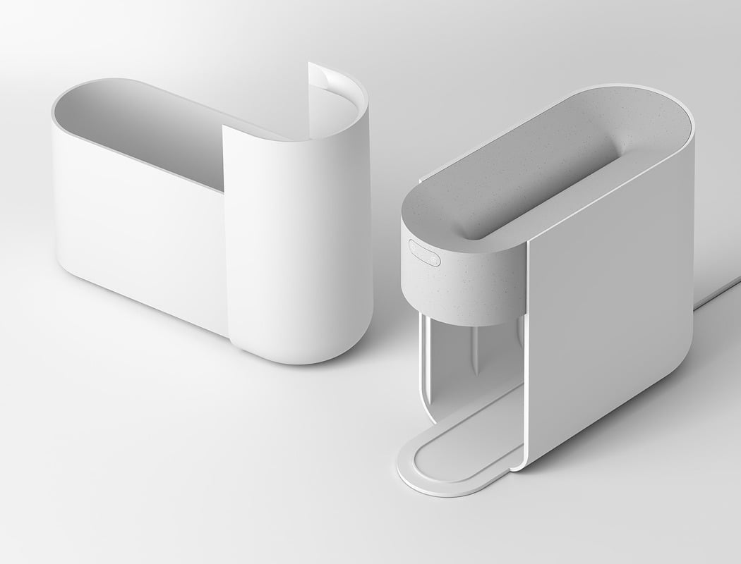
Paper shredders have unfortunately found themselves falling into the category of ‘over-designed’ and ‘unnecessarily complicated’ products, with their often visually-complicated aesthetics jarring with their surroundings and their functionality getting lost beneath the unwanted functions. This is the exact issue that the team at Blond Design Studio identified, and their answer to the problem is Aperture.
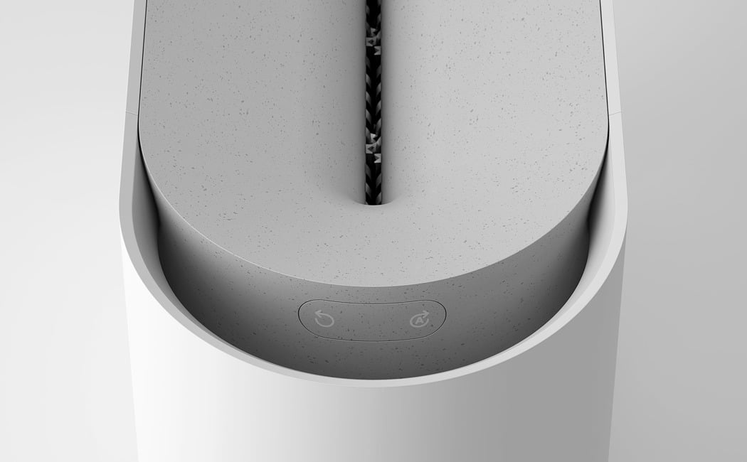
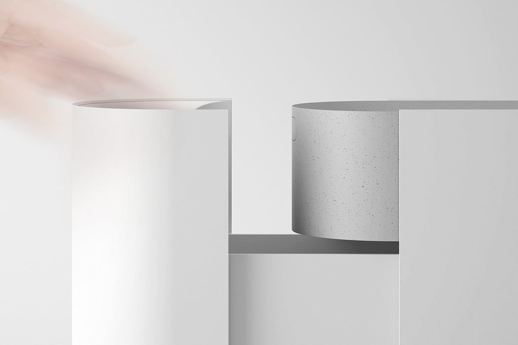
Aperture is an intriguing product, where functionality and simplicity have been at the forefront of the design. Just two buttons are present on the device, these being auto and reverse, making operation straightforward and hassle-free. A viewing window is absent from the clean, uninterrupted form, as this has instead been replaced with a viewing hole on the top of the device, meaning that the user does not have to awkwardly bend down to check the paper contents.
The primary drive behind the fuss-free aesthetic was to create a product which can be integrated into a range of interior styles and sceneries… without standing out like a sore thumb!
Designer: Blond Design Studio
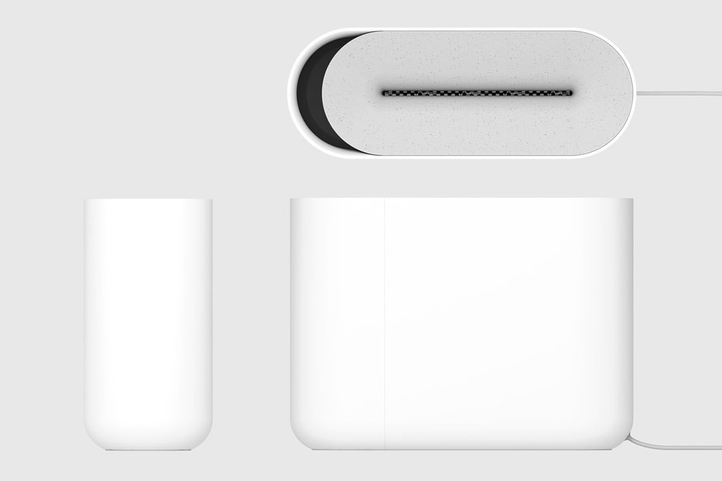
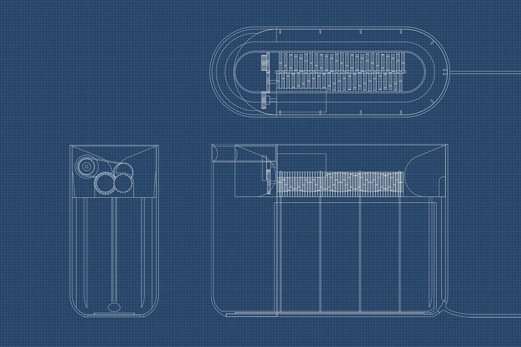
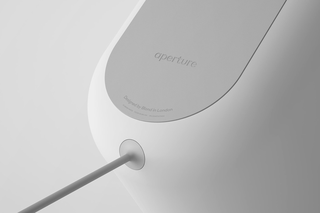
During their research they noticed that most paper shredders had a power cable which exits from the top of the product, as this is where the components are located. However, this cable position causes complications in terms of positioning, not to mention; it is aesthetically unpleasant. Due to this, they created a cable channel on the inside of the casing and relocated the power cable to the bottom of the product.
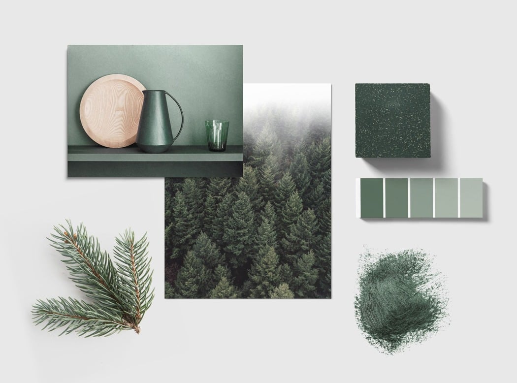
In additional to the white CMF direction, supplementary colour pallets have been inspired by the woods used to make paper.
