With Sir Jonathan Ive’s exit from Apple just days ago, it’s finally the end of an era that Steve Jobs envisioned back in the 90s. Ive left his design agency Tangerine to formally join Apple in 1992, recruited by Jon Rubinstein at the time. It wasn’t until 1996, when Steve Jobs made a return to Apple (an almost-bankrupt company at the time), when Jonathan Ive’s career really took off. Along with Ive’s eye for design, and Jobs’ attention to need, detail, and usability, the two formed one of the most successful creative alliances in recent history, taking the company to a valuation of $665 billion in 2011, around the time of Jobs’ demise, and finally to the trillion dollar mark in 2018.
Ive’s journey at Apple can be distinctly broken down into these phases, that roughly fall into the decades too. We’re here to look at the work of Ive through the lens of time, as he went from product to product and strength to strength with each passing decade. The video above provides a very rare look into Ive’s and Apple’s elusive design process, while the products below aim to codify and categorize Ive’s 27-year-long design journey with one of the most innovative companies on earth. Here’s a look at Jonathan Ive’s 27 years at Apple, in products.
1992-96 Jonathan Ive leaves Tangerine for Apple. Steve Jobs hasn’t made his comeback yet.
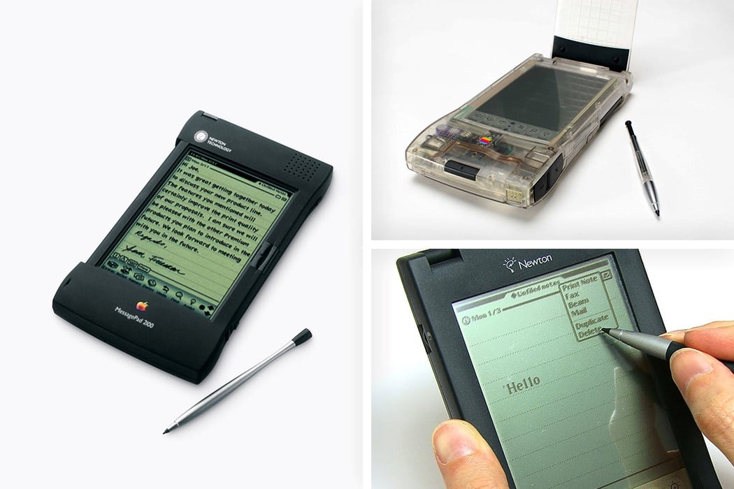
There honestly isn’t much to look at here. This was pre-Jobs comeback, when Apple was facing financial difficulties. Ive made his way from Tangerine to Apple, only to realize that most of the design team was being let go of. Rumor has it, he almost tried to quit around the same time, but was pep-talked into staying by Jon Rubinstein. Ive, under Apple, designed a few not-so-successful products at the time… like the Newton MessagePad, shown above. However, his experimentation with transparency (top right) led to a few breakthroughs later when Steve made a comeback.
1997-2011 Apple’s renaissance period under Jobs and Ive. Apple Design follows Dieter Rams.
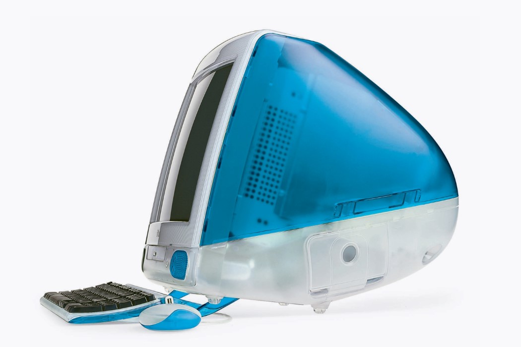

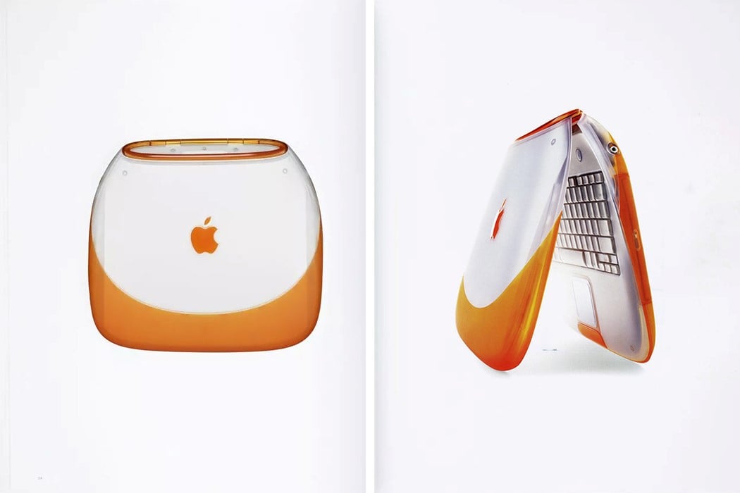
Design flourished when Steve Jobs made a comeback in 1996. The iMac G3 and the iBook explored curves, and the use of transparency and translucency. Jobs was adamant that the insides of the computers be beautiful enough to showcase to the world, rather than make more white boxes. Ive’s design efforts went into making ‘computers sexy again’.
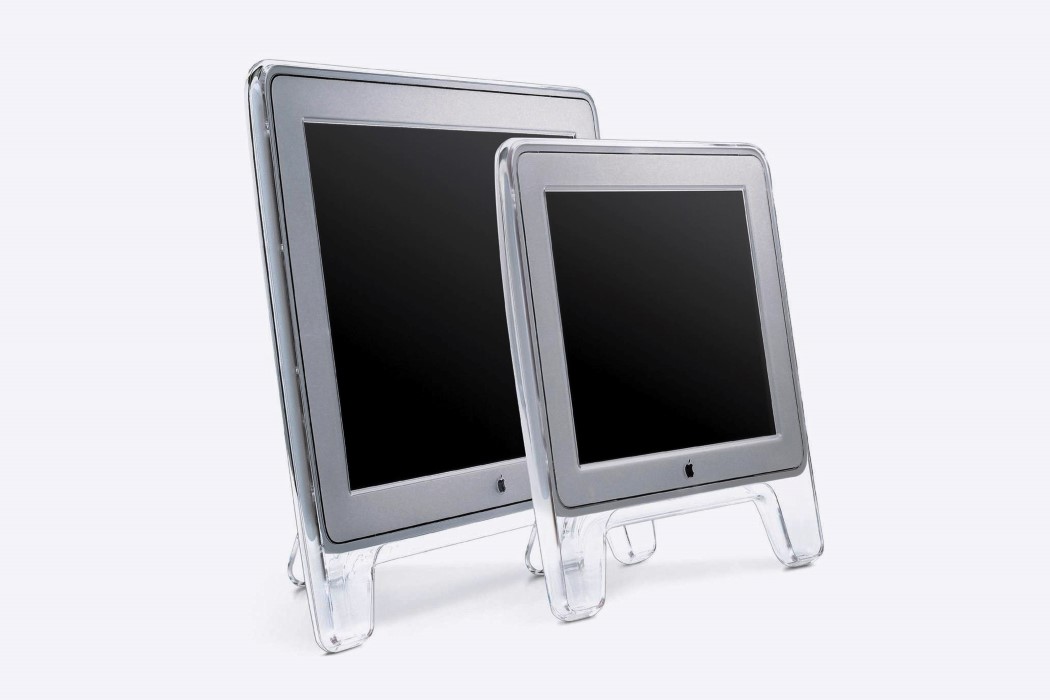
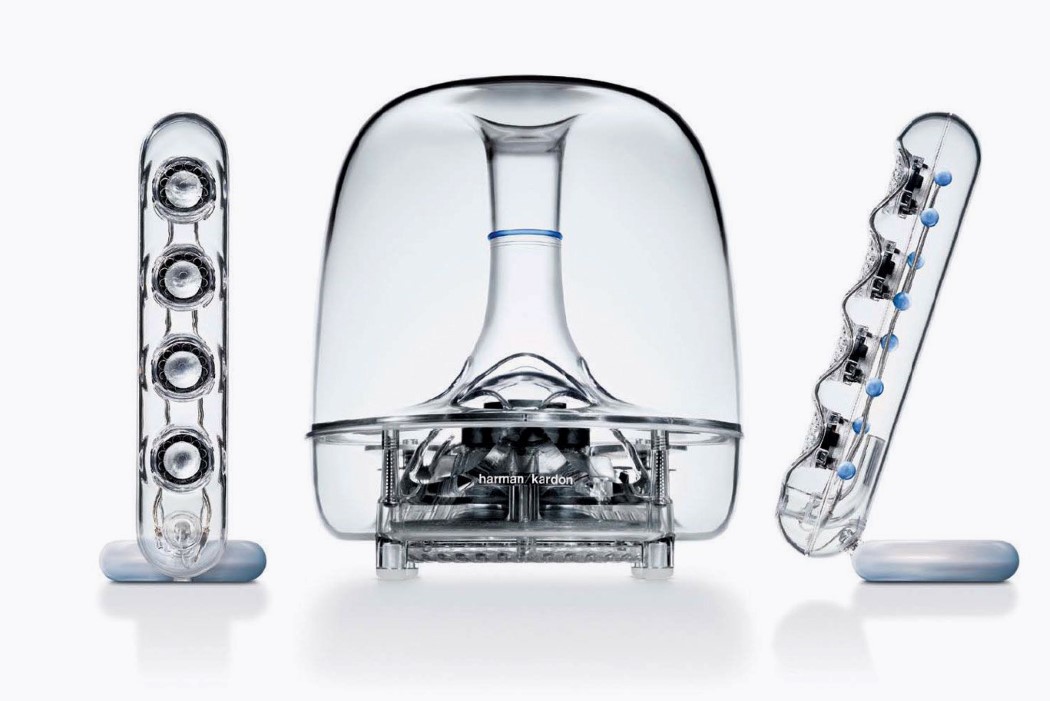
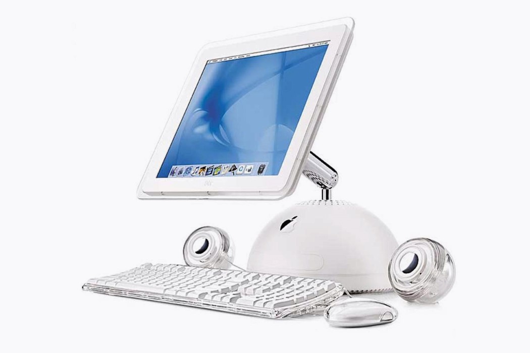
Ive’s obsession with transparency evolved further, while products that were previously curved, started taking on a more slick appearance. Shown above are the Apple Cinema Display, the iMac G4, and a rare non-Apple product, Harman Kardon’s Soundsticks that were designed by Ive!
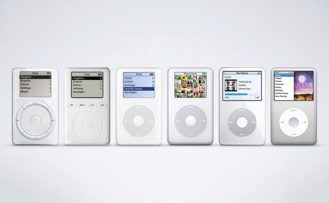
Nothing put Apple more on the map than the iPod. It revolutionized everything, and truly made Jobs stand out as a visionary, and cemented Ive’s role in the company. The iPod also owed a big debt of gratitude to Dieter Rams, who’s design language at Braun truly began influencing Ive’s work. The circular jogdial, the no-nonsense design, the philosophy of “Form Following Function”, and the liberal use of white, all were owed to Dieter Rams. While naysayers saw this as Apple ‘not being original enough’, iPods flew off the shelves, and Apple finally became a household name.
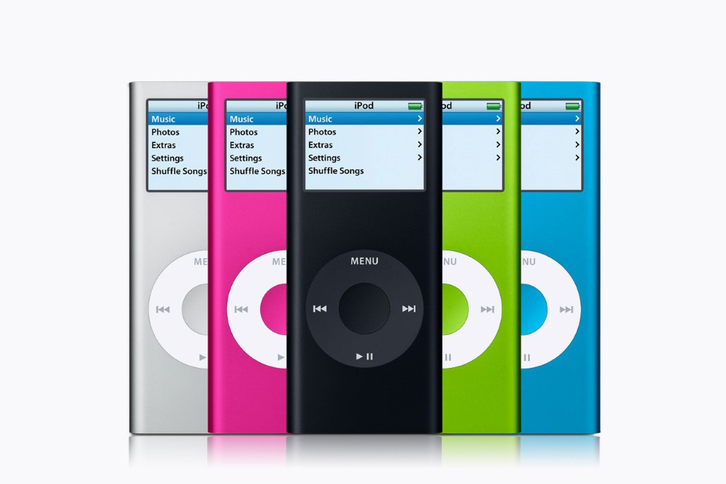
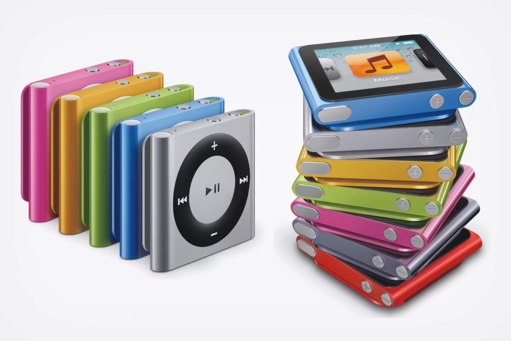
As iPods grew popular, Ive strived hard to make them sleeker too. As a result, the Nano and the Shuffle were born. With an iPod for everyone, these came in a variety of formats, stored as many as 2000 songs, and now came in color! Another subtle innovation was that Ive discovered the material that would change the consumer tech industry forever… aluminium.
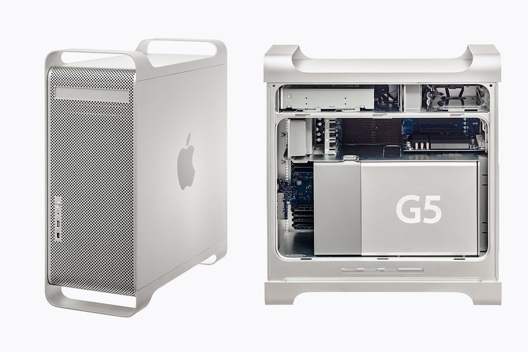
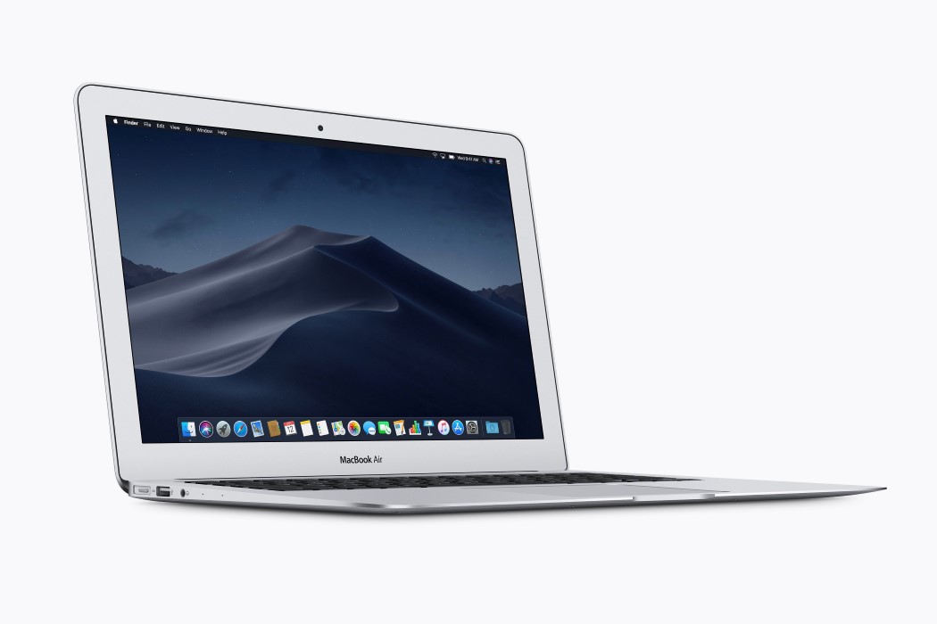
Aluminum allowed Ive to truly explore Apple’s new aesthetic of beautiful, premium, and sleek products. Aluminum was abundant, could be machined to precision, and Ive even devised a way of utilizing spare aluminum parts from the Mac Pro to make the MacBook bodies (discussed in Gary Hustwit’s Objectified). Ive pushed the limits to how beautifully sleek products could be made, and in 2008, Steve Jobs walked out on stage with a Manila envelope, carrying the world’s thinnest laptop within it… the iconic 19.4mm MacBook Air!
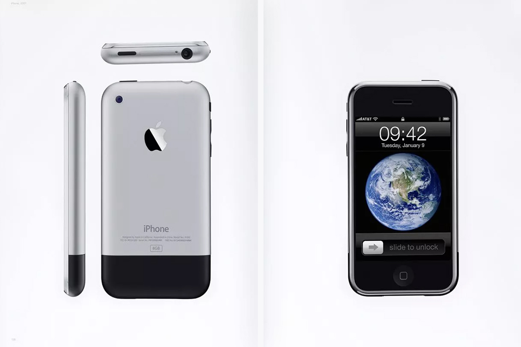
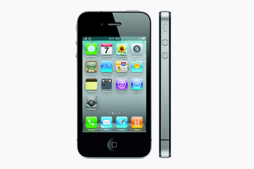
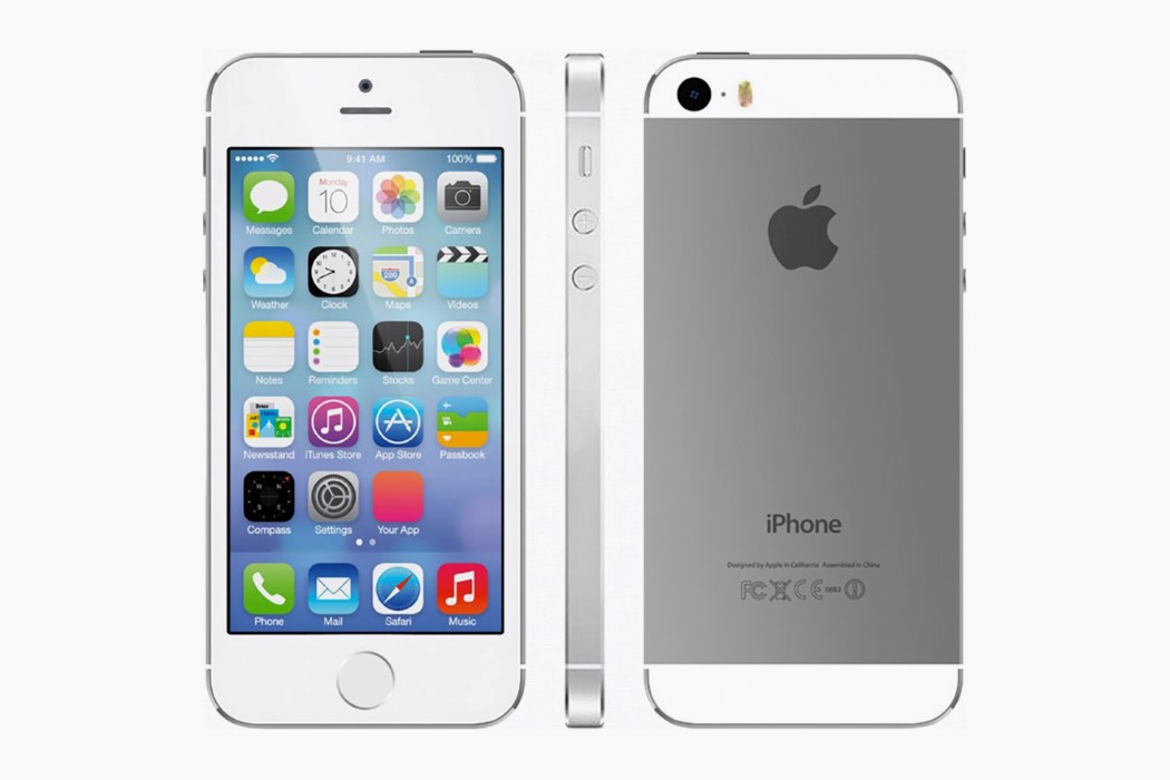
One more thing… arguably the three most important words in Apple’s history. The iPhone is considered to be Jobs and Ive’s magnum opus. So much is owed to the birth of the iPhone. Industries, companies, technologies, materials, the iPhone created them all. The first iPhone, introduced in 2007 was the first true smartphone. It came with a touchscreen you could use with your fingers, and boasted of Apple’s iOS and the birth of the app marketplace. Further iterations only grew better. The iPhone 4 came with a glass front and back, but a slick aluminum frame that made it one of the thinnest phones of its time. It was the perfect size (some still believe so even today) and had Siri, Apple’s voice AI. In 2012 came the iPhone 5, a reiteration of its successful predecessor, with a standard-setting aluminum unibody, a revolutionary 16:9 display, and the world’s first fingerprint sensor on a phone. The iPhone 5 was considered to be the last iPhone co-created by Jobs and Ive.
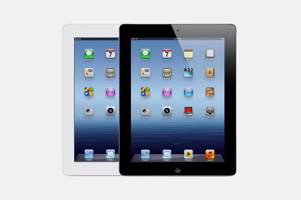
The iPad debuted in 2010, just a year before Jobs’ demise. Ive designed it to be the sleekest tablet on the market, following the footsteps of the iPhone and the MacBook Air, although the idea for the iPad came to Jobs much before the iPhone. Jony developed a device so iconic that it remained the only strong contender in the tablet market with practically no competition for roughly seven years.
2012-19 Apple finding its post-Jobs identity, & becoming a trillion dollar company.
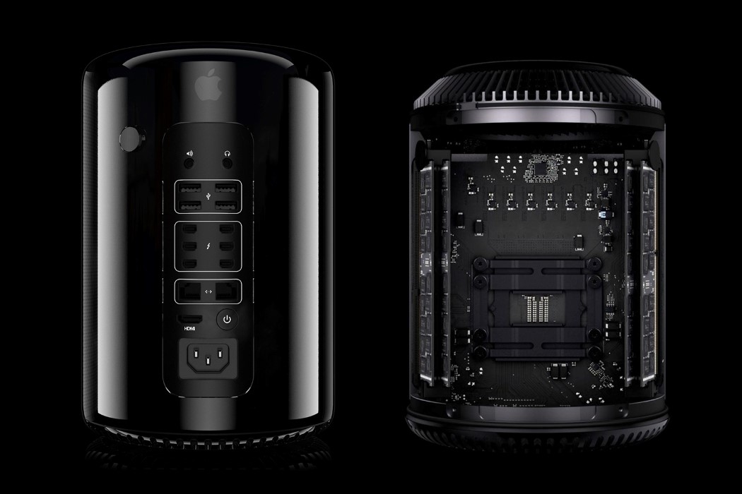
The 2013 Mac Pro came at a time of uncertainty. Two years since the death of Jobs, Apple was looking for its next great product. The iPhone and the iPad proved to show how great Jobs was at envisioning new products. Apple hoped a redesigned Mac Pro would show people that Apple was still capable of innovation. Jonathan Ive’s redesign didn’t receive much praise, and was often referred to as the trashcan Mac, for its dustbin-shaped appearance. For the people that bought it too, the Mac Pro had quite a few problems, ranging from its heat issues, to the fact that it wasn’t easy to upgrade… a pretty necessary feature considering how much the 2013 Mac Pro cost.

The following year was one of redemption. Apple’s recent recruitments to the design team included designer Mark Newson and CEO of Yves Saunt Laurent, Paul Deneve. These two stalwarts aided Ive in building consumer electronics that were comparable to fashion items, with their sheer sense of style (and even a price tag to match). The Apple Watch was born, kicking off a wearables market. It featured a small screen, a touch-sensitive UI and a rotating crown, all encased in a remarkable aluminum body. The watch came with wireless charging, and featured a built-in heart-rate sensor… a feature that would soon define the Watch’s use-case. As a consumer-friendly medical wearable.
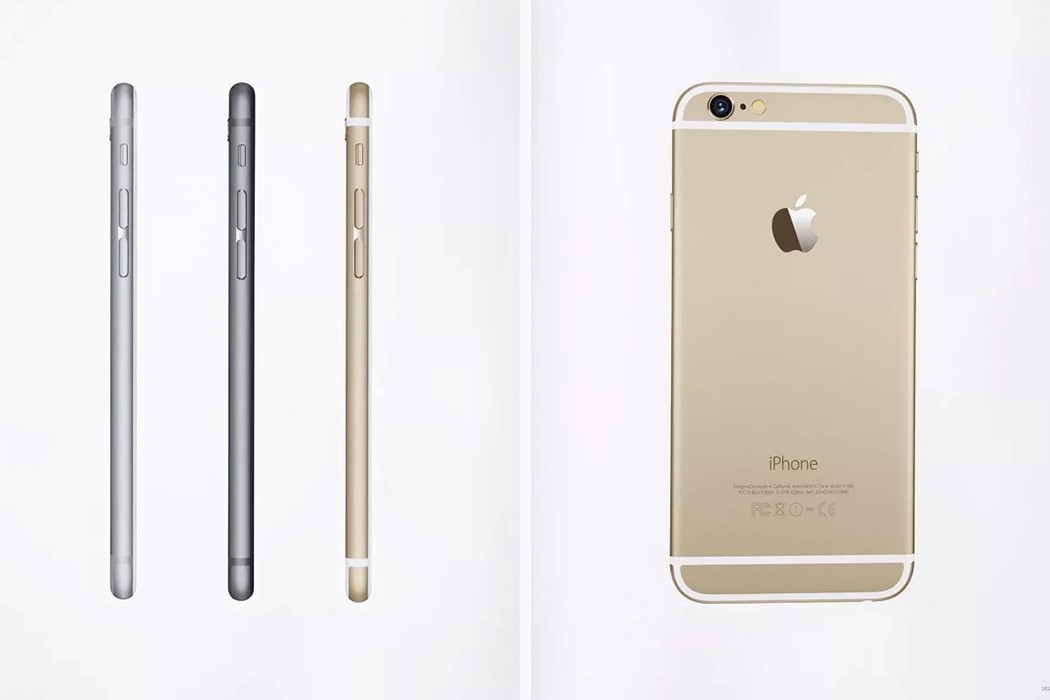
Among other noteworthy design achievements, Apple acquired Beats by Dre., a company that considered Robert Brunner’s Ammunition as their design partners (Brunner was an ex-Apple design lead). Alongside that, Ive’s team even designed the iPhone 6, a smartphone with an incredibly slick design that received mixed reviews, while also being one of the most sold smartphones in the world. Ive’s obsession with slim devices finally led to what became the Bendgate. The iPhone 6 was so thin, it would bend if kept in your back pocket. Apple eventually fixed the problem in the iPhone 6S with a stronger chassis and a harder aluminum alloy. The 6S also gave birth to the era of Rose Gold, a color that Apple debuted in 2015 which became a standard in almost all subsequent iPhones and even in the new MacBook Air.
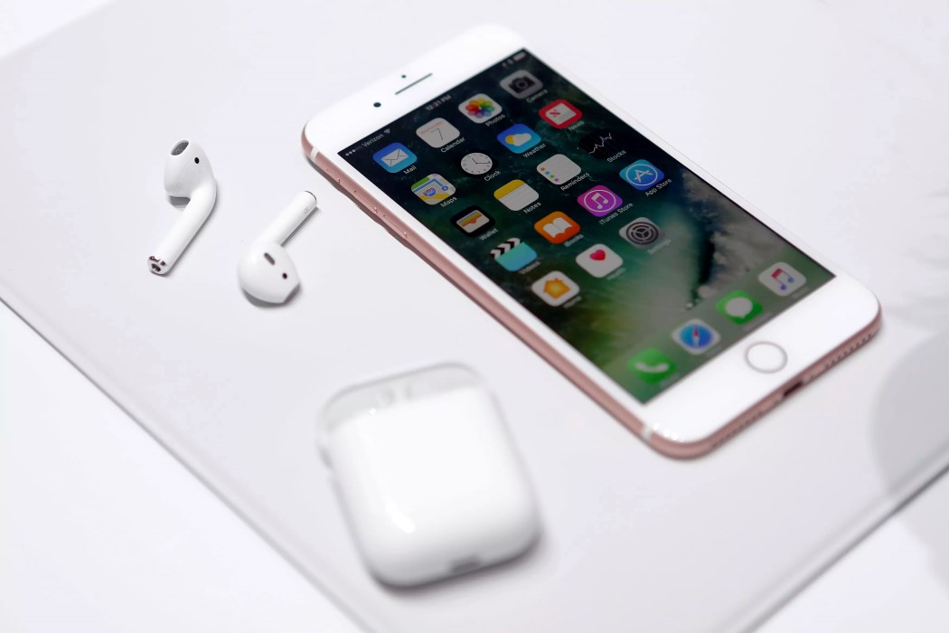
Later in 2016, Apple announced the iPhone 7, which infamously ditched the headphone jack. The absence of a 3.5mm jack on the phone meant the release of the Airpods, Apple’s incredibly small truly wireless intelligent earbuds. Perhaps not the most consumer-friendly decision, the Airpods were a runaway business success. The Airpods were convenient, incredibly well-paired with the iPhone, and came with touch-sensitive surfaces that let you control playback as well as the iPhone’s core features without taking your phone out. The Airpods were sleek, well-built, and came with their own charging case that you could carry around with you. 2016 was also the year Apple killed ports on the MacBook, leaving just a USB Type-C port and a headphone jack (a strange decision there) on the side. The 2016 MacBook also ended the tradition of having glowing Apple logos on MacBooks.
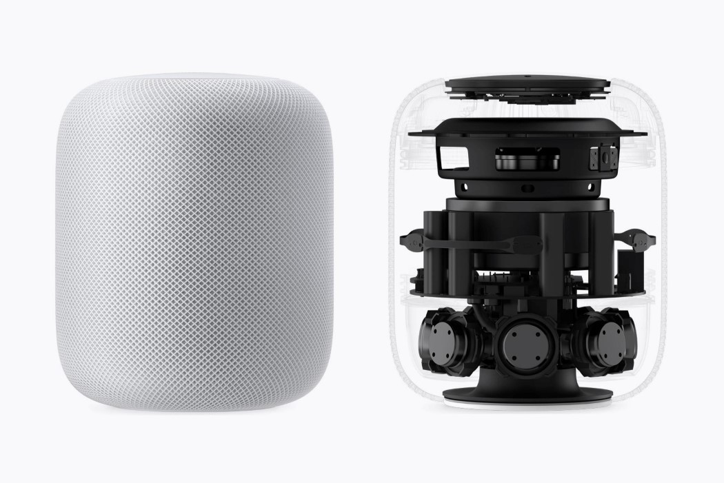
2017 saw the release of the HomePod, Apple’s foray into the smart-speaker market. Ive pretty much revived the cylindrical design (of the Mac Pro) to create a powerful speaker capable of throwing out high-fidelity sound in all directions with equal intensity. The smart-speaker featured a touch-sensitive upper surface, and could respond to “Hey Siri”. Available in white and black, the HomePod came perhaps too late, with Amazon beating Apple to the smart-speaker market by three whole years.
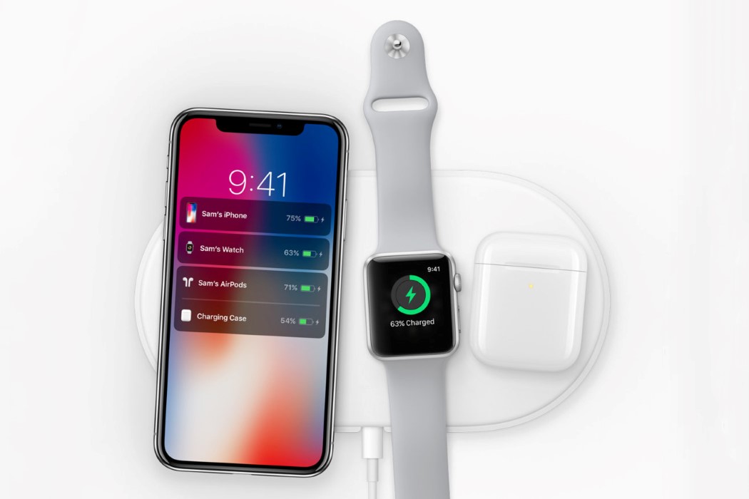
Towards the end of 2017, Apple announced the AirPower, a tray capable of charging all of Apple’s wireless devices… simultaneously. The announcement was perhaps a little premature, considering two large things. A. The Airpods didn’t charge wirelessly, and B. The technology wasn’t perfected yet. Ive’s design showed how easy it was to lay your products on the AirPower mat and have them charge, but Apple’s engineering team couldn’t get it to work without heating up tremendously. The AirPower was finally shelved in 2019.
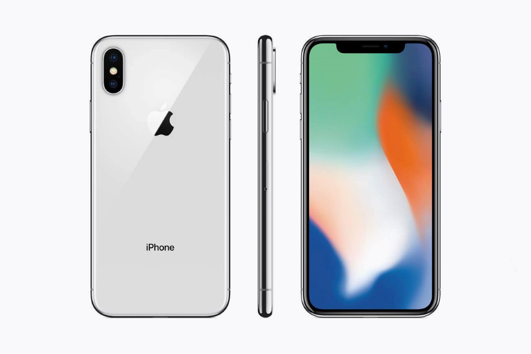
2017 also marked a full decade since the launch of Apple’s greatest product ever, the iPhone. Alongside the iPhone 8 (which was due at the time), Ive designed the anniversary iPhone, titled the iPhone X. With a stellar dual-lens camera capable of clicking portrait images with computational blurring, the iPhone X actually sold more than the 8, even with its $999 price tag… and its notch! The notch became a standard detail for almost all other smartphones to follow, as Ive’s vision for a truly bezel-less smartphone became more and more possible. It also meant saying goodbye to the good old TouchID and hello to Apple’s new FaceID, its revolutionary facial recognition system. The new iPhone was also a departure of sorts from Ive’s love for aluminium, since the metal wouldn’t support wireless charging.
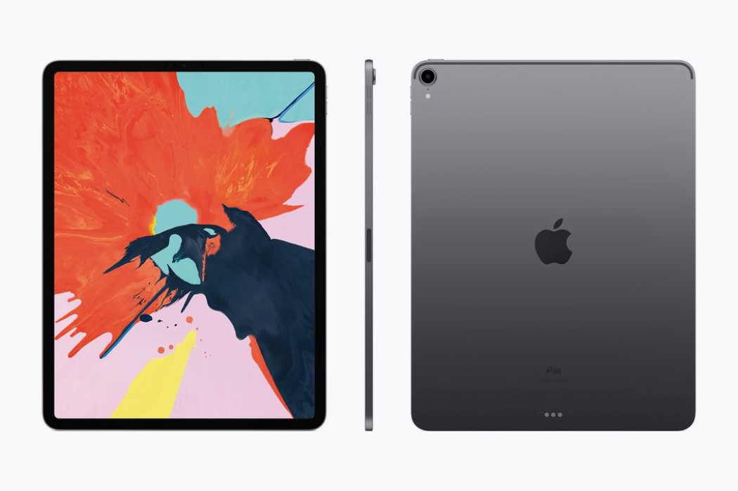
The 2018 iPad Pro was the tablet every creative professional needed. With an incredibly powerful processor (as powerful as the Xbox One), a great camera, a redesigned stylus (that charged wirelessly), and virtually no bezels, the iPad Pro became a standard for the creative industry. It also came with a Type-C port, showing users exactly how versatile the tablet was designed to be, as it could be connected to pretty much any other device, and not be inhibited by Apple’s lightning charger.
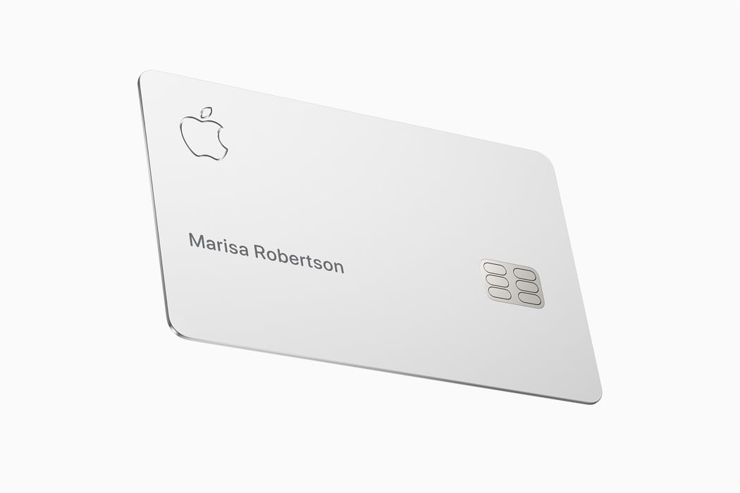
As Apple’s hardware sales slowed down (nobody wanted to buy a new iPhone every year), the company finally made a pivot to services. The Apple Card was one of them. Machined out of titanium, the card was an exercise in sheer minimalism, thanks to Ive and the design team. it came with a machined Apple logo, and an etched name on the card… that’s it!
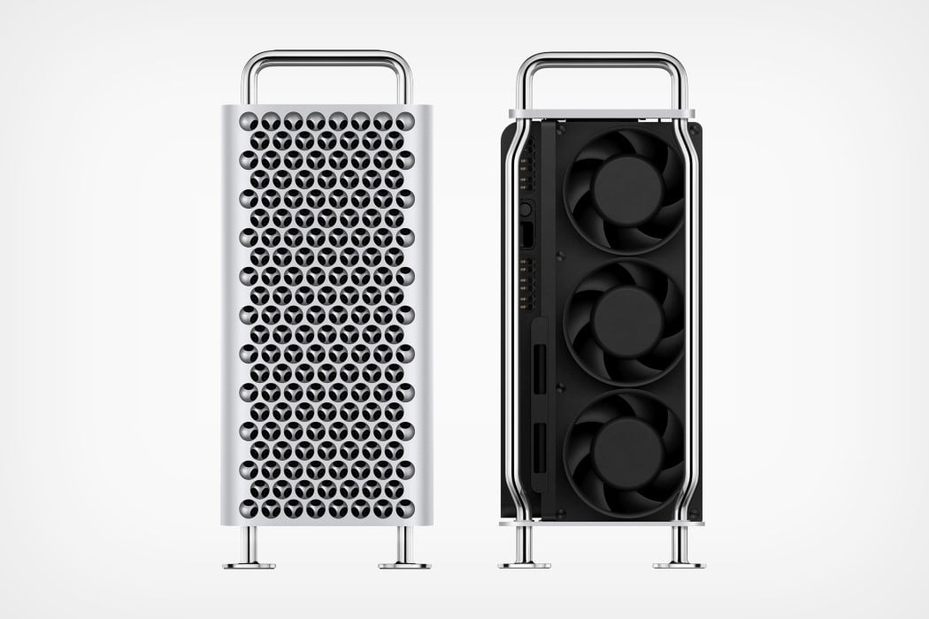
Ive’s last product at Apple, the Mac Pro sent quite a few mixed messages. At the time of his death, Jobs made it clear that Ive’s work was not to be interfered with, and he was answerable to no one. The Mac Pro 2019 was proof of Ive’s free reign. It came with a dual-machined airway system that gave the Mac Pro an appearance of a glorified cheese-grater, with an incredibly hefty price-tag. Apple’s trillion-dollar valuation, and Ive’s ability to design without any constraints resulted in one of the most talked about designs of the year so far… that’s until Ive finally put in his resignation along with Marc Newson to form LoveFrom, an independent design outfit that considered Apple as one of its top clients. Let’s see what the 2019 Apple October event has in store for us!

