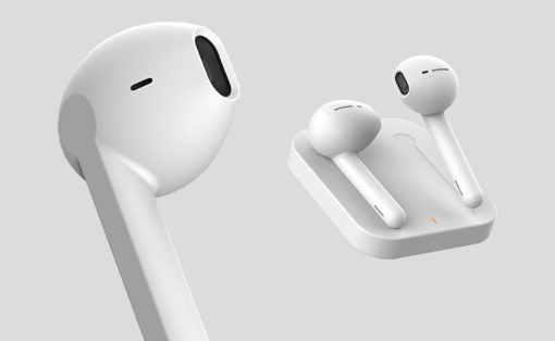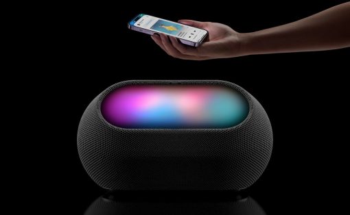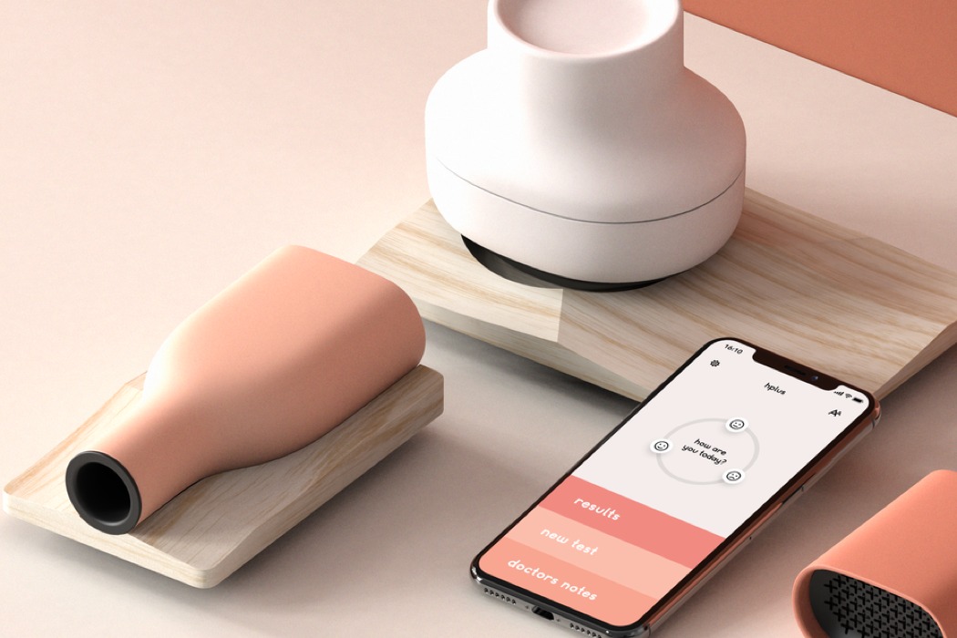
Hplus is a family of equally beautiful devices that have been thoughtfully designed to streamline the repetitive routine of monitoring nine of the most common health conditions. The assortment of products includes a finger-prick, urine-analyzer, blood tester and spirometer, where all but the most essential of user interactions have been abolished!
What makes this project so fascinating to us as designers, is the thoughtful, empathy-rich approach to design that completely eliminates the stigma that we are so used to seeing with medical products; by changing the form and materials to something we more commonly see in domestic decorations, it dramatically alters how we perceive the products. As opposed to being an inconvenience in our daily-routines, it instead integrates itself almost seamlessly.
Designer: Matt Canham
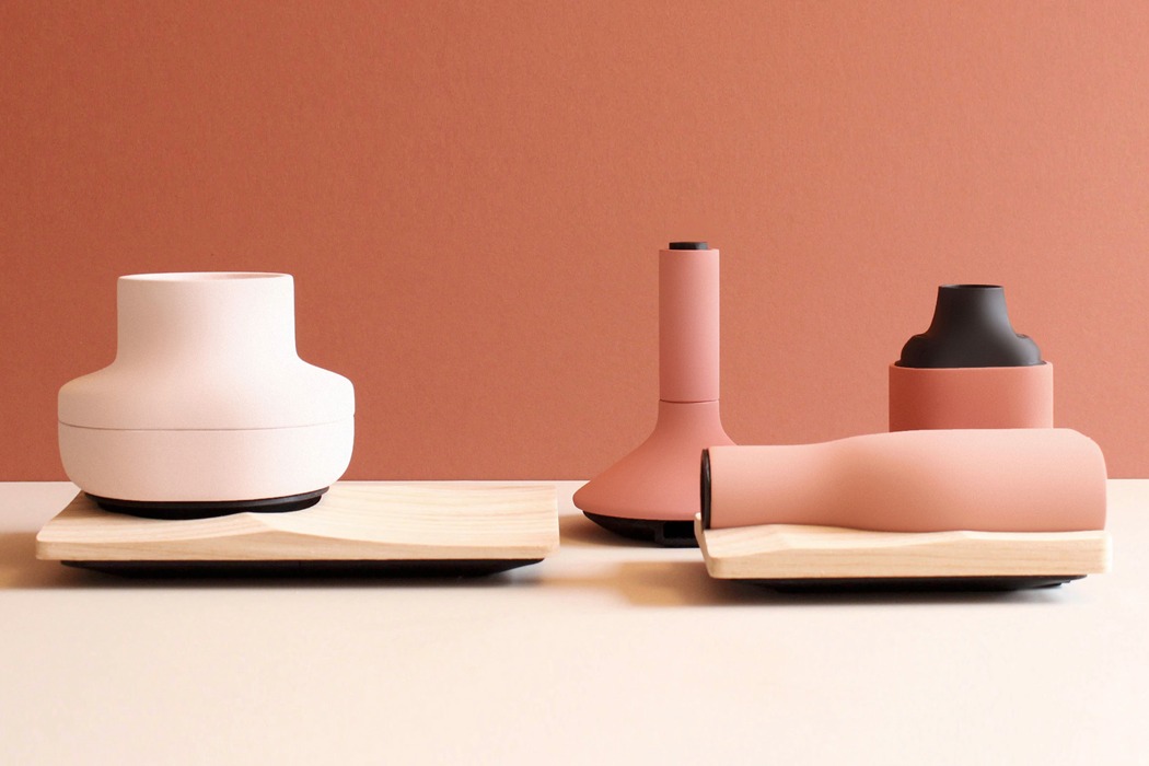
“The project is designed to alleviate the pressure on general practitioners, by allowing patients to monitor elements of their condition that wouldn’t normally be possible with in-home devices. Underlying this aim, there is a core belief that functional devices should be intuitive and beautiful,” Canham explains.
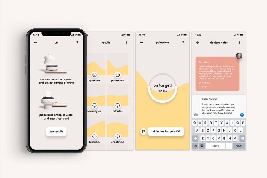
The devices within the hplus collection are accompanied by a mobile app that acts as the core user interface, handling data collection and test operations.

Inside the app users select the test they want to perform and are then guided through the process of carrying out a successful clinical test. When the GP prescribes a new device, users can scan the barcode on its packaging, automatically adding it into their app. In doing this, the process of learning a new testing procedure is simple and hassle-free.
After tests have been performed, users can view the results within the same application. Data is collated into simplified overviews that show how well a patient is progressing, with a more detailed analysis available when required. When a data set is at a dangerous level, it is automatically flagged and an alert is sent to both the patient and clinician.
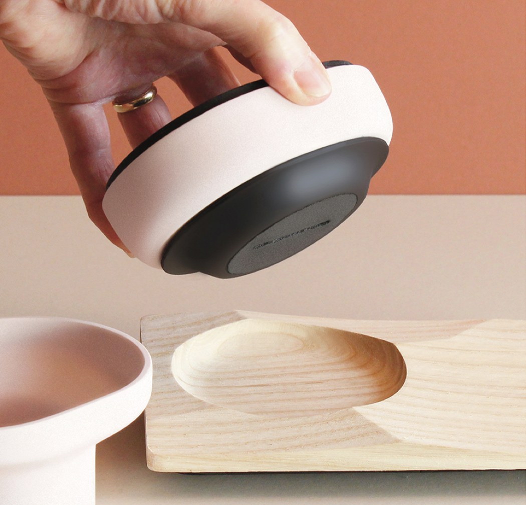
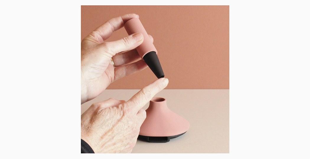
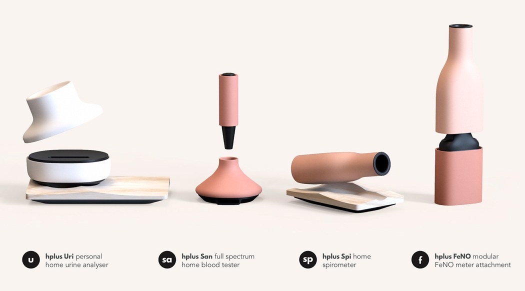
The devices that include a urine-analyzer, finger-prick, blood tester, and spirometer, are removed of all but the most essential of user interactions, ensuring that the user experience is streamlined and hassle-free.
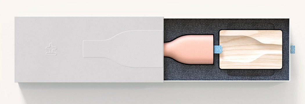
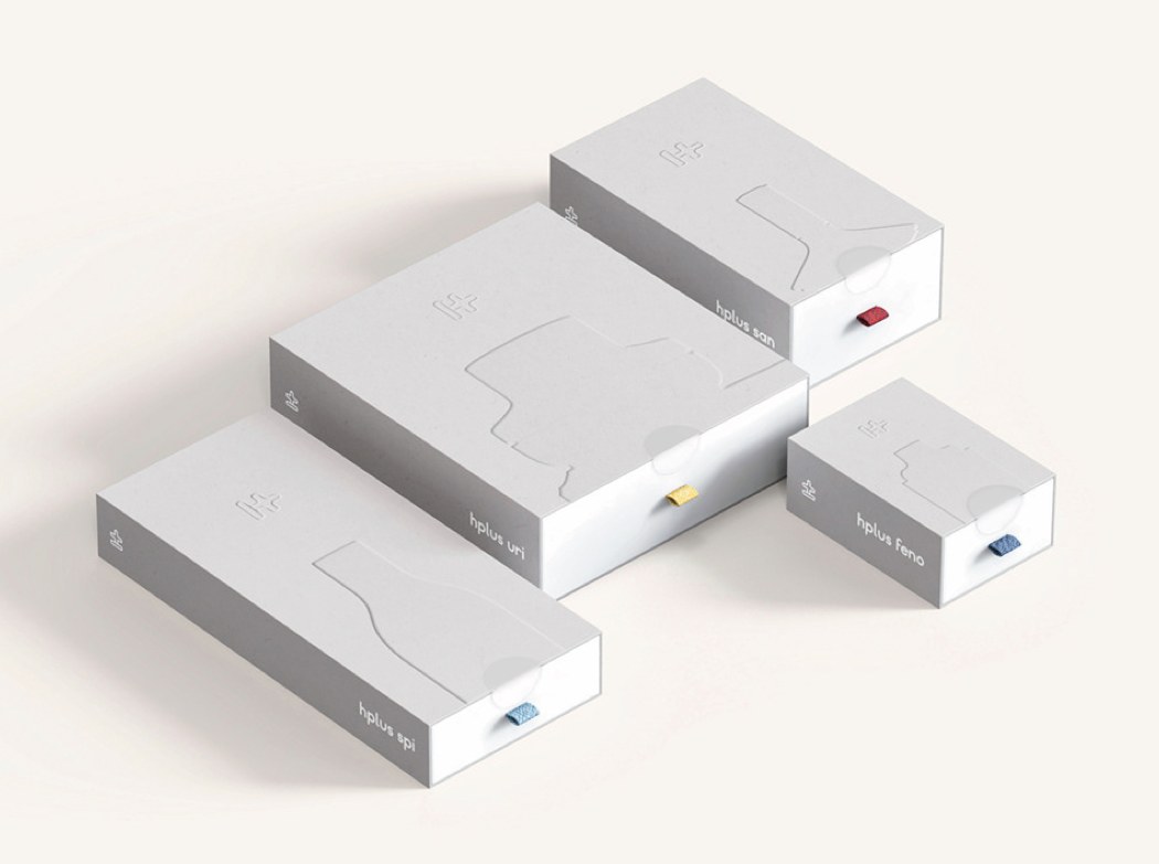
Colored fabric tabs reference the individual color palette of each device used within the UI of the mobile application; helping to create a unified product experience and increase users understanding.
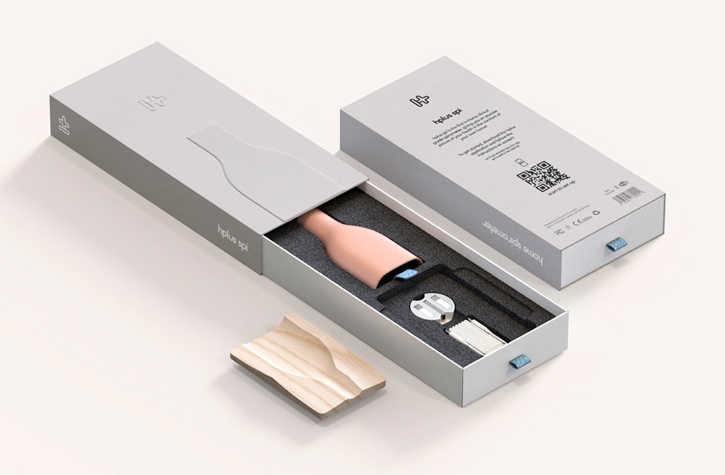
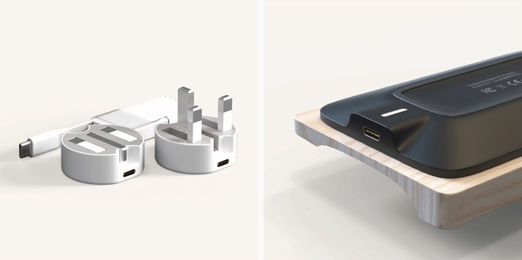
A custom folding adapter plug and tangle-free flat USB-c charging cable are included with each of the hplus devices. No instruction manual is needed as to set up the device, users scan the QR code on the back of the box within the hplus application to be guided through installation, while a single button on the base of each design allows the product to pair with the users app.
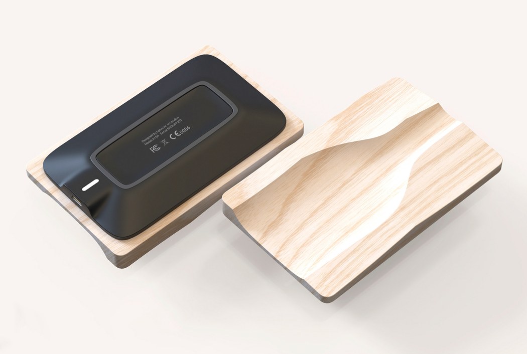
Each base station or base until features a single button and LED indicator that are used in pairing the device to the users application.
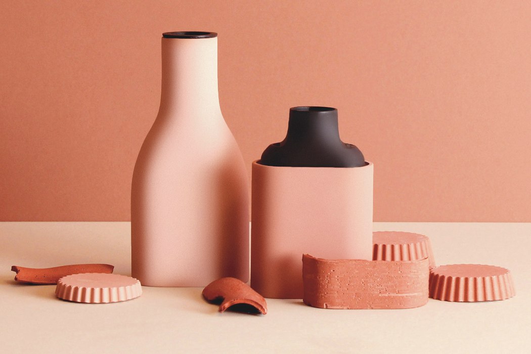
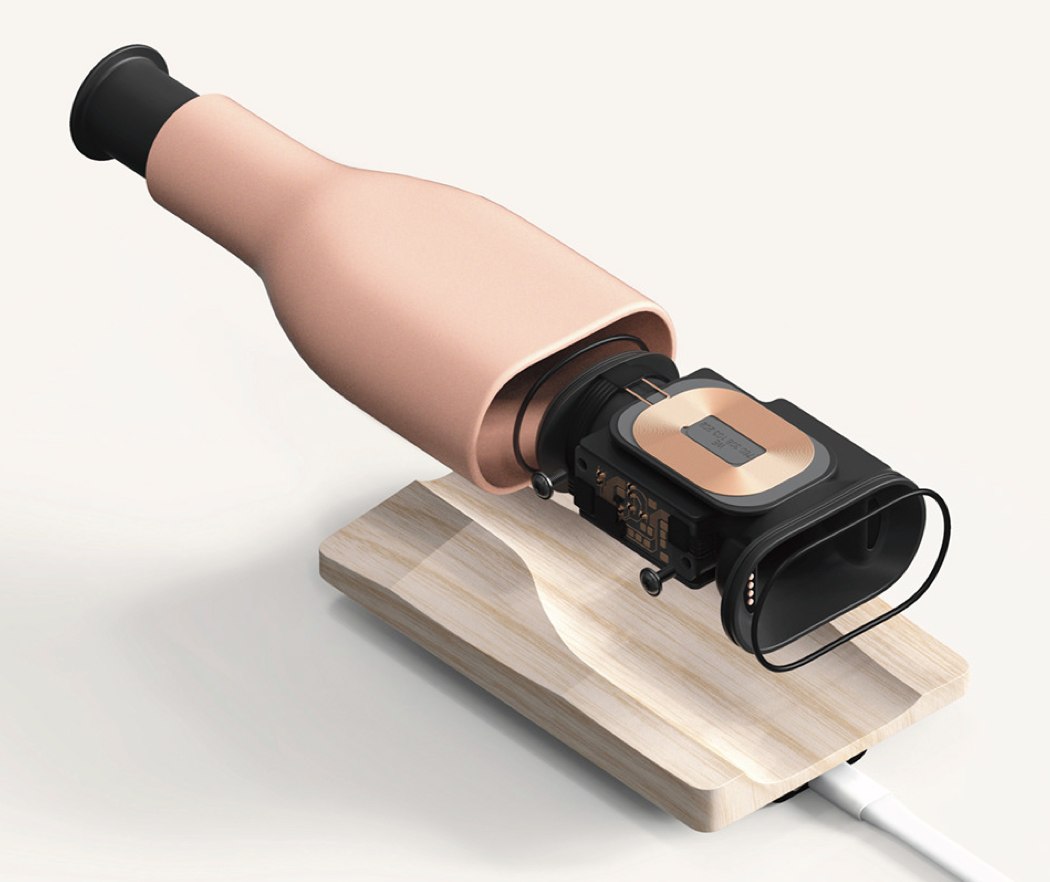
By changing the way we interact with products and the materials they are made from, it is possible to change the associations we give to them, and in turn, make them more acceptable in society and our daily lives.


