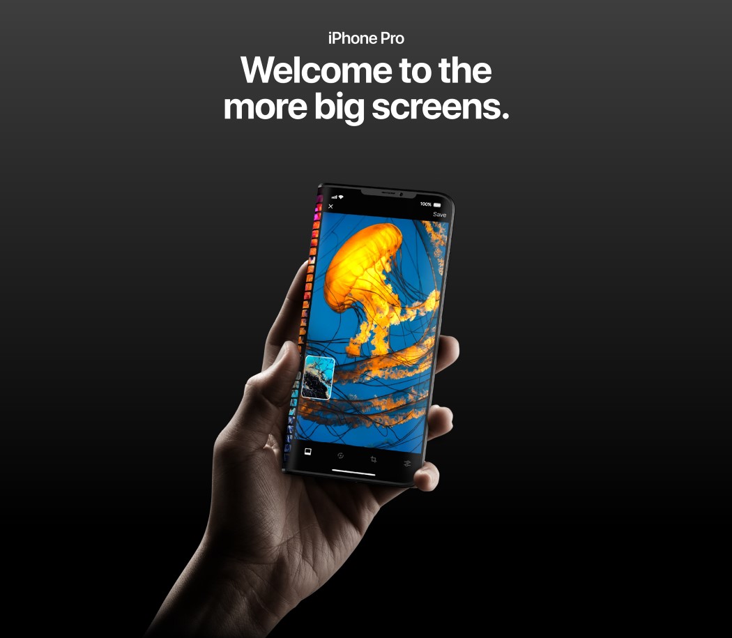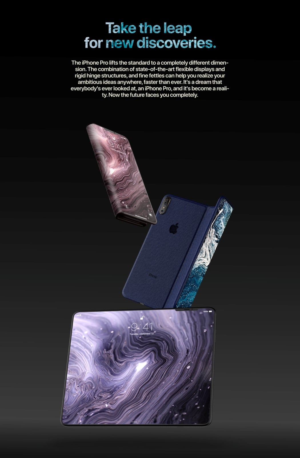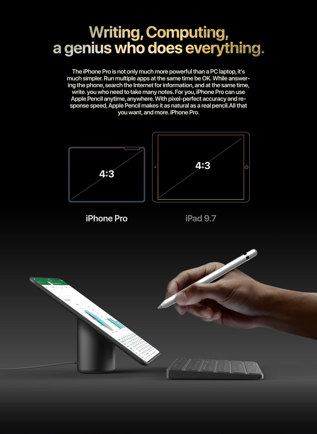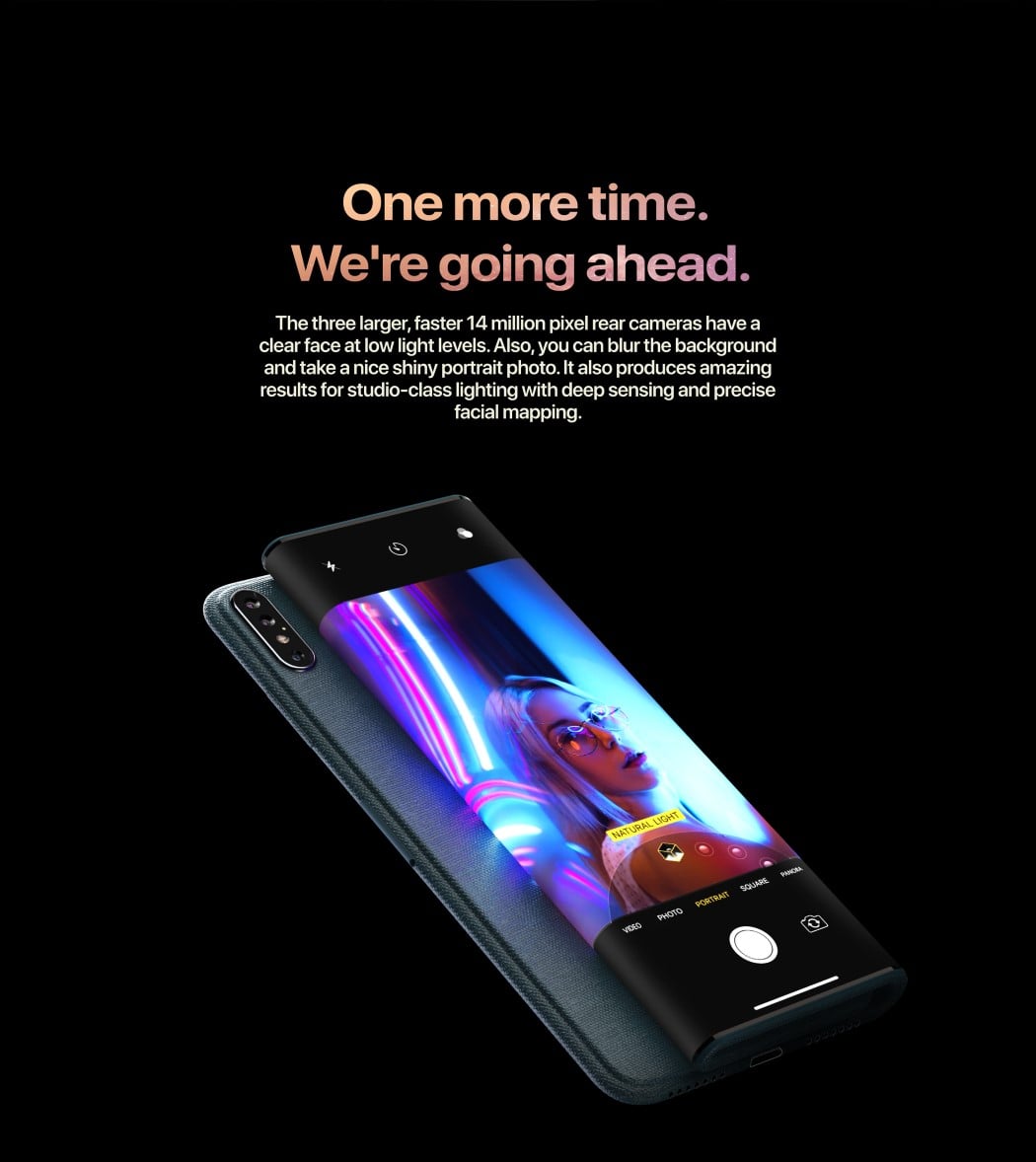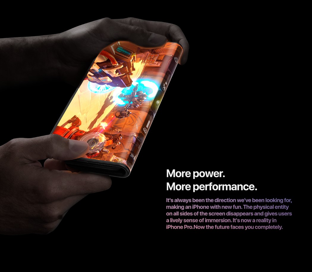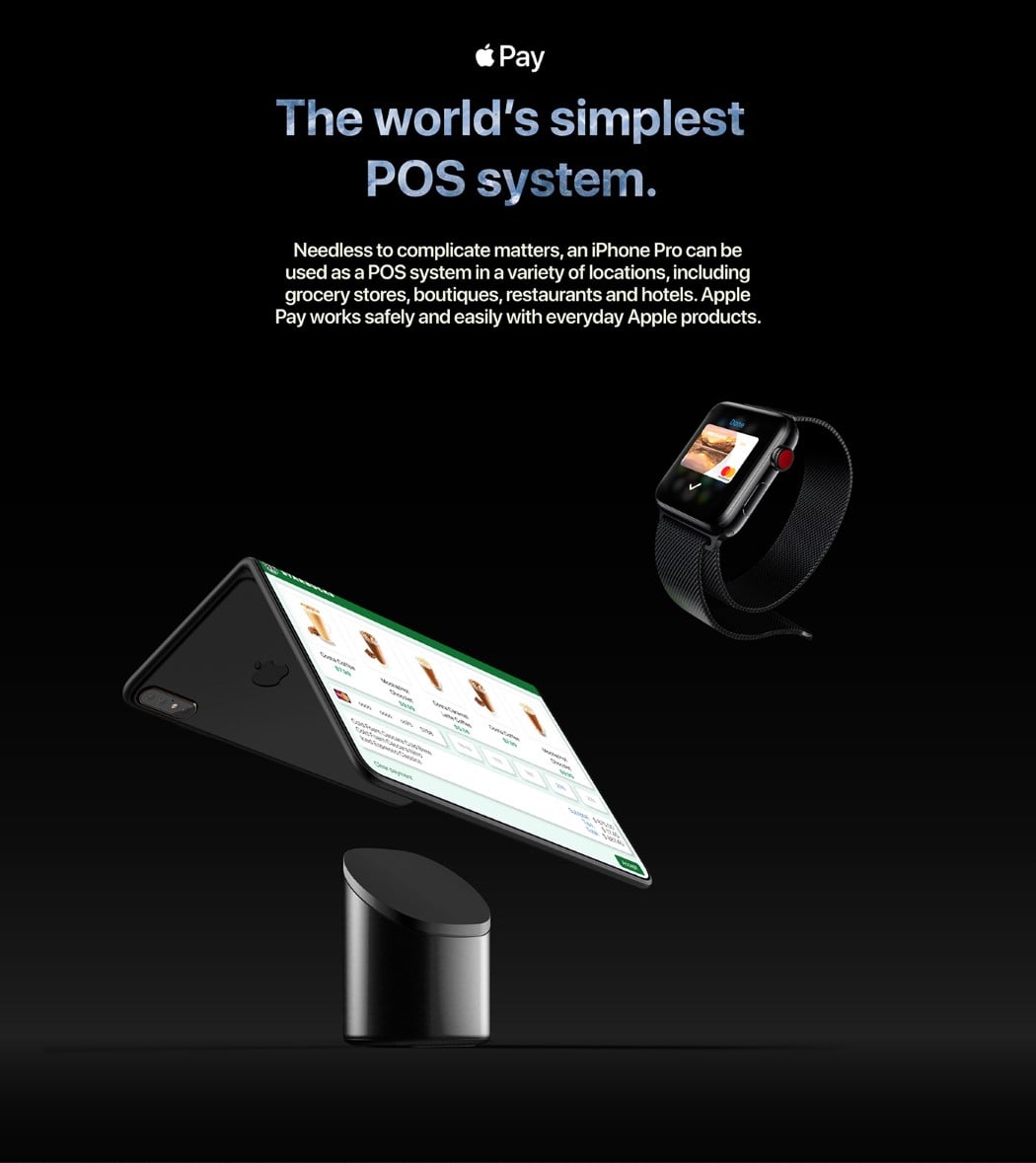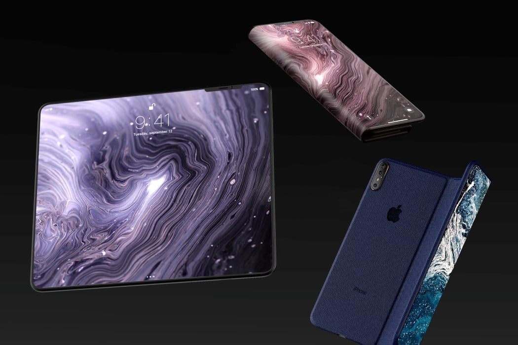
Now that Jony Ive is no longer running Apple’s design team (he’s off their website too), a folding iPhone may just be a possibility. Here’s what Seong Jun Park believes it should look like. Park’s flexible iPhone manifests itself as an intersection between a phone and a tablet (like most folding phones), but the advantage Apple has over its competition is its complete dominance in the tablet sector. The iPhone Pro neatly goes from a regular smartphone (with a notch) to a 4:3 screen tablet (with a slightly offset notch). It comes with not one, but two hinges that separate the AMOLED screen into three parts with outward facing screens, and a slight cantilever at one end that allows the rear camera to not be covered (not the most elegant of solutions, but then again it lets you have a screen right beside the powerful triple-lens rear-view camera.
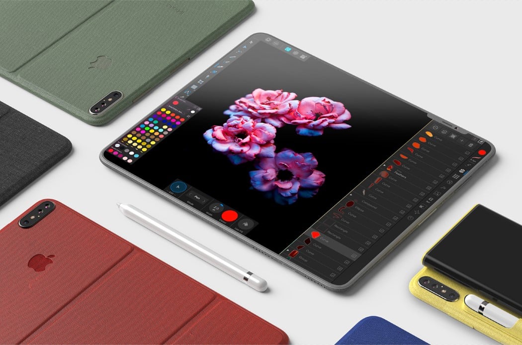
To facilitate folding, the iPhone Pro ditches the glass back for the padded fabric used in the iPad’s smart cases. I’d guess that the fabric still retains the iPhone Pro’s ability to wirelessly charge. The iPhone Pro’s biggest sell (apart from the 3-part screen, obviously) is its Pro suffix, which, with the large screen can only mean one thing… Apple Pencil support! The phone comes with the ability to dock and charge your Apple Pencil, even using it on the iPhone’s vast tablet-esque screen to quite literally get the best of both worlds. Plus, with a screen that big, Apple TV+ would probably just come to life, right??
Designer: Seong Jun Park
