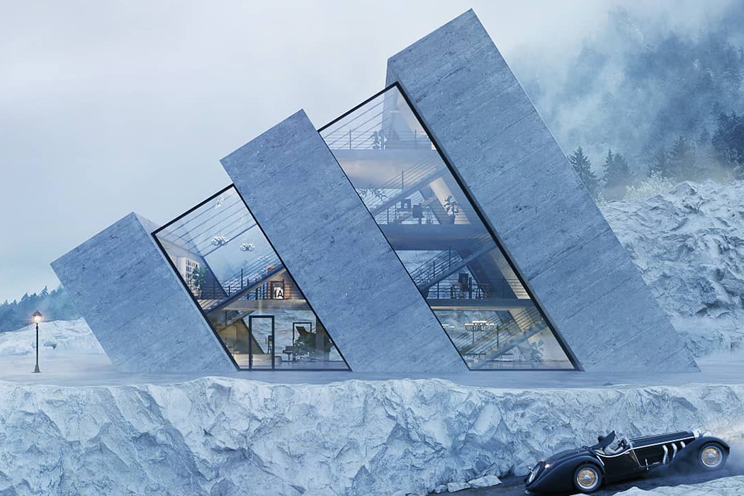
Meet Karina Wiciak of Wamhouse, a Polish designer who has been designing structures based on iconic logos known all over the world! Instantly recognizable because of their inspiration, Karina’s designs utilize negative spacing in the logo to add character and help us imagine how it would be to live in one of these. Looking at them, we can’t wait to see what Karina comes up with more of such brand-worthy designs!
Named as the Trihouse, this conceptual house takes direct inspiration from the Adidas Logo. Now, while this would be an obvious choice for the brand loyalists, the house does hold appeal from a purely aesthetic and architectural point of view. This design is sure to create some interesting corner spaces for the user to work with!
The Ringshouse automatically brings to mind the four companies that combined together to form Audi as we know it today. From afar though they may look like tunnels, the designer, Karina, envisions a pool in the backyard with a view of rolling hills and straw-filled fields in the front of the driveway.
For the love of Chevrolet, meet the bowtie-shaped house named Crosshouse! Imagined as an island, this house stands two-stories tall to be accessed only by a boat, this boat is perfect for the loner who would love to cut off from the surroundings!
Mitsubishi’s three-diamond logo comes to life in this ‘A-shaped’ Pyrahouse! With the glass-fronted windows offering a peek into the interior of the house, the functioning space is visually divided into three individual bits that allow the user to rearrange and match each section to their need.
Rhombhouse encompasses Renault’s diamond-shaped logo! Though the narrow base of the render does make us question the stability of the structure, this house is sure to stand out among the sea of homes we see.