Haters are going to say this isn’t real. Design-literate haters are going to say this isn’t ergonomic. Before you lose your mind because of some deep-seated logic that every single thing needs to make sense, relax, it’s just a harmless concept.
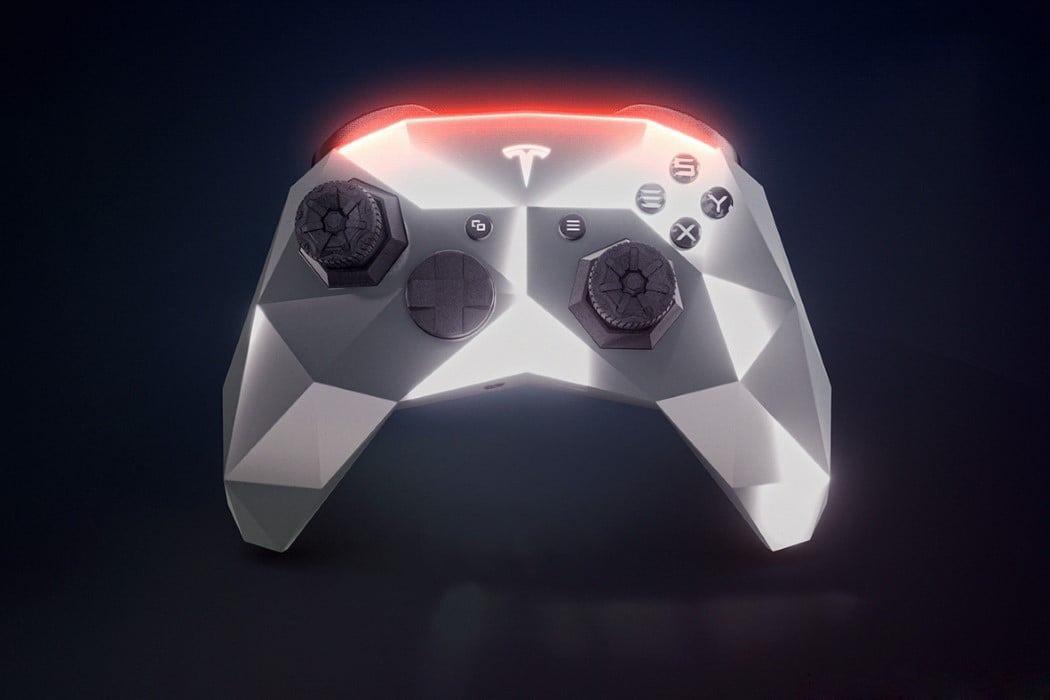
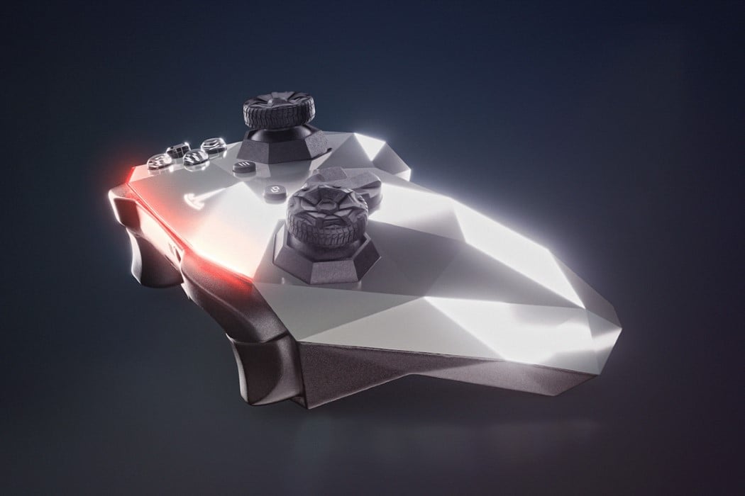
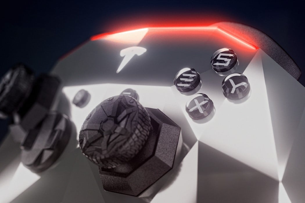
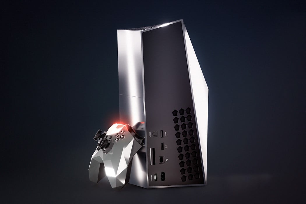
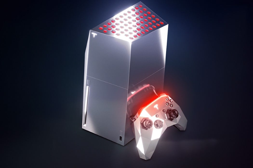
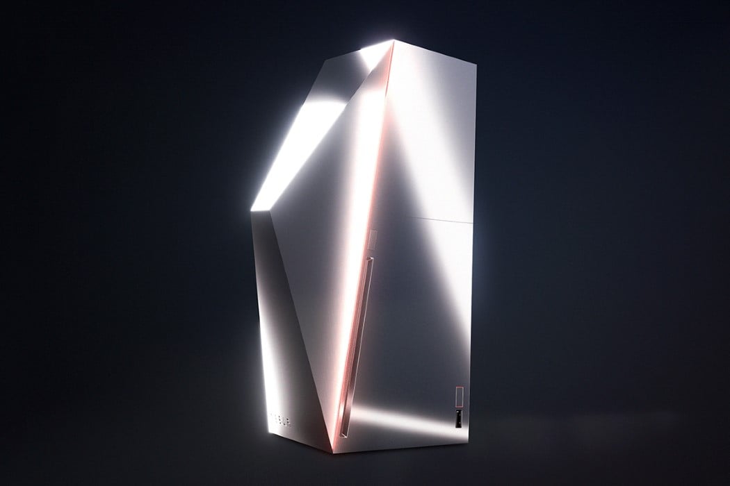
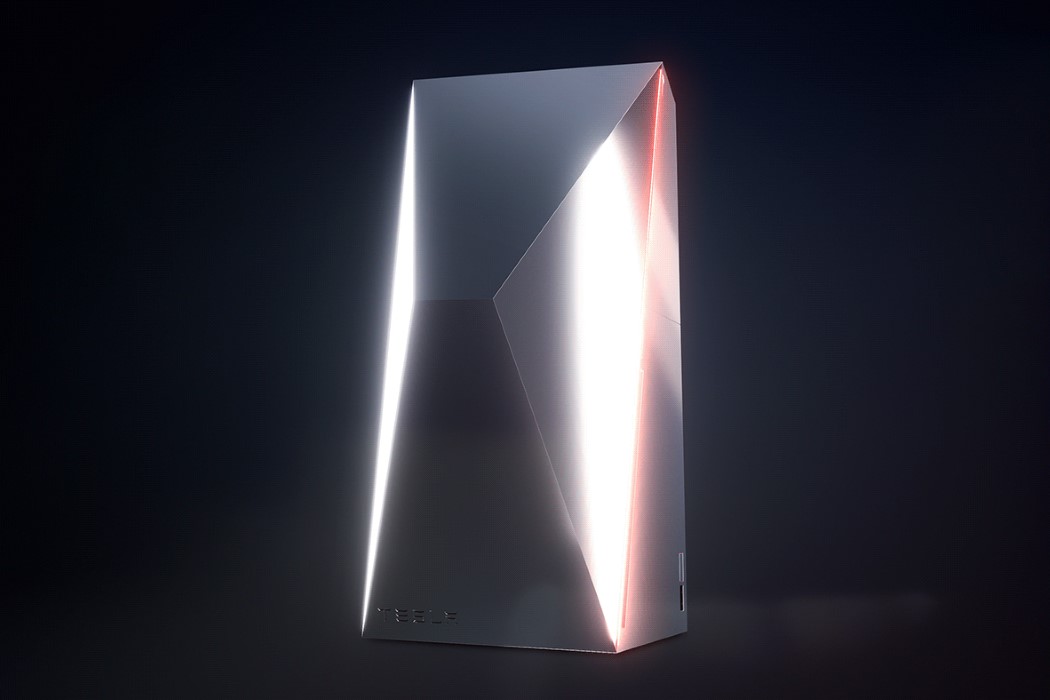
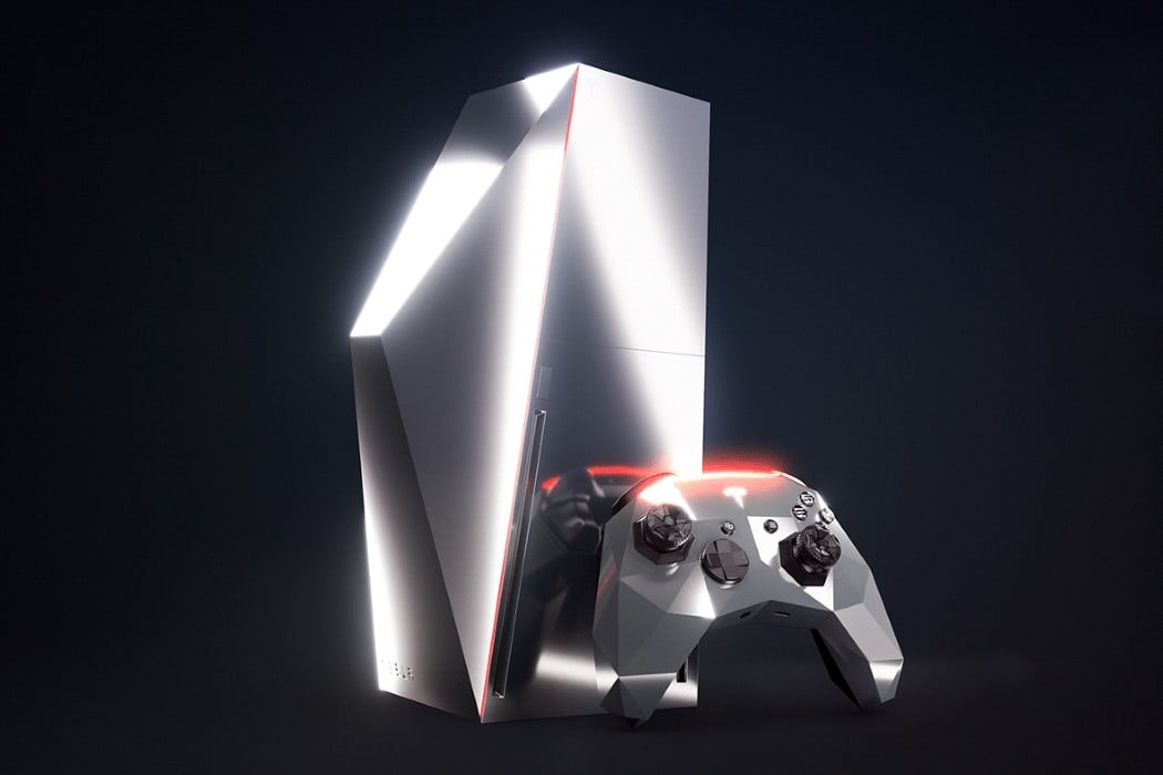
A concept’s biggest objective is to open the mind to possibilities. To spark the imagination, to inspire… not to be feasible. That’s what this is. The Tesla CyberBox is an exploration/exercise in taking the design language of one product and superimposing it onto another as a neat CMF experiment. The CyberBox comes with an edgy console that looks borderline Alienware-worthy, and a controller to match. Made with that same nude metallic finish and sporting the same sort of edge-lighting as Tesla’s pickup concept, the console and controller do a pretty remarkable job of carrying automotive details onto consumer tech design. Designer Martin Hajek’s commitment to the tiny details is absolutely awe-inspiring too – for instance, if you take a closer look at the controller, the joysticks are styled as wheels, and you’ve even got a polygonal ring where the joystick meets the controller too, perfectly mimicking the mud-guards on the Cybertruck. Even the XYAB buttons on the controller come with a Tesla-inspired twist, sporting glyphs from the company’s logo!
I know what some of you are thinking, though. The low-poly design on the controller would be uncomfortable to hold… and a metallic body would cause it to heat up, burning your hands if you play for too long. Don’t stress yourself out, though. The world has much bigger problems than a conceptual design that doesn’t (and hopefully won’t ever) exist. Just think of it as a Render Weekly challenge!
Designer: Martin Hajek
