Apple’s WWDC just wrapped up and the highlight of the event is Apple’s switch to ARM instead of Intel. While that would be a major transition and not an easy one, we thought we would showcase the best of Apple-inspired designs to get a headstart on what we imagine the next set of hardware designs would be like. From touch-based MacBook concepts to Apple accessories for your existing gadgets, there is a design in here for everyone!
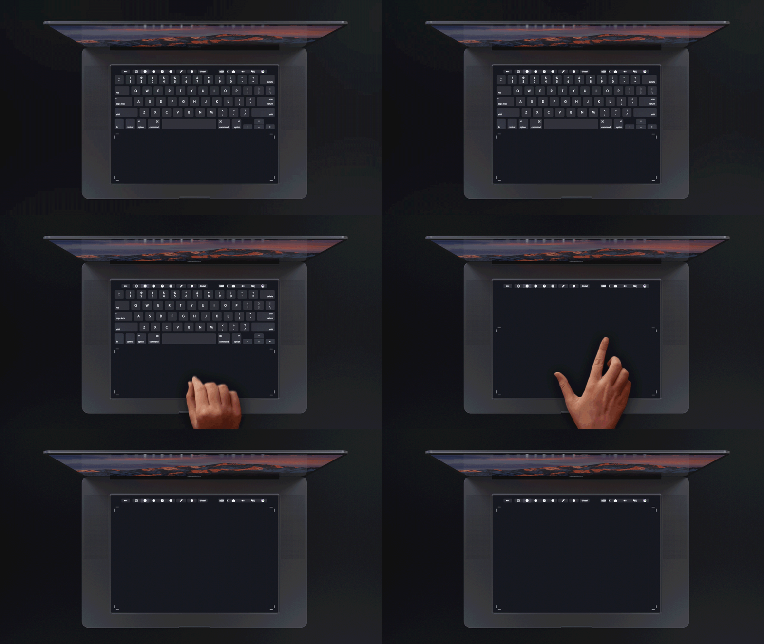
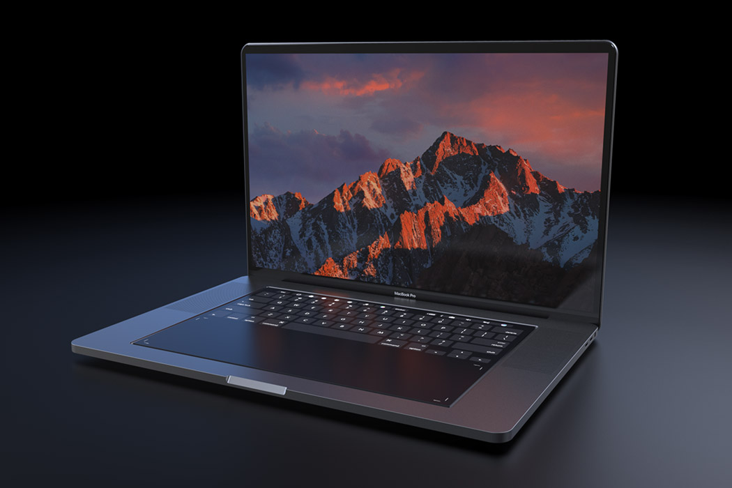
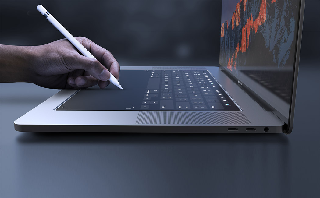
Designed with designers in mind, this MacBook Pro 2018 concept by Daniel Brunsteiner explores the integration of a full-size touchpad in place of the traditional keyboard. It relies on Apple’s own Taptic Engine system to give the user the feel of physical buttons or even emulate a scroll wheel or sliders. It retains the touch bar for shortcuts and function keys but the entire surface is touch-enabled! Better yet, now Apple Pencil is compatible with the new MacBook Pro, helping creative professionals in their workflow and allowing for new applications using the touchpad area.
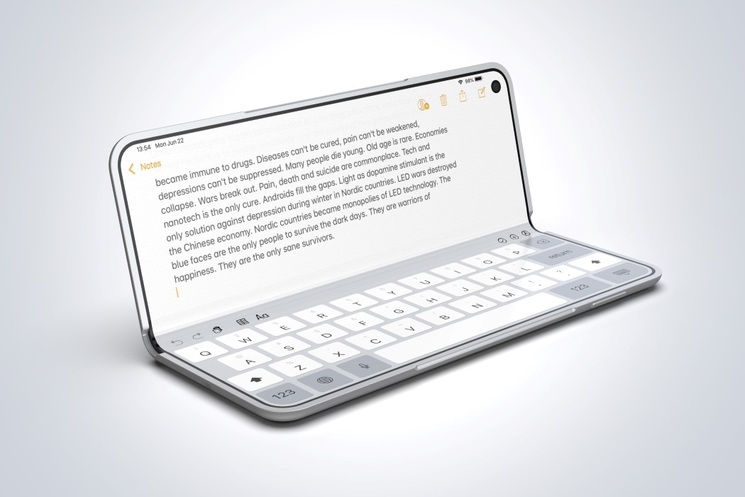
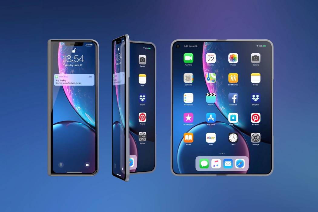
If you look at the iPhone X Fold’s OS by Roy Gilsing Design, you see that it’s essentially an iPad Mini folded in half… a desirable #bendgate if you will. It features a secondary screen on the front that resembles the iPhone X (why it features the notch, I’ll never know), but its most unlikely yet apt inspiration comes from one of Apple’s most reliable products ever, the MacBook. The XFold features an inward screen as the MacBook does, and even comes with the same anodized aluminum finish. Look at the rim and you’ll even see a slight cutout on the frame to slide your thumb in and open the phone, just like the MacBook has.
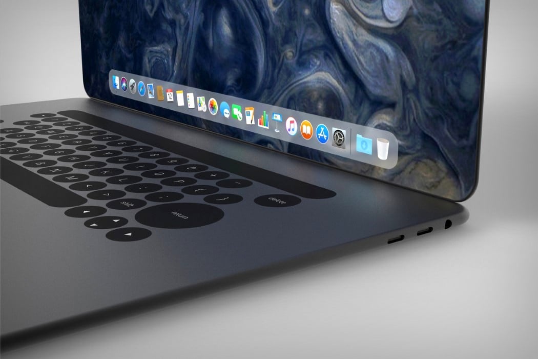

Ludovico’s MacBook redesign takes similar routes to the iPhone X and rather appropriately christens itself the MacBook X. Featuring a body that’s curved, rather than wedged, the MacBook X does a hat-tip to the iPhone and looks less susceptible to horrible denting given the lack of a sharp edge. It also explores a more expansive display that has those incredible curved edges and absolutely no bezels. The absence of a notch means there’s no webcam on the MacBook X, which does raise questions, but none too serious, considering this is purely conceptual. Look down at the bottom half and you’ll see the touch-bar is still there, sitting above what I can only say is a keyboard that feels much too different. Deviating from the regular square-keyed board, Campana’s MacBook concept takes on a circular key design, which I honestly have conflicting opinions about, but then again, conflicting opinions are all too common in the domain of consumer electronics… aren’t they?

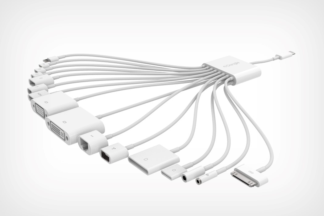
Apple may have killed the AirPower, but if anything, it’s still the most customer-friendly company out there! Take for instance this Dongle by Ryan Geraghty that truly empowers iPad Pro users into connecting pretty much anything to their iPad Pros. With one USB-C port at one end and a WIDE variety of possibilities at the other, the latest dongle lets you connect everything from a LAN cable, to a pair of headphones, to memory cards, to even iPods (Hallelujah!). The dongle even comes with a proprietary cable technology that ensures that the dongle’s multitude of wires don’t get entangled, and is available in a wide variety of colors.


Now while Apple doesn’t have a reputation of listening to its consumers, most third-party OEMs do. Take the AirBar for instance. This amazingly thin little beaut is capable of turning your MacBook screen into a touchscreen. It broadcasts invisible light-waves to detect movement, allowing virtually anything to become a stylus. Use anything from chopsticks to a paintbrush to even your fingers (with or without gloves) to touch, navigate, zoom, swipe, or even paint on your MacBook! All you got to do is plug the AirBar into a USB port and mount it on the bottom of your screen. The only drawback here is the lack of pressure sensitivity since the AirBar only works in the X & Y axes.
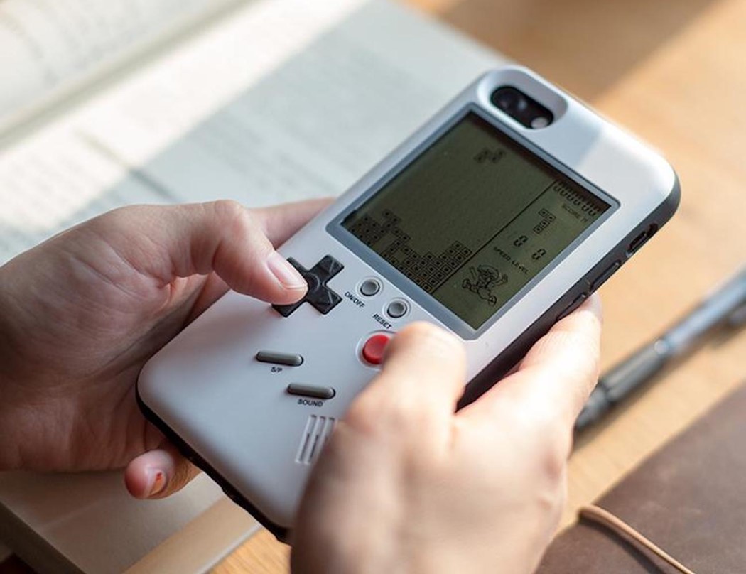
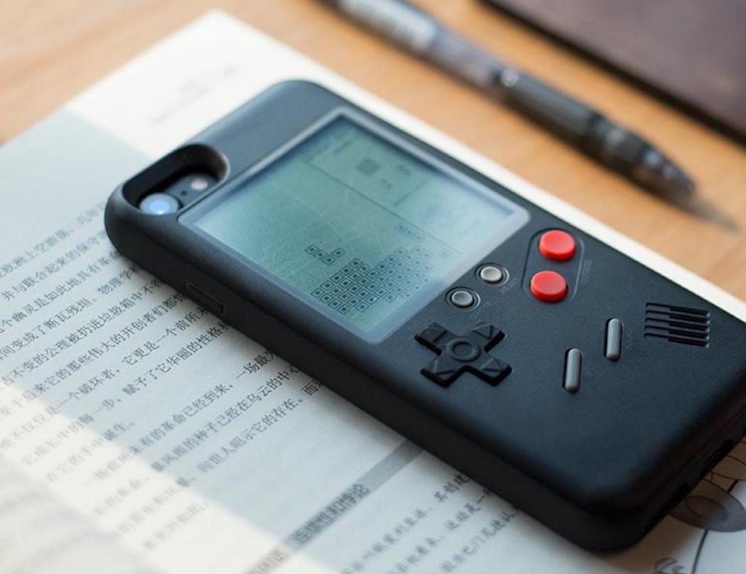
The Wanle phone case for the iPhone turns your futuristic device into a slice of retro gaming heaven. It uses the backside of your phone and turns it into a retro Gameboy of sorts, letting you play classic games like Tetris, Tank, F1 Racing, and the legendary Snake. Without inhibiting any of your iPhone’s functions or ports, the Wanle case sits nicely on the back of your smartphone, turning what would be just a plain metal surface into a gamer’s paradise. It uses its own button-cell battery to power the video games at the back, allowing you to simply flip your phone over when you want to game without draining your iPhone’s battery. The cover case is beautifully designed with a curvature that feels great to the touch and actual 3D buttons that feel like the real thing.
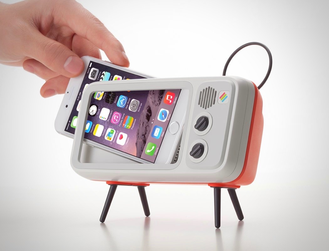
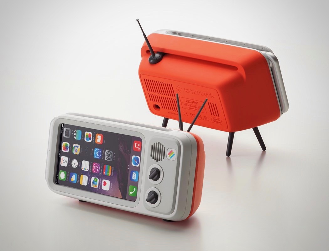
The Retroduck stand does something rather noteworthy. Phones are light, portable, and have a reputation for being multi-tasking devices. Televisions on the other hand are the exact opposite. When you dock your phone into the Retroduck, your perception of your phone instantly changes to that of a television, therefore allowing you to watch content on your phone’s screen with much more attention… as you would on a TV. The Retroduck works as a rather neat multimedia dock, with its beautiful vintage-inspired design (even built with dummy controls and antennae!). It’s thick/hollow design helps channel sound better, allowing sound from your phone’s speakers to resonate within the empty space, effectively making it louder/punchier, while evenly channeling the sound through both the front as well as the back of the dock.
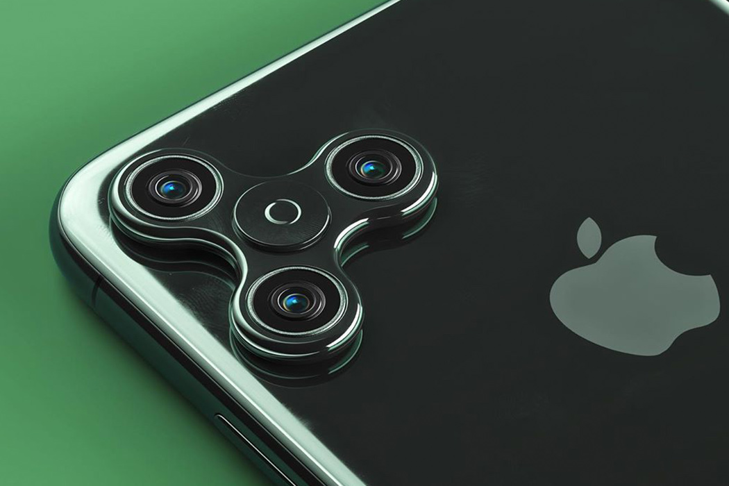
‘Reality leaves a lot to the imagination’, this quote by John Lennon is what I believe must be the inspiration behind this wonderful mix of reality and imagination displayed by designer Philip Lück. Philip has been adding a twist of imagination to the mundaneness of our daily lives. Now here’s a version of the iPhone 11 Pro that adds some fun to the 3 camera setup, and keeps the trypophobia at bay! Not to forget, the hours of screen-free analog procrastination it would provide when the phone was not in use.
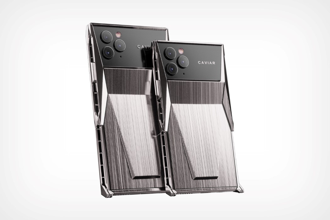
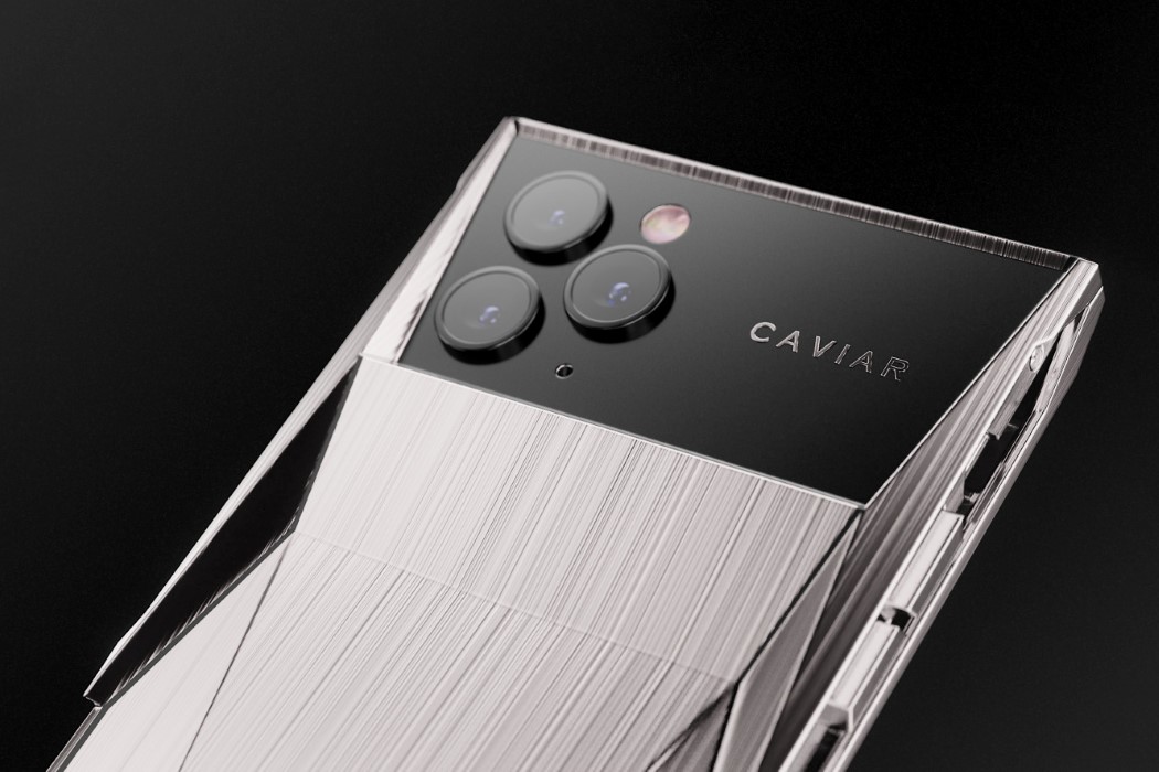
The guys at Caviar, famous for their custom-made iPhones, have launched the Cyberphone, an iPhone 11 Pro’s soul in the body of a Cybertruck. This pimped-out iPhone 11 Pro comes with a PVD-coated titanium body featuring a polygonal edgy design reminiscent of the ‘polarizing vehicle’. The body extends all the way to the front, entirely covering the screen like a clamshell phone (so there’s never a repeat of the ‘shattered-glass’ incident), but with the hinge located at the bottom edge. The unique hinging mechanism allows the phone to immediately have a kickstand that you can use anywhere to prop the phone up on a table as you show it off.
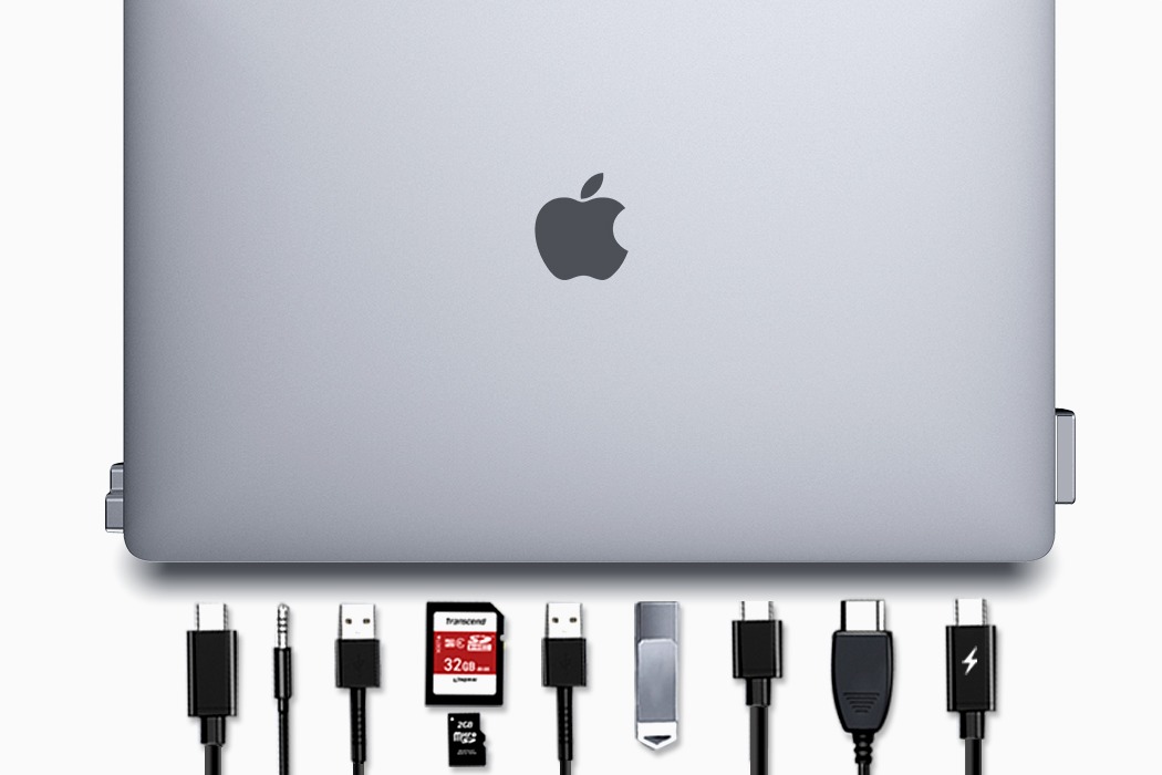
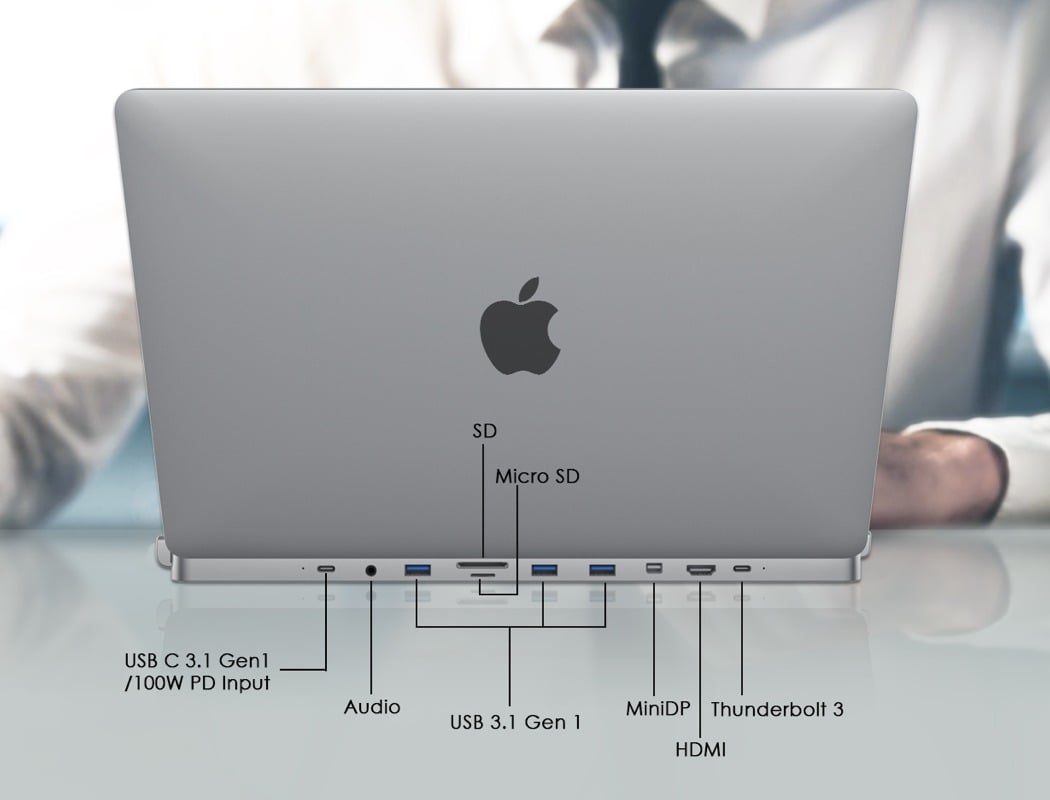
The designer of DGRule Nicole Chang describes it as an “invisible hub” and I guess we can see why. The DGRule promises to be a convenient alternative to the limited Thunderbolt 3 USB-C ports since they aren’t always compatible with all devices. Subtle, discreet, and far from bulky, DGRule snaps onto both sides of the MacBook Pro. Available in Space Gray or Silver, it camouflages with your laptop, appearing to be a natural extension of it. Created from CNC aluminum, this allows the hub to comfortably merge with the MacBook Pro. The DGRule encloses two Thunderbolt ports on the same side, leaving the two others on the opposite end completely free. The invisible hub connects your Thunderbolt 3, HDMI display, USB-C, Mini DP, three USB 3.1, one MicroSD, SD, and your headphones!
If you love everything Apple, this curated selection of Apple accessories and the list of iconic Apple Store Designs is exactly what you need!


