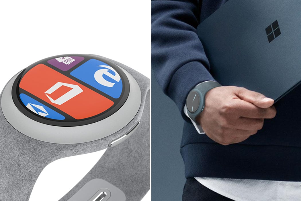
Its high time Microsoft released a smartwatch. They entered the mobile phone market rather late and couldn’t capitalize on it compared to the other players. And with news of a smartwatch development doing the rounds for quite a few years now, it is very much likely that they may launch one soon in their Surface family of products. Until then, we have designer Reiten Cheng who has developed a concept Surface Watch which goes with the design language of Microsoft’s latest line of products.
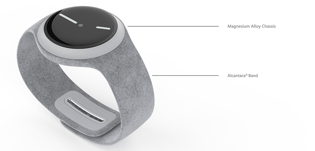
Reiten has boldly gone ahead and made the body circular. An approach that may not be congruent with the rectangular tile UI that Microsoft carries across all its devices and one that I don’t think the designers at Microsoft would take. Nevertheless, the form is quite appealing and the concept comes with some neat features other than the ones on the screen. The watch features a magnesium alloy chassis with Alcantara for the band. It comes integrated with a rim around the dial, which acts as an interactive input method. The adjustable band comes with a unique mechanism too. You can adjust the clasp by pushing the button, which is adorned with the Microsoft logo, which then releases the lock. The designer has also taken a spin at the UI, reshaping the tiles of the Microsoft logo. And this watch comes in a wave of beautiful colors we can’t wait to get our hands on if they ever become a reality.
Microsoft really needs to buck up and bring their product to the market which is increasingly getting over-crowded. Maybe the not so successful Microsoft Band has dissuaded them from launching another product that hasn’t been fully developed in all ways. But the cost of perfectionism is that the customers would get used to other brands and may no longer switch loyalties. Either way, market response and customer feedback are the only ways you can make changes and improve your design and I hope Microsoft brings out their Surface smartwatch real soon!
Designer: Reiten Cheng
