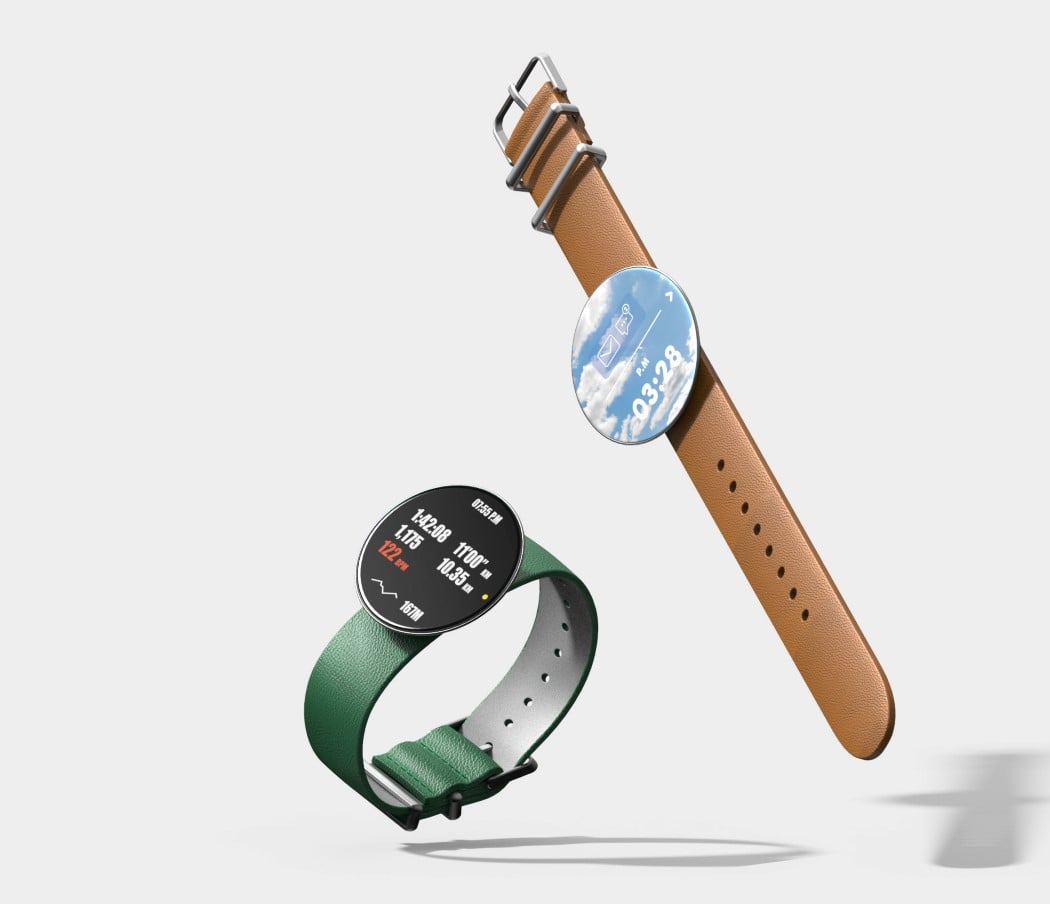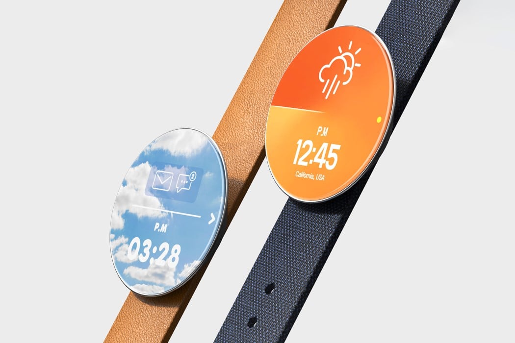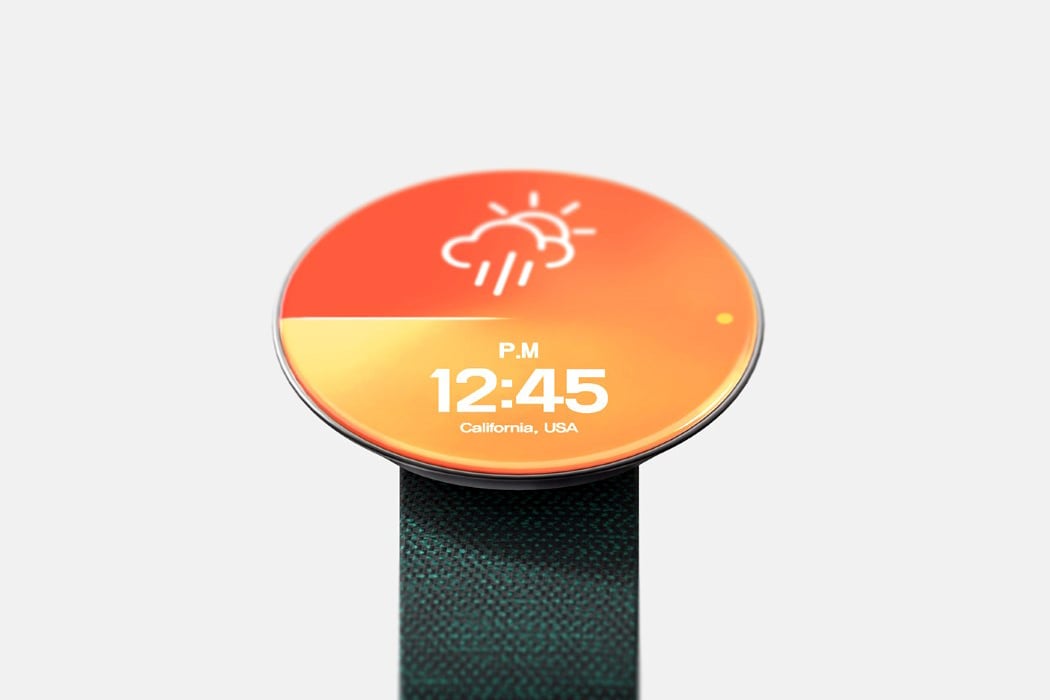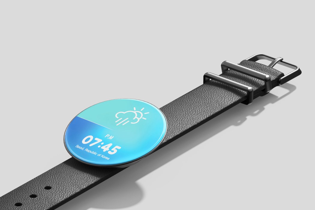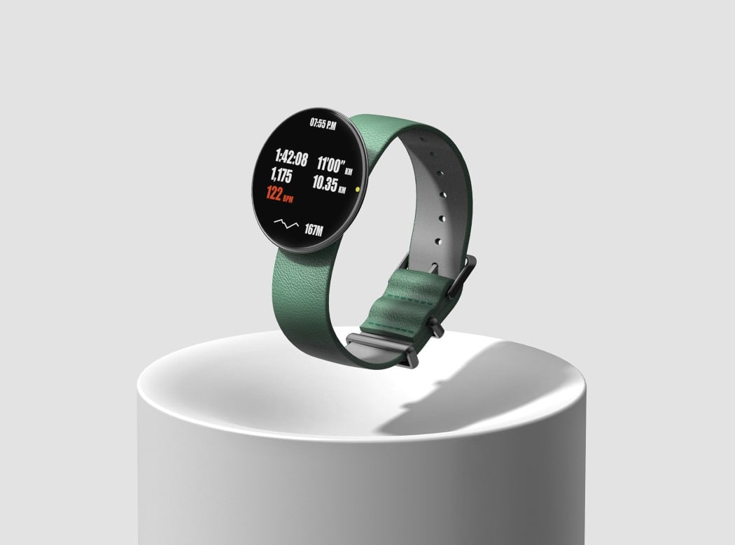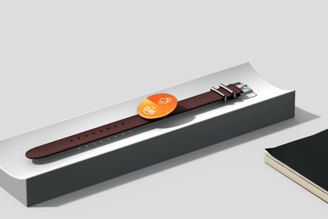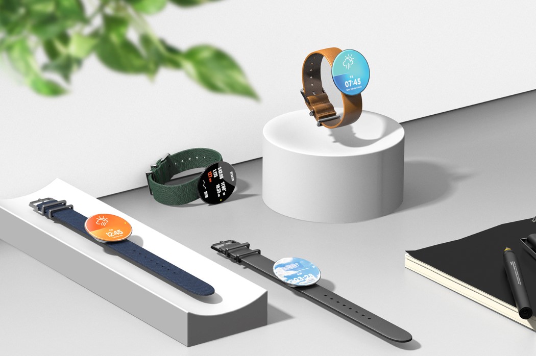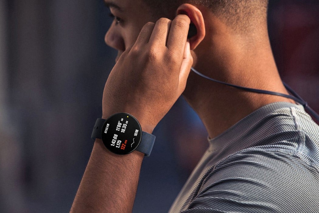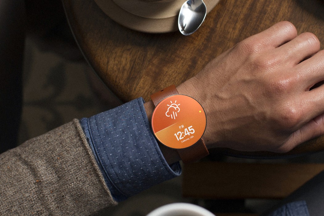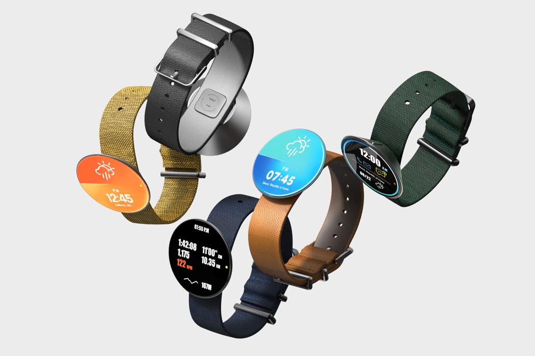
With an approach that strikes a fine balance between tech, sensibility, and sheer artistry, the Circle Watch is truly #smartwatchgoals. It’s beautiful to look at, has an edge-to-edge circular display, runs an incredibly clean UI, and comes with a body that looks unusual at first, and then makes a world of sense after.
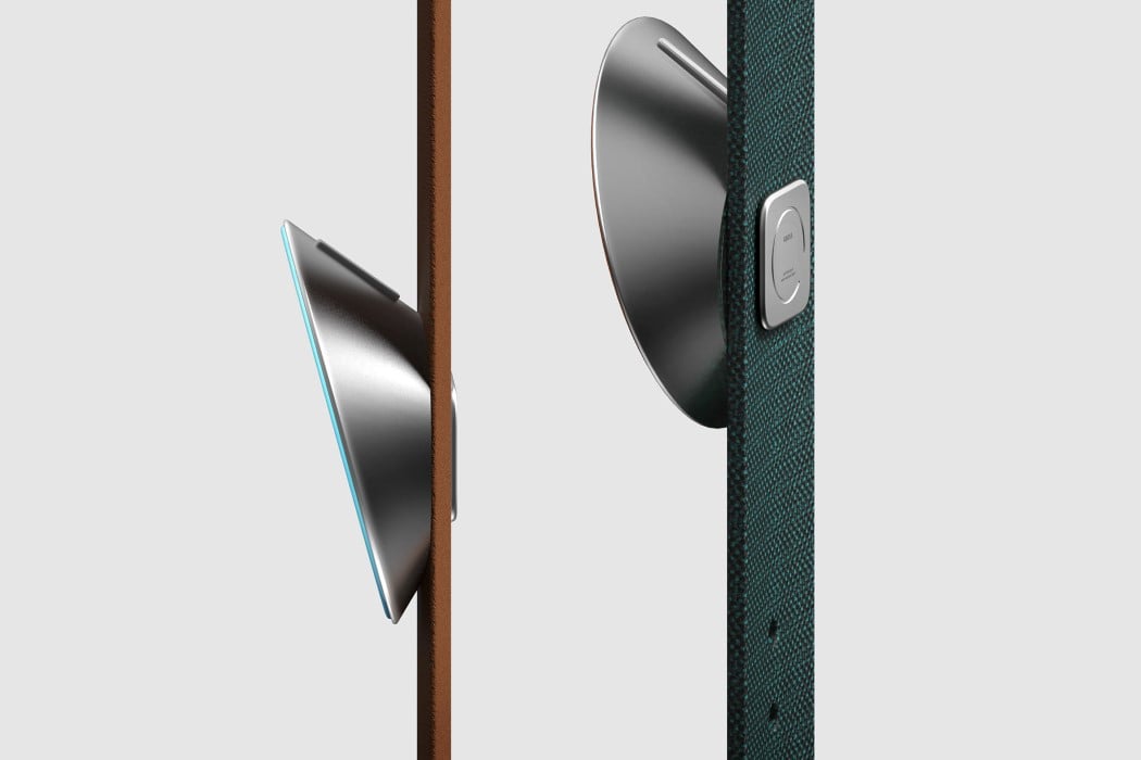
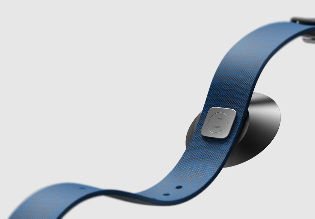
The Circle Watch’s body sits on the watch-strap at an angle, leaning towards the user. Designed to make it easier to read the time without tilting your wrist too much, the Circle watch’s own inherent 15° tilt gives you a clear view of the watch’s always-on display at all times. This tilt also creates space for a button right behind the Circle’s body, allowing it to remain otherwise thin and minimalistic. The button hides from view (unlike in the Apple Watch, where the crown forms a significant part of the watch’s aesthetic), giving you a smartwatch that just feels clean and sophisticated, and focuses on the good stuff with a convenient, tilted UX and a boundless, edge-to-edge UI.
Designer: Jeong Kim (Weekend-Works)
