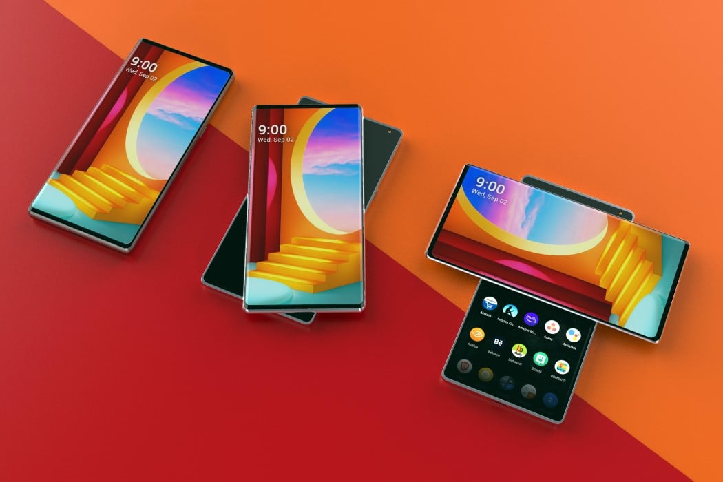
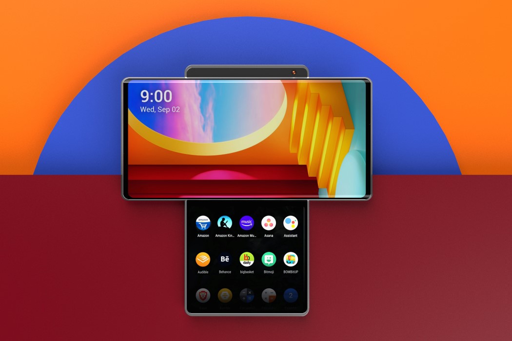
I didn’t think I’d get excited for smartphones in a while and I surely didn’t think Motorola and LG would be the companies responsible for that feeling. Earlier this week, LG “leaked” a video of their upcoming smartphone in action. Codenamed the Wing (as opposed to Samsung’s Galaxy Fold), this smartphone reinvented the candybar mobile format with a swiveling screen layout. Designed to behave a lot like the LG VX9400 smartphone that Tony Stark used in the 2008 Iron Man, the Wing featured a front screen that rotated 90° and slid up to reveal a second screen underneath. While LG’s leaked video wasn’t much of an aesthetic reveal, it definitely did a lot to show what the company had in store for the future of phones – a future that promised multitasking without horrible hinges, delicate folding screens, and awkwardly thick phones.
The Form Factor
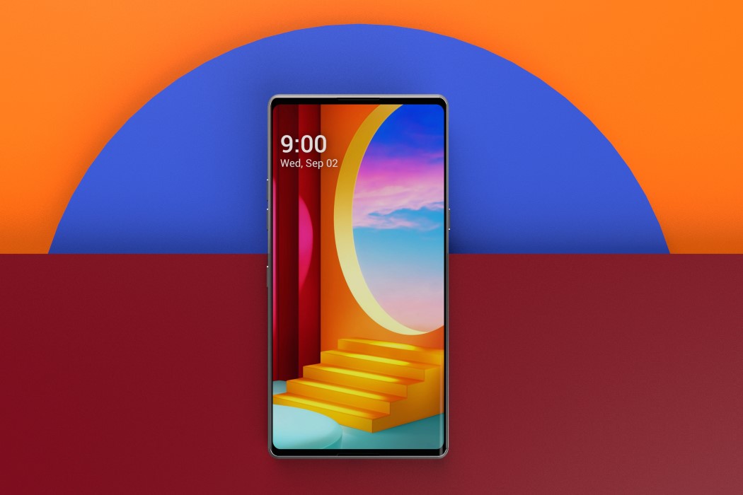
The Wing’s form is undeniably unique when opened, but what’s great about it is that it’s still a regular smartphone when closed. It doesn’t come with a thick body or an unusual gap (like the Galaxy Fold). When closed, you’ve got all the benefits of a regular smartphone, but open it up and the swiveling format really reveals a new side of smartphone computing to you. With two screens (or one and a half screens, if you compare the surface area), the Wing feels refreshing, and in a good way. Here’s why.
Two regular screens are better than one big one
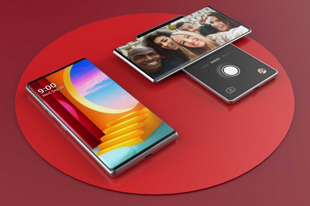
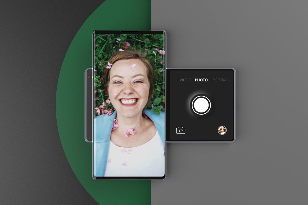
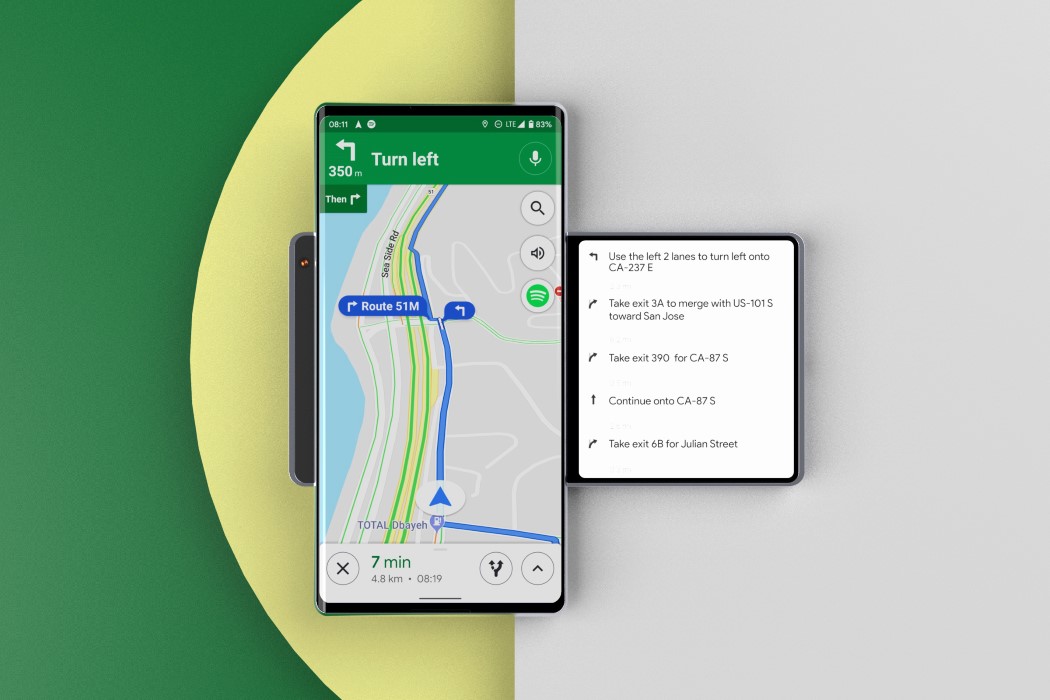
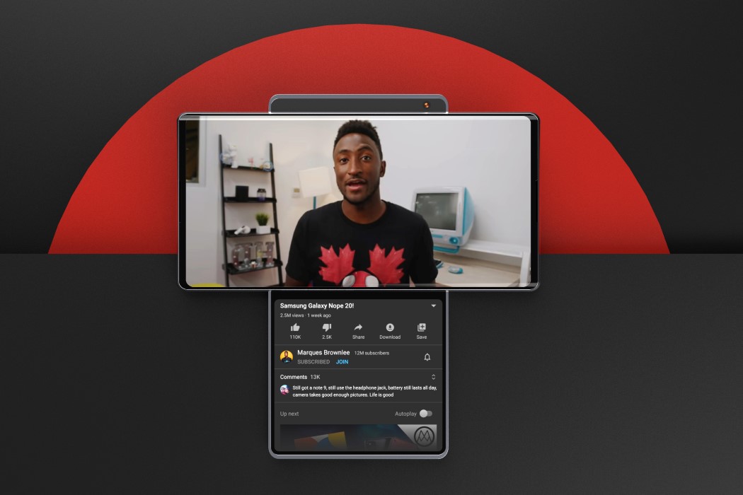
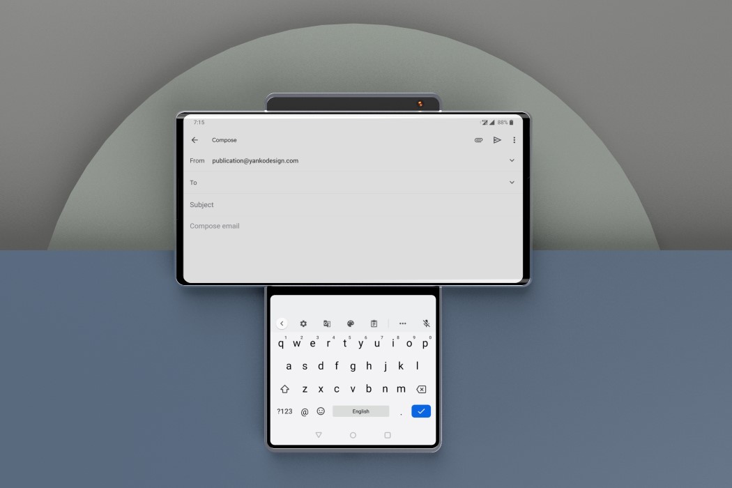
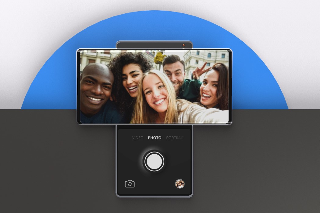
Here’s a statement worth thinking about. A bigger screen doesn’t enable multitasking… more screens do. No matter how large your laptop or tablet’s screen is, chances are you don’t really multitask on it – you just do the same stuff, but on a bigger screen. This fundamental realization is something that sets the Wing and Microsoft’s Surface Duo apart from most folding smartphones. Physically separating screens really makes it easier for your mind to separate tasks, and that’s something that works to the benefit of the Wing. Moreover, its split-screen layout makes the UI of apps really interesting. You could be watching YouTube on the larger screen and browsing related videos on the smaller one. You could even be using Whatsapp or Gmail in landscape while typing in portrait on the smaller screen. The split-screen helps split elements of an app’s experience, allowing you to separate information in a sensible way. Think about having Spotify running on the larger screen and the playback buttons on the smaller one, or Netflix on the landscape screen and the subtitles on the lower screen, not interrupting the visuals you see. Even if you consider something as basic as the camera app, the Wing’s dual displays really help make clicking selfies and taking videos easier, just by being able to space out elements effectively, and separate the visuals from the controls for a cleaner, easier-to-use interface. A split screen helps really effectively split up information, and if done well, can result in a much more sensible user experience.
The Pivot vs the Folding Hinge
The swiveling pivot detail gives the LG Wing a major durability edge over folding smartphones. The hinge is often considered the Achilles heel of the folding smartphone, and is often the first component to fail. By abandoning the hinge detail, the LG Wing coolly circumvents the inherent problems that hinges have. The swivel mechanism sits INSIDE the smartphone rather than outside it, protecting it from any accidents, and here’s the best part… the absence of hinges allows the Wing to be much thinner than traditional folding phones.
The Bezel-less display
This has to be by far the most exciting part about the Wing. The swiveling screen can afford to have a truly bezel-less design, simply by shifting the front-facing camera to the panel behind it. Apart from being an aesthetic upgrade (because bezel-less displays look incredible), it makes the Wing safer too, by allowing you to physically block the front-facing camera when you don’t need it.
No folding display, no problems
As glamorous as folding displays look, they have two massive, fundamental problems. Larger displays need bigger batteries, and more importantly, if you fold anything, it’s bound to crease. The LG Wing’s refreshing format avoids those two problems almost completely… with regularly sized displays that don’t strain the battery as hard, and the absence of a display-crease because there’s really no folding involved.
At the end of the day, even though all we got was a mere microdose of what’s cooking at LG’s headquarters, it was enough to prove a few things… that there’s still room for innovation and improvement in smartphone designs, that folding screens may not be the way moving forward, and that the swivel-format is more than just a fancy gimmick… it’s actually sensible, and has the potential of completely revolutionizing the way we interact and multitask with phones, apps, and interfaces.
Designer: Sarang Sheth
