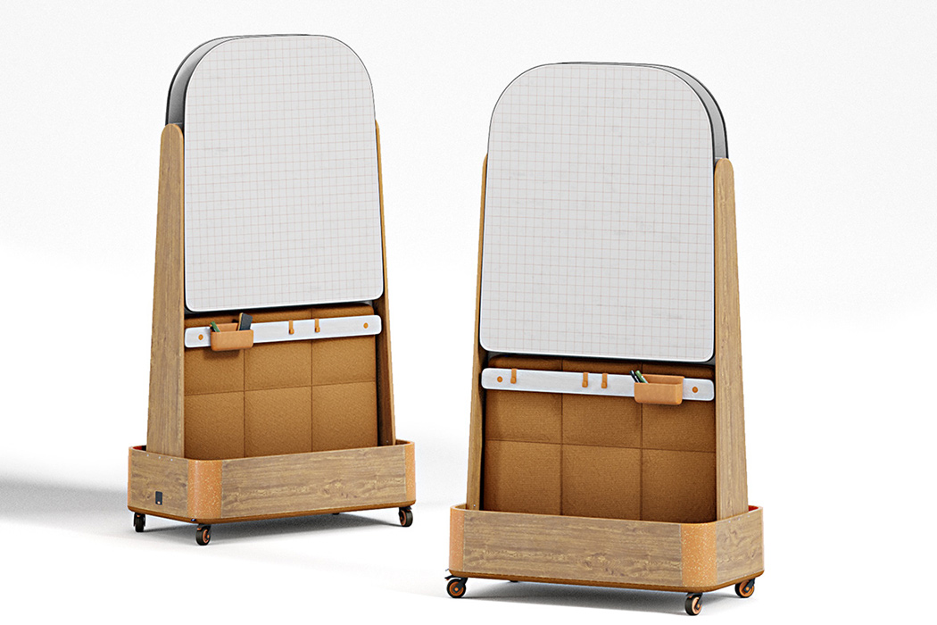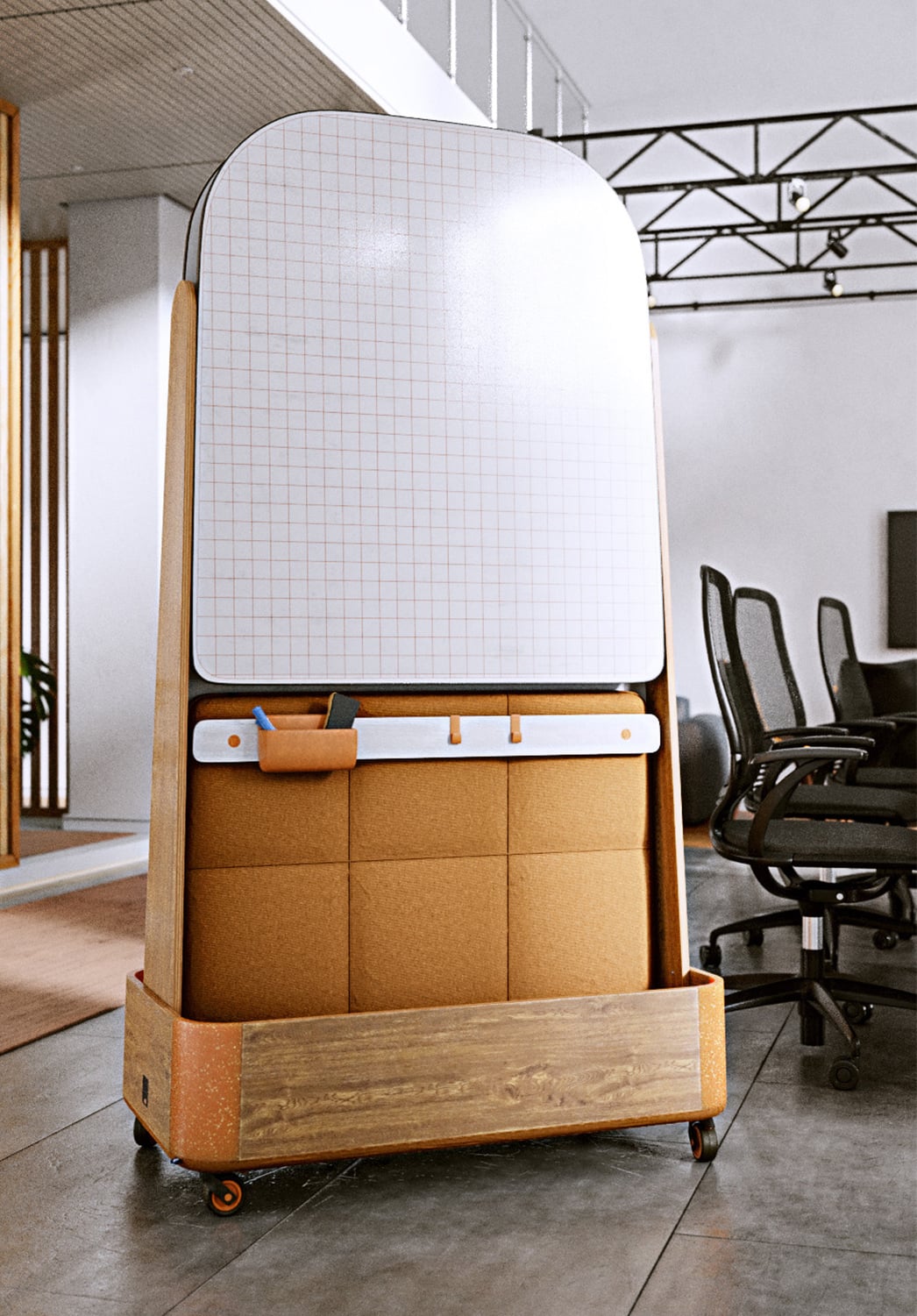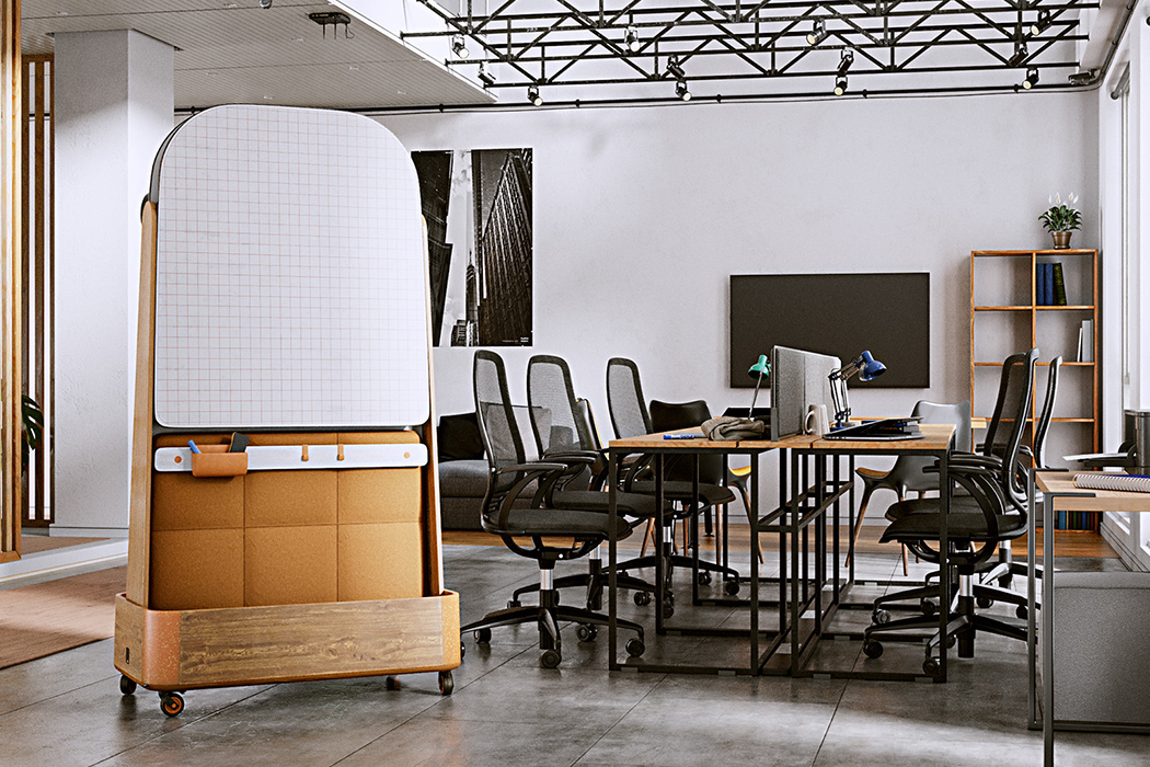
When I think of a whiteboard, I imagine a rectangular drawing space framed by painted steel or aluminum: a purely utilitarian design. I don’t imagine whiteboards as practical and decorative pieces for an office space. That is what makes the OMI whiteboard room divider unique: it reimagines what an office partition can be.
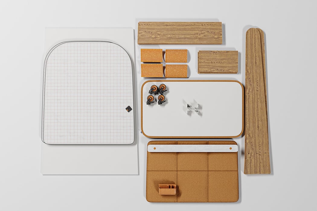
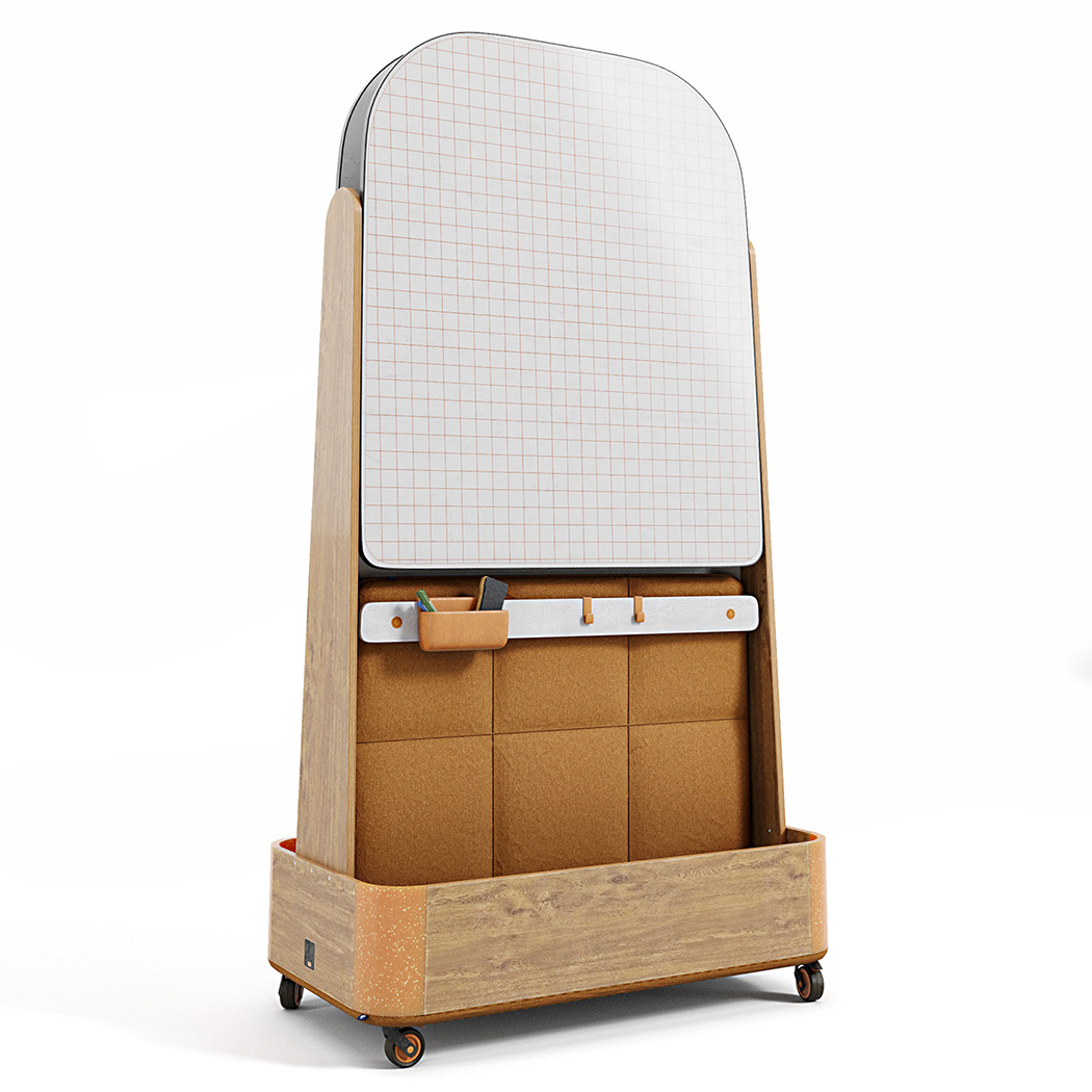
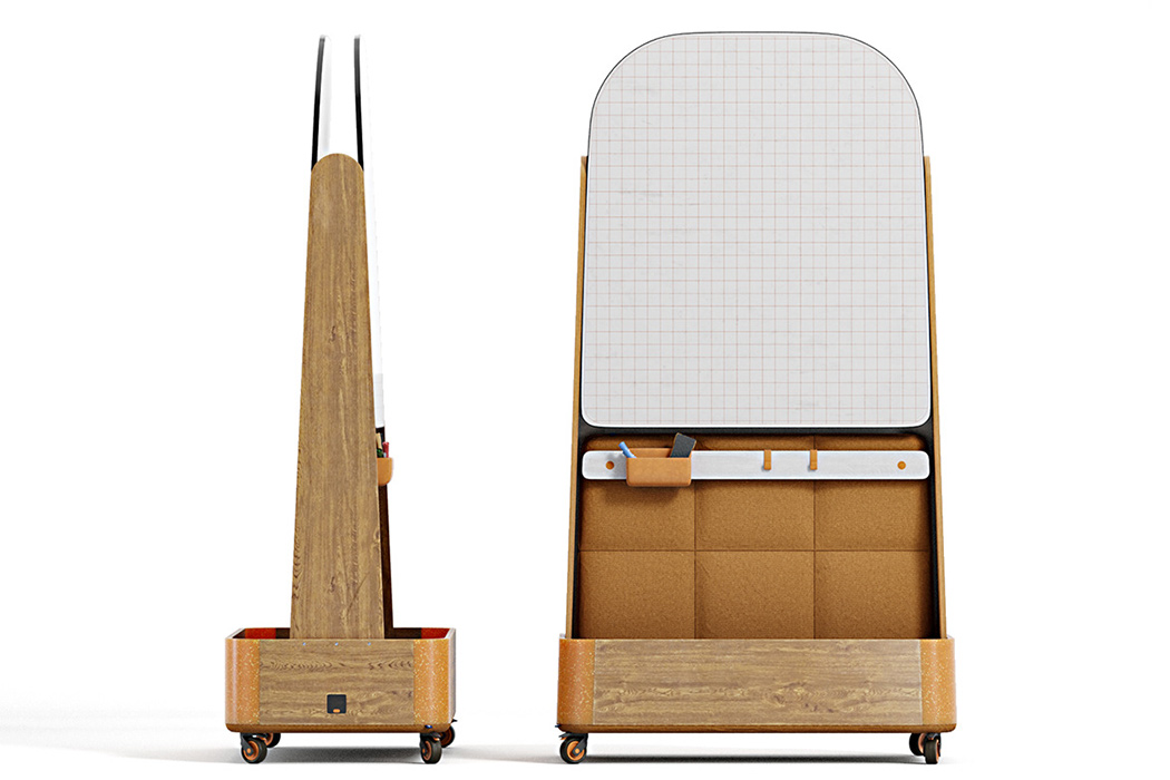
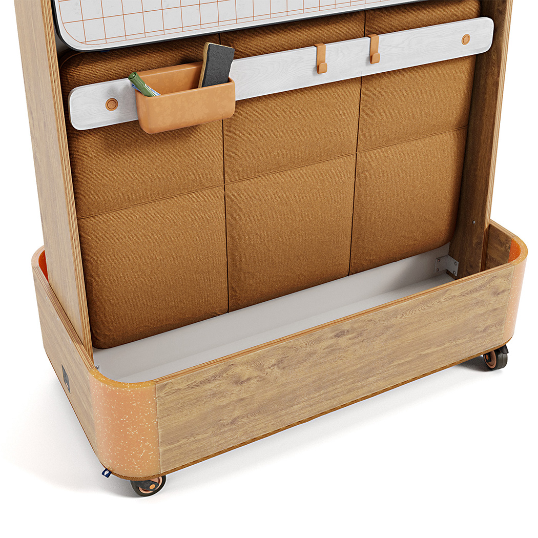
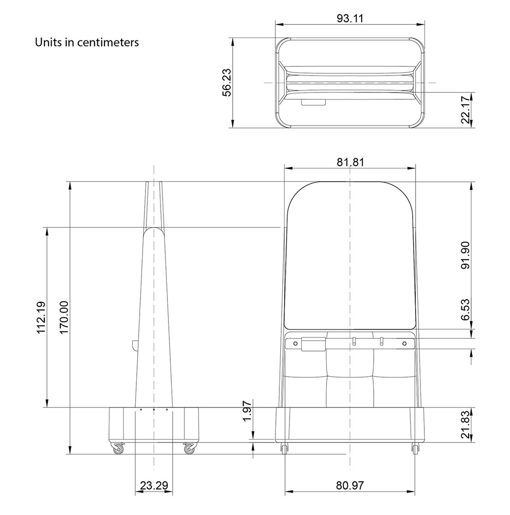
Several design elements deviate from what we expect from a whiteboard or a room divider. First, its frame uses wood instead of gray or black material, which normally blends into the background. In contrast, the OMI’s frame is its most noticeable feature — more so than the whiteboard itself. It looks thicker and heavier than most whiteboards, but the wheels make it easy to maneuver through a room. The individual parts also look easy to dismantle and reassemble, adding to the product’s mobility.
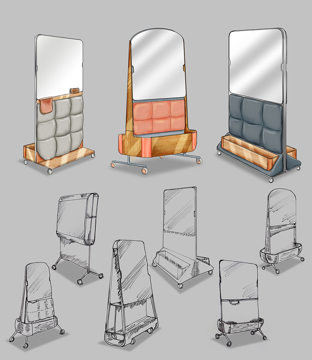
The OMI’s shape is also quite unusual, resembling a full-length mirror more than a whiteboard. Its frame is quite bulky, not the most modern or sleek design, but I think it makes the most of its build by including sound-absorbent pads and storage bins underneath the whiteboard. This shape might be the best design choice considering its thick wooden frame, but it also limits the available drawing space.
Overall, the critiques mentioned above are minor. The OMI room divider isn’t trying to be the most utilitarian option, but a happy medium between looks and practicality. I imagine this product as a homey cubicle divider for an open-office, something to brighten up your workspace or classroom.
Designer: Sebastian Medrano Casas
