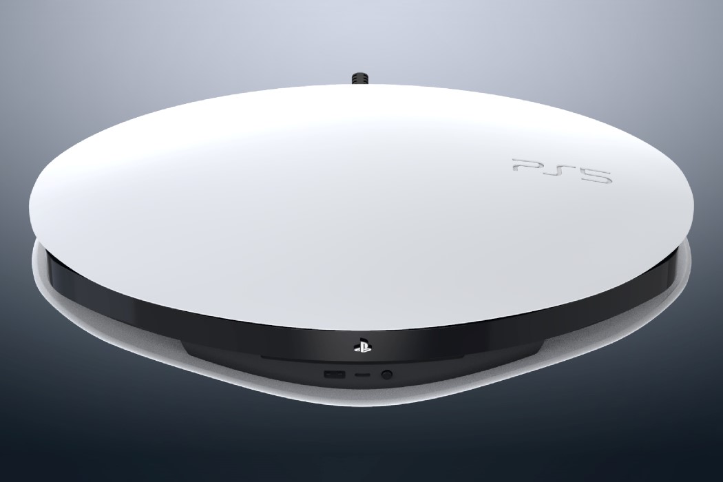
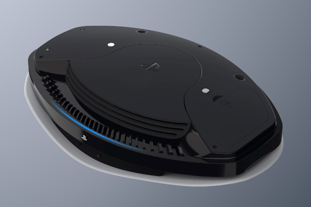
Could we, collectively as a species, agree on just one thing? The Playstation 5 pushes the hyper-organic design language a little too far. Objectively, even though it looks better than the Xbox Series X (yes I said it… I like my gaming console to look like a work of art, not like something out of Minecraft), if the guys at Sony dialed down the organic, free-spirited aesthetic, the PS5 could easily be a stellar-looking gaming console. Speaking of which, feast your eyes on this absolutely beautiful alternative design for the PS5 by Riccardo Breccia.
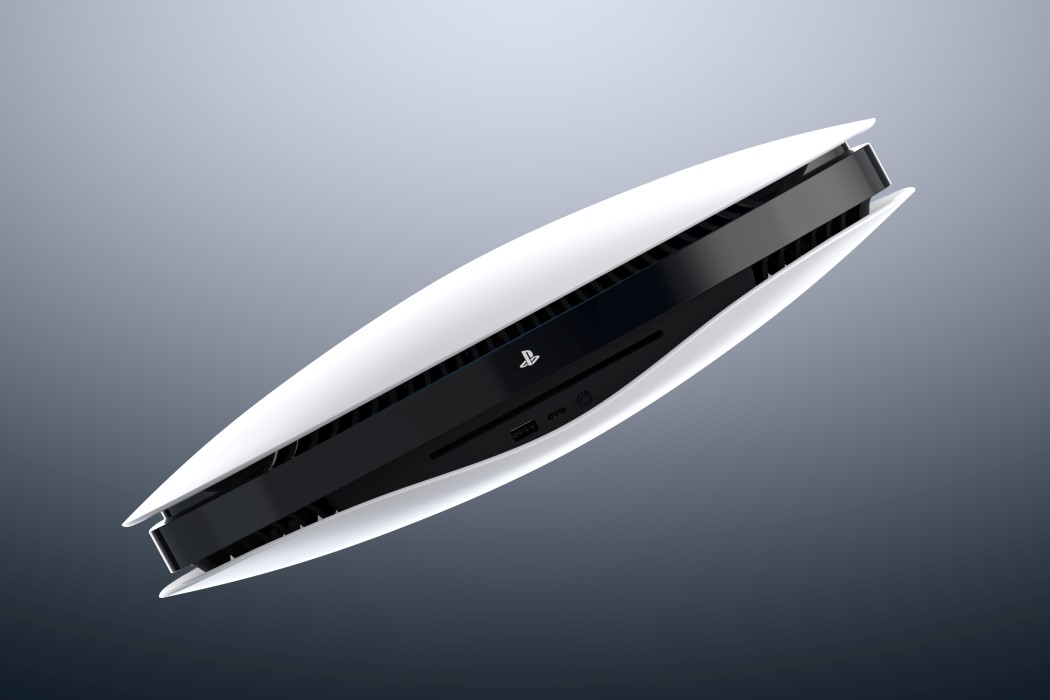
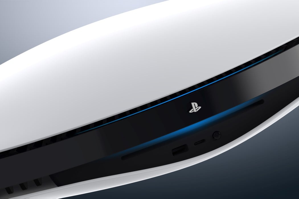
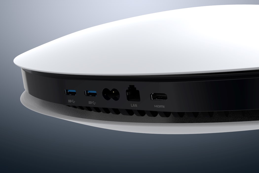
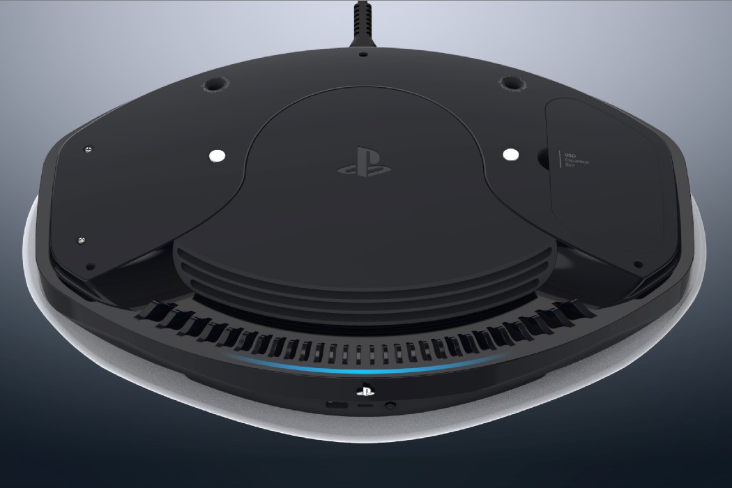
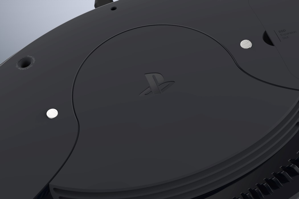
Breccia’s reinterpretation of the PS5 comes from the same place as those who criticize the company’s existing design… it scales the height down dramatically and makes it look less like an upright folder and more like a console, taking a page from the 1st generation Playstation’s design. Breccia’s PS5 sports a circular form that harks back to the circular shape that punctuated the design of the PS 1st gen. One much even draw parallels to the Walkman/Discman designs of the pre-iPod days. The PS5’s redesign is a lot wider than you’d expect, given the components that sit within. Breccia’s taken the liberty to even detail out where the inner parts would fit, along with a detachable upper-plate that reveals the fan below, along with an SSD expansion slot. The front of the console features a disc-slot right beneath the PS logo, along with a USB port for connecting/charging your controller. The remainder of the ports, including the Power Supply, Ethernet, and HDMI ports sit on the back, obscured from view.
Overall, Breccia’s PS5 design does a good job of reducing the original design’s shock-value. Breccia’s redesign is sensible and simple (like the Xbox Series X), but does take the liberty of playing around with interesting forms, curves, form-separation, color-separation, and CMF, resulting in a design that should somewhat please both the people who love the PS5’s audacious design, and the people who appreciate the Xbox Series X’s overt simplicity.
Designer: Riccardo Breccia
