Apple is in the news again with a mysterious new rumor that they are launching a new product. While the company has already done an unprecedented number of product launches this year, experts wage a war – guessing the launch today can be anything from the MacBook Pro with their new M1 chip (fingers crossed it is this one) to the AirPods 3 making a reveal just in time for the Christmas shopping to hit its spree. Either way, whatever Apple reveals, they sure have the world excited with their ears perked up at the idea of seeing a new design. Speaking of the excitement for all things Apple, this post contains the best of Apple-inspired designs we have curated – showing designs that have the potential to shock, awe, and have us demanding Apple to convert these concepts to reality before next Christmas!
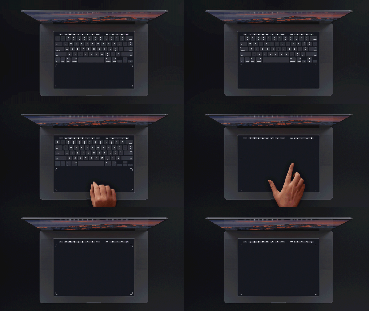
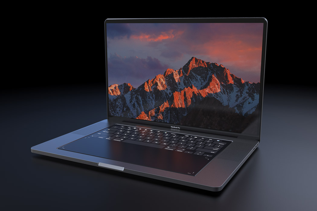
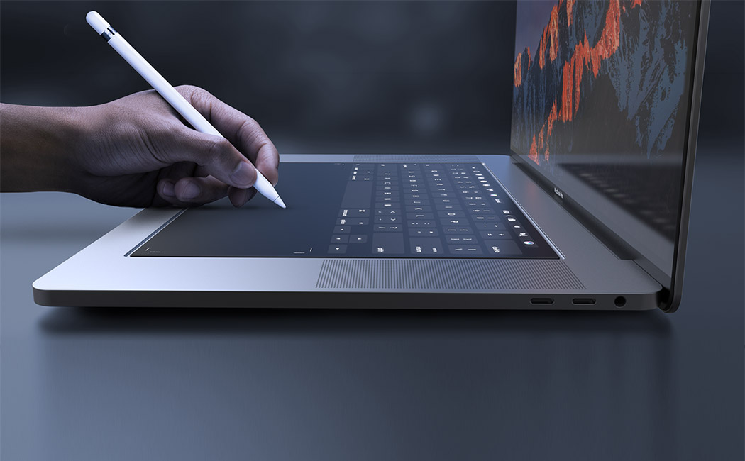
Designed with designers in mind, this MacBook Pro 2018 concept by Daniel Brunsteiner explores the integration of a full-size touchpad in place of the traditional keyboard. It relies on Apple’s own Taptic Engine system to give the user the feel of physical buttons or even emulate a scroll wheel or sliders. It retains the touch bar for shortcuts and function keys but the entire surface is touch-enabled! Better yet, now Apple Pencil is compatible with the new MacBook Pro, helping creative professionals in their workflow and allowing for new applications using the touchpad area.

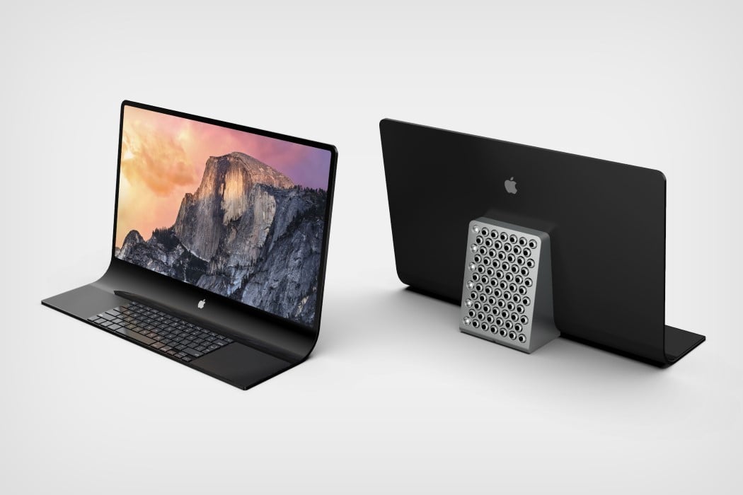
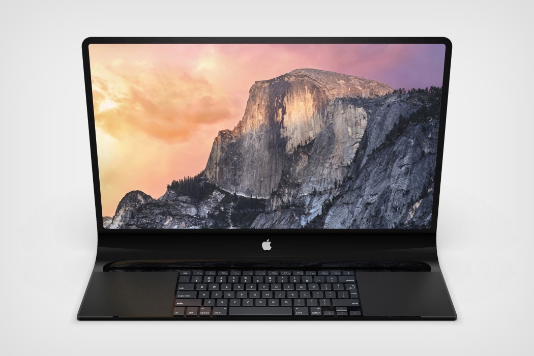
The concept visualized by our very own Sarang Sheth showcases an interesting monolithic take on the all-in-one Macintosh, featuring a slick unibody glass that transitions from screen to keyboard in one grand, singular motion. The screen literally folds downwards as soon as it hits the desk to provide a precipice for a keyboard as well as two track-pads that reside within the glass. All in all, the entire thing looks rather Dali-esque. This impressively thin form factor allows Apple to isolate the actual computer into a block at the back that helps prop the glass facade up. Complete with a smorgasbord of ports (and that cheesegrater CNC-machined grille that Jony designed exactly a year ago), the grille sits at a slight tilt too, allowing heat to travel outwards and upwards. The new take on the iMac Pro allows Apple to keep its all-in-one desktop computer looking incredibly slim without sacrificing on power and performance.
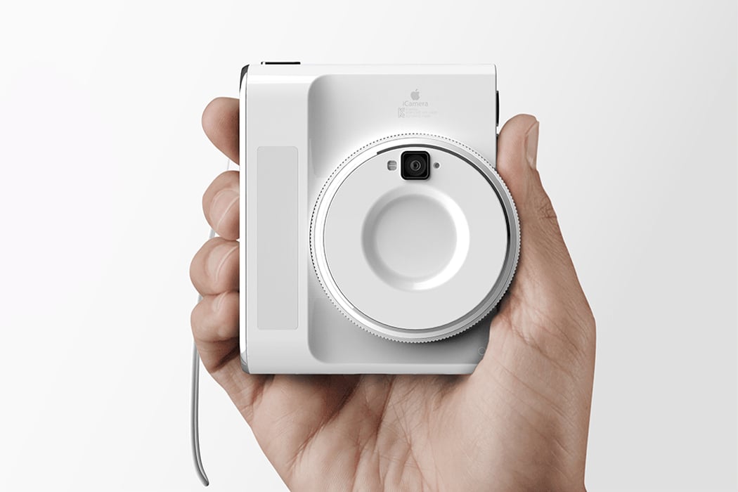
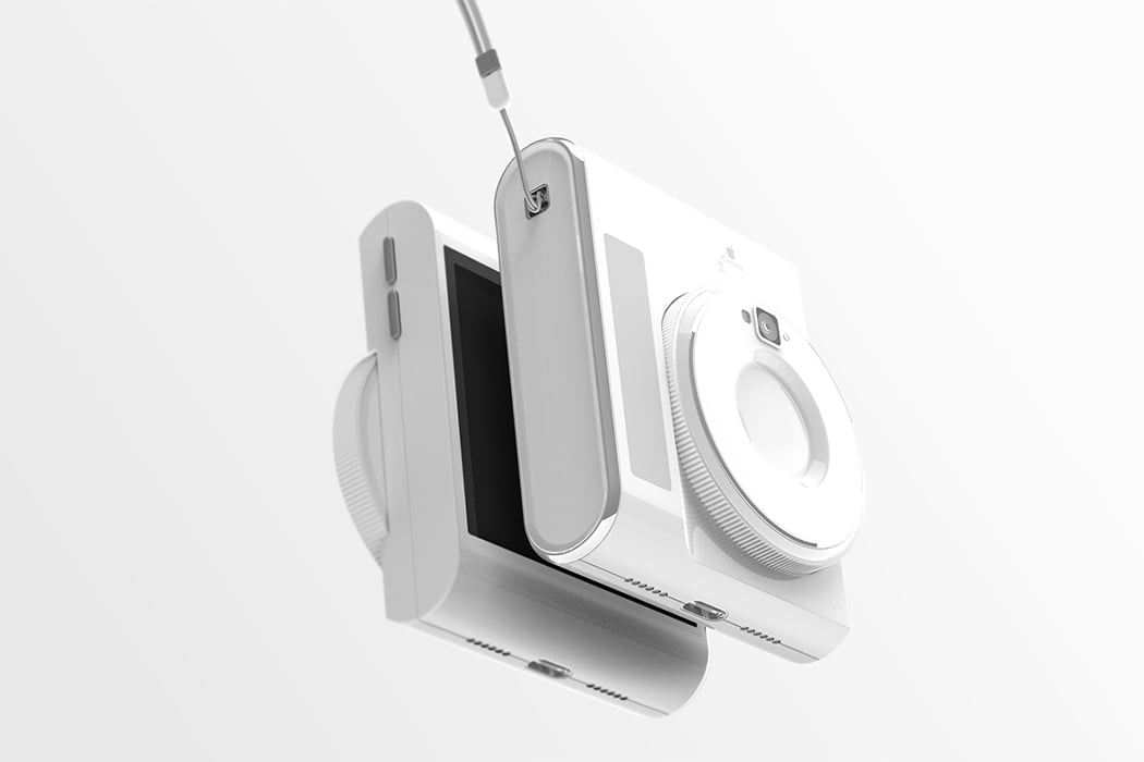
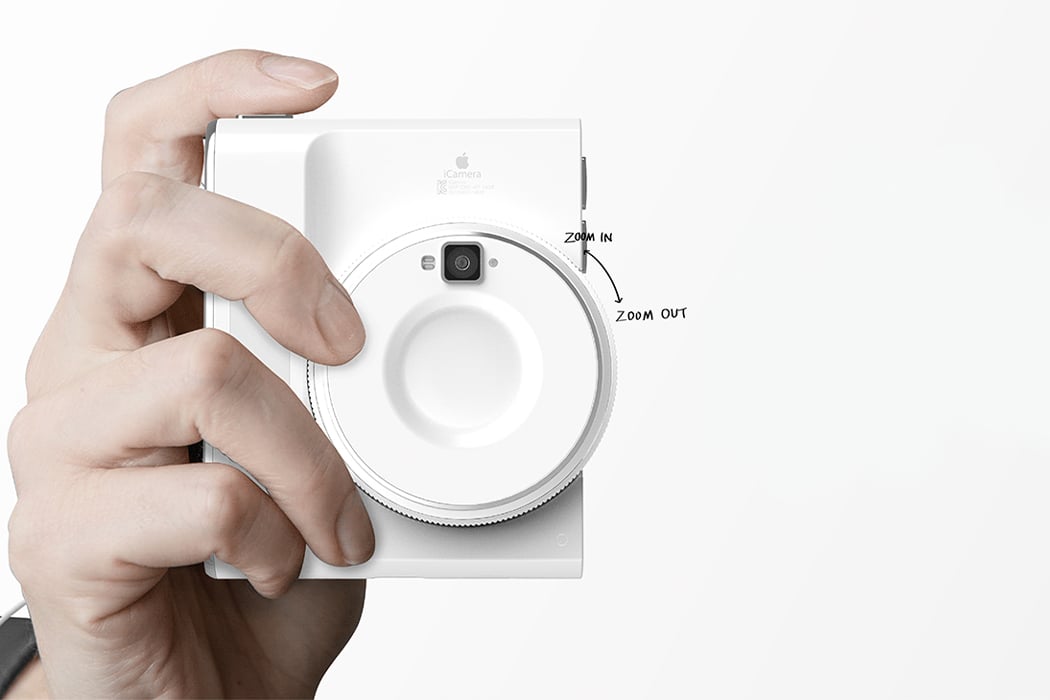
Get those professional shots without having to study the manual and watch several YouTube videos, the iCamera by Cha Hee Lim aims at breaking down the complexity of advanced cameras to make people comfortable with the idea of shooting with a gadget that is not their phone. “It increases your ability and easily leads you to the world of cameras,” says the designer about the gap he wants to bridge with this concept design. The designer wanted to simplify the existing advanced cameras’ user experience by making the body more compact and lighter. The bulk of the lens is reduced but it still includes the revolving functionality to zoom. However, now you can do it comfortably with just a finger.
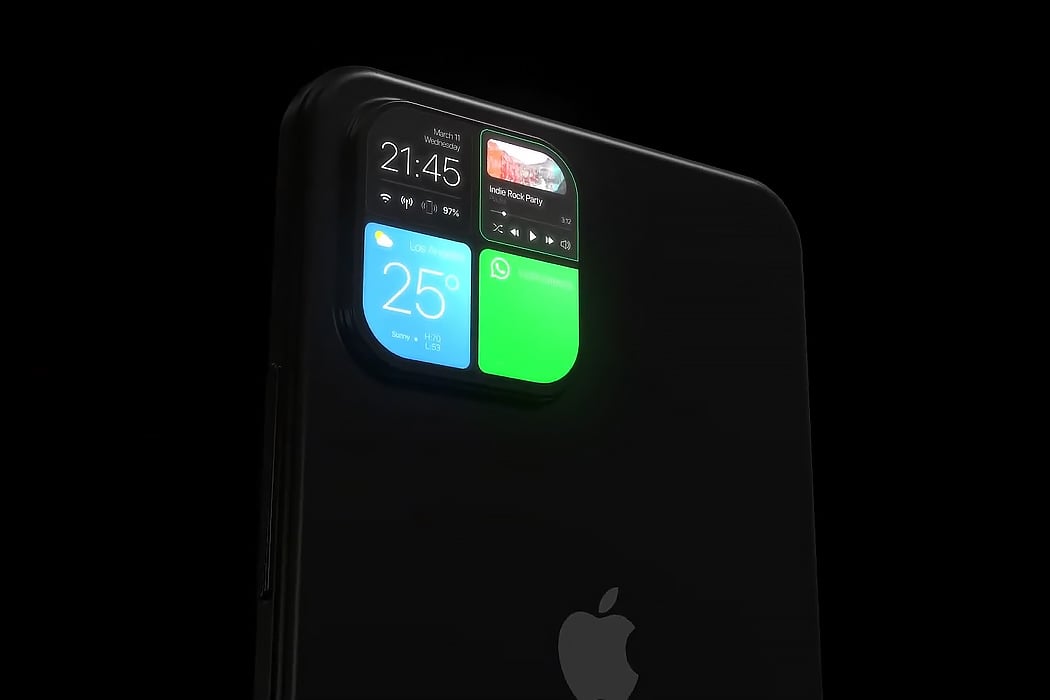
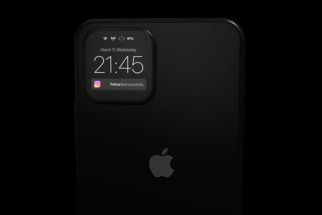
The iPhone 12 retains the dreaded notch that was established with the iPhone X – and while we look for changes in the screen of the phone, Furkan’s iPhone 13 concept makes us look at the camera notch in a whole new way and how! Firstly, the camera bump comes with 4 lenses now (maybe the macro lens is finally coming to the iPhone!) and doubles up as an instant notification panel. The UI of this notification panel borrows heavily from the well established and tested UI that the Apple Watch carries – showing everything from app notifications, widgets, and even your health statistics. We have seen conceptual tech showcasing a glass panel that doubles as a touchscreen, this would be the first commercial implementation of this technology, but one thing we know – if Apple actually does this, most of the newer models are soon to follow suit. The coolness factor of this design aside, the mini-display can help extend the battery life by reducing our dependency on the home screen to check our notifications.
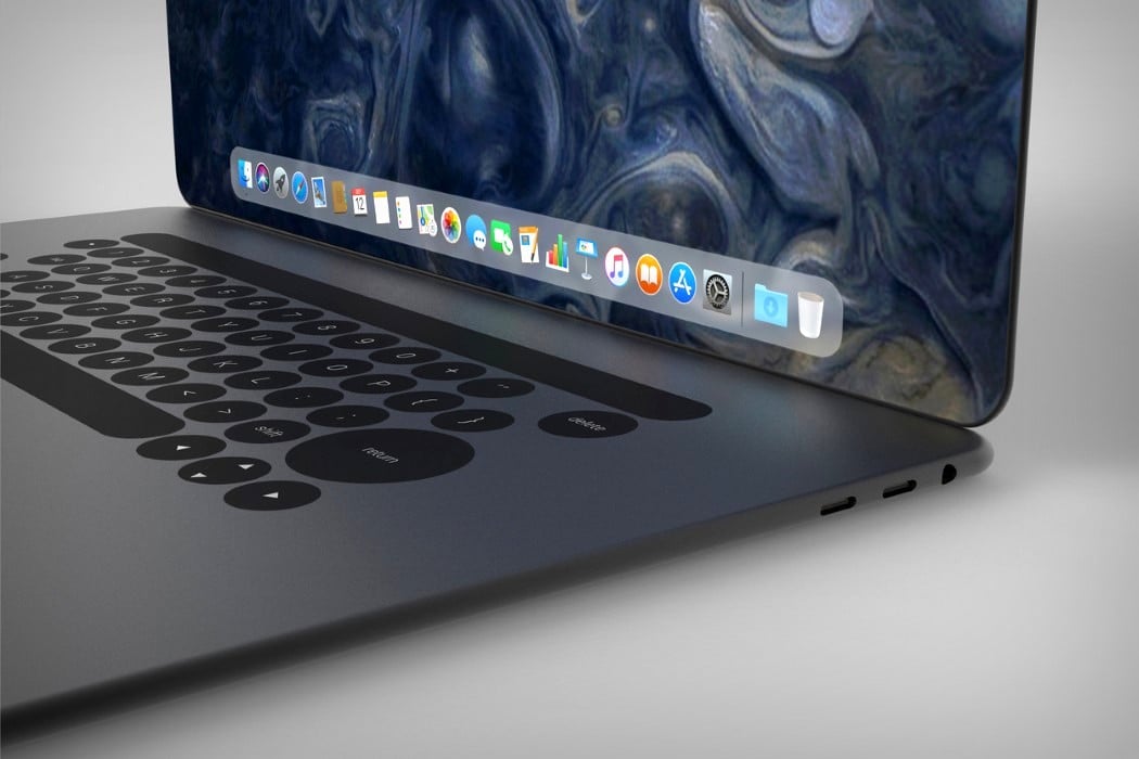

Ludovico’s MacBook redesign takes similar routes to the iPhone X and rather appropriately christens itself the MacBook X. Featuring a body that’s curved, rather than wedged, the MacBook X does a hat-tip to the iPhone and looks less susceptible to horrible denting given the lack of a sharp edge. It also explores a more expansive display that has those incredible curved edges and absolutely no bezels. The absence of a notch means there’s no webcam on the MacBook X, which does raise questions, but none too serious, considering this is purely conceptual. Look down at the bottom half and you’ll see the touch-bar is still there, sitting above what I can only say is a keyboard that feels much too different. Deviating from the regular square-keyed board, Campana’s MacBook concept takes on a circular key design, which I honestly have conflicting opinions about, but then again, conflicting opinions are all too common in the domain of consumer electronics… aren’t they?
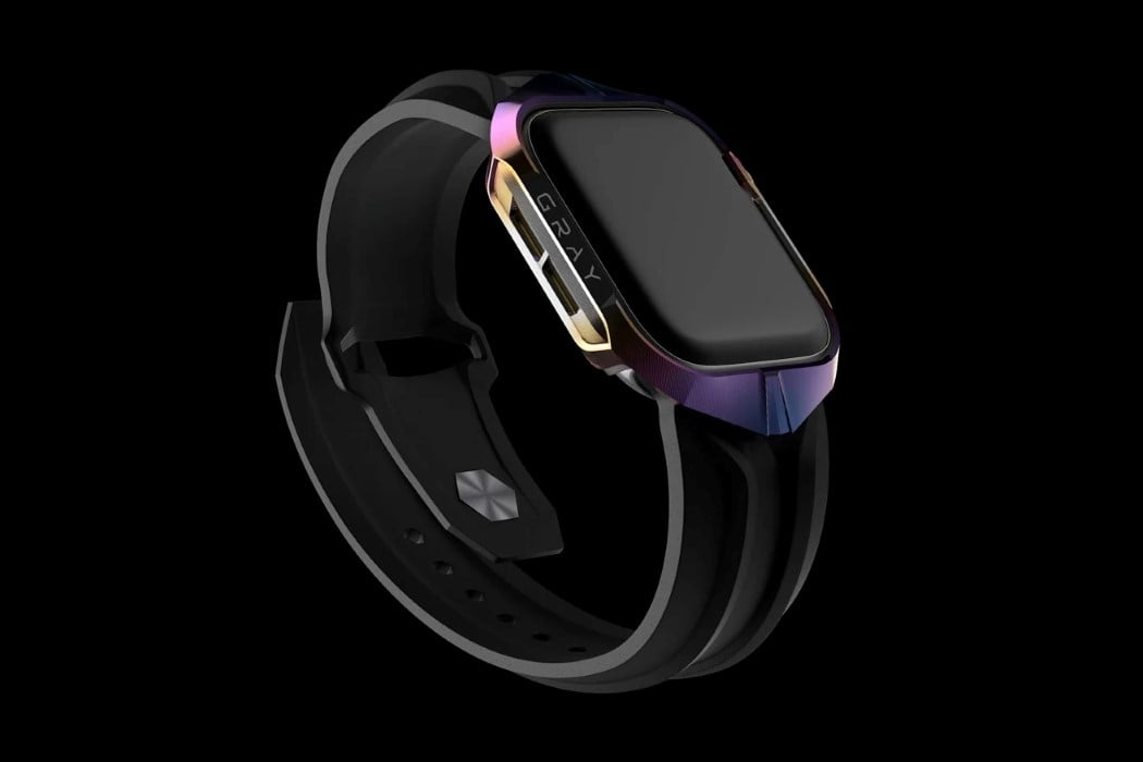

This mechanically-textured CNC-machined titanium case makes your Apple Watch look like (and possibly be as strong as) the Cybertruck. Designed by the guys at Gray Inc., the Cyber Watch skin gives the Apple Watch a certain sculptural quality that channels Tesla’s design aesthetic, opting for something more eclectic than Apple’s sleek aluminum styling. The Cyber Watch is equal parts rugged and modern, with an exterior that is as captivating as the watch’s UI and features themselves.
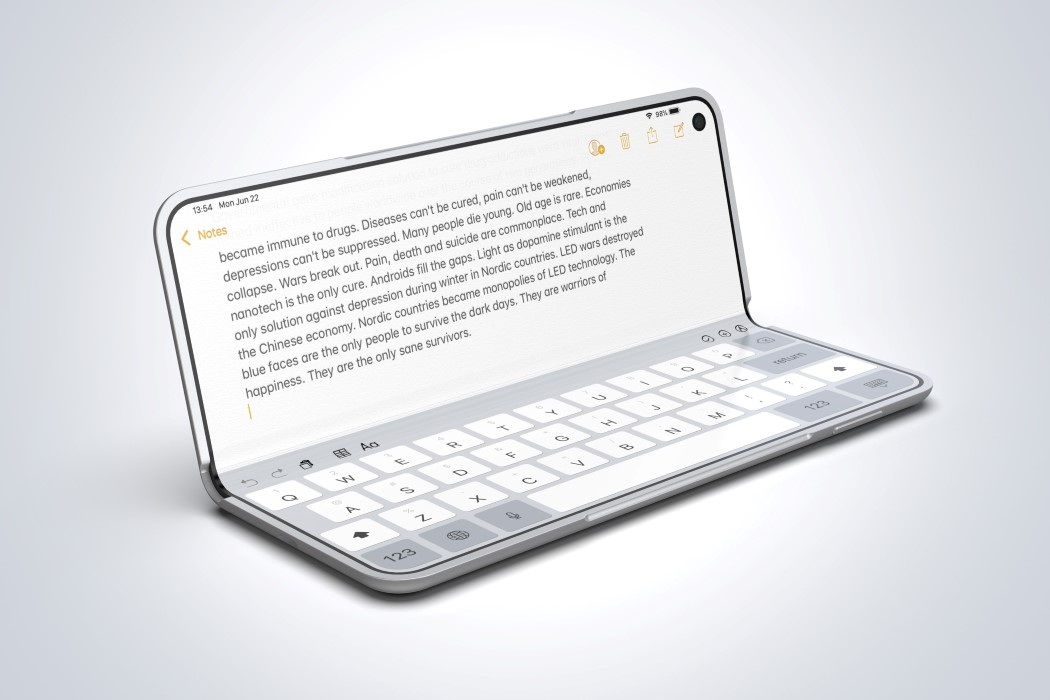
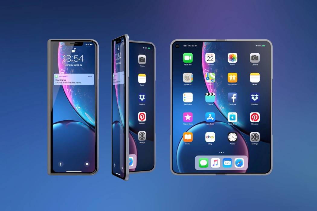
If you look at the iPhone X Fold’s OS by Roy Gilsing Design, you see that it’s essentially an iPad Mini folded in half… a desirable #bendgate if you will. It features a secondary screen on the front that resembles the iPhone X (why it features the notch, I’ll never know), but its most unlikely yet apt inspiration comes from one of Apple’s most reliable products ever, the MacBook. The XFold features an inward screen as the MacBook does, and even comes with the same anodized aluminum finish. Look at the rim and you’ll even see a slight cutout on the frame to slide your thumb in and open the phone, just like the MacBook has.
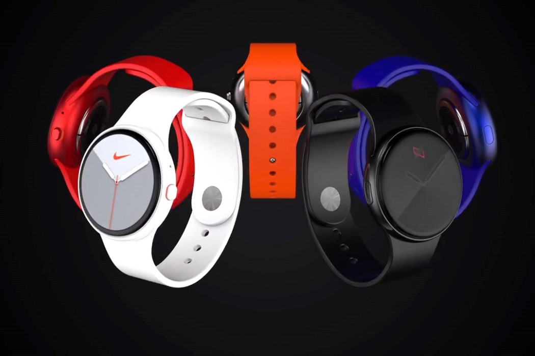
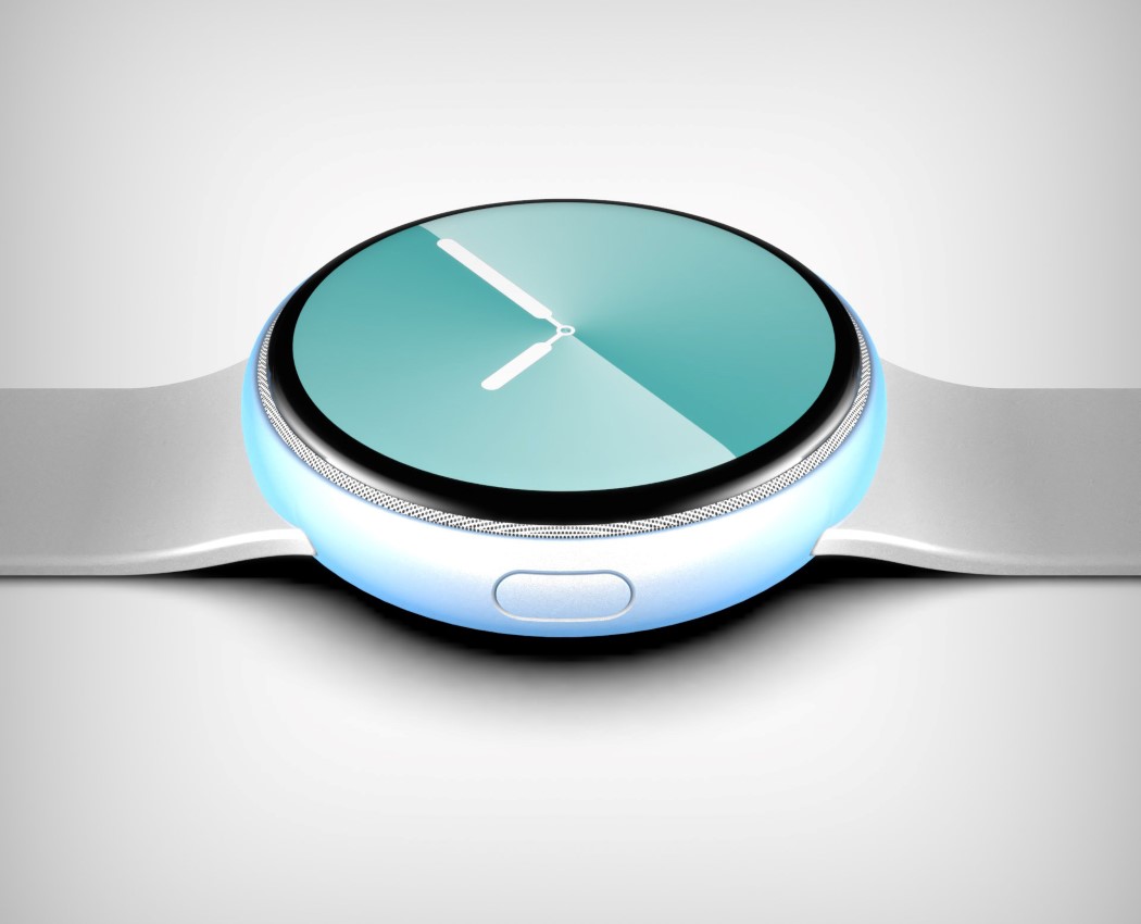
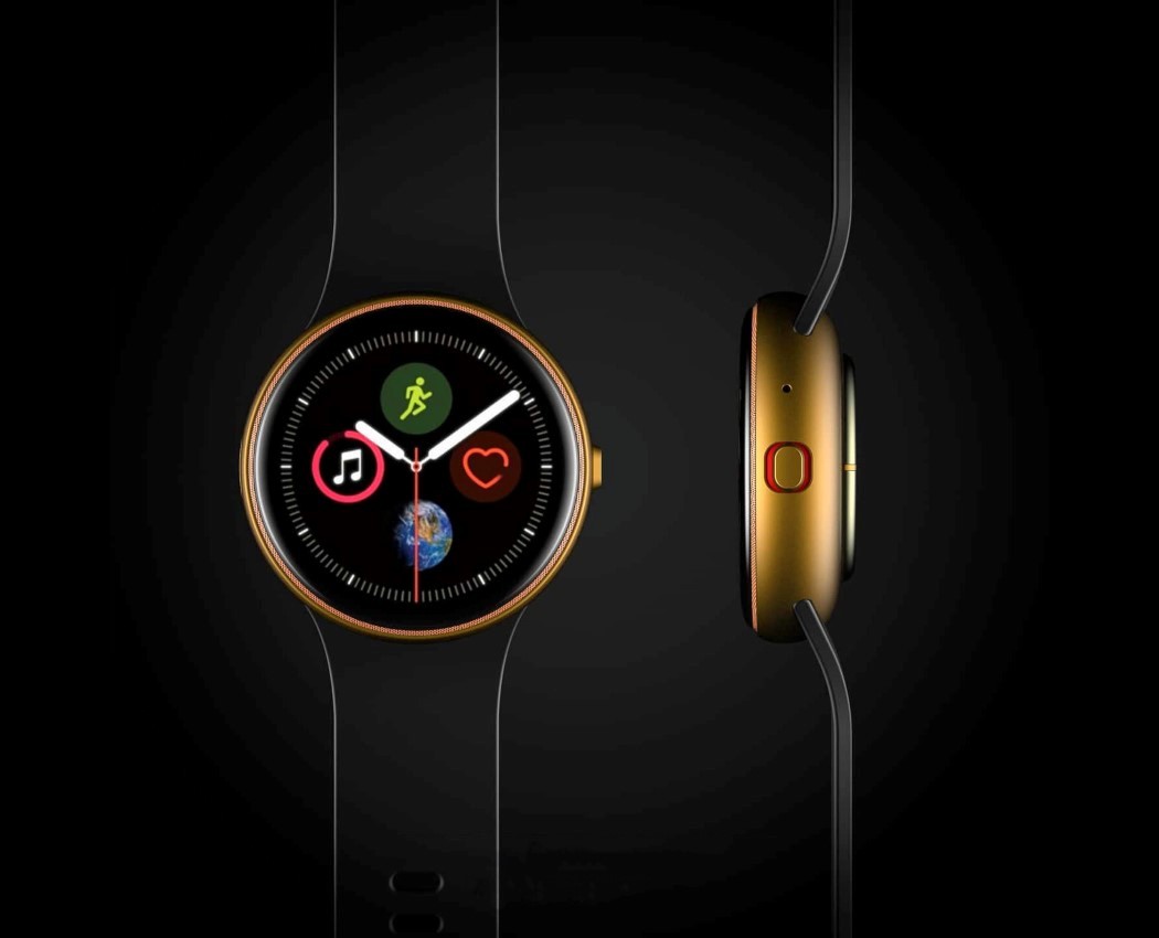
What could the Series 6 possibly do to be different from (and better than) the Series 5? A concept creator by the name of Phone Industry’s envisioned a radically different, circular Apple Watch 6… because why not. It features a Samsung Galaxy-inspired circular body and dial, with a thin bezel around the edge, and a speaker grill at the very periphery of the dial. It also ditches the rotating crown for a more standard tactile button.
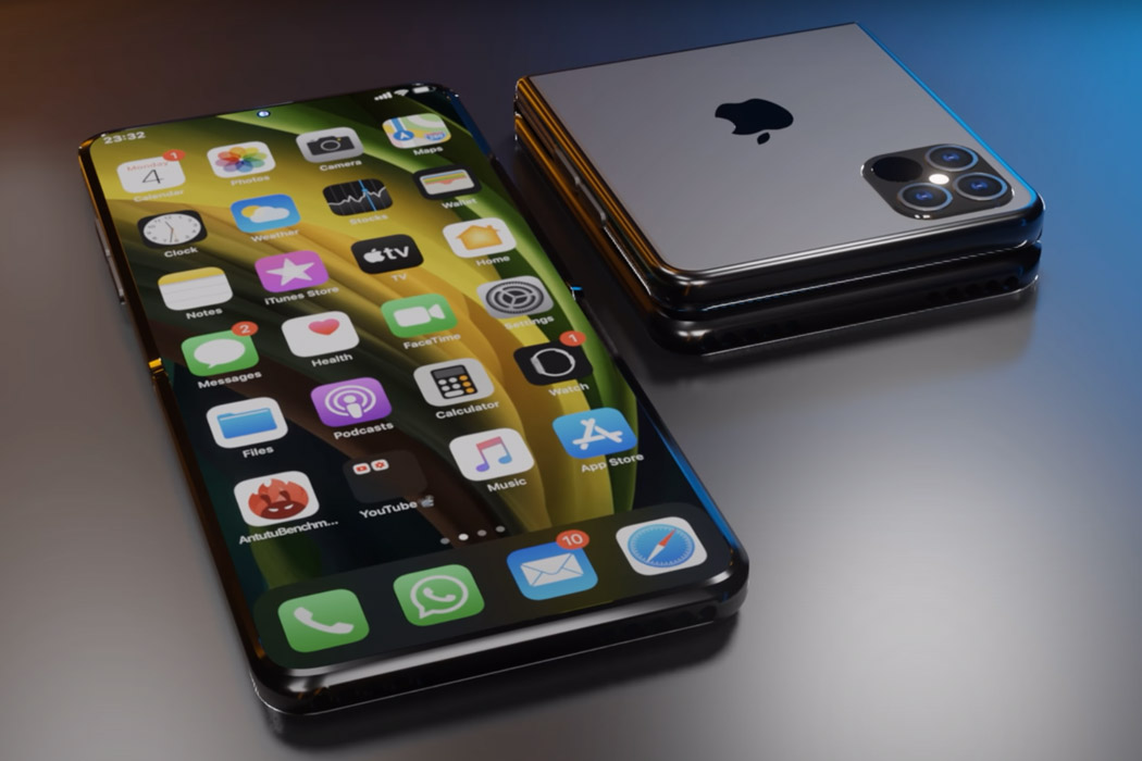
Traditionally iPhones have always been very compact and designed with one-handed use in mind. To that end, Samsung and LG have not constricted themselves and brought big-screen phones to the market that are tailored for multimedia consumption. That competitive push has forced Apple to increase the screen size gradually, as this year’s iPhone 12 Pro Max has a big 6.7-inch display. The Apple version of a folding phone could take design cues from the Galaxy Z Fold 2 if they decide to make it an all-out flagship-grade version, or go for a subtle Razr-like form factor if they desire to cater to a niche set of buyers. If we go by the patent filed by Apple, the conceptual iPhone 13 displayed here will have a crease-less foldable panel (like Galaxy Z Fold 2) and a folding mechanism similar to Motorola Razr – folding like a handy mirror. The early renders of the iPhone 13 are not exactly promising (for either of the versions) but we can count on Apple’s tendency to be thorough in its design testing and the result will be ready to shock and awe.
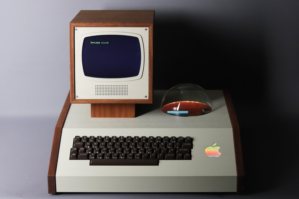
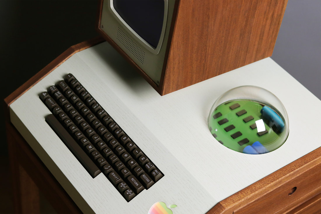
If you are a vintage curator of all things Apple, Aple is a bespoke, made-to-order, battery-operated display cabinet that encases original, ‘Woz-built,’ Apple motherboards from 1976 or later. Unlike Apple-I’s consumer products, Hultén’s display case comes equipped with a fully integrated keyboard and monitor protection framing that’s hand-constructed out of either black walnut or old growth teak wood. The wooden monitor housing perches above the display cabinet on an angled mount carved from the same wood as the rest of the case. On the display case’s right side, a pull out drawer reveals the motherboard’s circuitry. Mostly enclosed, Apple-I’s circuit board can be magnified by looking through the case’s plexiglass dome, resembling a crystal ball cut in half, which Love Hultén might have included to evoke 1970s era mysticism.
For more Apple-inspired innovations, check out the first part of this series!


