The air is buzzing with the news that Apple is close to sealing a deal with Hyundai to manufacture an electric Apple automotive! Excitement is pulsing through the entire tech world, and we cant wait to see what Apple has in store for us. The groundbreaking company never fails to surprise us, we always find ourselves biting our nails and squirming with curiosity, whenever Apple announces a new product launch! Their ingenious and mesmerizing designs and design philosophy have inspired and influenced designers all over the world, resulting in some pretty unique Apple concepts! These Apple-inspired designs are the best of the lot and a dream for every Apple lover. We just hope Apple converts them into a reality soon!
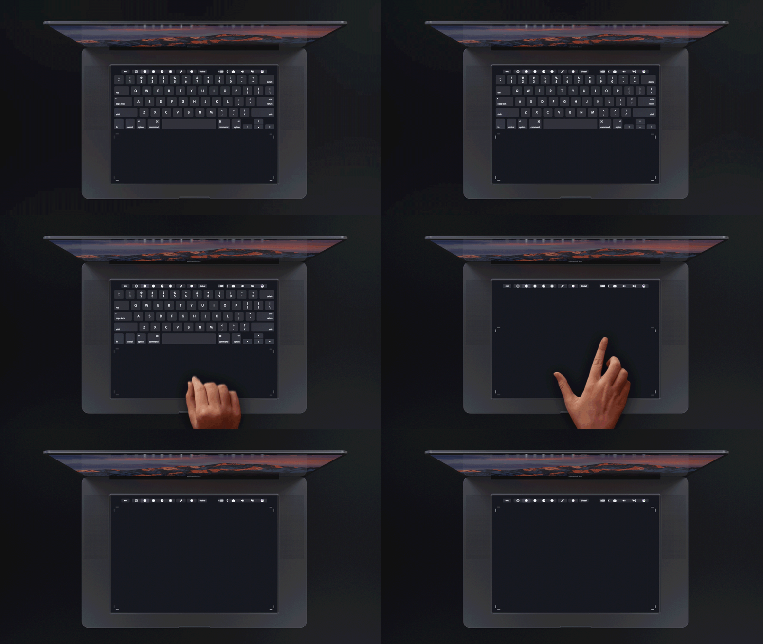
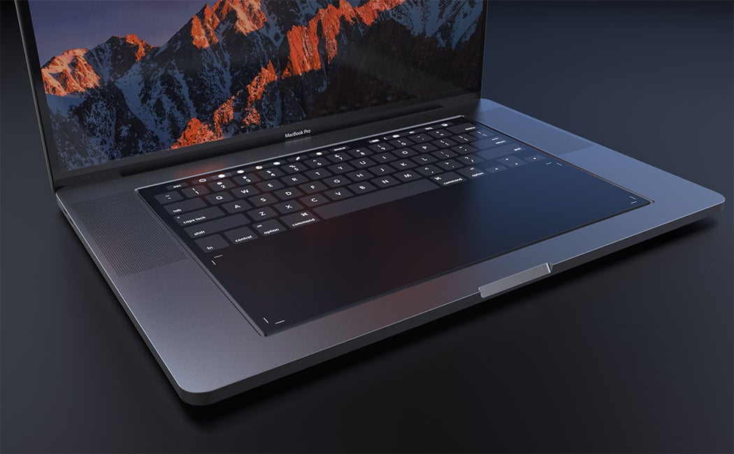
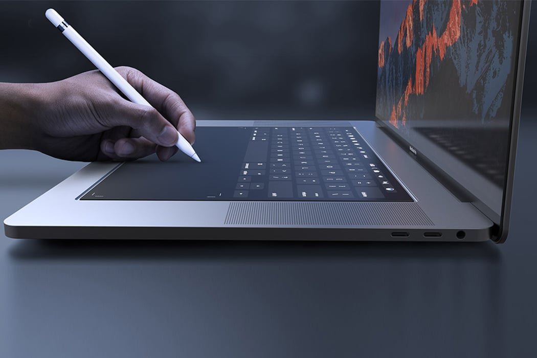
Designed with designers in mind, this MacBook Pro 2018 concept explores the integration of a full-size touchpad in place of the traditional keyboard. It relies on Apple’s own Taptic Engine system to give the user the feel of physical buttons or even emulate a scroll wheel or sliders. It retains the touch bar for shortcuts and function keys but the entire surface is touch-enabled! Better yet, now Apple Pencil is compatible with the new MacBook Pro, helping creative professionals in their workflow and allowing for new applications using the touchpad area. Now, software like Adobe Photoshop or Autodesk Sketchbook will be more powerful than ever!




With the news of the Apple car giving all of us jitters, we decided to explore another Apple automotive concept! And dare I say, I like this Apple more than any post-Jobs release?! Despite being an exploration in automotive design and not tech gadgetry, its minimalism and purity look quintessentially Apple and it feels like something straight out of the brand’s heyday. Designed by Alexander Imnadze, little is known about the conceptual specs except that it’s electric (of course) but put our pre-order in! We think Jobs might just approve of this one. This automotive design looks as if Jaguar and Porsche had a love child but with a quintessential Apple touch!
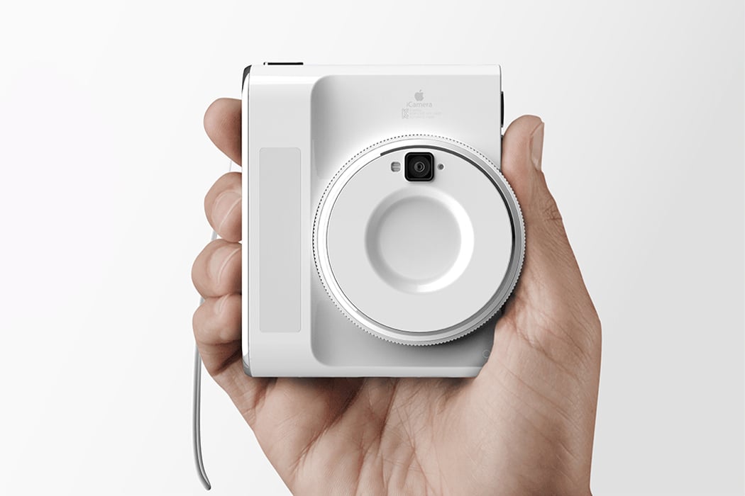
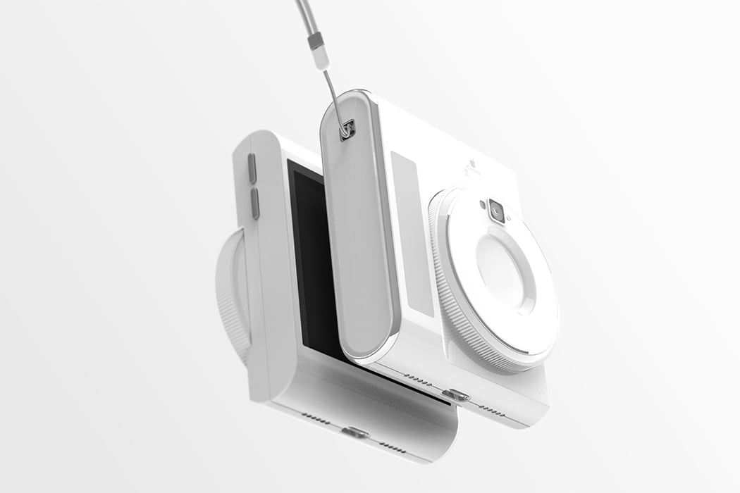
Ever wanted more than a phone camera but less than an advanced camera? This conceptual Apple-esque iCamera perfectly fits that gap! DSLR cameras can be daunting if you are just starting out but if you want to learn beyond the simple point-and-shoot then this camera is the perfect stepping stone into your visual art journey. The designer wanted to simplify the existing advanced cameras’ user experience by making the body more compact and lighter. The bulk of the lens is reduced but it still includes the revolving functionality to zoom. However, now you can do it comfortably with just a finger. It also aims to make transferring your files easier through cloud-based technologies – that one tedious task every photographer hates to do but has to do. So say goodbye to HD cards, setting up Bluetooth, and keeping a track of multiple accessories that one usually needs to transfer. It charges wirelessly and has a handy flash that attaches magnetically to the body!
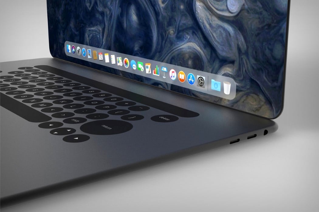
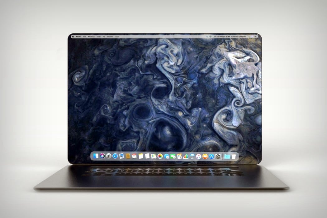
Ludovico’s MacBook redesign takes similar routes to the iPhone X and rather appropriately christens itself the MacBook X. Featuring a body that’s curved, rather than wedged, the MacBook X does a hat-tip to the iPhone and looks less susceptible to horrible denting given the lack of a sharp edge. It also explores a more expansive display that has those incredible curved edges and absolutely no bezels. The absence of a notch means there’s no webcam on the MacBook X, which does raise questions, but none too serious, considering this is purely conceptual. Look down at the bottom half and you’ll see the touch-bar is still there, sitting above what I can only say is a keyboard that feels much too different.
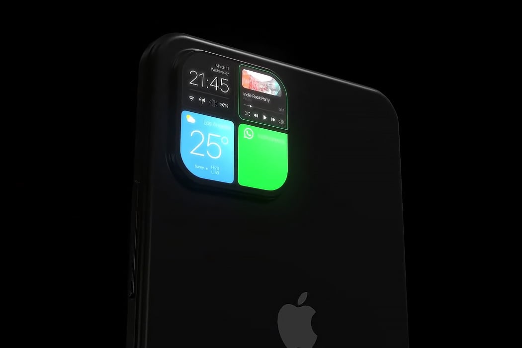
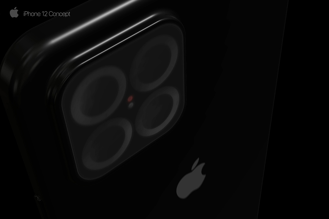
The iPhone 12 retains the dreaded notch that was established with the iPhone X – and while we look for changes in the screen of the phone, Furkan’s iPhone 13 concept makes us look at the camera notch in a whole new way and how! Firstly, the camera bump comes with 4 lenses now (maybe the macro lens is finally coming to the iPhone!) and doubles up as an instant notification panel. The UI of this notification panel borrows heavily from the well established and tested UI that the Apple Watch carries – showing everything from app notifications, widgets, and even your health statistics. We have seen conceptual tech showcasing a glass panel that doubles as a touchscreen, this would be the first commercial implementation of this technology, but one thing we know – if Apple actually does this, most of the newer models are soon to follow suit. The coolness factor of this design aside, the mini-display can help extend the battery life by reducing our dependency on the home screen to check our notifications.
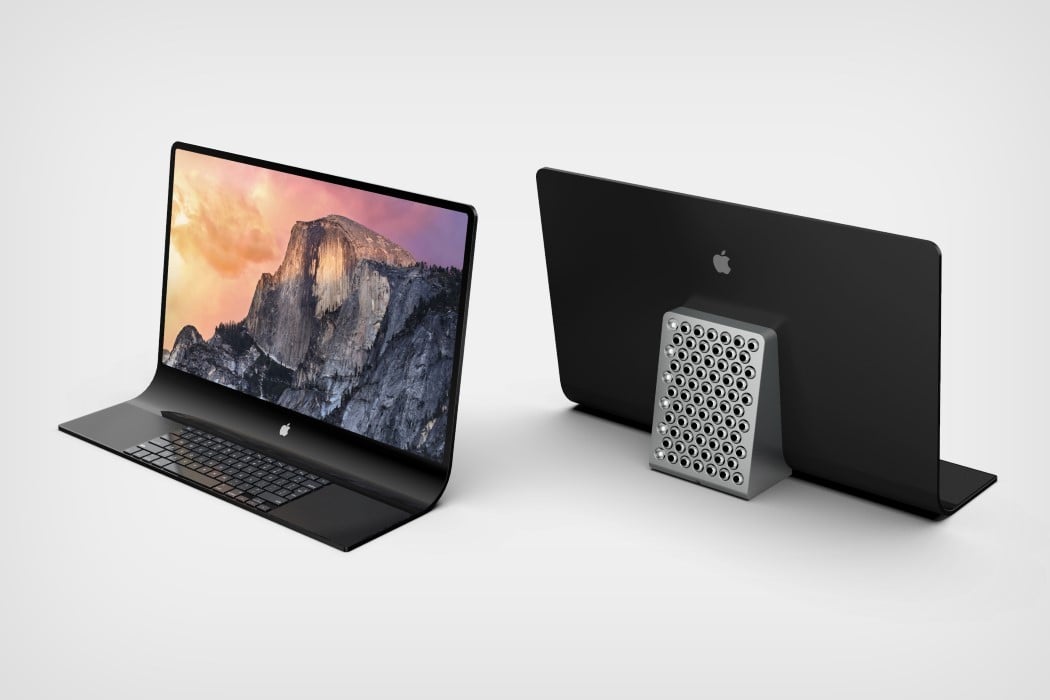

The concept visualized by our very own Sarang Sheth showcases an interesting monolithic take on the all-in-one Macintosh, featuring a slick unibody glass that transitions from screen to keyboard in one grand, singular motion. The screen literally folds downwards as soon as it hits the desk to provide a precipice for a keyboard as well as two track-pads that reside within the glass. All in all, the entire thing looks rather Dali-esque. This impressively thin form factor allows Apple to isolate the actual computer into a block at the back that helps prop the glass facade up. Complete with a smorgasbord of ports (and that cheesegrater CNC-machined grille that Jony designed exactly a year ago), the grille sits at a slight tilt too, allowing heat to travel outwards and upwards. The new take on the iMac Pro allows Apple to keep its all-in-one desktop computer looking incredibly slim without sacrificing on power and performance.
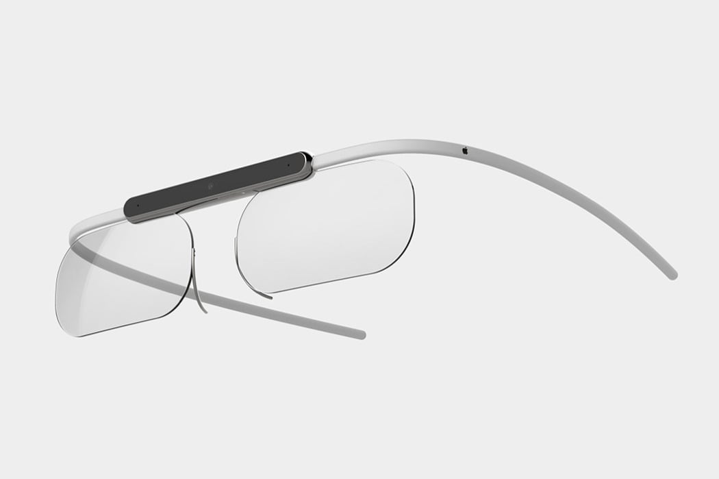
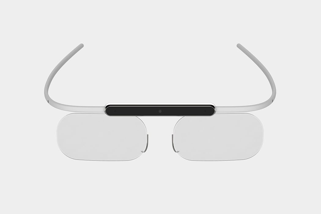
Introducing the conceptual augmented reality goggles that beautifully carry the iconic design language that we know and love. The challenge for this project was to create a revolutionary pair of spectacles where the elegant fusion of technology and style drives the design! We’ve seen Google attempt this in the past, but we believe that their downfall was that they lost the ‘glasses’ element, leading to a cyborg-esque aesthetic that wasn’t to everyone’s taste. This concept retains both of the lenses and the iconic form of a pair of glasses, to create an understated yet undeniably Apple-like product!
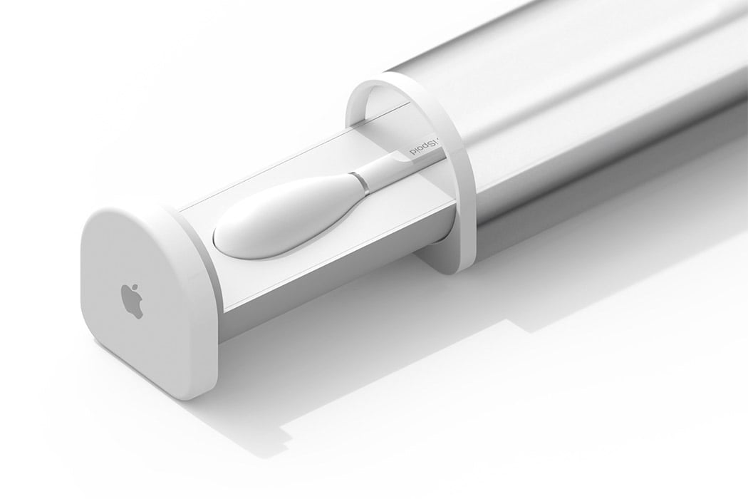
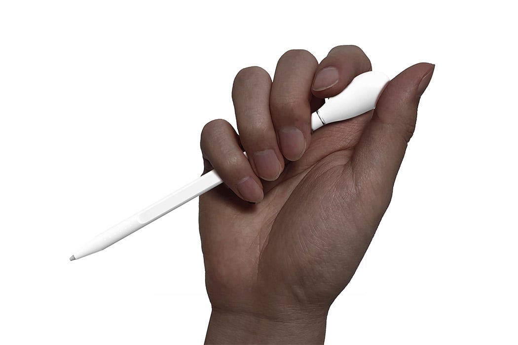
The iSpoid is a conceptual dropper that picks up data instead of colors and we are here for this! The motion of using a dropper to transfer colors was reinterpreted with the data delivery interface with an Apple pencil-like tool which has been christened as iSpoid for this concept project. The group of Korean designers who came up with this conceptual product wanted to make data transfer and data sharing between devices as easy and joyful without the stress of connecting via Bluetooth, hard drives, and the quest for finding the right device to AirDrop. The product development phase involved sketching, brainstorming about usability, and making the device itself as physically similar to a dropper as possible – if you observe the form, it’s a hybrid between the color dropper and the Apple Pencil. The action is instinctive with this device, you position the dropper on the file, press the bubble on top, and watch the 3 lights on the tip light up indicating the file has been picked. You then drop it on the desired device and the lights will dim down just like releasing color from a dropper, but here it is the data.
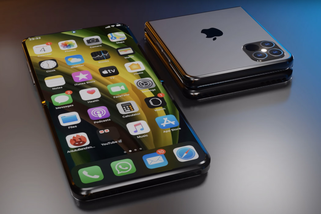
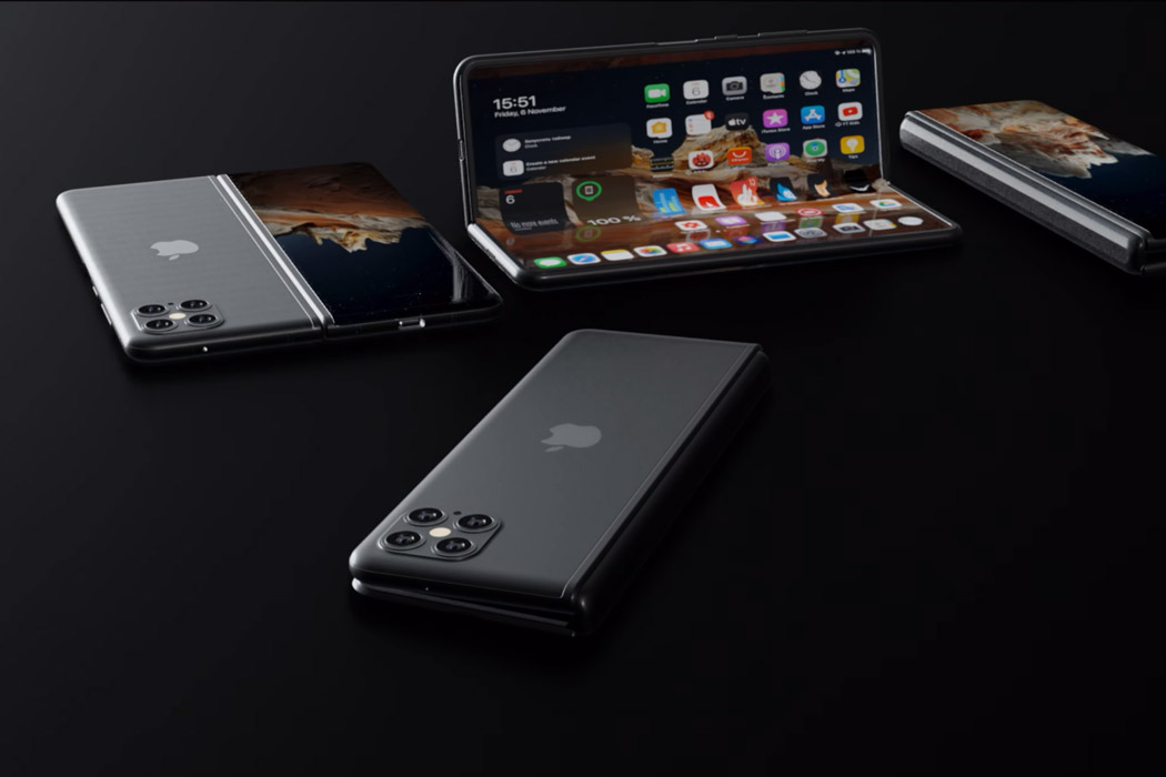
The Apple version of a folding phone could take design cues from the Galaxy Z Fold 2 if they decide to make it an all-out flagship-grade version, or go for a subtle Razr-like form factor if they desire to cater to a niche set of buyers. If we go by the patent filed by Apple, the display will have a crease-less foldable panel (like Galaxy Z Fold 2) and a folding mechanism similar to Motorola Razr – folding like a handy mirror. The early renders of the iPhone 13 are not exactly promising (for either of the versions) but we can count on Apple’s tendency to be thorough in its design testing and the result will be ready to shock and awe. Personally, I find the Moto Razr inspired fold a more unique design with the folded screen seemingly a throwback to the iPod Nano that was a part of their game-changing arsenal.
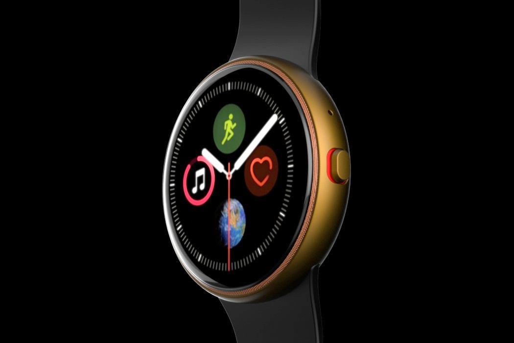
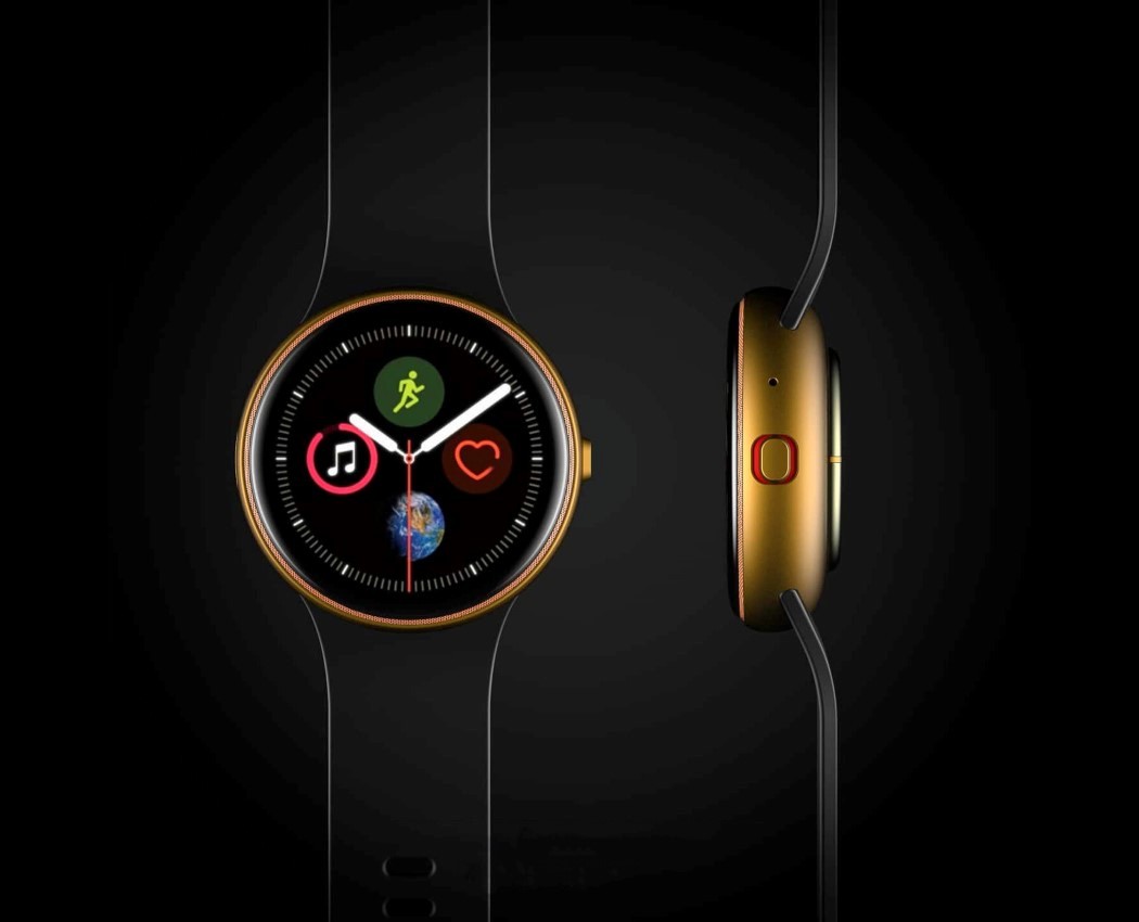
A concept creator by the name of Phone Industry’s envisioned a radically different, circular Apple Watch… because why not. It features a Samsung Galaxy-inspired circular body and dial, with a thin bezel around the edge, and a speaker grill at the very periphery of the dial. It also ditches the rotating crown for a more standard tactile button. I doubt you could watch Apple TV or a keynote on the circular screen (or even browse the internet effectively), but the Apple Watch has never been touted as an internet-browsing device on your wrist. Instead, the circular screen could enhance the Apple Watch’s existing services by making use of the circular UI to lay-out information in an effective way. Besides, that circular watch-face looks pretty stunning, don’t you think?!
For more such innovative and exciting Apple concepts, check out Part 1 and 2 of this post!


