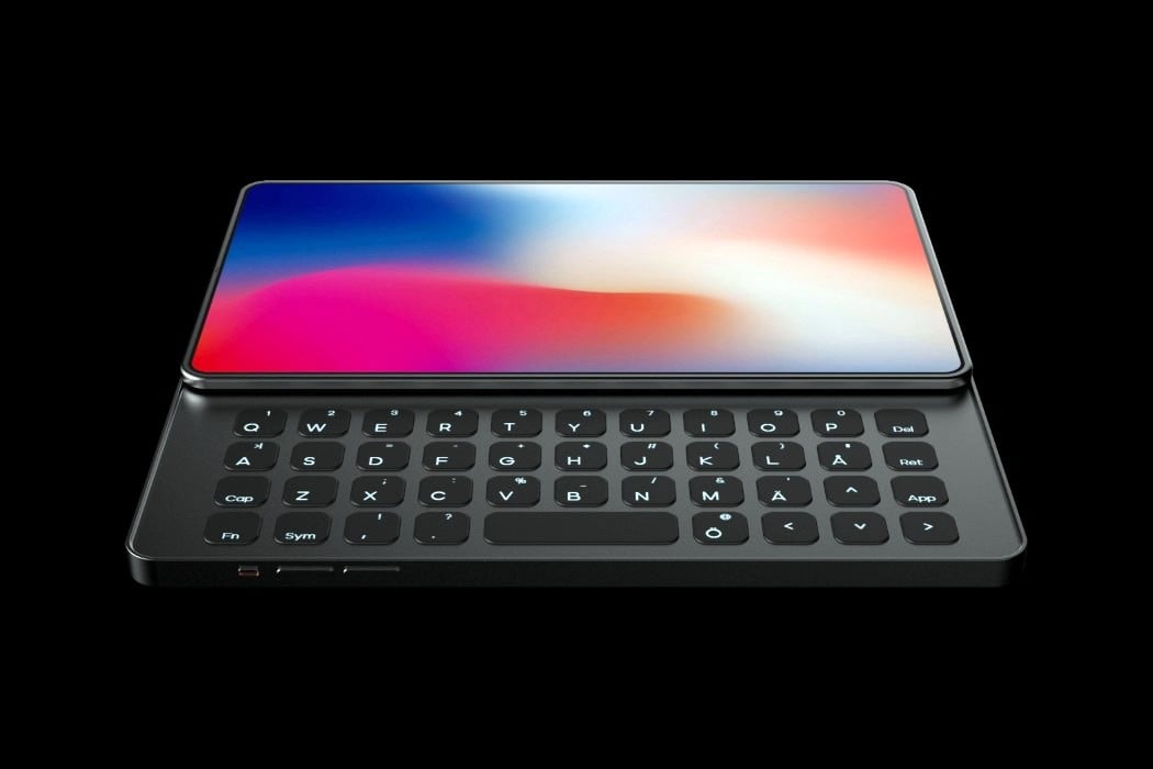
It’s the year 2005, and Nokia’s E-Series phones have a cult following that’s difficult to ignore. The phones came with a relatively large-ish screen, but what really sealed the deal was the fact that you could slide the screen to reveal a nifty, usable QWERTY keyboard underneath. Before the iPhone became the computer in your pocket, the Nokia E-Series phones were the computers in everyone’s pockets. The E stood for Executive, and it wasn’t uncommon to see businessmen in suits strutting down the road with Nokia phones in their hand and Jabra earpieces in one ear. It was the iPhone and AirPods combo, nearly 15 years prior.
I think the fundamental problem with the smartphone touchscreen isn’t its size, it’s how we use it. Screens have a finite amount of space for infinite amounts of data, which makes designing interfaces really complicated, and using them even more so. In that regard, just empirically, a bigger screen on a smartphone doesn’t make it ‘better’… which is why this concept by Johan Gustafsson feels so refreshing. In a world where smartphones are finding new ways to push more pixels into a smartphone, Gustafsson’s iPhone Q brings a level of sensibility to that computer in your pocket – by simply making it a miniature computer!
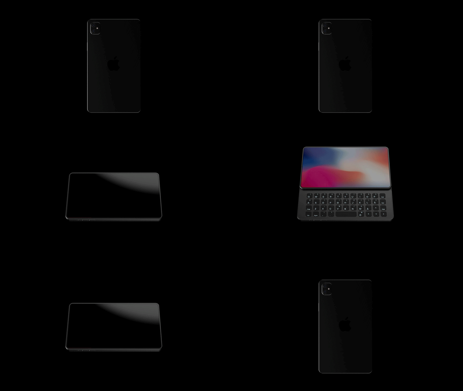
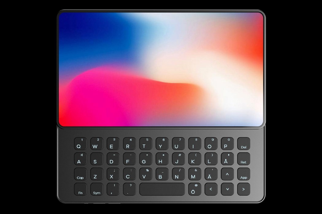
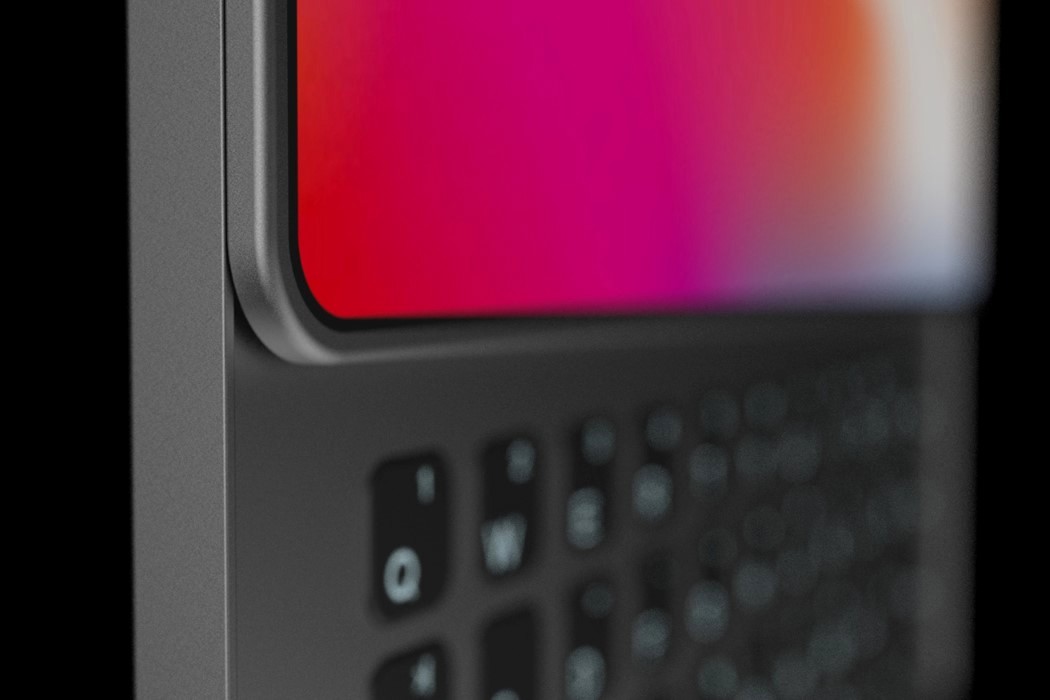
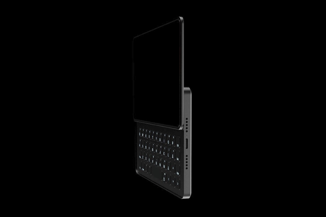
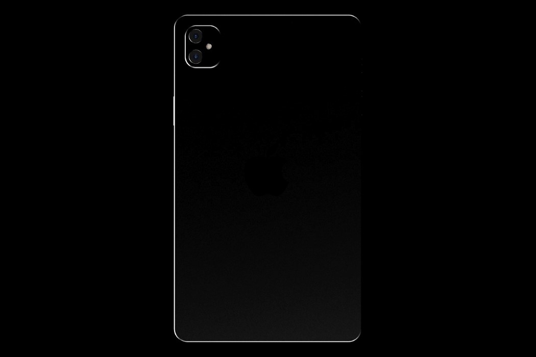
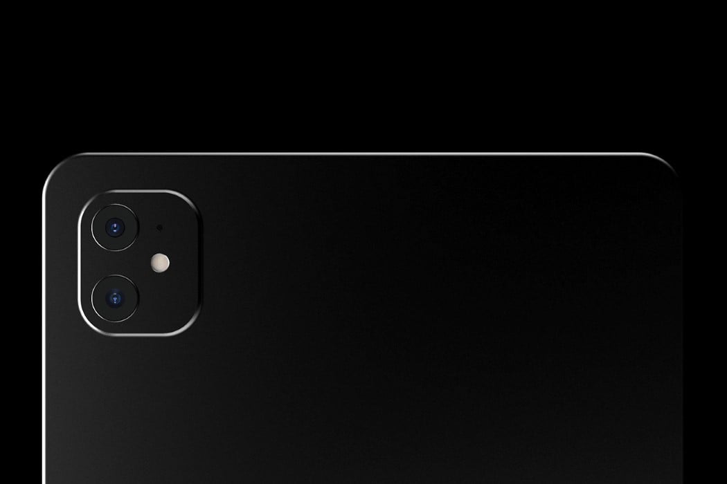
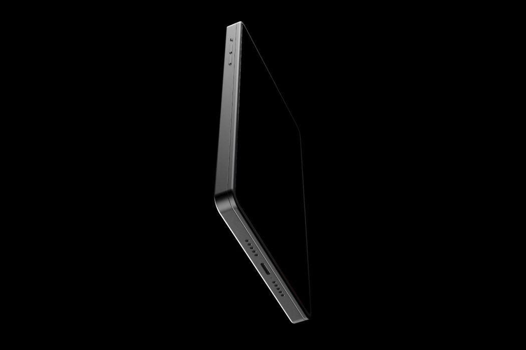
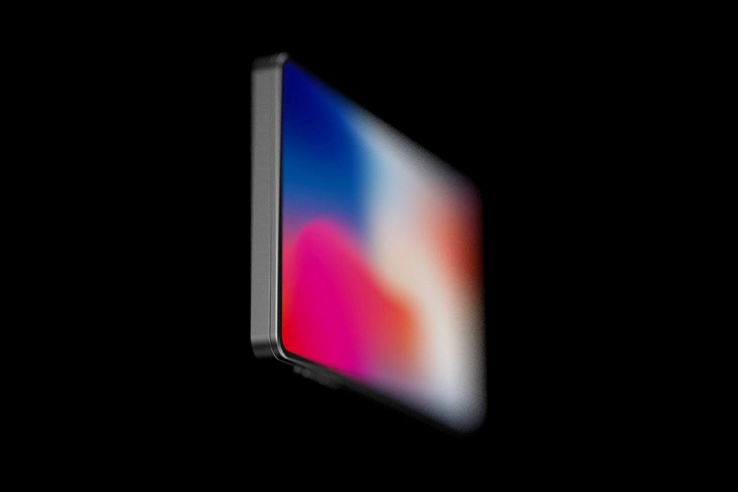
The iPhone Q (named after the fact that it comes with a dedicated QWERTY keyboard) presents a bold ‘new’ vision for the iPhone. I use the word ‘new’ in air-quotes because while adding a dedicated tactile keyboard to a phone isn’t new, it’s new for the iPhone, and more importantly, it presents a new format as smartphone companies desperately try to make their phones look less blockish and more gimmicky. In a world of folding phones with creased displays, pathetic battery-lives, and clunky bodies, the iPhone Q feels like that perfect premium, enterprise-grade smartphone to pair with the iPad Pro or the MacBook Pro. The phone comes sans a notch, but makes up for the lack of a front-facing camera with a complete tactile keyboard right underneath the screen. The screen slides upwards in landscape mode, revealing the 42-key keyboard below, which can be used as a much more functional alternative to the on-screen keyboard, allowing you to quickly replay to messages and send out emails in a jiffy. A dual-lens camera on the back reinforces the fact that the iPhone Q is less of a multimedia device, and more of a piece of functional hardware, designed for a niche of executive users.
Sure, the iPhone Q is just a concept, but even conceptually, it feels much more contextual and sensible than a folding iPhone with a larger screen. Quite like the iPhone Pro, designed for professional media-creators, the iPhone Q serves a niche group of users, becoming a perfect alternative to people who still use BlackBerries. Sure, they may be a small group RIGHT NOW, but if the iPhone did sport a dedicated slide-out keyboard, I’m pretty sure a lot of executives and office-goers would promptly make the shift!
Designer: Johan Gustafsson
