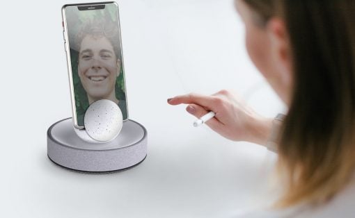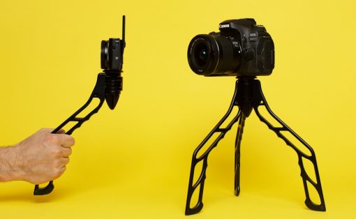
April Fools’ Day is right around the corner, a lot of us are gonna be pranked by our friends or some or the other mischievous joker in our lives! In an ode to this prank-filled day, we’ve created a special collection of designs for you. These are a bunch of concepts, seemingly so real, cool, and mind-blowing that they’ll almost have you convinced that they’re actual tangible designs. These too good to be true designs are the epitome of innovation, creativity, form, and functionality. Not to forget, their dynamic good looks and aesthetics that’ll make you wish you could instantly buy them. Did these concept designs manage to fool you? Did you truly believe they’re real products that are available on the market? Have a look and see!
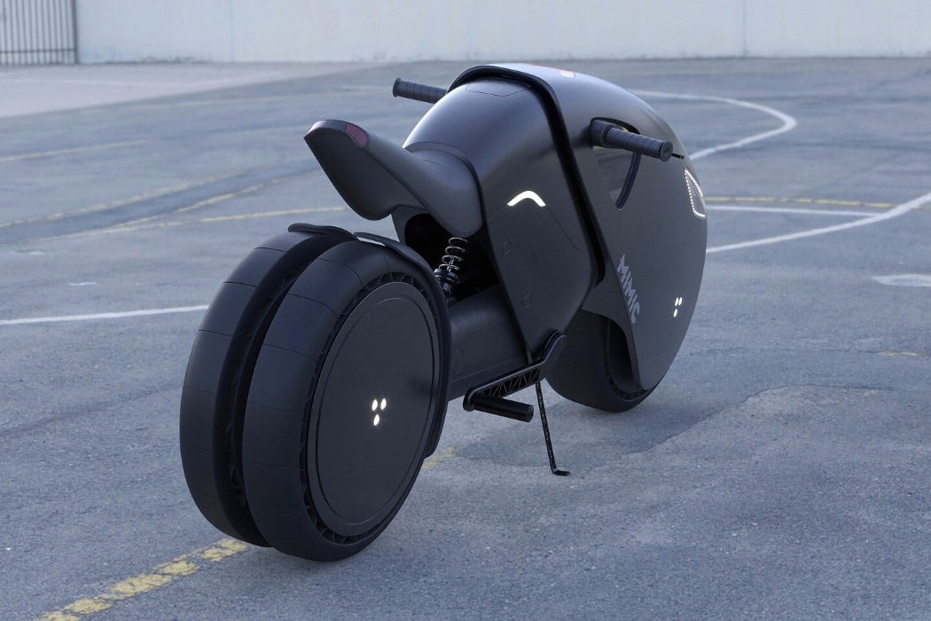
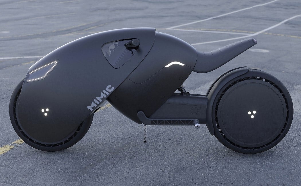
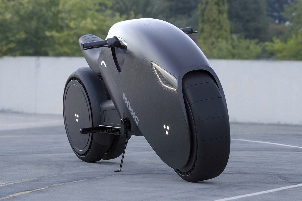
If it were up to King T’Challa, the MIMIC e-bike would be fitted with vibranium tech, but we’re going to stick to an electric power-train for now. This crouching-jungle-cat of a bike is a concept designed by Roman Dolzhenko. Outfitted with what looks less like a body and more like armor, the MIMIC e-bike comes with a rounded, Tron Light Cycle-inspired form with rounded elements and just an overall absence of straight lines or sharp edges. The e-bike has a dual-lamp headlight fitted on the front, looking almost like a menacing pair of eyes, and a dashboard that lays flush against the e-bike’s curved panther-esque body. Other noteworthy details include a cantilever seat, inverted handlebars with the brake levers facing the rider, and a three-hexagon logo on both the front and back wheel, a detail that pays tribute to Daniel Simon, designer of the Tron Light Cycle, who uses a similar hexagon insignia to mark his designs.
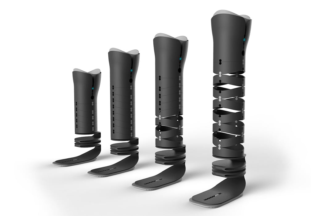
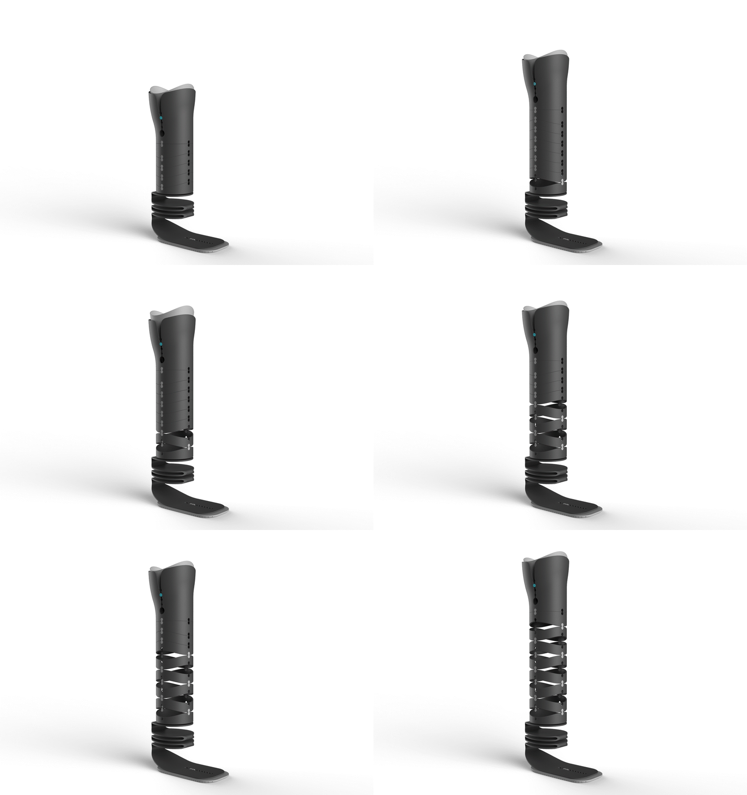
Ring is an adjustable, custom-made prosthetic leg designed specifically for transtibial amputee children in developing countries to help reduce costs while bettering their quality of life. The conceptual prosthetic leg aims to make the otherwise rigid medical equipment more flexible especially to fit seamlessly in the life of a growing child. The user will wear the leg and it can be adjusted it as they grow to make sure the fit is always optimal and comfortable. “Ring achieves this thanks to an adjustable foot portion to ensure an optimal stride as well as the upper portion that can be paired with additional rings to suit the person’s body as they grow and develop,” says Jeremic. Ring is a conversation starter that addresses the need for more modular healthcare equipment.
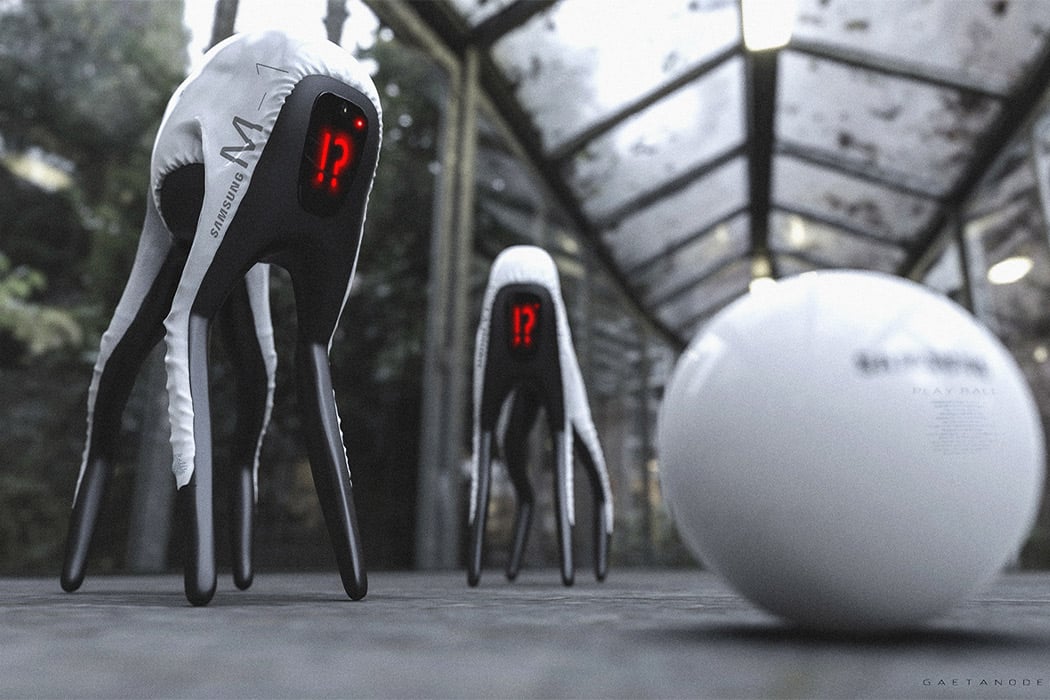
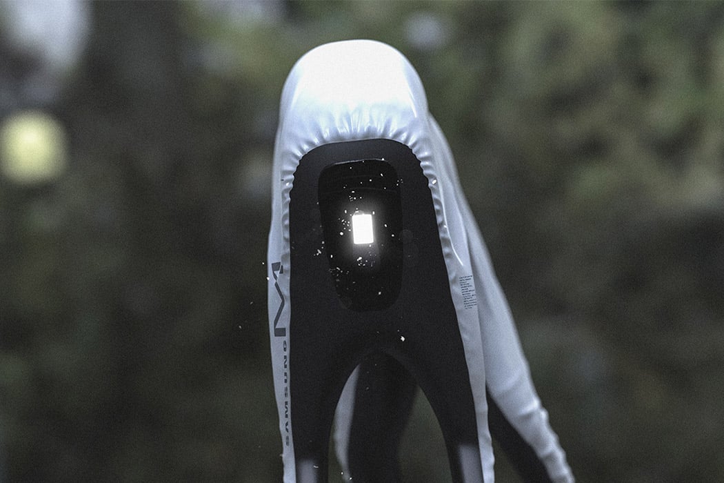
This conceptual Samsung dog bot replaces the dog’s features with a screen, so instead of a confused head tilt the face aka screen of the robot will show you a question mark. If the tech giants are to make a robot dog, using a screen as an interactive interface will save a lot more material than using plastic-like materials to replicate the real build of your pet. With the rapid rate at which AI is growing and the conceptual renders show, the dog bot will be able to chase balls and give you a leaping welcome when it senses your arrival. It is interesting how the design is so futuristic and yet when you look at it, you can tell it was made to resemble a dog. You may not even have noticed that the ‘tail’ is missing and yet our brains have evolved to associate emotion with robots.
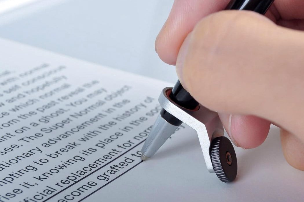
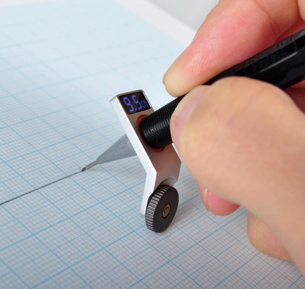
The Constrained Ball by Gihawoo Design is one of those concepts I can easily see myself buying from a late-night infomercial. I’m not saying it’s bad but the novel approach to a simple kind of problem is endearing. Fitted with a gasket, the gadget helps you draw straight lines and indicates the length. OMG, is this the end of the ruler’s dominance?!? No, but I quite like this concept. I’m a stickler for drawing straight lines. It’s either gotta be straight and perfect or it’s a no-go for me.
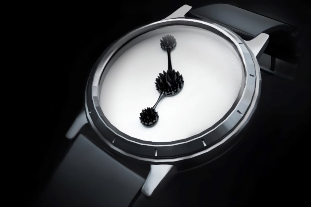
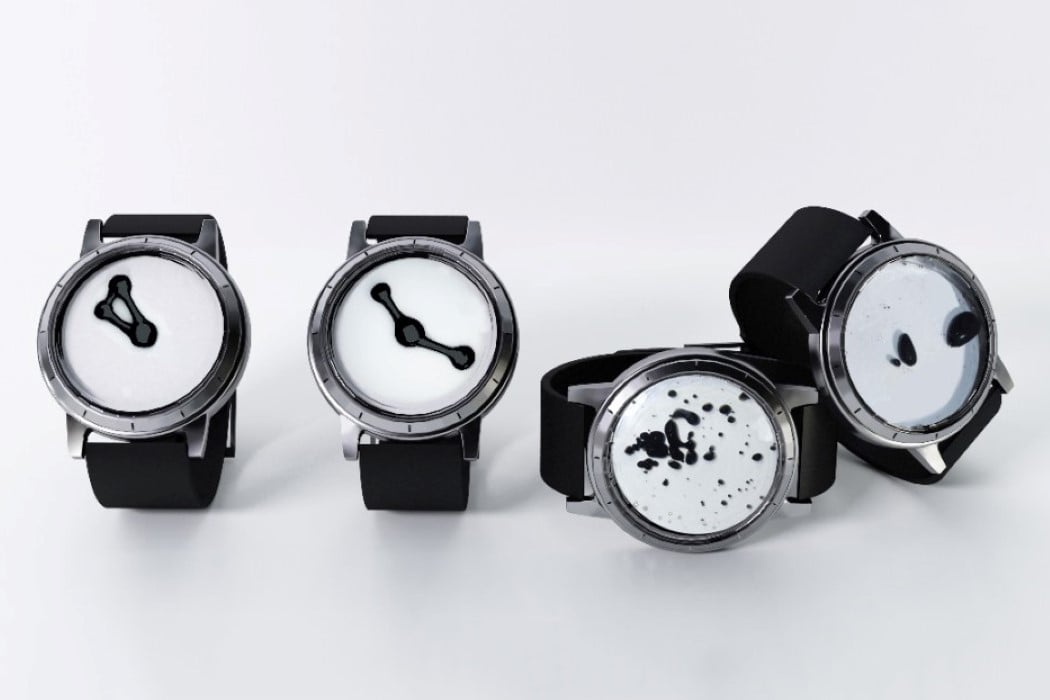
The idea of a watch has always been to deliver the time to you in a quick manner so you can go about your day. The usual interaction is just to glance at your watch and get on with business, but the INK-MAGNETIC watch takes a much more different approach. Rather than telling you the time so you can rush to complete your tasks or get the day over with, the Ink-Magnetic watch captivates you and helps you appreciate the seconds and minutes rolling by. The watch makes use of a ferrofluid chamber in its face, while magnetic hands manipulate the liquid from behind the scenes, creating a dynamic Rorschach-test-inspired piece of art that also happens to tell the time. In doing so, the Ink-Magnetic watch hopes to get you to pause for a bit and reflect on the beauty of time, instead of rushing through your day and not appreciating it!
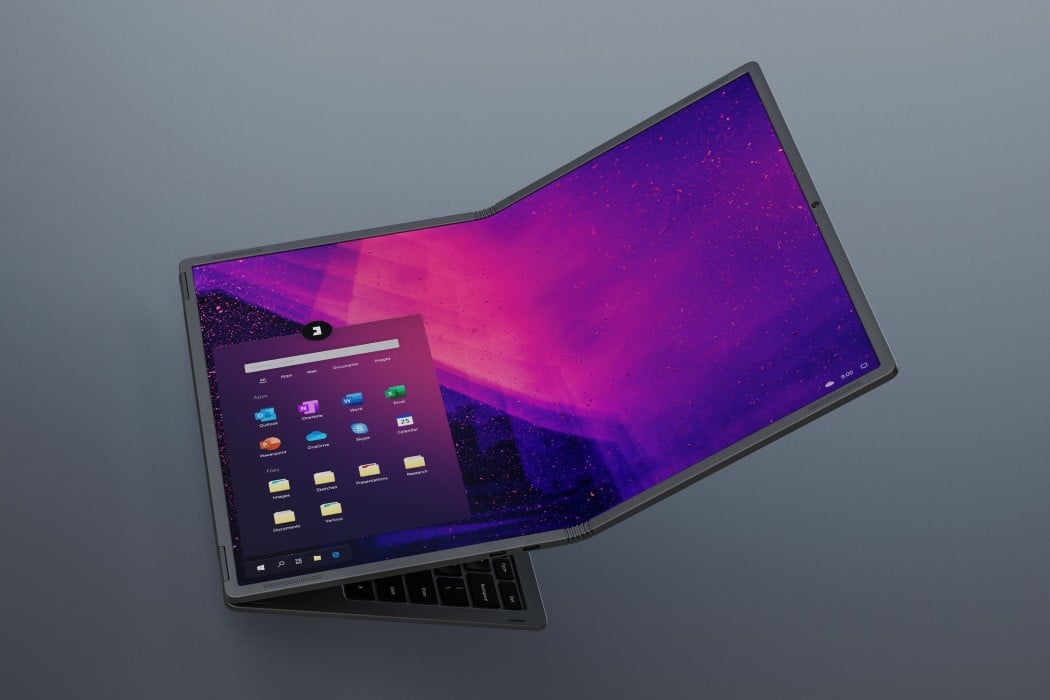

The Flexbook is like a laptop met a sandwich. Unlike most laptops, which have a two-part design connected via a hinge, the Flexbook has three parts. The main body, comprising your motherboard, electronics, ports, and keyboard… and around it, a two-part flexible screen that sandwiches the keyboard in the middle. The Flexbook can be traditionally used as a laptop with a 3:2 12.6-inch display, simply by opening it and using one half of the screen, or as a massive Wacom Cintiq-style tablet PC with a neat 4:3 17.8-inch touchscreen. This interchangeability is what makes the Flexbook such a unique laptop because it can alternate between being a laptop and a tablet, much like the Microsoft Surface, but with the advantage of a massive 17.8-inch screen in the form factor of a 13-inch laptop.

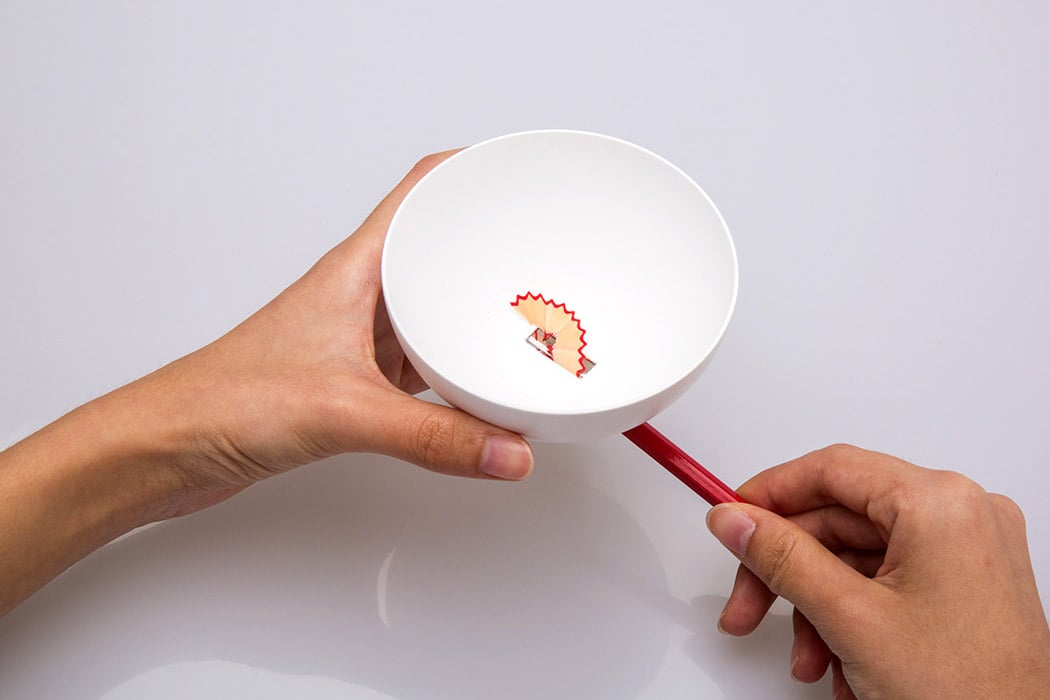
I’ve never paid much attention to pencil sharpeners. Simply because I consider them as a wholly functional product, which tends to create a mess, and lack any aesthetic value. However, designer Jiachun LV is here to prove me wrong. Jiachun’s Bowl Sharpener is shaped like a cute little soup bowl! The base of the bowl consists of the actual sharpener opening, through which you slip in your pencil, and begin to sharpen it. As you sharpen your pencil, the pencil shavings and the lead residue are stored in the bowl. If you’re sharpening color pencils, the different colored shavings create a beautiful visual! Since all the shavings have been collected in the bowl, it is relatively easy to throw them away. The sharpener’s bowl-like form ensures that the waste can be discarded in one go. No more shavings going astray, only to be found in some dingy corner of your desk.
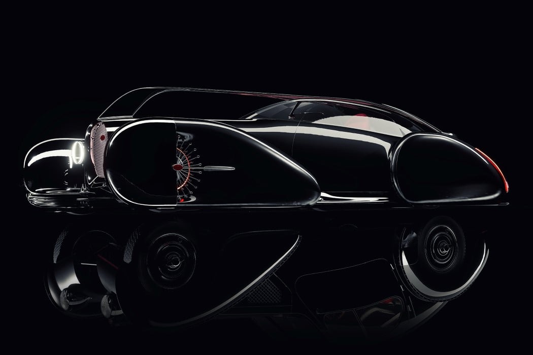
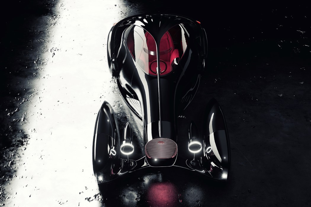
Created as an homage to the classic Bugatti 57, the Next-57 celebrates every inch of the vintage car by modernizing it, exaggerating it, and making it even more beautiful. The result? A chariot fit for a king, with an incredibly elegant long body that tapers off at the front, exposes the axles on the front wheels, giving a chariot-like appearance, along with an interior that’s ensconced in luxurious red suede. The black and red combination is a statement in their own right. Giving the car its mysterious, million-bucks appearance, the chariot’s gloss-black exterior is a magnet for sharp highlights and high contrasts, making it look like a jewel on the road. The car’s long body starts with its edge-lit headlights, sitting between the externally-placed wheels. The wheels are covered by fenders that half-cover it, revealing the luxurious constellation-inspired rims behind, that shine and rotate as the wheels turn.
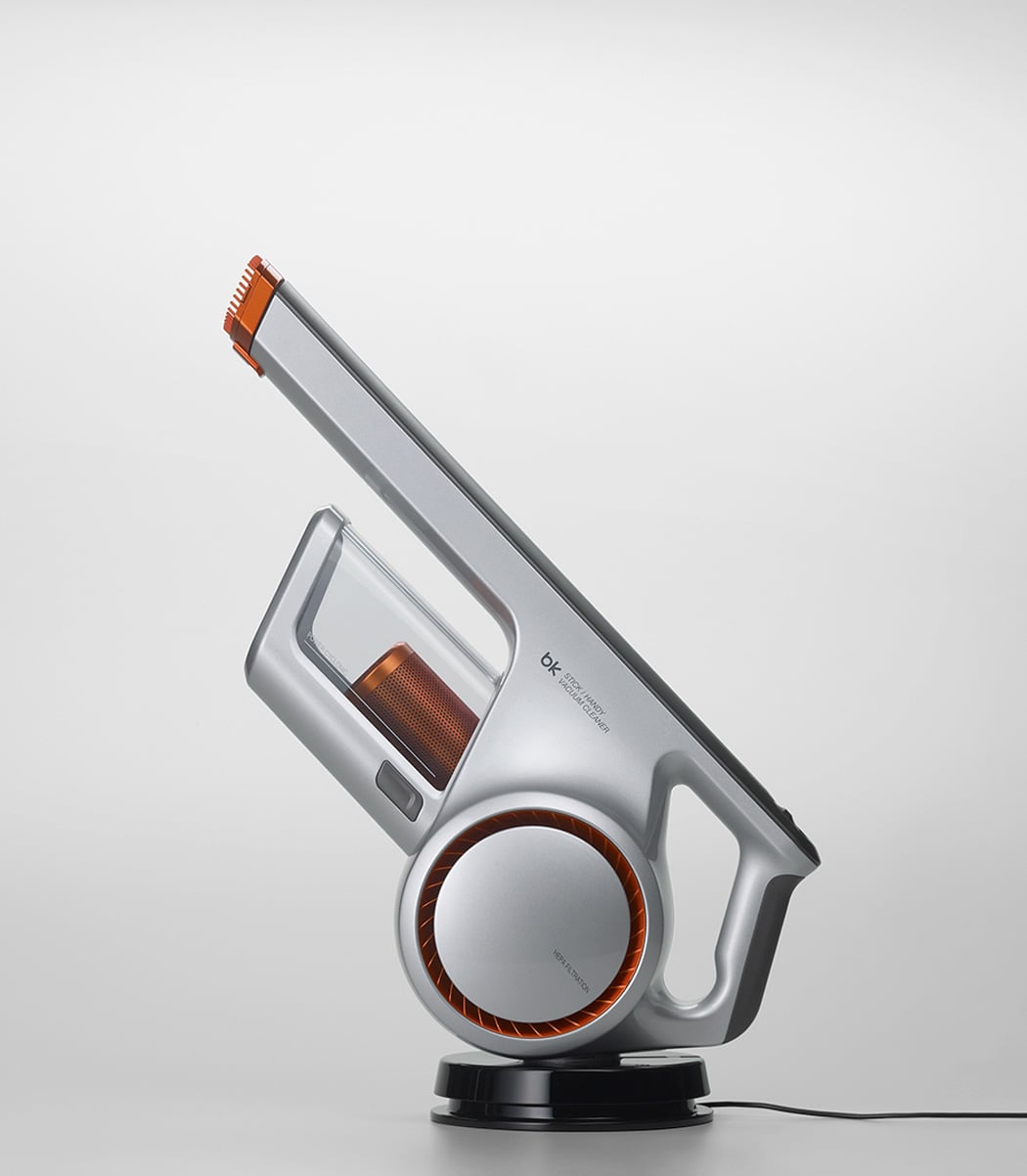
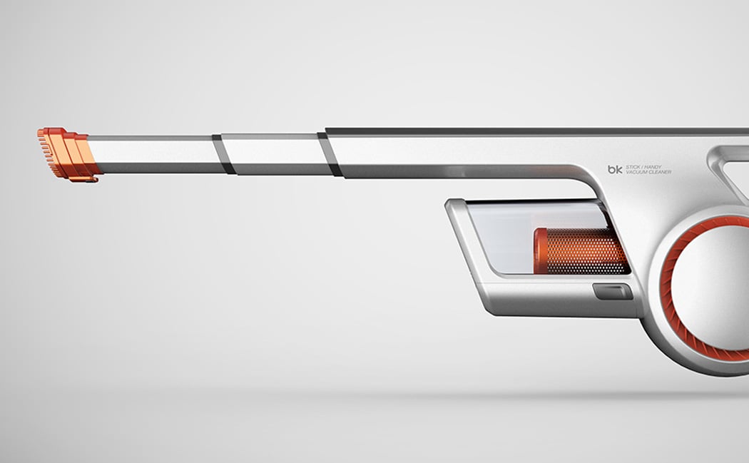
When you think of vacuums, there are probably a few images that come to mind – the engineering aesthetics of Dyson, the loveable face of Henry the Hoover, or the old reliable clunky hard-shelled Bosch and Siemens of the past. Well, what if you were to take the brilliance of both the emerging Chinese and Korean design languages and transform the handheld vacuum – you’d stumble upon the Handy Vacuum Cleaner designed by Myeonghoon Lee & Yubin Choi. This product is edgy, coming off as intimidating almost, something that you would pick up in the toughest of situations and never bat an eye. This handheld vacuum is a dust-royer. The cyclone and motor located just under the handle, have a visual appearance like that of a futuristic concept bike, adding a subtle flair with the orange highlight. There is one area that I feel Lee and Choi rushed, which was the charging unit. With the Dyson handheld vacuum, the charging unit can be mounted to a wall, like that inside a closet, and the interaction of docking the vacuum is an effortless process, a carefully thought out one.
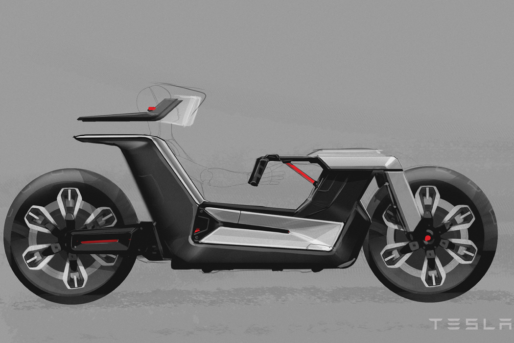

The concept dubbed ‘Tesla Model C’ is a rare combination of road safety, driving comfort, compact size, and driving dynamics! The duo put a lot of thought into designing the bike concept with a driver sitting position adopted from the four-wheelers. The steering column of the revolutionary ride extends out horizontally like that of an F1 car in handlebar-like form for superior grip at all times. The motorbike aesthetics are evident in the shape of the rear swing-arm and the two wheels’ positioning. Perhaps, the most exciting bit of the design is the flexibility in the parked position, which allows the driver to comfortably get out of the Tesla Model C and decreases the vehicle’s footprint for parked spaces. Now, isn’t that ingenious or what!


