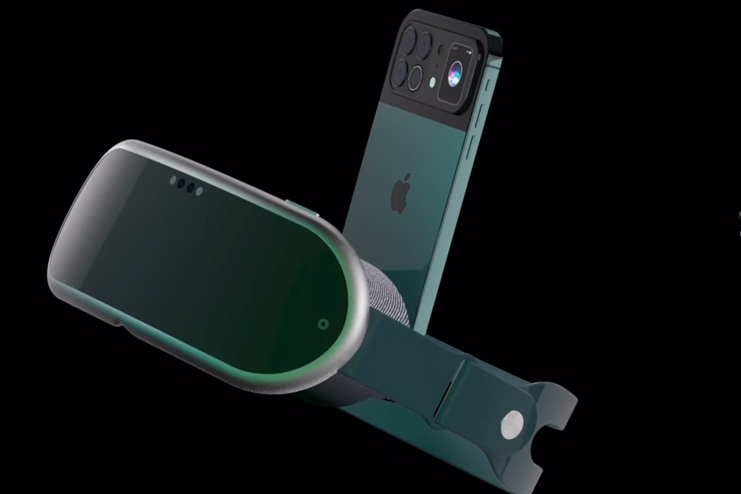
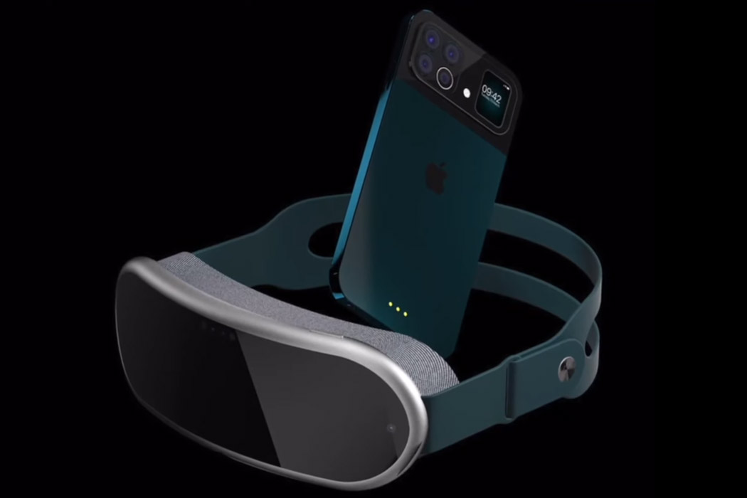
Apple’s mixed reality headset has been in the works for quite some time now, and a couple of months ago it became apparent that the lightweight VR headset will be coming in 2022, with the Apple Glasses to follow soon after. On the flip side, the iPhone 13 is destined to arrive this fall, and like all times it is already the topic of interest in the tech circles. While iPhone 13 and the Apple VR headset cannot be launched in the same given timeframe – still it doesn’t deter imaginative designers from mustering up how the two products will look together.
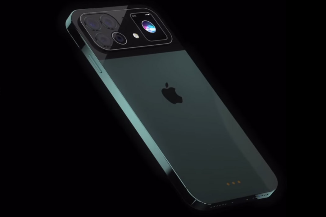
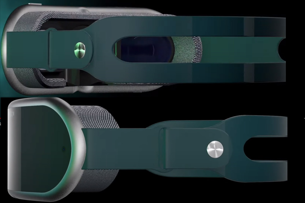
ConceptsiPhone has created a render of the two upcoming devices by Apple and mashed them together in a video dubbed iPhone 13 VR for creative writer’s delight. The VR headset is open to any imagination possible, and the folks over at ConceptsiPhone have taken that opportunity to show the world how the mixed reality headset will be like. It looks plush (after all it’s Apple) and is in sync with the design principles Apple has put in place for the headset – comfort and lightweight aesthetics. The strap looks reassuring as far as ergonomics go while the padding around the viewable area ensures utmost comfort.
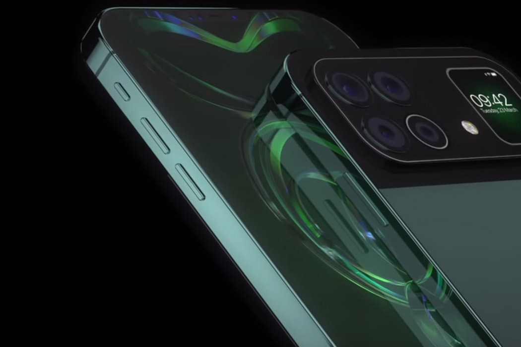
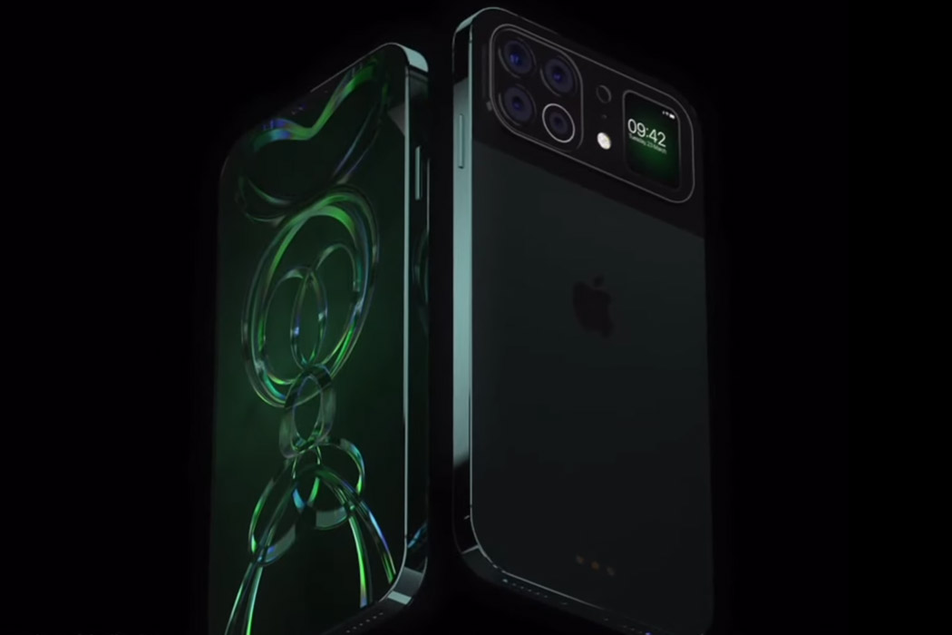
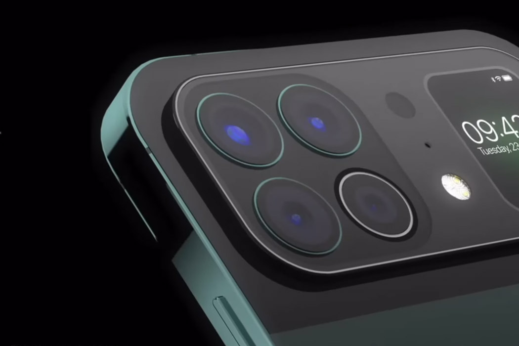
To be honest, more than the VR headset, I’m more intrigued by the iPhone 13 design. The concept shown here retains the iPhone 12 Pro’s DNA for the most part of it, and when you have a look at the rear camera module, it’s fresh nostalgia. The camera bump looks so strikingly similar to the newly launched Xiaomi Mi 11 Ultra flagship. Yes, I’m talking about the secondary display that’s actually the same OLED display as on the Mi Band 5 (smart move by Xiaomi) to show notifications, act as a viewfinder or music player widget. The camera module takes up the upper third real estate space on the back of the phone with a four-camera sensor setup accompanied by the squarish secondary screen looking much like the Apple Watch. Since Xiaomi didn’t shy away from making the smart move to use Mi Band 5 as the secondary display, nothing’s stopping me from believing that Apple could also salvage the Apple Watch display for the same on their phone.
While Xiaomi made the leap to this unique rear setup, I doubt Apple would make the same move as long as the whole smartphone industry doesn’t – sway that way. The kind of user-base Apple has, they wouldn’t want to have the distraction of a secondary screen when their phone is turned upside down for digital detox. Apart from showing notifications or other secondary controls, the screen is too small for any interactive space to make a thumping statement for it to be there. Anyways, the concept looks interesting and another interesting story for netizens to have an endless discussion on!
Designer: Antonio De Rosa
