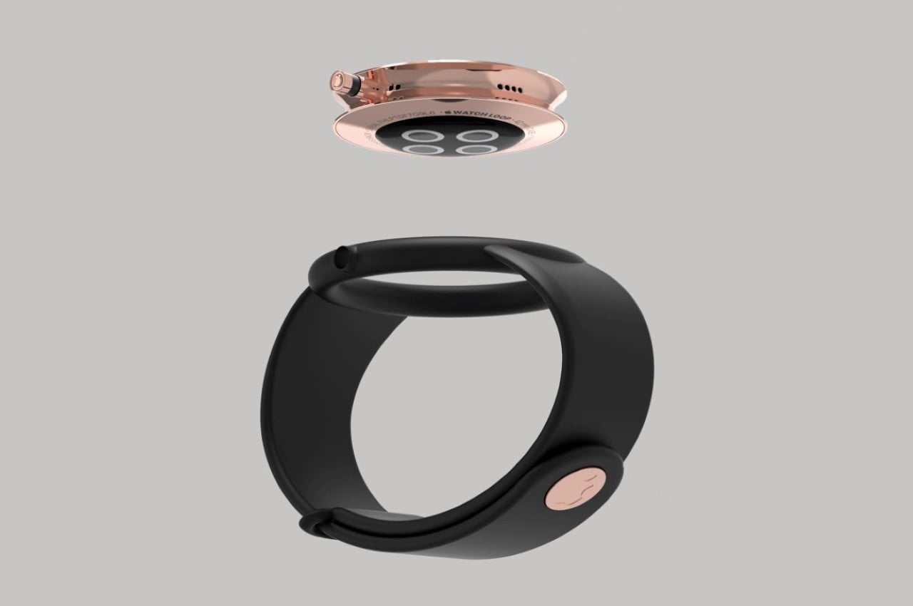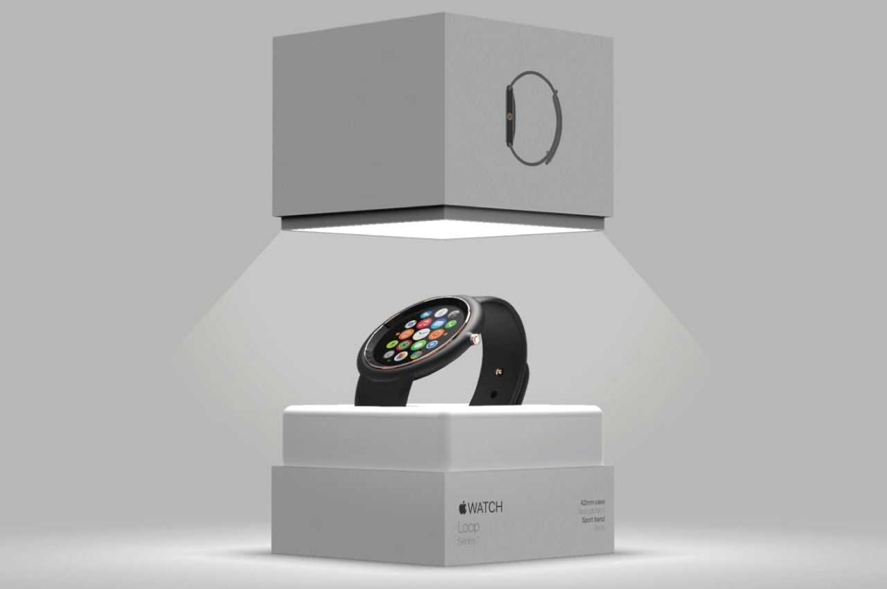
Titled the Apple Watch Loop, this concept by Felipe Duarte does two things – it brings variety to Apple’s smartwatch offering and adds a beautifully-basic ‘Air’ variant in Apple’s watch lineup, just like with their other products like the iPhone Mini, iPad Air, and MacBook Air.
Apple’s always fervently stuck to the square-shaped watch. They debuted the Apple Watch and spoke heavily of how much they were influenced by classic watches, they even added a rotating crown to the design, but unlike the circular Samsung Gear watch and Moto 360, Apple went for what was considered the logical, ‘safe’ option and outfitted their Watch with a square screen, instead of the classic watch-inspired circle display. It’s been some 7 years to the day, and Apple hasn’t really rocked the boat with the watch design – although the watch’s core functions have definitely changed over time, going from a fashionable gadget to a life-saving medical fitness tracker on your wrist. Industrial Designer Felipe Duarte decided to have some fun with the Apple Watch’s design, experimenting with a few radically different details while retaining the Apple Watch’s core essence. The result was the Apple Watch Loop, a fun, friendly, circular concept that’s funky, resistant to damage, and provides Apple’s most important Watch features, in a circular form.

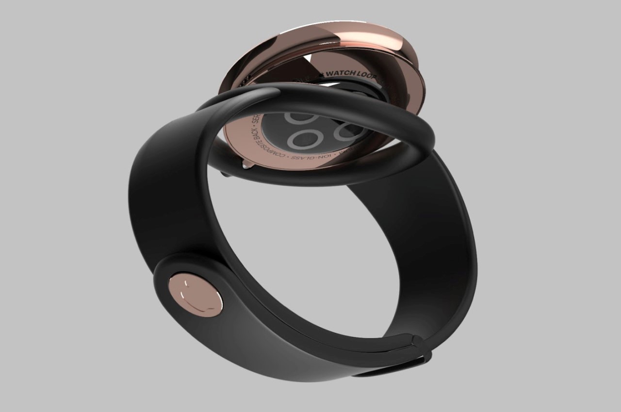
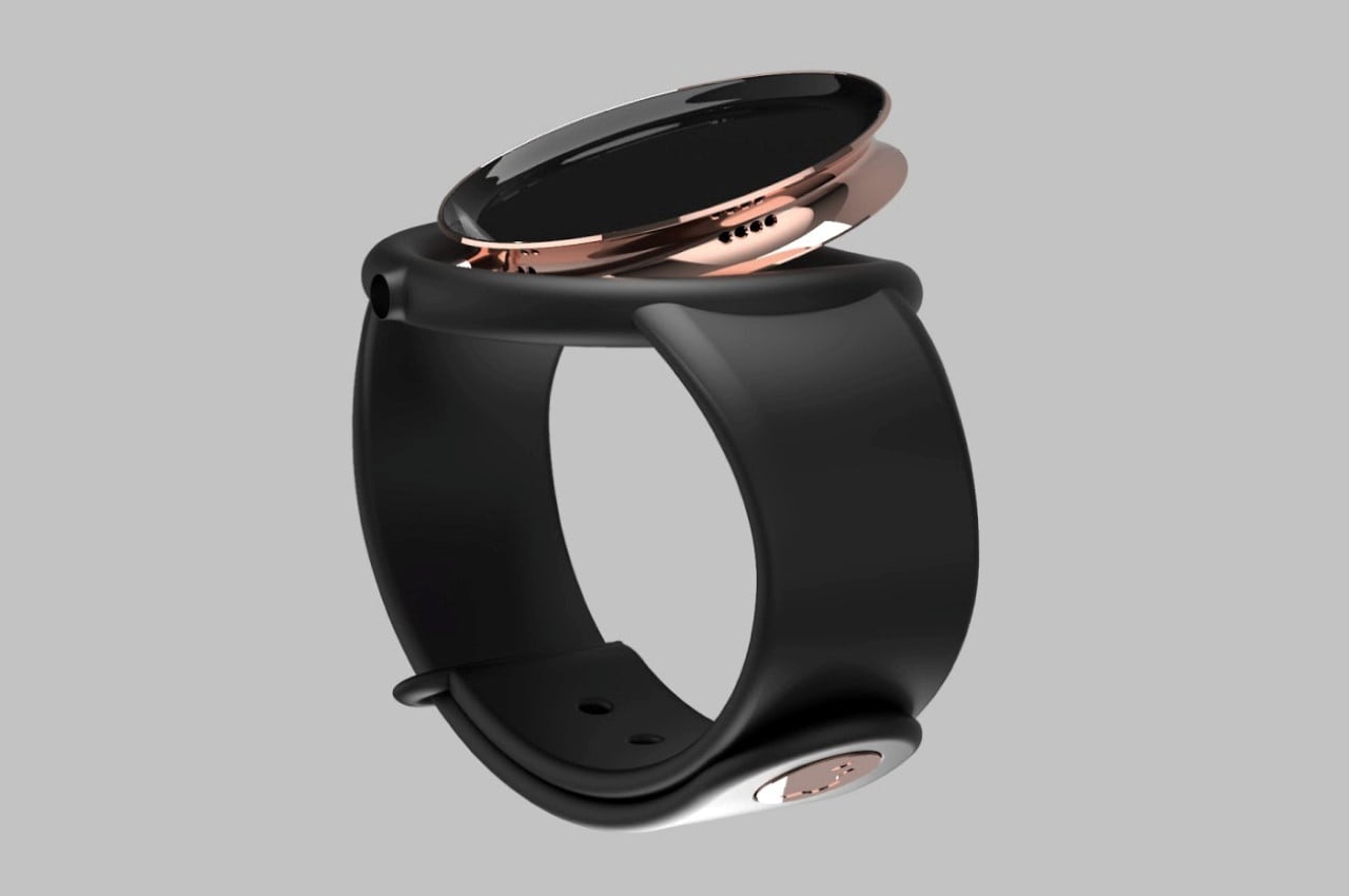
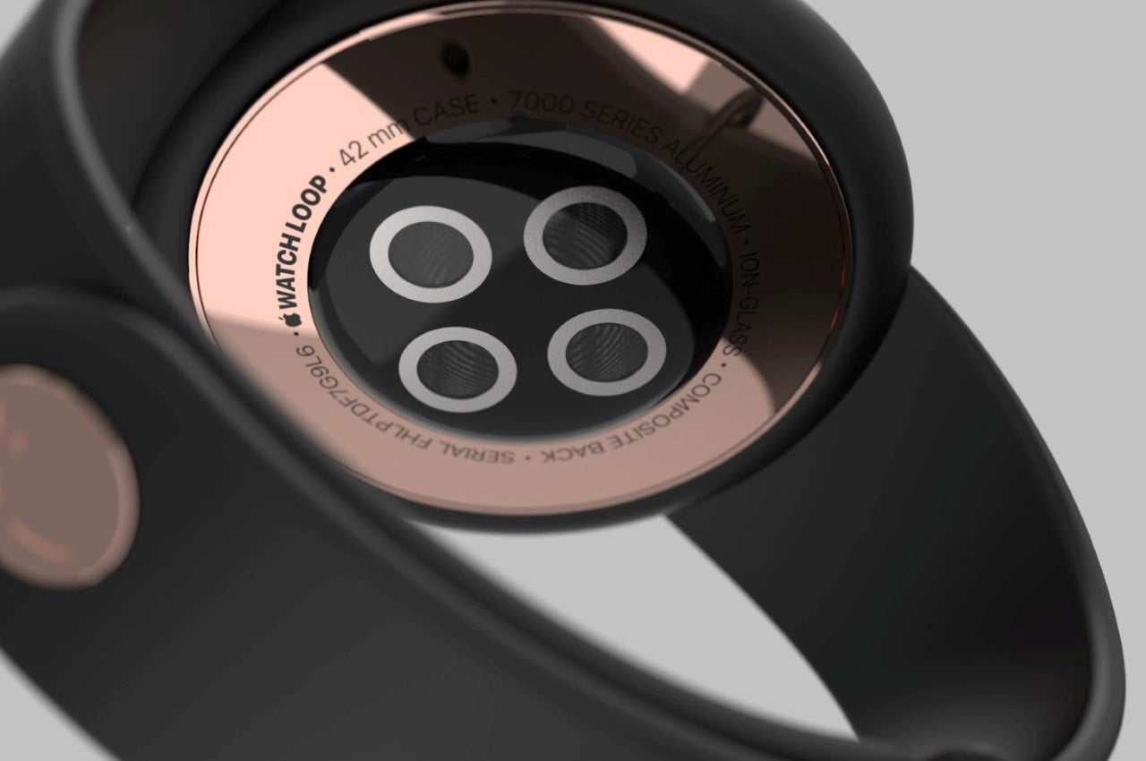
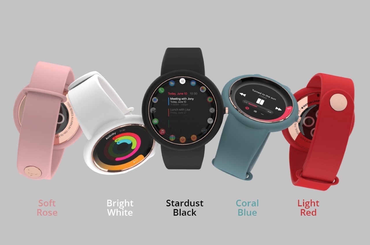
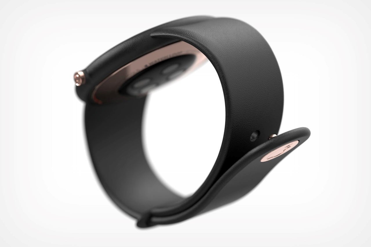
The Apple Watch Loop’s three drastic changes include A. its circular body, and B. the concave screen, and C. the watch strap, which forms a bumper around the smartwatch’s main hardware. Designed to provide a compact-yet-robust experience, Duarte outfitted the watch with a concave screen that’s extremely user-friendly, yet is impossible to damage when you accidentally bump your hand on a surface. Similarly, the large rubber bumper around the watch’s hardware component provides similar shock-absorbing features (although it does result in an unavoidably large physical bezel around the display).
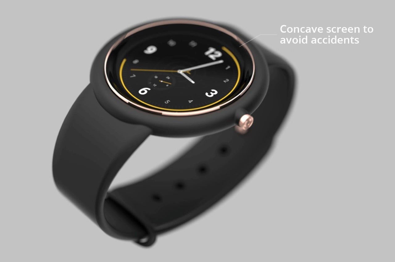
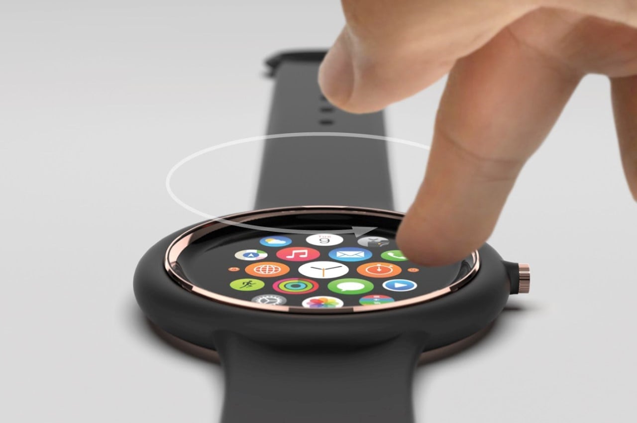
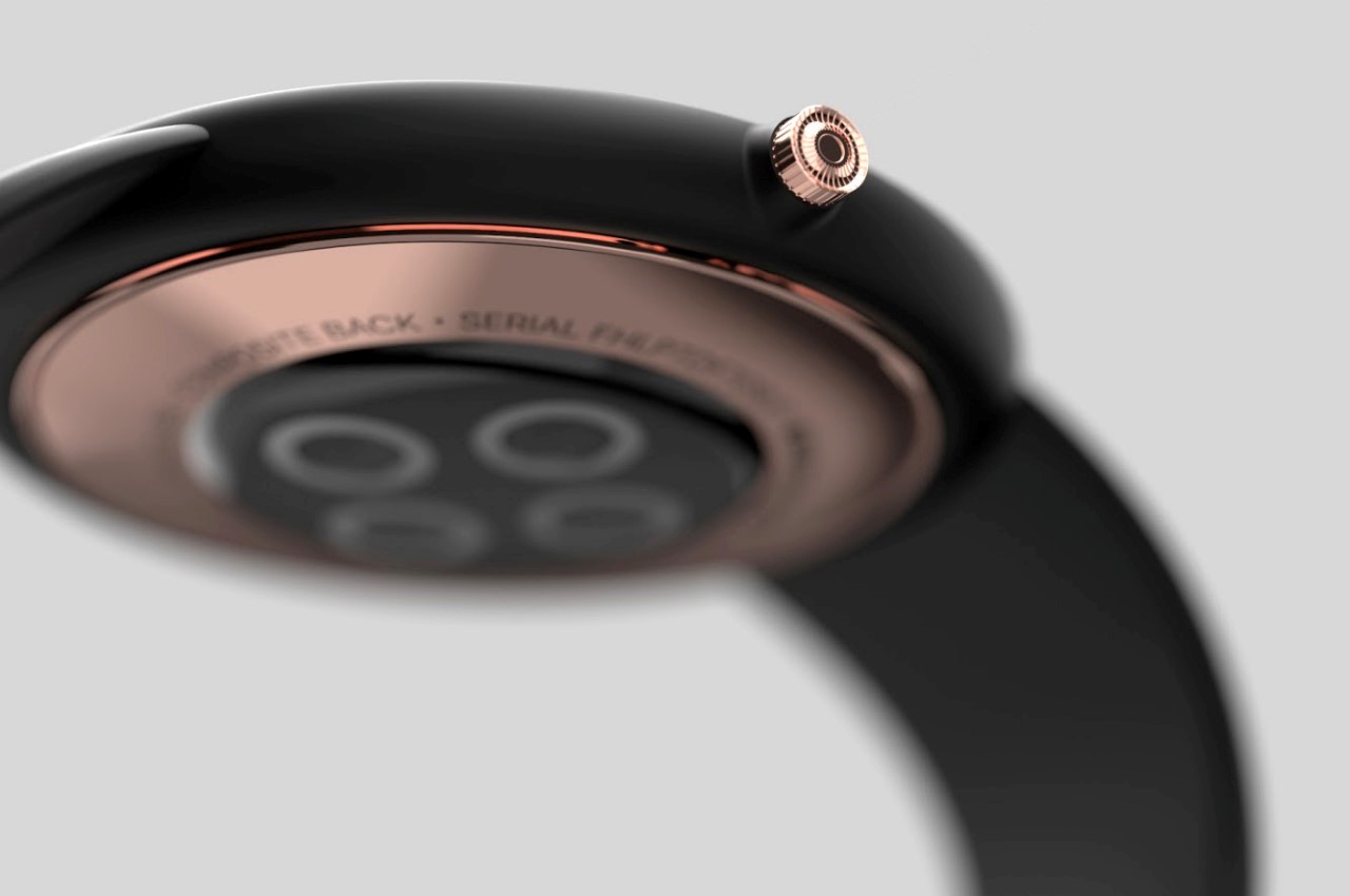
The Watch Loop is still rather unapologetically an Apple smartwatch. It comes with the rotating crown, the familiar interface (although probably slightly modified for the circular layout), sports the heart-rate tracker and magnetic wireless charging zone on the base, and has an interchangeable watch-strap system that’s available in a host of colors. Notably, its speakers hide behind the rubber bumper of the watch strap, its concave screen sinks into the design, helping somewhat reduce mass, and the watch’s circular design can be popped out of its strap and used sort of like a pocket-watch or even a handheld stopwatch. Duarte’s concept aims at bending some of the rules that Apple’s set for its Smartwatch while adhering to the others. At the end of the day, it’s still a memorable design that looks like a part of Apple’s ecosystem. It comes in a fun display case too (which is slightly bulkier than the Watch’s slimmer vertical cases). What do you think?
Designer: Felipe Duarte
