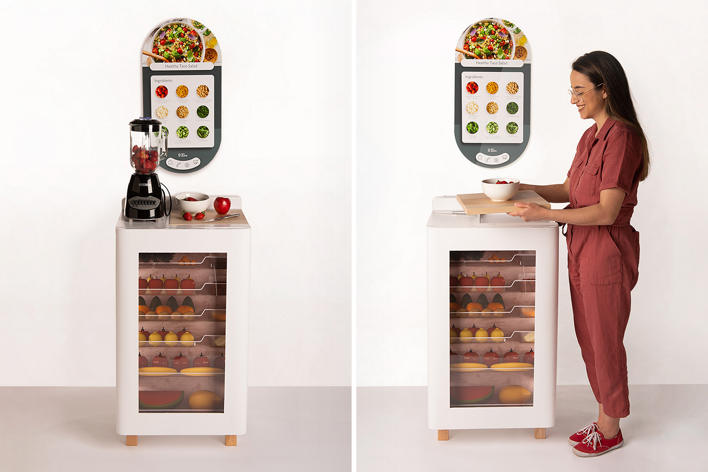
“Displaying vegetables and fruits makes me remember to eat them”, said one of the target users in an interview with designer Tati Ferrucio while she was developing The Fresh Fridge.
The Fresh Fridge relooks the very brief of the refrigerator. Most fridges are designed to perform one prime function – keeping your food fresh for long. The Fresh Fridge, however, also considers other aspects like the contents of the fridge and the behaviors of the user, and promotes a lifestyle that gets you to eat healthier, more nutritious food like fruits and vegetables. With a transparent door, the Fresh Fridge feels like the produce section of the supermarket. The fruits are kept on display, reminding you to eat them when you’re hungry, and the transparent window actually discourages you from wanting to keep unhealthy food in the fridge, in case other people see it and judge your eating habits.
The Fresh Fridge is an ecosystem featuring the fridge itself, and a smart display above it. Designed by IDSA Student Merit Award-winner Tati Ferrucio, the Fresh Fridge focuses on the complex system of a healthier lifestyle, rather than just on individual food items. The smart display above the fridge comes with a touch-sensitive surface and a built-in camera. It acts as a sort of hub for all information, allowing you to manage inventory, order fresh food online, watch recipe tutorials, and bond with friends or family members while you prepare food or while eating (you also get the added bonus of being able to show your mum you’re eating healthy!)
Underneath the smart display sits the main fridge, designed to be a slightly more compact companion to your regular fridge (where you’d store all your day-to-day meals, groceries, drinks, leftovers, etc.) The Fresh Fridge comes with compartments designed specifically for different kinds of healthy foods – leafy greens go on top, where it’s cooler, while fruits and veggies occupy the lower spaces. The trays even account for prepared/cooked items like salads, burrito bowls, smoothie bowls, or cut fruits, with slide-in areas for airtight containers.
The top of the Fresh Fridge becomes the perfect area to prep your food. The ingredients remain easily accessible below, while the smart display on top lets you tick off items from your inventory and even prepare meals by watching recipe videos or chatting with your nonna who guides you with their tips. Plug-points built into the top of the Fresh Fridge let you hook up appliances like blenders, induction stoves, or rice-cookers, while a slide-out tray makes mise en place easy, allowing you to chop, dice, peel, mash, season, or garnish your food.
As you take food from the Fresh Fridge, the smart display on the top lets you tick it off, helping the fridge track inventory for a more planned grocery shopping experience. It’s not entirely clear if the Fresh Fridge also reminds you when food’s spoiling, although that would be an extremely handy feature in making sure you don’t waste anything!
The Fresh Fridge approaches the appliance’s design rather uniquely. The clear (slightly textured) glass on the front really helps inform the interiors, which Ferrucio designed keeping organization in mind. Each of the trays (made from recycled plastic) come with horizontal shelves that help you neatly organize and present your food. The trays feature a modular section on the right too, letting you add containers with dividers, airtight storage boxes, microwave-friendly lunchboxes, etc. Lastly, a mild light on the inside helps illuminate the Fresh Fridge like the refrigerated aisle at supermarkets. The light activates the minute the camera on the smart display notices someone approaching the fridge or walking by, and the fact that the healthy food’s put on display for you really helps condition the mind into eating healthier, more nutritious meals!
Designer: Tati Ferrucio