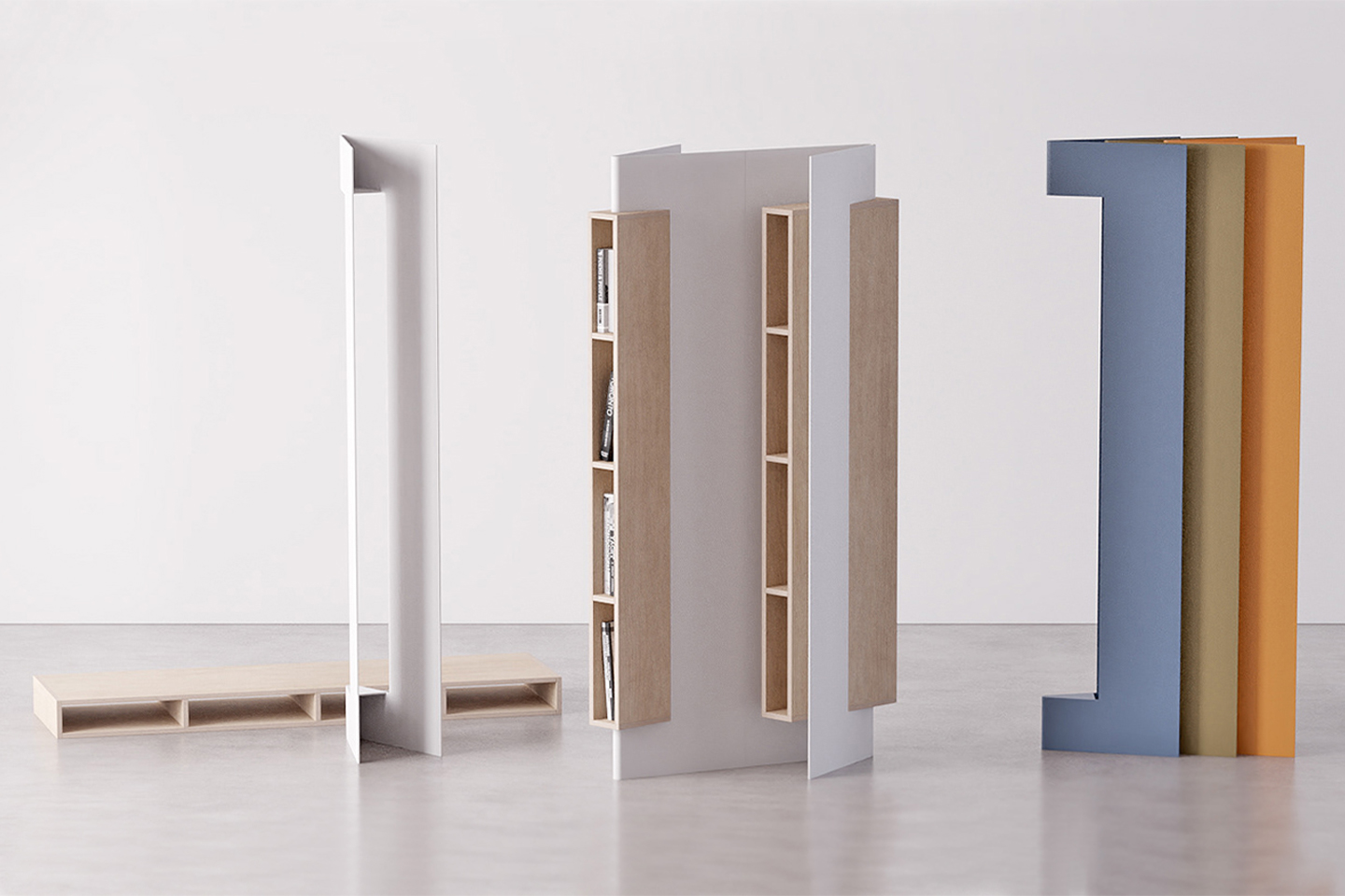
Imagine instead of having a self-care app send you a notification that reminds you to read (especially if that is your resolution for the new year), the furniture itself can be a reminder! That is what Slice essentially is, a minimal, compact, elegant bookshelf that looks like an open book so that it can nudge you to read without having any more screens or digital stimulation.
“In amazingly digital era books aren’t easily opened, having this in mind ‘Slice’ is a bookshelf that intends to motivate individuals to read more often,” says Portuguese designer Joao-Teixeira who is known to always understand the assignment and delivers every single time with unique pieces like this.
Slice connects the environment, the activity, and the user very seamlessly through its form and function. Besides its emotional character, the bookshelf also takes on an aesthetic approach based on minimalistic and sleek shapes. Its elegantly formal look allows the product to become modular, enabling dynamic configurations as a means to highlight its presence and therefore its use.
You can access books from both sides (front or back) easily and the shelf was deliberately created with a slim profile to better fit in smaller spaces. It is horizontally stackable if you want to add more colors or create a piece for your home library, but Slice is certainly a slice of heavenly furniture for every book lover out there with big dreams and little floor space!
Designer: João Teixeira