Perhaps one of my favorite moments in the design-documentary “Objectified” is when Alice Rawsthorn draws the analogy between analog and digital products. She brings up the example of a chair versus an iPhone, stating that if a Martian were to land on earth, chances are that they could look at a chair and roughly guess what its function was. On the other hand, the iPhone with its black slab design, really doesn’t tell you what the device is or what it’s capable of. In a lot of ways, the forms of analog products are easy to understand even without knowing their history or background. Yezin Shin’s Toaster follows that same line of logic.
Designer: Yezin Shin
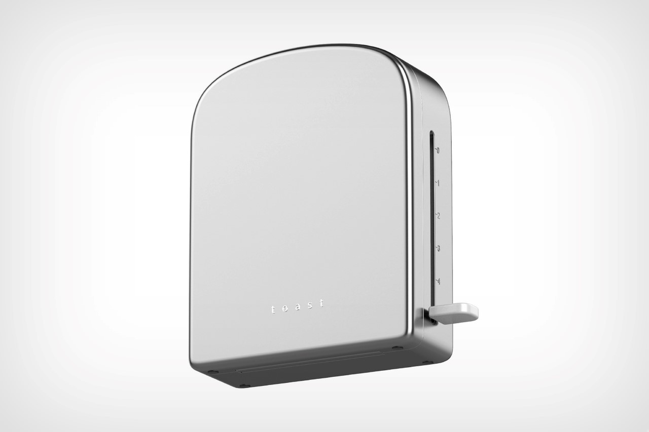
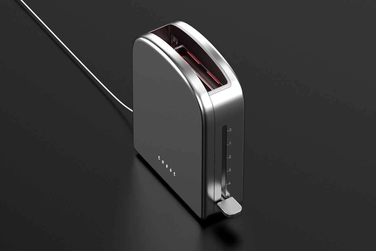
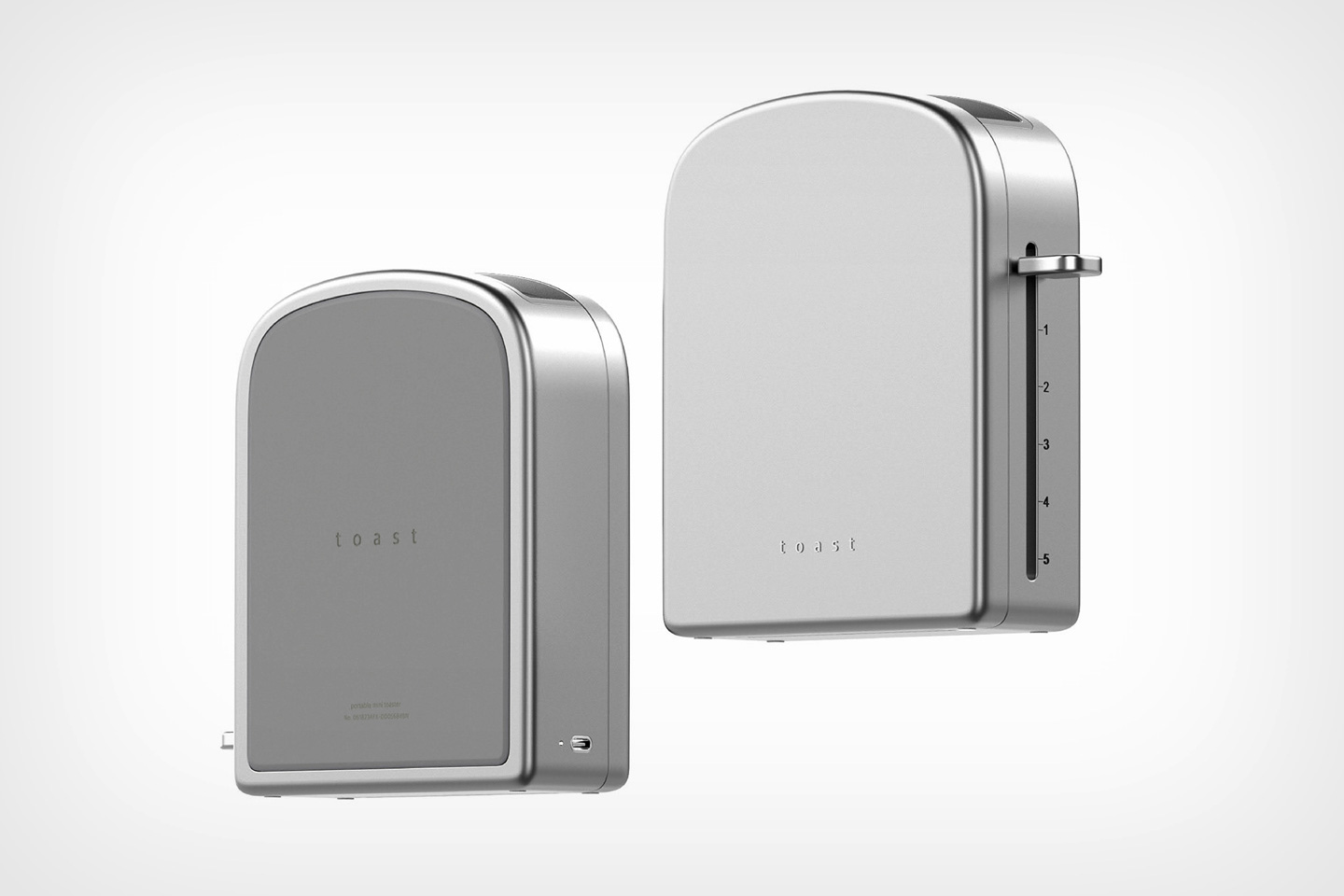
A toaster is simply an oven for your slices of bread. Place the bread slice into its slots and heating coils ‘bake’ the bread to golden perfection. While it’s fairly easy to identify a toaster by simply looking at its form with the two slots on top and the lever on the side, Shin decided to distill its form down even further. Her toaster celebrates the shape of the ubiquitous white bread slice, with a form that follows its inspiration. Designed to toast one slice of bread at a time, the toaster is quite literally shaped like a slice of bread, allowing you to instantly make the association. Shin’s toaster also provides the ability to work vertically as well as horizontally, sort of like a traditional oven.
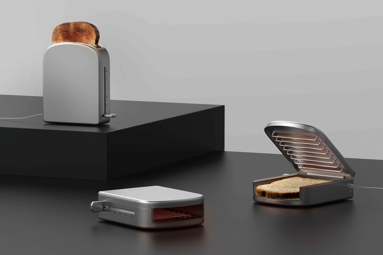
While one could say that Shin’s toaster is a bit of an oversimplification (with no strong need for it, given that toasters are pretty well designed the way they are), her redesign is more of a thought exercise that compels you to question the very things you take for granted. For decades, we’ve associated the toaster with being a vertical appliance that ‘pops’ out a cooked slice of bread once it’s ready. Shin challenges that archetype with a toaster that can even be used sideways, so you could potentially cook your bread with butter, cheese, or a variety of toppings on it. In a parallel universe where popping vertical toasters weren’t such a strong social norm, I’d like to imagine that Shin’s toaster design would be the much more accepted standard. Besides, props to Shin for that beautifully bare-basics design!
