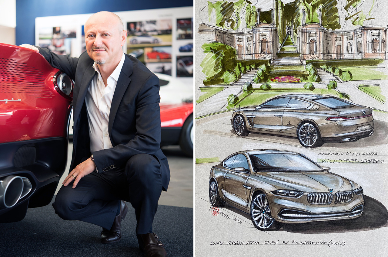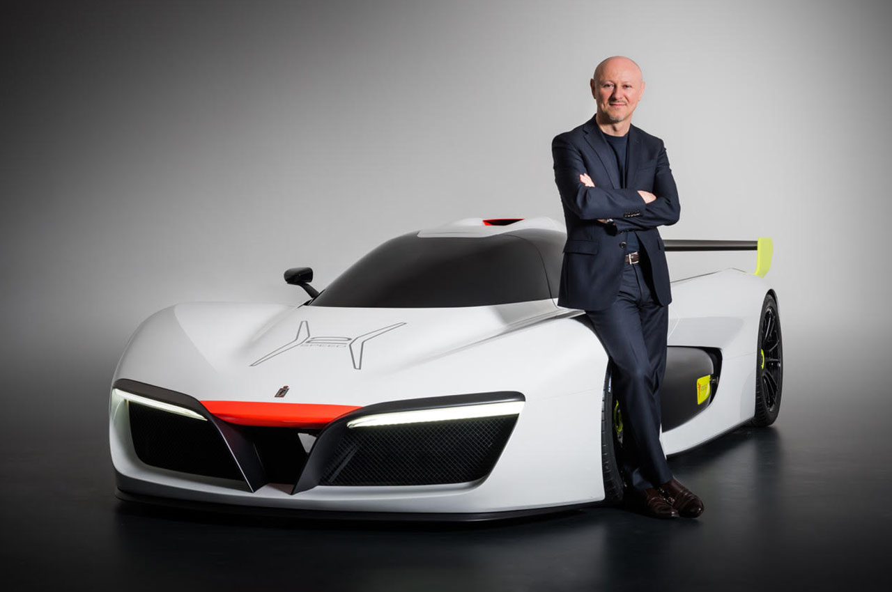
We talk to Fabio Filippini – Ex-Pininfarina design director and author of ‘Curve.’
BACKGROUND
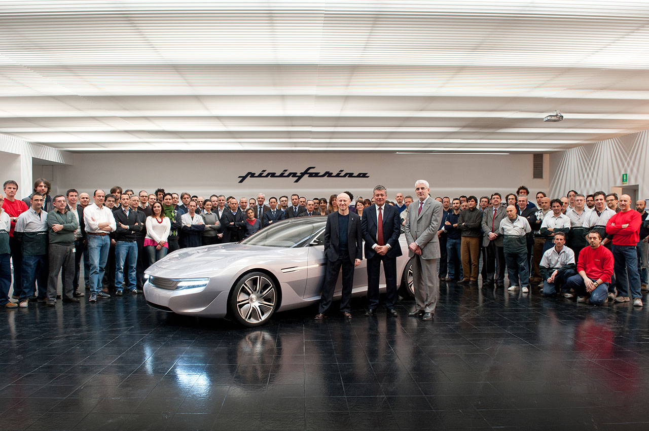
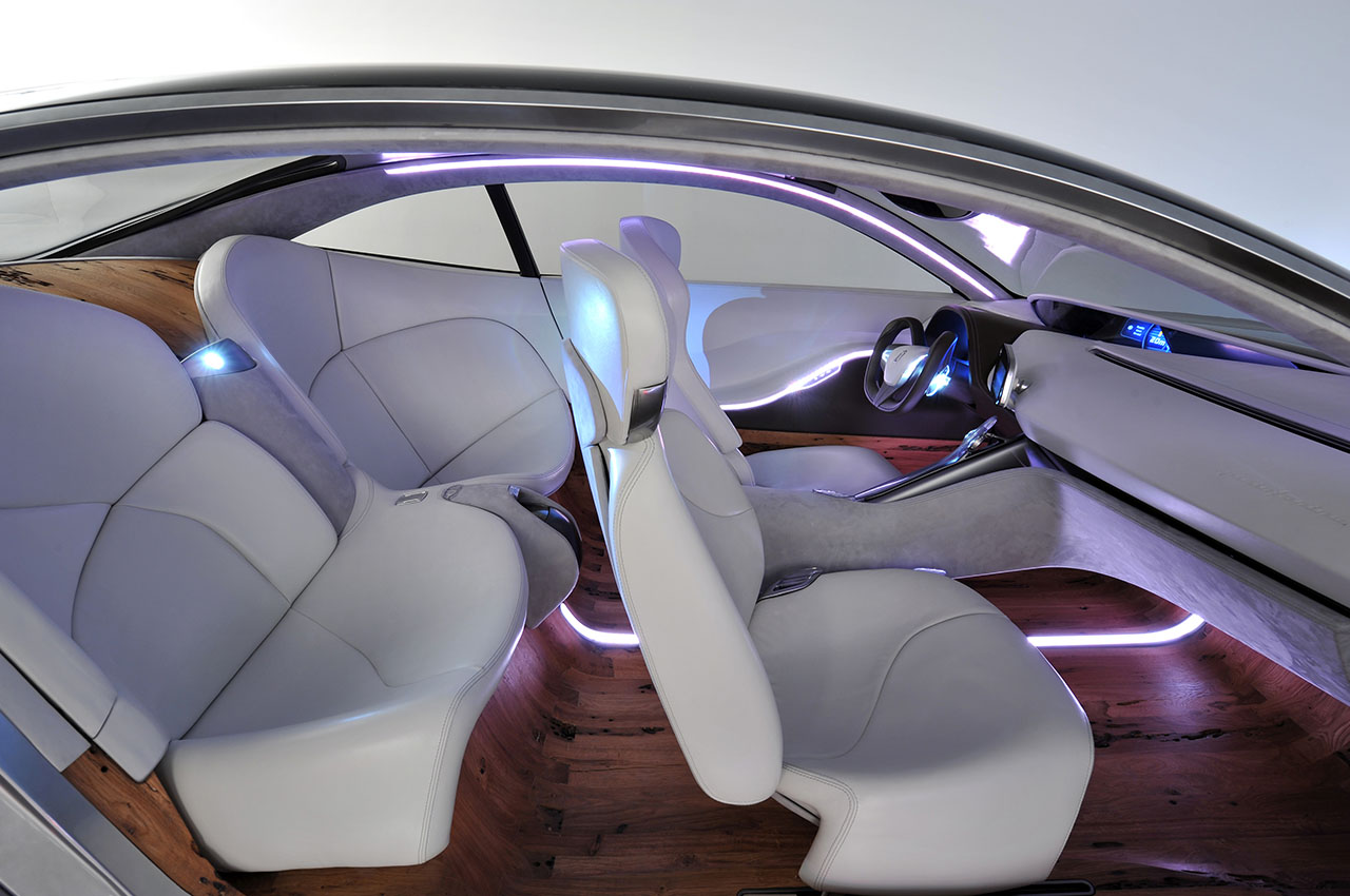
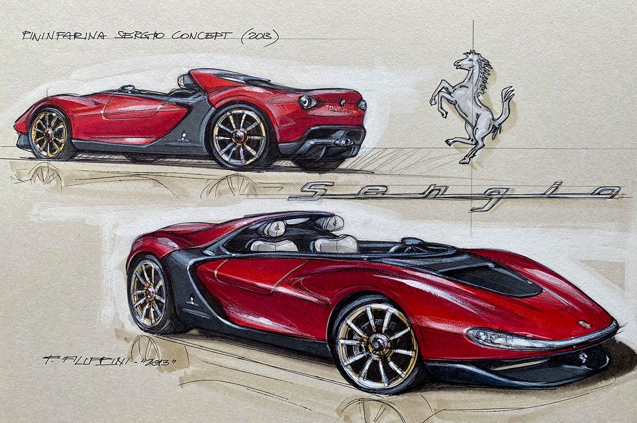
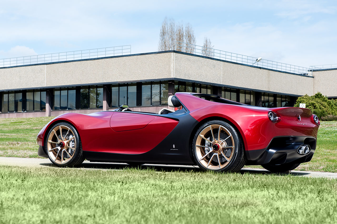
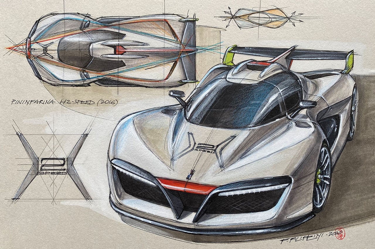
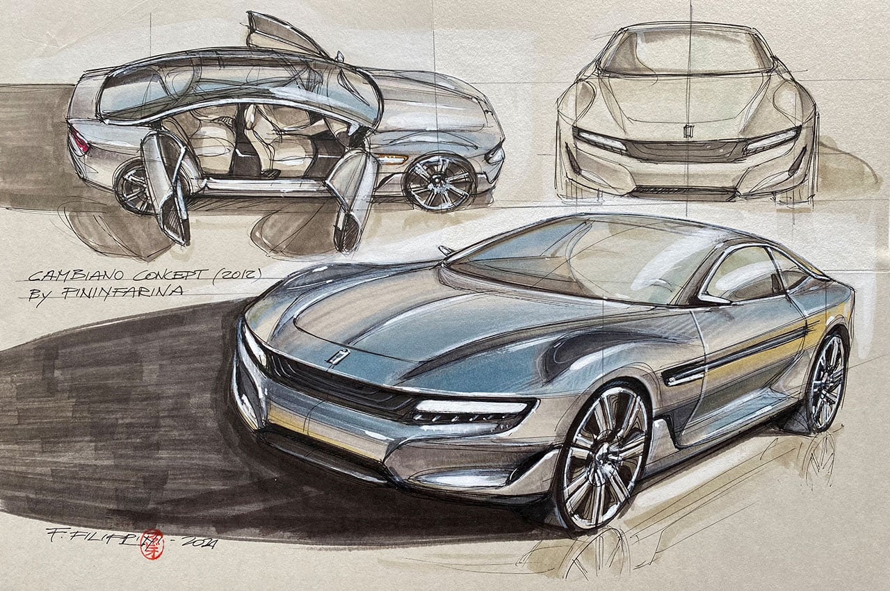
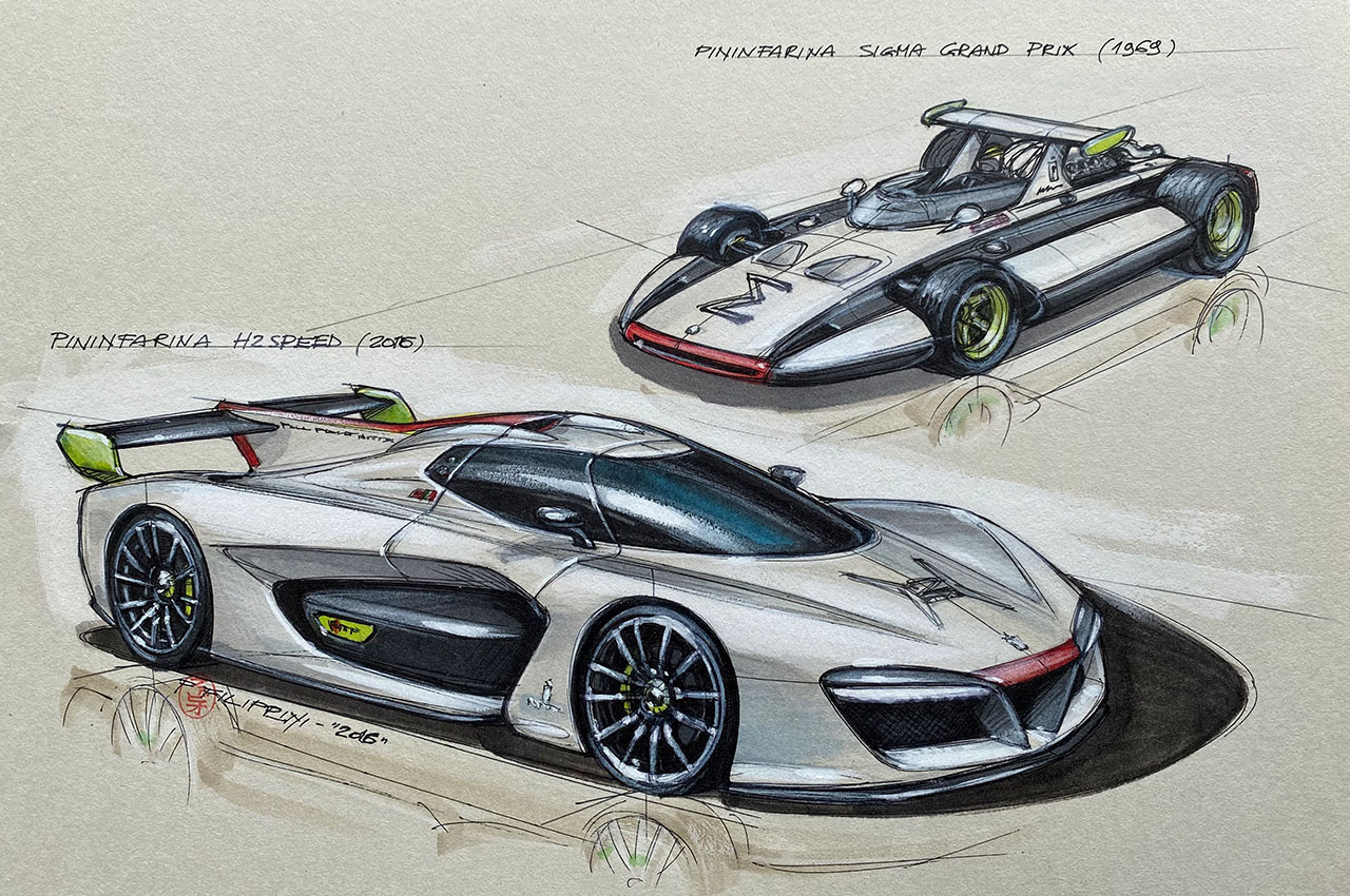
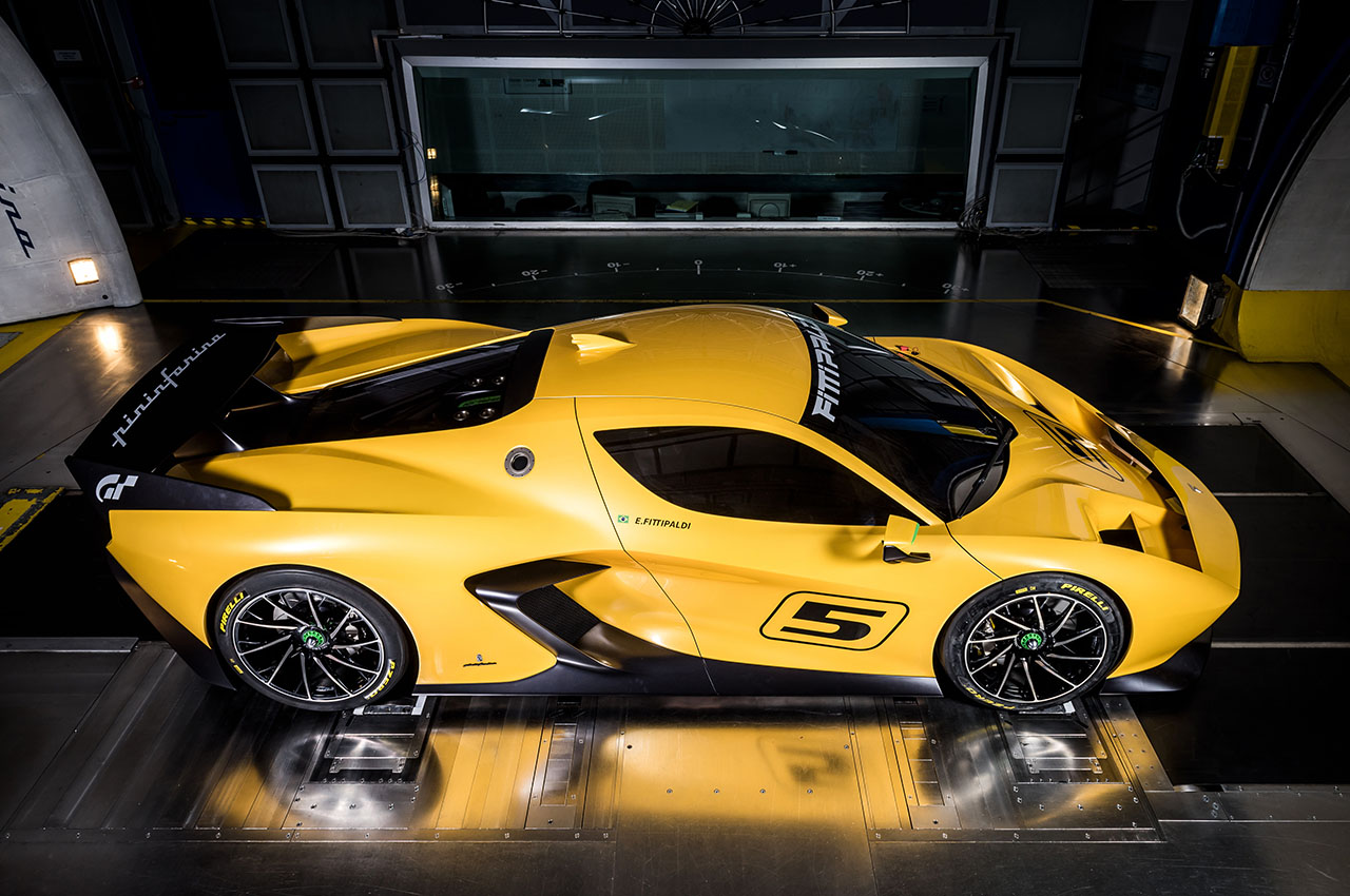
Over the past 35 years, Italian design guru Fabio Filippini has worked as an influential car designer for such automakers as Volkswagen, Audi, Groupe Renault, and other international car makers in countries ranging from Italy to France or Spain and China to Japan, before taking up a position as Pininfarina design director from 2011. He is best-known for his work on the Mitsubishi Minica, Audi A8, Kangoo 2, Mégane III, Clio 4, Twingo III, Espace V, as well as concept cars including the Pininfarina Cambiano and Sergio, BMW Pininfarina Gran Lusso, the hydrogen-powered H2Speed and the Fittipaldi EF7 Vision Gran Turismo. He has also dabbled in the design of alternate transportation vehicles like the Eurostar e320 train and the Zetor Concept Tractor. For his design work, Filippini has received numerous awards such as the ‘Interior Design of the Year’ in 2012 and the National Innovation Award for the Pininfarina Cambiano, and ‘Best Design Study’ for his Pininfarina Sergio at the 2013 Autonis Design Awards.
In 2018, he moved to Tokyo where he currently works as an independent car designer and design strategy adviser. Besides his professional design duties, he also serves as an international judge at the world’s most renowned classic car concours such as Pebble Beach Concours d’Elegance and Salon Privé.
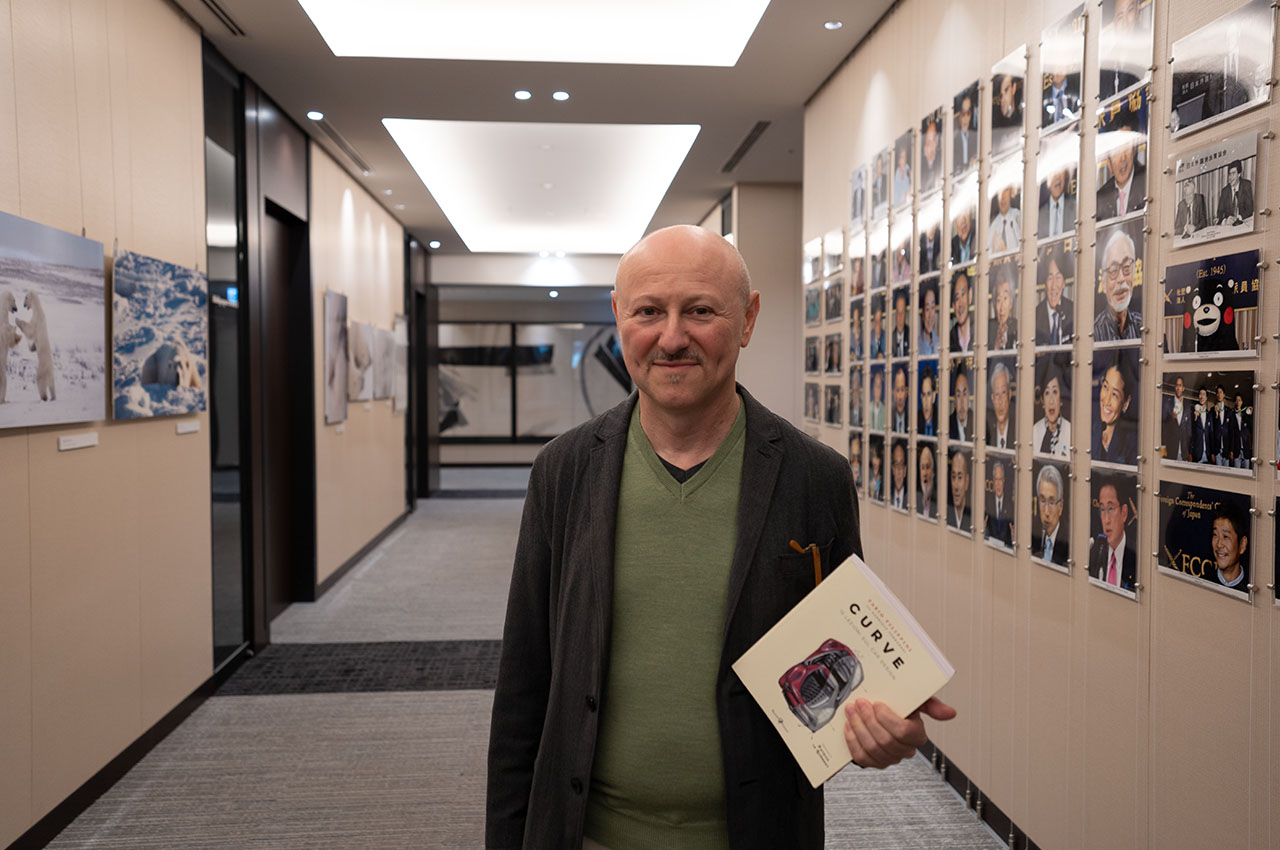
In late 2021, Filippini toured Europe to launch ‘Curve,’ his new book on automotive design. I caught up with Fabio recently for a chat about his work, his thoughts on design, and his book.

INTERVIEW
Peter Lyon (PL) – Firstly, congratulations on the launch of your book. I must say that once you start flicking through its pages, your book is hard to put down. The illustrations are exquisite. Are they all your own work?
Fabio Filippini (FF) – Thank you. Yes, I drew all of those drawings and sketches. I’m glad you like them.
PL – The book’s introduction looks intriguing and should capture the attention of every student of automotive design out there. It says “What does an iPod and a Renault have in common? Why was Le Corbusier creating innovative architecture but driving a car with decidedly antiquated lines? How does the car industry react to changes in society and its impact on the environment? The illustrated essay ‘Curve’ by Fabio Filippini brings together the history of car design with the personal and professional experiences of the author.
This is a book that talks about the essence of the car and the path that leads to its creation with unprecedented passion, competence, and originality.”
FF – There is a lot of history in this book. And a lot of passion.
PL – Speaking of passion and originality, I’m interested to hear what you consider to be the best five car designs ever?
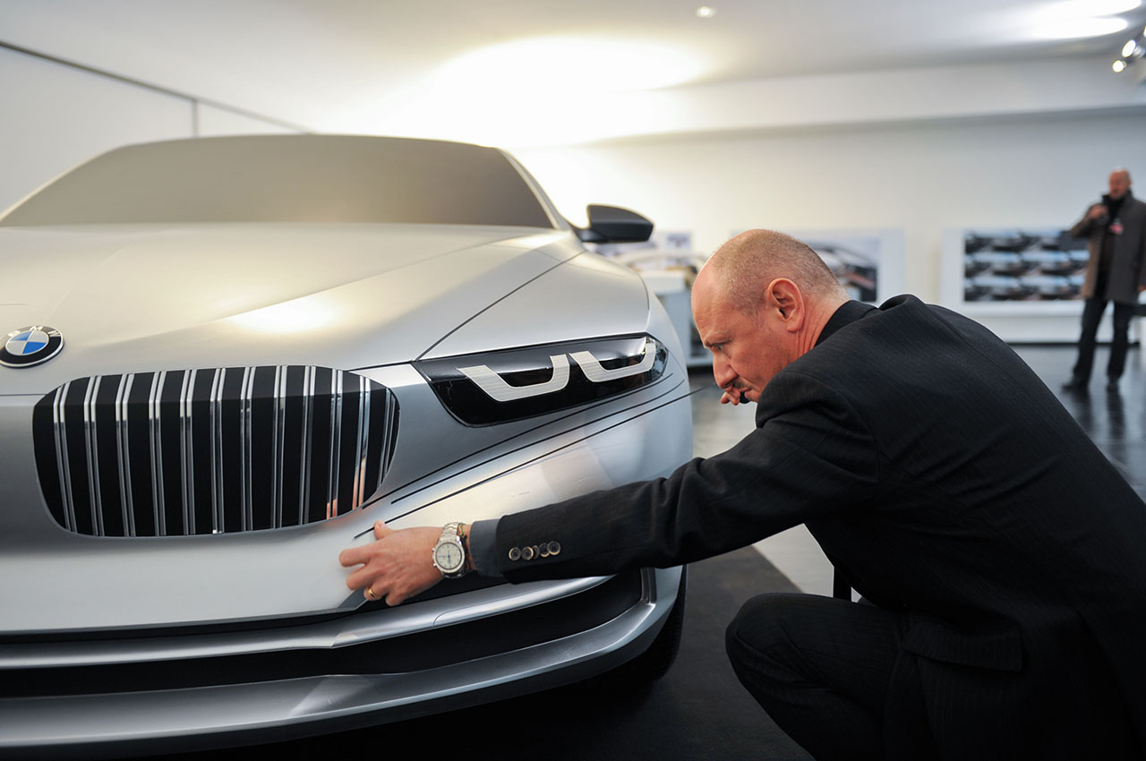
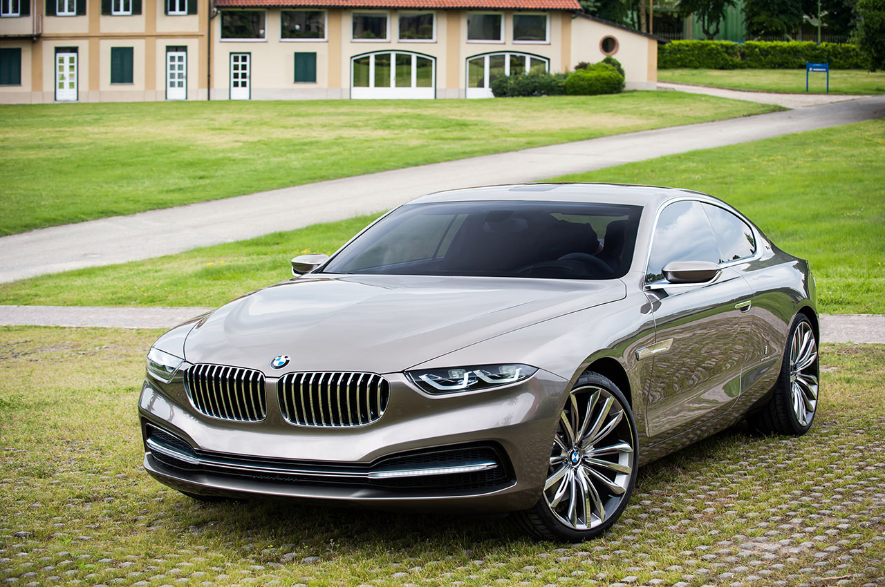
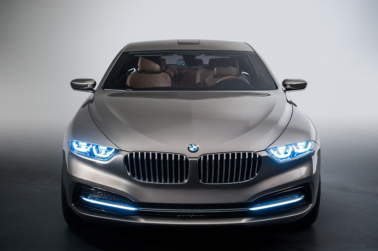
Image – BMW Pininfarina Gran Lusso
FIVE BEST CAR DESIGNS according to Fabio Filippini
1. Ferrari 512s Modulo Pininfarina
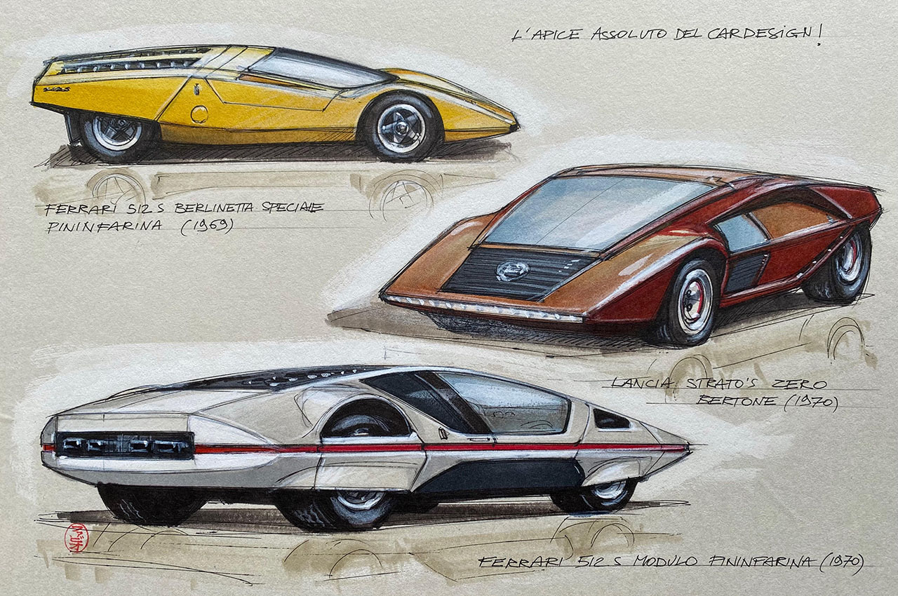
That’s a tough one. Okay, let me start with the Pininfarina Modulo based on the Ferrari 512S from 1970. This was an extremely special Berlinetta, an experimental one-off prototype penned by Paolo Martin for the 1970 Geneva Motor Show. When it came out it looked more like a spaceship than a car. It matched perfectly the mood of the time to come. The first sketches appeared in 1967 before man had landed on the moon. And of course, at that time, Stanley Kubrick was still preparing his ‘2001: A Space Odyssey’ movie. If you look at the Modulo, it could so easily have appeared in Kubrick’s film. This Pininfarina concept and ‘2001’ were the top expressions in different fields of this futuristic vision at that time. And the car still looks futuristic today.
2. Citroen DS

My second car would be the Citroen DS. It was so advanced when it appeared in 1955. There was nothing like it. And still today, it is still much more modern than most contemporary cars. The shape, the space inside is big and comfortable. Aerodynamically it was fantastic and so modern with its fiberglass roof. But strangely, no one copied it. In the years after that, no other carmaker took inspiration from the DS. It influenced no one. Not even new technology like the unique hydraulic suspension influenced other carmakers. It was beautiful but seemed to be an anachronism.
3. Fiat Panda
Next is the Fiat Panda designed by the legendary Italian designer Giorgetto Giugiaro of Italdesign in 1980. It’s like Muji-style philosophy applied to cars 20 years before the Muji brand was born. I like the proportions. It’s purposeful, functional, thoughtful and refined. It’s a masterpiece in simplicity by Giugiaro.
4. Nissan Silvia
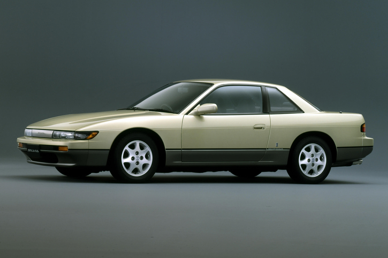
Obviously, I could also add the Lamborghini Miura and Ferrari Dino to my list but that would be too obvious. I’d much rather add a Japanese car that was launched around the same time I first arrived in Tokyo. Now this car might not be one of the most beautiful cars ever, but it’s a car I really love, even 34 years after its launch— it’s the Nissan Silvia (S13) from 1988. This Silvia was so beautiful that it almost looked like a Pininfarina-styled car. It was low-slung with nice proportions, had very clean styling, and had good balance. It was a very Italian-looking car. There is a subtlety with the treatment of the front fender that not many people recognize. But as a designer, I look at it and I like to see the subtle twisting effect on the fender and hood.
5. Porsche 911
Now, where would a top 5 list be without the Porsche 911? Basically in any of its iterations, starting with the original air-cooled model in 1964 right through to the current 992 Series, it’s an automotive masterpiece. To me, the 911 is not only a brilliant technical evolution but also a perfect representation of good and timeless design going through the ages. While the 911 is an icon, I will not include the 996 version which I consider to be a heavy makeup caricature.
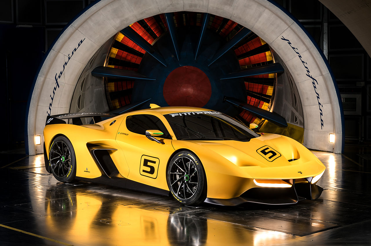
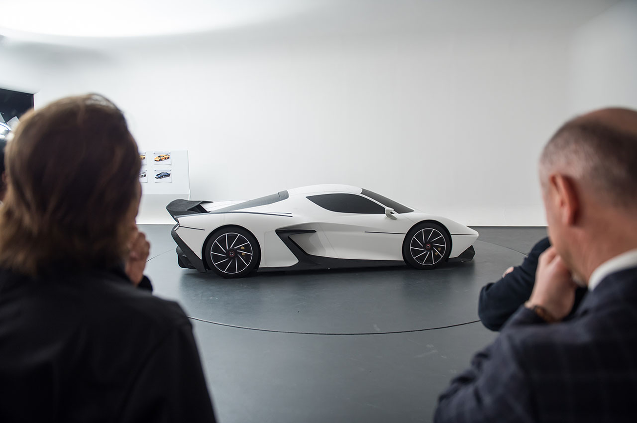
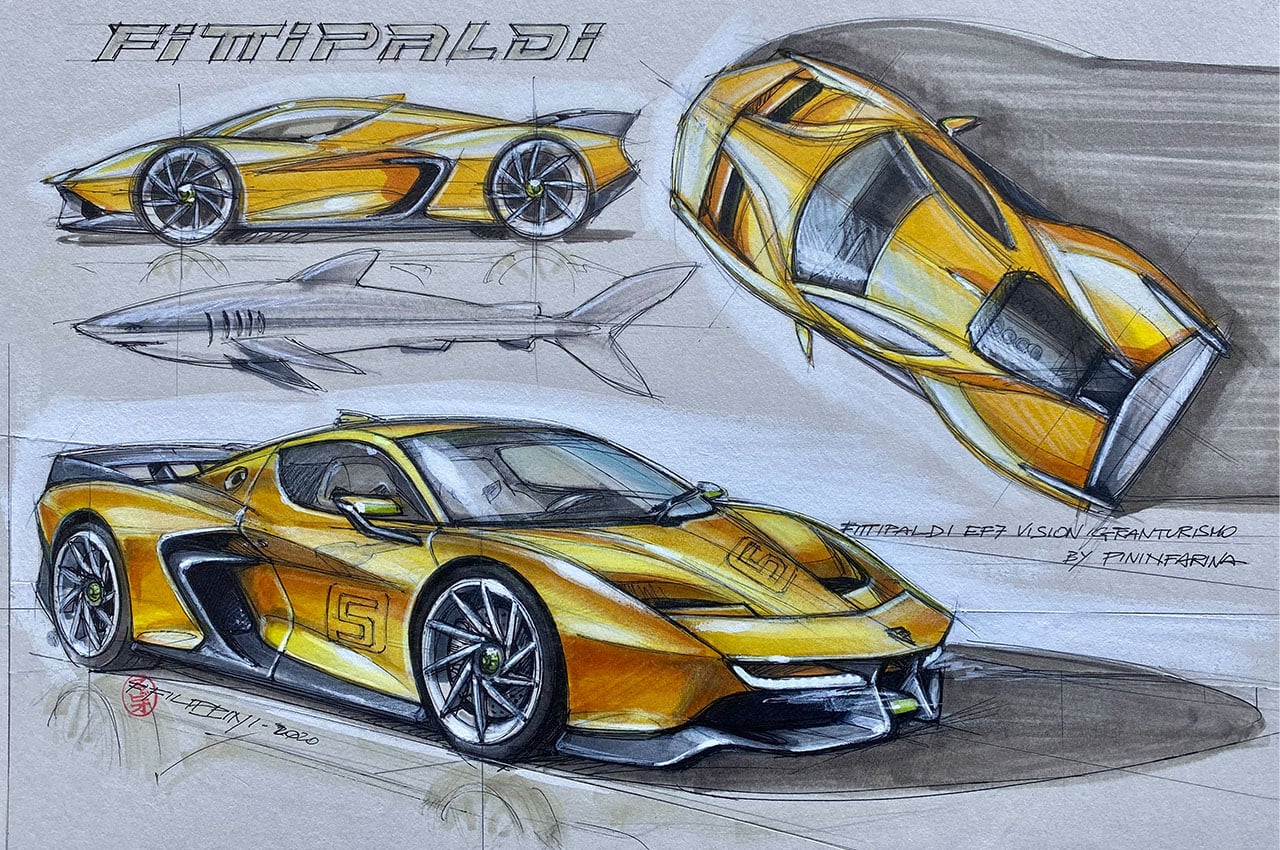
Image – Fittipaldi EF7 concept
WHAT ABOUT TESLA’S CYBERTRUCK?
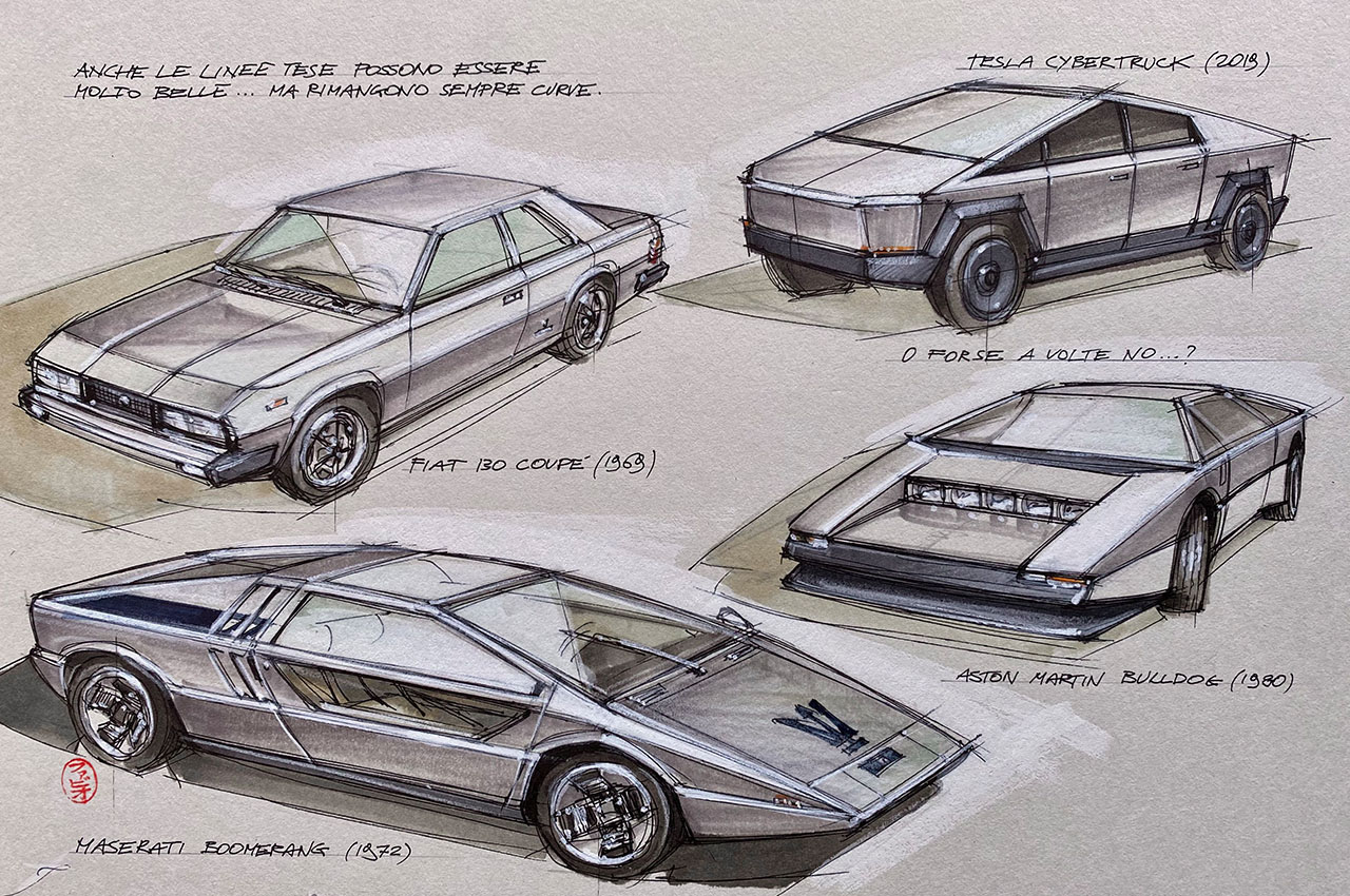
PL – Okay, that’s a very eclectic list of five cars indeed. Thank you. Actually, as we were going to interview you today, we asked Yanko Design’s over 1 million Instagram followers for questions, and one that came up several times was your take on the Tesla Cybertruck. When it came out – our demographic was a 50:50 breakdown. Half loved it because they said it was innovative and outside the box and the other half said it was rubbish. What do you think?
FF – My take? Okay, I think it’s brave and courageous. This truck is brave to go against convention but it’s nothing revolutionary and nothing new. I think Tesla has real guts to come out with something like that. It’s edgy and looks like a triangle or a pyramid shape but that is not new. You can find cars with sharp, triangular designs like the Aston Martin Bulldog or Citroen Karin concept, but at least they look good. I don’t see the Cybertruck as being innovative, just different. The electric powertrain technology inside is innovative, yes, but that’s what the market wants. To be honest, I think it’s bad to do something so aggressive in modern times. It’s like a caricature. In 99% of car designs, there is not a single straight line. Even when they look straight, every line is actually curved in some way. Even in the Fiat 130 and Maserati Boomerang, which is a beautiful wedge-shaped car, all of the lines are curved to a degree. But in the Tesla Cybertruck, some of its lines are actually straight. Also, the rear door area is not good because when you get in you will hit your head. They’ve made no consideration of the most basic consideration.

WHY I CAME TO JAPAN 30 YEARS AGO
PL – Thanks for your expert insight into those designs. For someone who has traveled so much and worked in so many different design studios, I’d like to get an idea about the different aesthetics and approaches towards design.
FF – It comes back to the reason why I came to Japan over 30 years ago…
I was working on Japan designs for Mitsubishi in Italy in the 80s. In one of my first design jobs with Open Design in Torino where we were working on Mitsubishi’s Minica and GTO styling, I was seeing something totally different from the Japanese when compared to our traditional Italian designs. In the middle of the 80s was good in Italy. Sensibilities were so different. I was seeing some totally unique ways of doing designs from Japan. Just going through Japanese magazines like the well-known Car Graphic, I saw things that blew my mind. Like an advert for Bridgestone tires. I could not read the text but the images were telling. I saw a full page with a very nostalgic image of a seashore, of a man and a dog looking at them from behind, and then in the corner of the advert, was the name ‘Bridgestone’ and a small photo of a tire. If that was an ad for say, Pirelli tires in Italy, the tire would have featured much more prominently. I was intrigued with this artistic subtlety and very interested in this new design world opening up to me. Soon after I was invited to work in 1988 in Japan so I decided to go. I knew Italy, but I thought I needed more stimulation and a different outlook. I was attracted to things I don’t understand and I wanted to work outside of my comfort zone.
THE LATE 80s IN JAPAN WAS LIKE WORKING IN DISNEYLAND
PL – The late 1980s? That was the peak of Japanese car design with the new launches like the Skyline GT-R, Mazda MX-5, Subaru Legacy, Toyota Celsior, and the opening of luxury brands Lexus and Infiniti in the U.S. These cars all influenced European car styling, production, and product planning in their own ways.
FF – That’s exactly right. It was the middle of the ‘Bubble Economy’ and the peak of Japanese design creativity. And there were so many concept cars coming out too. It was so alive and vibrant that for a designer like me, it felt like being in Disneyland! Remember the early 90s with those brilliant tiny cars like the Nissan Figaro, Suzuki Cappuccino, and Honda Beat? Japanese designers were certainly thinking outside of the box back then. They were willing to push the envelope and experiment.
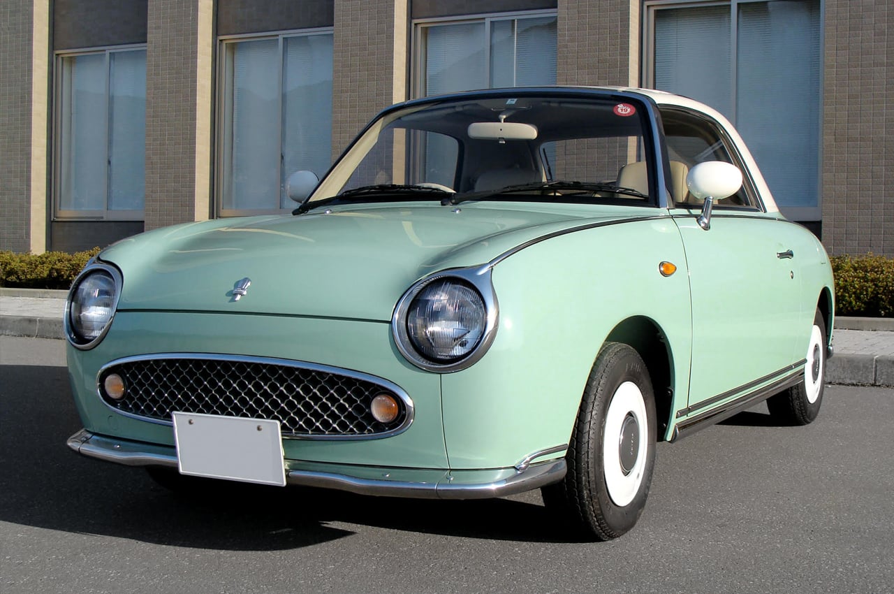
Image – Nissan Figaro
PL – So what really impressed you about Japan back then?
FF – It was part aesthetic and part philosophical. The aesthetics had a different range of criteria. Japanese design was similar to German or Italian design for the main, but there was always some kind of twist to it — either good or bad. But unexpected. In Europe, you have Italian, German, French, or English design — everything is defined. In Japan, they could mix everything without any barrier, without any frontier. And there were a lot of different influences from fashion, architecture as well. For example, the so-called ‘Pike’ postmodern cars from Nissan, namely the quirky Be-1, Pao, and Figaro.
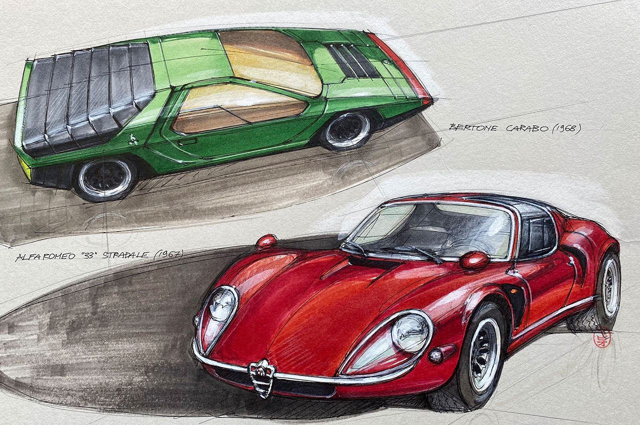
In Europe, many saw those designs as copying European design. But not me. To me, they were bringing back the emotional and nostalgic feeling of old iconic cars such as the 2CV, Mini, and Fiat 500, but in truth, none of those Japanese cars were copies of anything. They resembled European cars in certain ways but they still had their own identity and uniqueness. They were taking some generic hints from Europe’s classic cars and reinventing them.
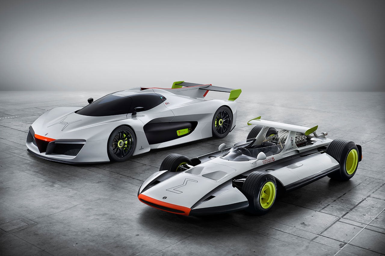
Image – Hydrogen-powered H2 speed concept
JAPANESE RETRO REACHES EUROPEAN ICONS
PL – Then again, you have a car like the Mazda MX-5, which was supposedly inspired by the Lotus Elan. But when the MX-5 was born in 1989, its looks, drivability, and reliability sparked a boom in roadsters giving birth to the Boxster, SLK, Z3, and TT among others.
FF – Yes, indeed. But what’s interesting is that Japan, through cars like the Be-1 and Figaro, was reinventing retro-style design. In the late 80s, Europeans were not into retro. But then, strangely, within around 15 years of these Japanese retro cars appearing, new versions of the Mini, Beetle, and Fiat 500 were launched. Because of the high intensity of creativity in Japan in the late 80s through the 90s, I realized that Japan was the right place to be at that time. That made me open up my mind to what was good and bad in Italian design and what was good and bad with Japanese design. The common denominators were purity, simplicity, and innovation although the definitions of those ideas were a little different in Japan. So it was those philosophies that I took with me to Pininfarina when I became their Design Director in 2011.
PL – Japan really seems to have shaped the designer you are today.
FF – Yes, you could say it did. But what really surprised and shocked me in the early 2000s was why Japan started to go in the wrong direction with a design that was not pure but very aggressive. They went through the 90s with the remnants of the bubble economy, but then from the late 90s, they seemed to get lost and were scared to do anything. They were turning things out without really knowing what to do. They just kept on doing what they were used to doing. Then they finally realized they had to change so Nissan brought on Carlos Ghosn while Toyota started with hybrids in earnest. That period you could say was a Japanese renaissance. Suddenly Lexus for example, wanted to become very original so it came up with the ‘Spindle’ design. Because they were saying that everyone buys Toyota but not for the design. So they tried to improve the design.
DESIGN LOSES ITS DIRECTION
PL – Yes, as you say, in the 2000s, design became very edgy and aggressive, like the spindle grille.
FF – Many Japanese carmakers suddenly became extreme with design and went to the other end of the spectrum with edgy aggressive styling. It was like a caricature. Yes, design nuances like the spindle grille, surfaces twisting in every direction, lights which are a patchwork of different shapes. It was like they were saying ‘we want to be different and unique and any cost.’ But such a design is not beautiful. That change of heart really shocked the design community. Okay, to be honest, some Lexus surfaces are magnificently done. But there seems to be no real cohesion. It was like an orchestra with all of the musicians playing their own instrument as hard as they can, trying to get the most out of it, while not playing in unison with other musicians—so it just ends up being a cacophony. That is not music. Like Lexus designers, all of the players are incredibly talented, but the end result is not in symphony, so to speak. This comparison with an orchestra is something I feel more often in car design. They are great at playing their instruments but they don’t know how to create music.
PL – But even with those edgy design traits, Lexus still sold very well.
FF – Yes, the new styling, hi-tech, and luxury levels appealed to a younger generation because it was radical, and I think very Asian, seemingly influenced by Kabuki or Chinese opera. It was around that time that China started to copy those edgy designs. We cannot forget of course that around the early 2000s, BMW’s Chris Bangle was doing some strange stuff like that controversial 7 series rear end and others. Even today design at BMW is overdone like the 4 Series kidney grille for example.
PL – Yes, as you say, that grille is a little over the top perhaps. So where do you see design going in the future?
CHINA AND INDIA GAIN INFLUENCE IN THE DESIGN STUDIO
FF – After 2000, design became repetitive and less creative and at the same time the digital world was happening. Now everyone everywhere can get online and be creative. It is getting more difficult to identify real trends from the original culture. Young designers today are being influenced from all over the internet including the digital worlds of China and India. As one-third of the world live in those two countries, now they are more influential than ever before.
At car design studios over the last 15 years, I’ve seen a lot of designers coming from India, China, Korea, and Russia. Suddenly there are more designers coming from these countries than traditional countries in Europe.
In China, there are several thousand design schools shooting out young potential designers every year. So today, even if you go to Western car companies, the majority of designers are either Indian, Chinese, Korean, or Russian which is having a definite influence on car design. Styling has changed already. For example, Russians are very precise, very technical but they have a particular taste for macho and aggressive design. Just look at the latest batch of SUVs coming out of Europe and the US. Some look very military-like. Then you have the Chinese who do these swoopy lines everywhere.
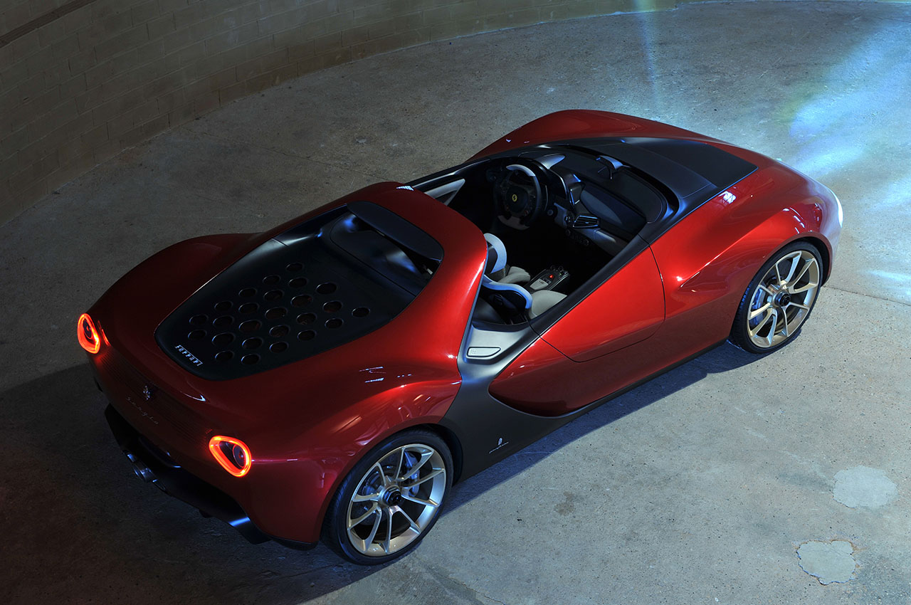
Image – Pininfarina Sergio
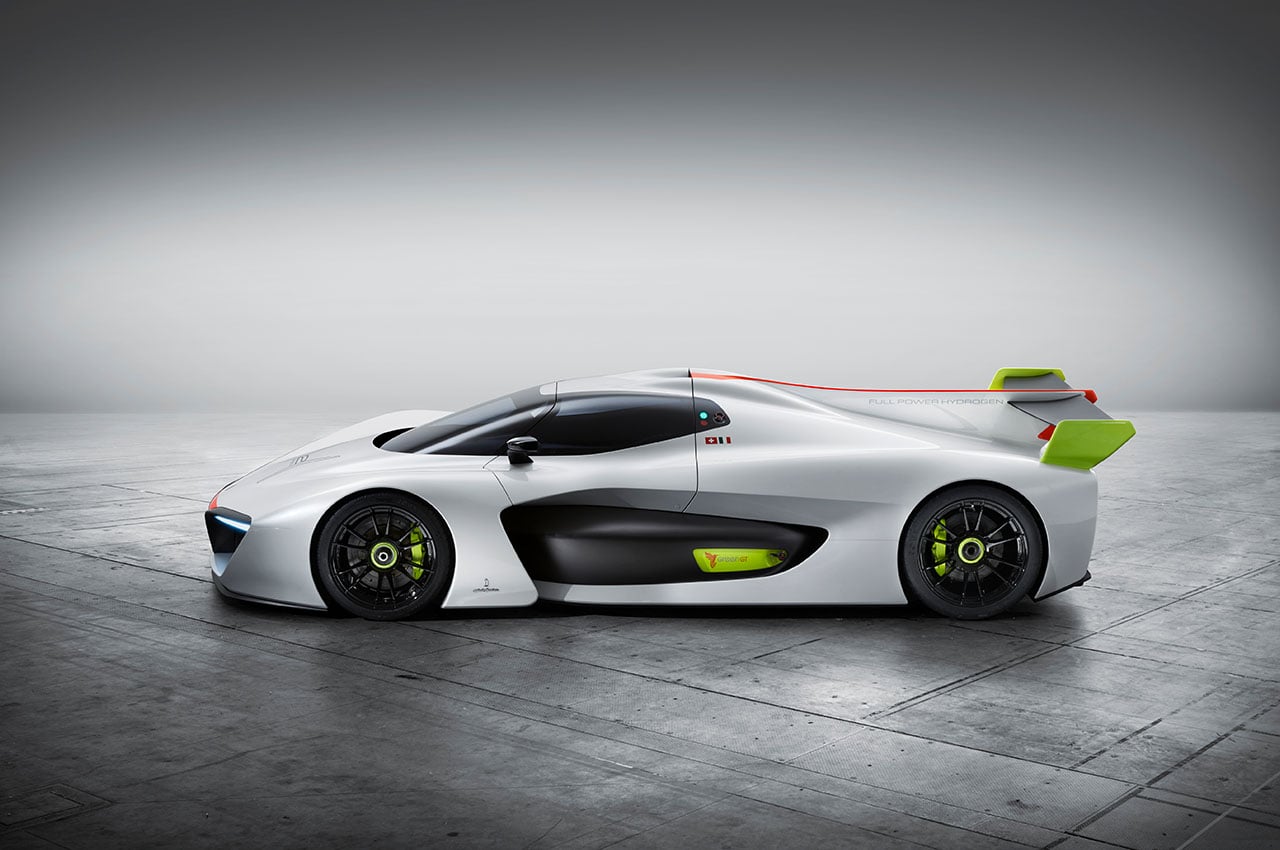
Image – H2 Speed concept
PL – I went to a couple of design studios last year and noticed the growing diversity of nationalities. As you say, many more Indians and Chinese. Speaking of the Chinese, they are becoming more influential on the world stage, not least because of their commitment to EVs. What sort of role do you think they will play in the near future?
FF – The big difference is that the Chinese are heavily into EVs and new technology and are able to switch and adapt quickly, whereas Americans, European and Japanese, like Toyota for example, are having trouble getting out of ICE (internal combustion) cars. China has already made this big jump into new tech and will help them gain a significant footing.
Remember that they started from basically nothing, so they can change fast.
The same thing happened with phones, like with Huawei. You did not know that name 10 years ago, and now it’s the biggest. I’ve been going to China for over 10 years and I have seen how quickly they can adapt and change.
PL – Speaking of design, how do you see design changing as powertrains switch to electric?
FF – Obviously with new EV powertrains we will see a totally new take on car design. I can understand, however, that people will still want a car looking like a traditional car. But in cities in the near future, we must think about personal transportation, which will require people to think in a different way. We don’t have to do the same shapes. You can make car bodies more efficient and practical. Indeed, you can make a car that can change its shape in the city, a car that adapts its shape to its needs or its environment. Cars will also be partially autonomous. You will be able to drive it on weekends but have it ferry you to work autonomously on weekdays.
PL – Now, I’d like to ask you what you are up to now in Japan.
FF – For the past few years in Tokyo, I’ve been working as an independent car designer and design strategy adviser. I mostly now work on strategy and advanced design to define the positioning of a design or a brand. They include all the things that happen before you start to draw a design. My job is to tell a brand which is the best way to go forward for them. I firstly identify the value of the brand and then try to put it into perspective and then create guidelines before starting to develop it with a team of designers and strategists, who are located all over the world. Presently I am working with carmakers and other design companies but unfortunately, I cannot tell you what projects I’m working on now. (Smiles)
PL – Can you give us an idea of exactly what your work entails?
FF – I’m currently working with a German company to develop a new business on sustainable transportation. It’s related to trucks and buses with electric and hydrogen powertrains. They have the technology so they are doing retro-fitting on existing vehicles. And they have even started selling them now to public companies, with some new transport for cities like garbage trucks. I’m working to help them define their new brand and identity. You must first set up a vision and then develop the products based on that vision, followed by design direction and identity.
PL – Many thanks today. Finally, what advice do you have for young designers wanting to get into car design?
FF – I think designers need to move around in order to grow and adapt. Above all, don’t be afraid to work outside of your comfort zone. And always keep an open mind. Don’t be afraid of things you don’t understand. Put simply, a designer should be someone who enjoys the art of designing, is critical and complimentary of a peer’s work, puts things into perspective, changes, and adapts.
PL – Grazie Mille.
