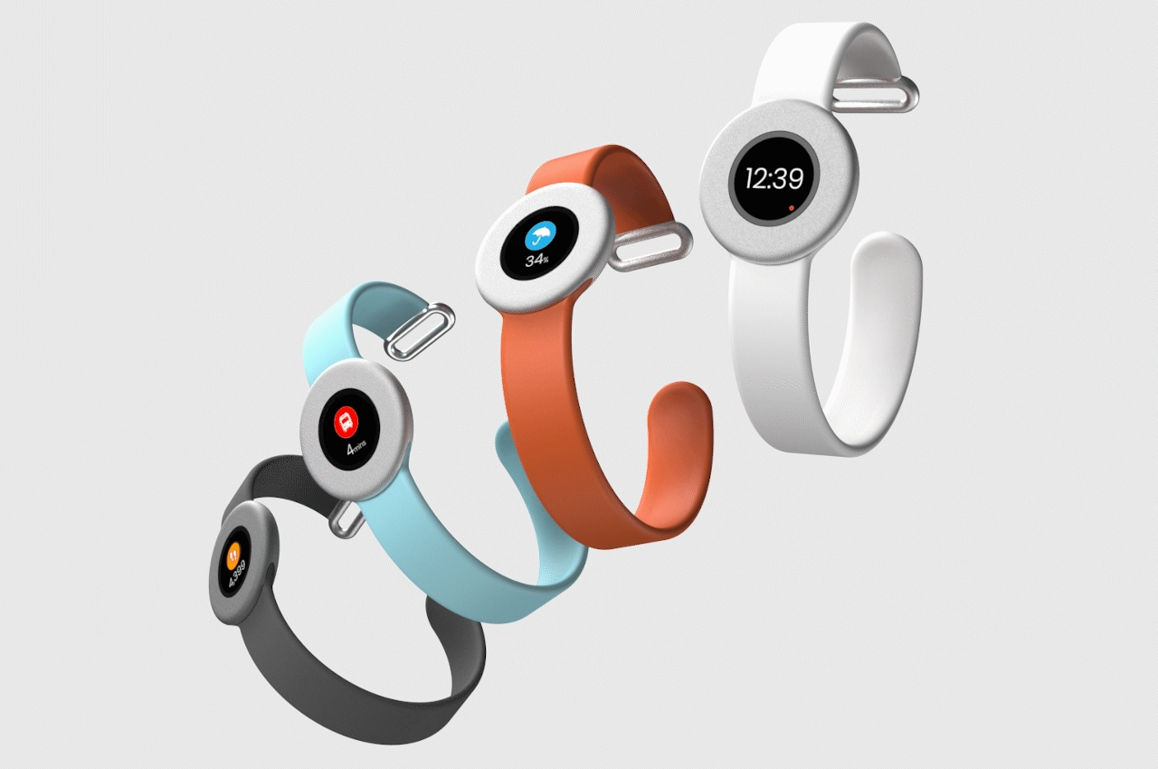
Smartwatches are meant to be smart but are they really meant to be smartphones on our wrists? This concept says, “absolutely not!”
It took a long time, but smartwatches have finally become more mainstream. For the longest time, both manufacturers and consumers have been confused about where this particular category of products fell, whether it’s on the health side like fitness trackers or on the smartphone side as partners in crime. Some think that smartwatches have leaned too much towards the latter, and a pair of designers are putting the focus back on a smartwatch’s most important function.
Designers: Sam Beaney and Ed Burgess
A smartwatch’s core purpose might mean different things for different people, but like their less complicated counterparts, smartwatches offer information when and where you need it in the most instantaneous and simplest way possible. Most smartwatches with sophisticated functions and health sensors also have a high information density when it comes to watchfaces, something that the Focus smartwatch is moving away from.
While manufacturers are trying to banish bezels, Focus embraces them wholeheartedly. Taking inspiration from traffic signs, particularly the circular ones, the smartwatch uses thick bezels as a way to increase the visual focus of the small screen in the middle. There are no other superfluous markings around that screen, be it a rotating bezel or even a crown. This design is almost similar to the Pebble Time Round from 2016, but the display is even smaller, and the design decision was made by choice rather than being limited by technologies available at the time.
That small screen also forces the software to be more selective in what data it shows and how. It’s pretty much limited to showing just one critical piece of information and nothing else. At the same time, the designers had to settle on iconography that would make that information understandable in a single, quick glance. Contrast that with the information and visual overload that’s common among smartwatches today, putting focus more on a fancy representation that sometimes requires a second or two to digest the information it is showing.
The design of the entire smartwatch itself was made with increasing focus and removing distractions, even visually. Although the straps are interchangeable, they’re designed in a way that they sit flush with the watch’s body, creating a nearly seamless surface that’s unbroken by any button or knob. This not only makes the smartwatch simple to operate but also simple to look at, making the simple screen its true focus.