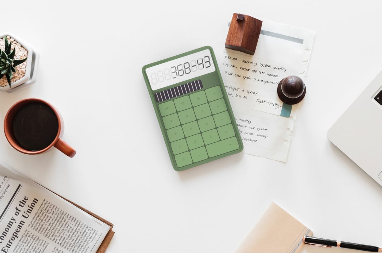
People are advised to clear their desks of things that give them stress, but that isn’t always possible, especially with everyday tools like calculators. It is, however, possible to choose tools that try to reduce the level of stress, at least with their designs. That’s why minimalist office products have become quite popular because they immediately convey a sense of calm through their simple and clean designs. That’s part of the idea behind this concept design for one of the most stressful work tools in existence, the calculator.
Designer: Joseph Donohue
Most of the computations that you can do in your head are often simple and small, from change to dates to ages. The times when you do need to pull out a calculator are the times when you might be sweating over larger figures, often those related to money or logistics. Of all the objects you’ll find on a desk or in drawers, the calculator is perhaps the last thing you’d associate with calmness, and their traditional designs don’t exactly help improve that image.
Although some have gotten lighter and more colorful, the basic design of calculators has remained the same throughout the decades. They are purely functional and utilitarian, leaving little room for any other design or expression. That’s the challenge that this concept design tried to face, cleaning up the calculator while still giving it a bit of personality.
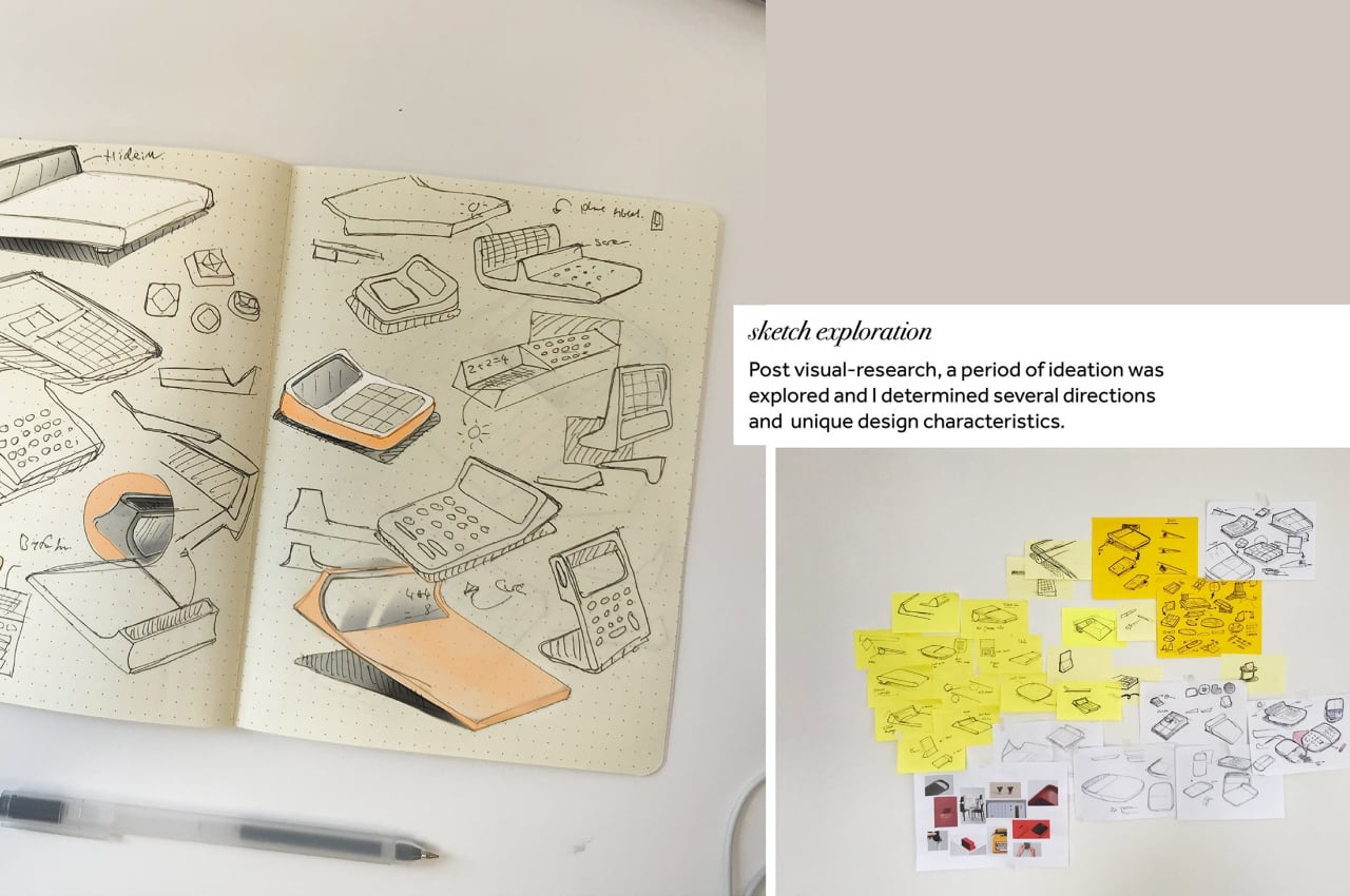
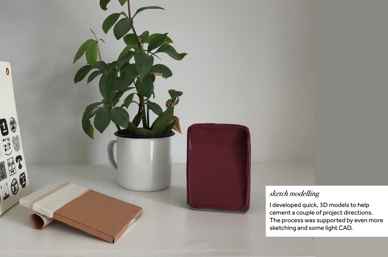
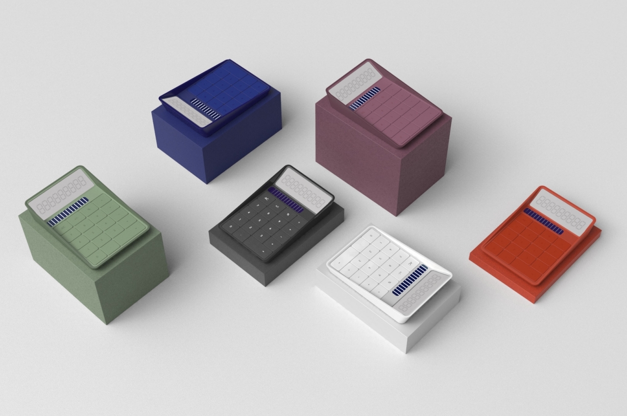
The initial ideas for this “Equals Calculator” concept played around with different shapes that expressed boldness and playfulness without going overboard. Personality was conveyed not through quirky designs or outlandish colors but through simple forms and somewhat muted hues. It results in a design that is both familiar yet, at the same time, a bit unlike what we’ve become accustomed to, forcing us to pause for a bit and breathe.
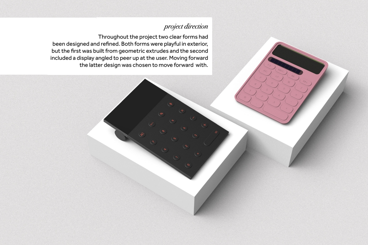
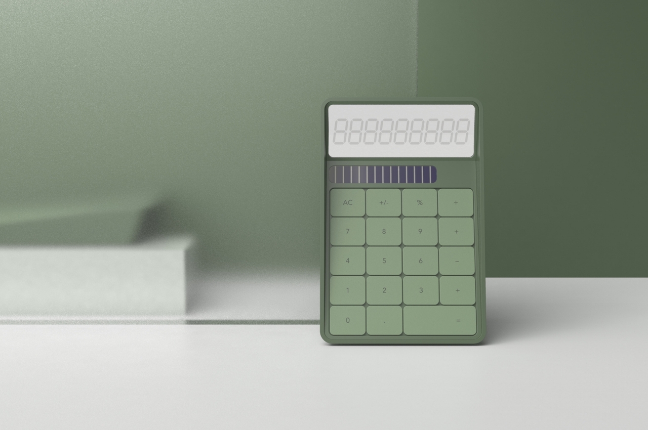
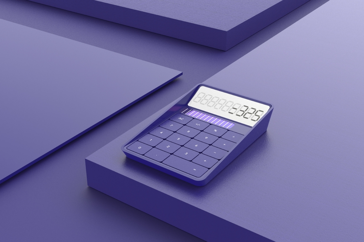
The final design that was chosen for this concept revolved around the idea of “peeking,” where an angled displays peers up to the user, making the digits easily viewable without having to tilt your head down. The form of the calculator resembles a tray with inclined sides, almost as if it’s inviting you to dip your fingers inside.
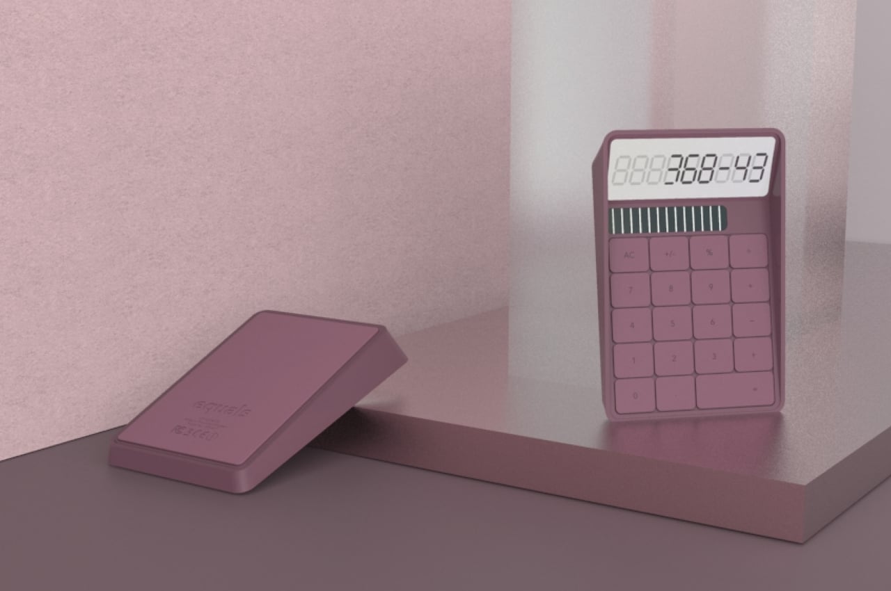
Instead of typical rounded buttons separated by wide spaces, this minimal calculator utilizes squarish ones that have very narrow gaps between them. There are still some spatial boundaries between buttons, but it creates a surface that looks almost unbroken and whole. The concept doesn’t change any of the functions of the calculator but instead creates a different atmosphere every time you look at and use what is normally considered a rather cold and calculating tool.
