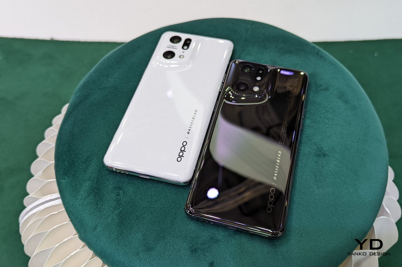
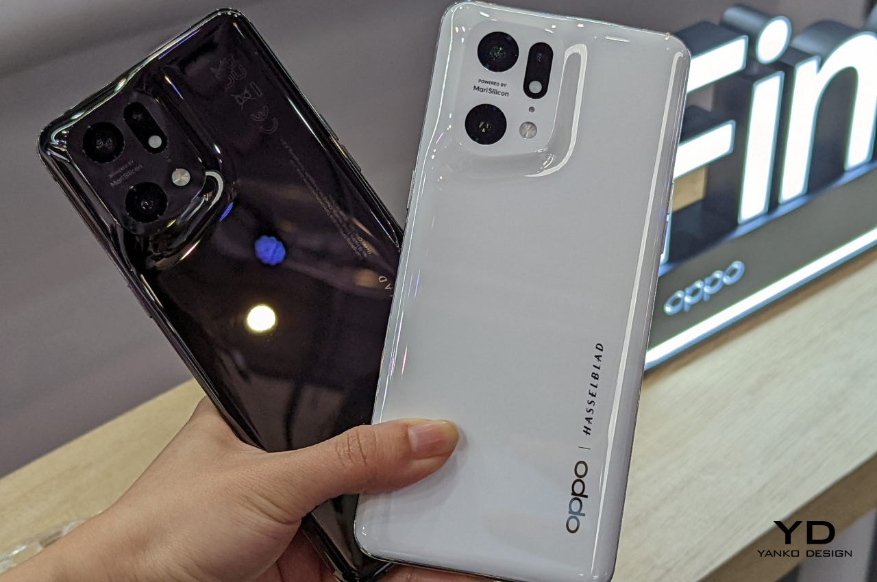
The OPPO Find X5 Pro is easily one of the most beautiful phones we’ve seen in recent years. It immediately stands out from the crowd in a way that is both pleasing and thought-provoking. It’s not a one-time thing either, having started with the Find X3 Pro last year. Given the company’s investment in this design, it hopefully won’t be the last time we’ll see this exquisite design either. Like many good product designs, however, OPPO didn’t just stumble on this winning look, nor was its journey as smooth as the curves on the phone’s back. Unsurprisingly, the company is only too happy to narrate its journey, and like many journeys, it starts at the womb of Mother Nature.
Designer: OPPO
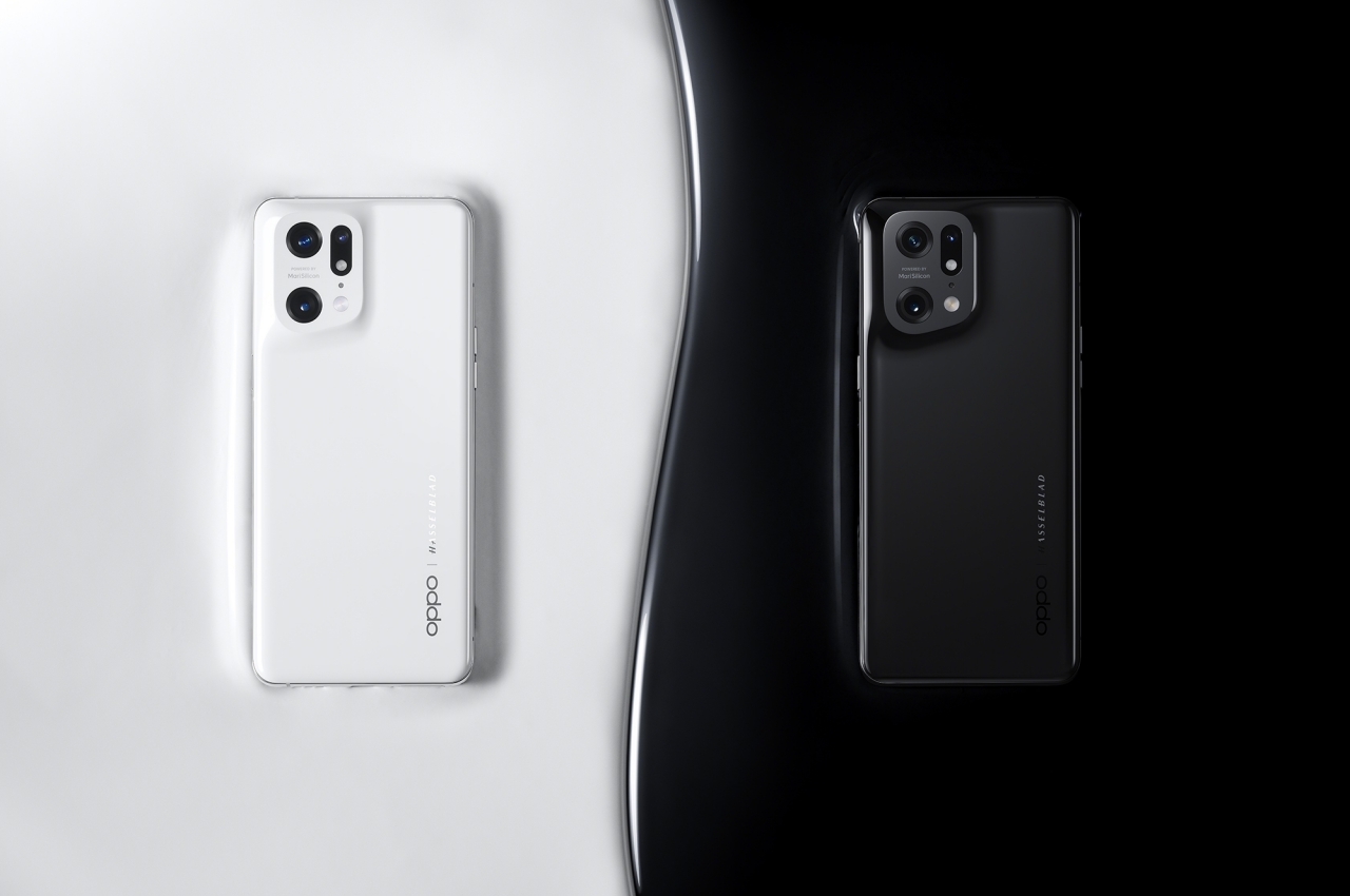
Natural Curves
While we see and use a lot of straight lines in everyday objects, those are actually a man-made convention. The famed Catalan architect Antoni Gaudi was quoted to have said that “there are no straight lines in nature.” Everything that looks or feels natural to our senses brains actually have an element of imperfection or curve to them, and that’s the kind of natural design that OPPO aimed for.
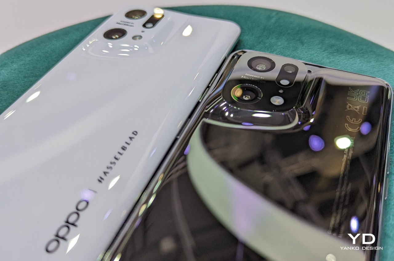
Almost all smartphones have camera bumps these days or at least individual lenses that sit on top of the phone’s back. No matter the design or arrangement, they all have one thing in common. They are both visually and structurally distinct from the rest of the phone’s back, often delineated by a metal ring or a plastic surface. While not exactly straight, these still create sharp edges, seams, and lines that look and feel unnatural.
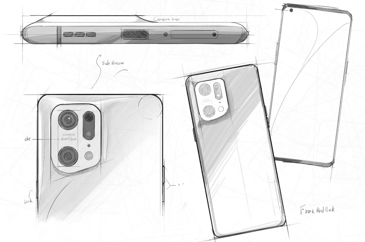
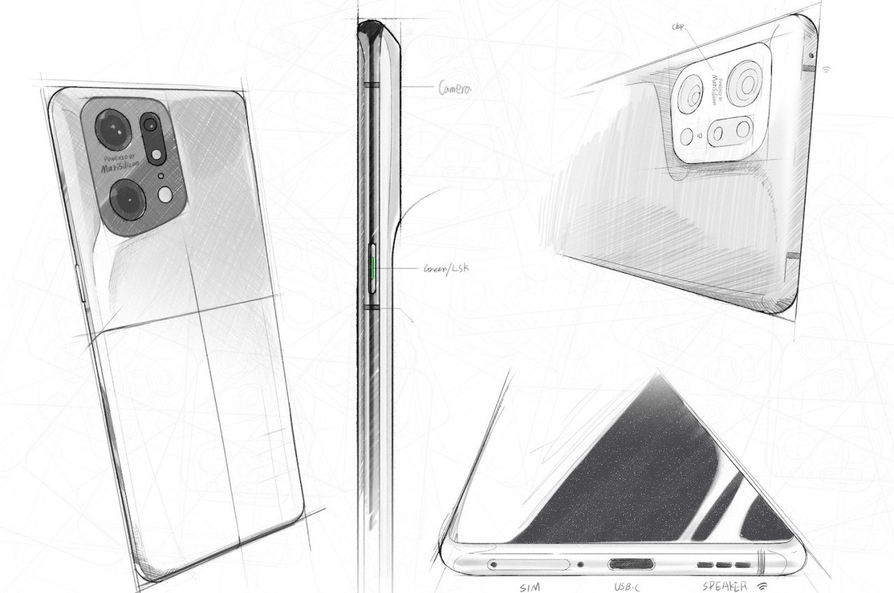
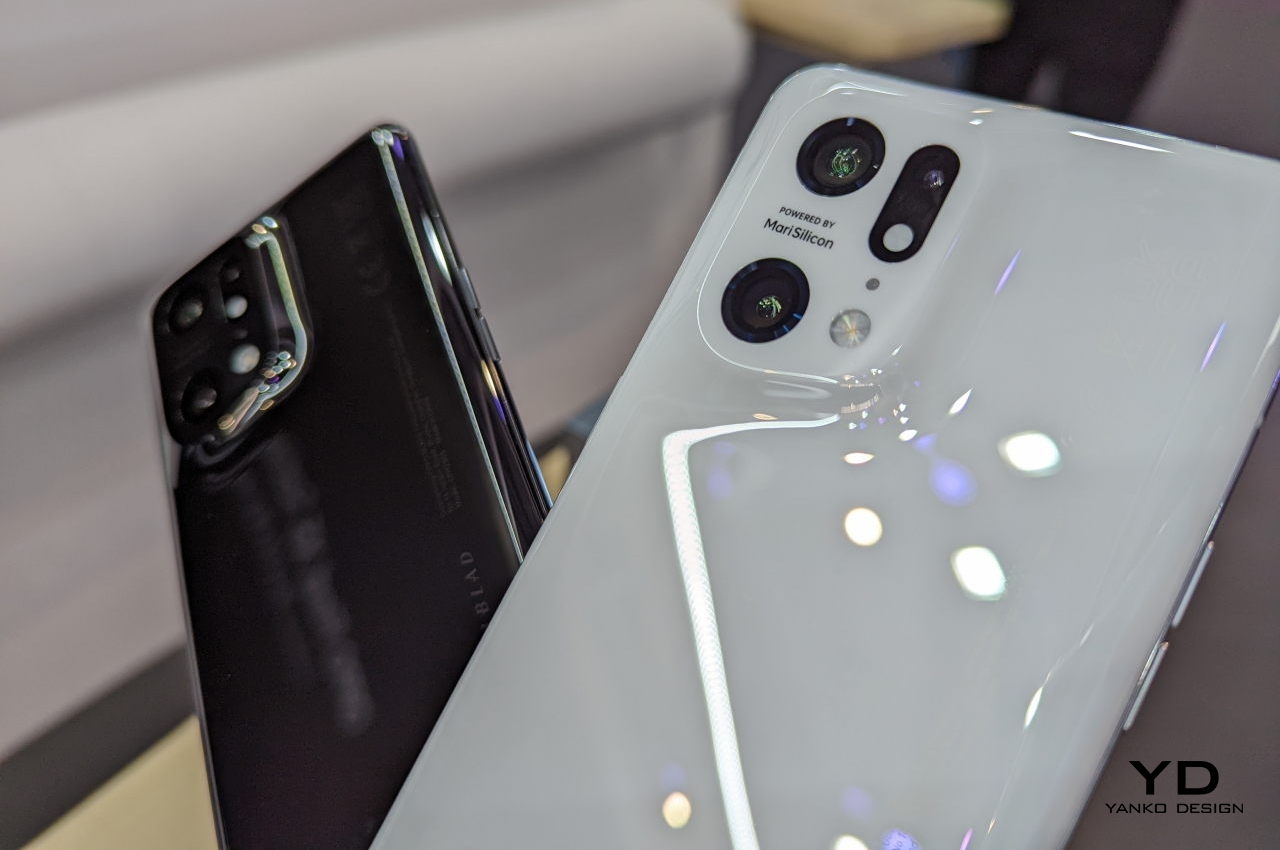
To capture the familiar and comforting feeling of nature, OPPO decided to opt for using natural-looking curves to raise the camera bump from the rest of the phone’s surface. The company calls the final result a volcano-shaped bump, but the flat surface on top is more reminiscent of a gently rising plateau. Either way, the effect is a unique camera design that is seamlessly integrated into the phone’s structure, a beautiful structure that actually caused OPPO more headaches at the start.
Tough Act
OPPO could have simply left it at that, ending up with something no different from the OPPO Find X3 Pro last year, just with a softer curvature. Looking good, however, was only half the equation, and the company wanted the phone to also feel good in people’s hands. Nature’s curves already provided visual relief, but the company now had to turn to technology to give the same feeling of comfort to the owner’s skin.
For this trick, OPPO decided to use ceramic instead of the glass material it is familiar with. Designers and manufacturers already know how terribly difficult it is to work with ceramic. Fortunately, we have come to a point where throwing enough time, money, and brains can yield advantageous results in addressing those pain points.
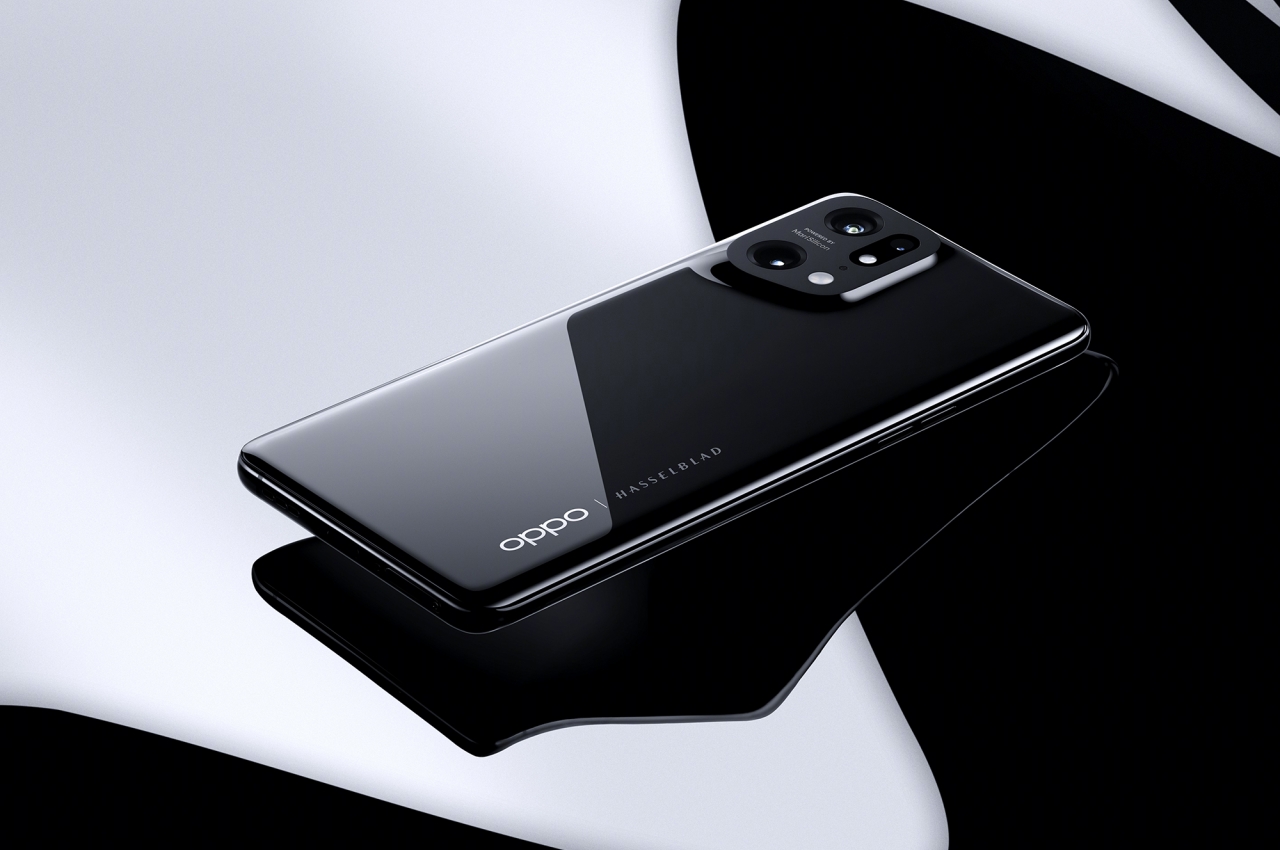
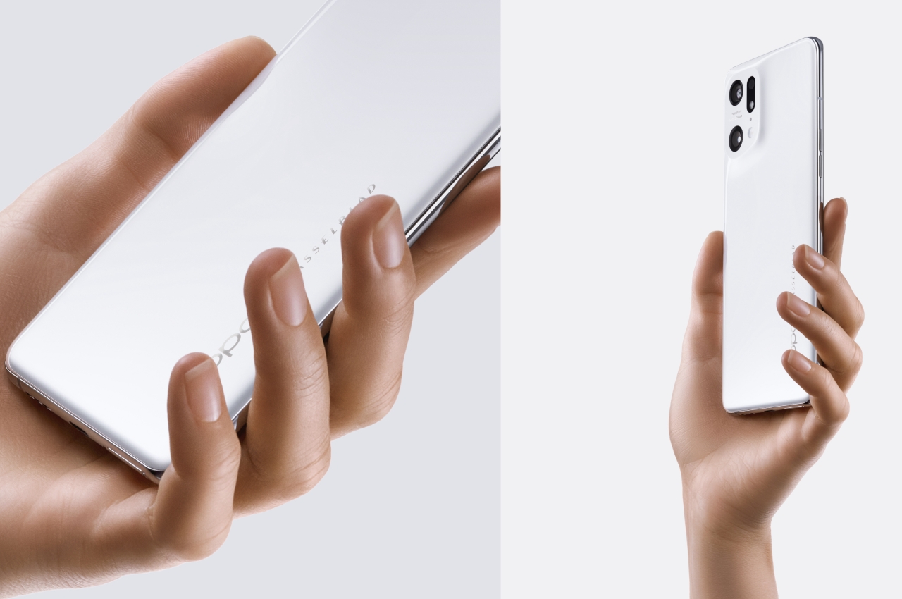
Again, OPPO is only too happy to dazzle you with the tales of trials and tribulations that it endured during this journey, from developing a new CNC machining process specifically for this design and material to a new four-axis polishing machine that uses micron-level diamond powder. Fortunately for people, they only need to hold a Find X5 Pro in their hands to appreciate the end results. They will feel the comfortably warm texture of ceramic without having to worry too much about fingerprints and smudges. They will also be more confident in the knowledge that their phone’s back has more chances of surviving a fall unbroken.
The Devil’s in the Details
The OPPO Find X5 Pro’s design story didn’t end there. There’s also the tale of how the camera lenses had to be positioned with painstaking precision so that they won’t extrude out of the housing, but also not too low to be effective at their job. It’s a minute detail that you will never know about unless someone (OPPO) tells you about it, precisely because the cameras blend almost seamlessly with the rest of the phone’s body.
Paying excruciating to details, even when those details will mostly be lost on most consumers, is a trait that is traditionally attributed to Apple, one of the best tech companies when it comes to product design acumen. Other phone brands like Samsung have also started talking more about these small details, sometimes to an exasperating degree. Others, on the other hand, force you to actually see and feel those small details to the point that the phone becomes a jumbled mess of discordant elements and design languages.
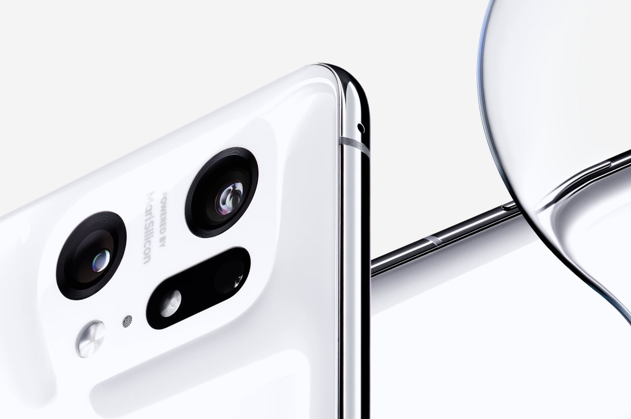
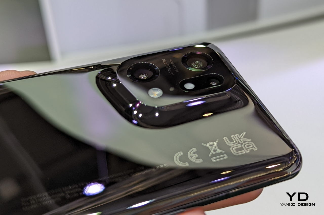
In contrast, OPPO aimed to hide those details and only talk about them as a side story of its journey. This left the Find X5 Pro with a minimalist and unified form that feels almost like a calm sound of silence in the midst of loud and obnoxious phone designs. Hopefully, the company’s future flagships will retain this nature-inspired DNA, and its futuristic manufacturing processes will become the future of its design lineage, especially since no one else seems to be keen on making the same odyssey.
