Products don’t have to be minimalist to be beautiful and useful. Sometimes, having more personality works better to make your desk feel alive.
The phrase “what’s old is new again” can be applied to many things in human history, but it is most often used for fashion and design trends. Minimalism grew almost as a counter-culture to the extravagances of modern products and lifestyles, but that, too, can be taken to the extreme. Recently, there has been a bit of pushback to make the things around us look less uniform and visually more interesting. While not exactly in the realm of maximalism, this contrarian desk organizer tries to embrace some of the characteristics and materials of minimalist products but doesn’t shy away from mashing forms and shapes together to create beautiful order out of chaos.
Designer: Snehal Garg


Given their nature as things to organize other things, you’d expect desk and stationery organizers to be the epitome of order and organization themselves. In practice, that isn’t exactly a hard requirement, but that has become the norm against which these accessories are measured. Of course, nothing says clean and orderly better than a minimalist design, but even then, some desk organizers have tried to stand out from the crowd in their own ways.
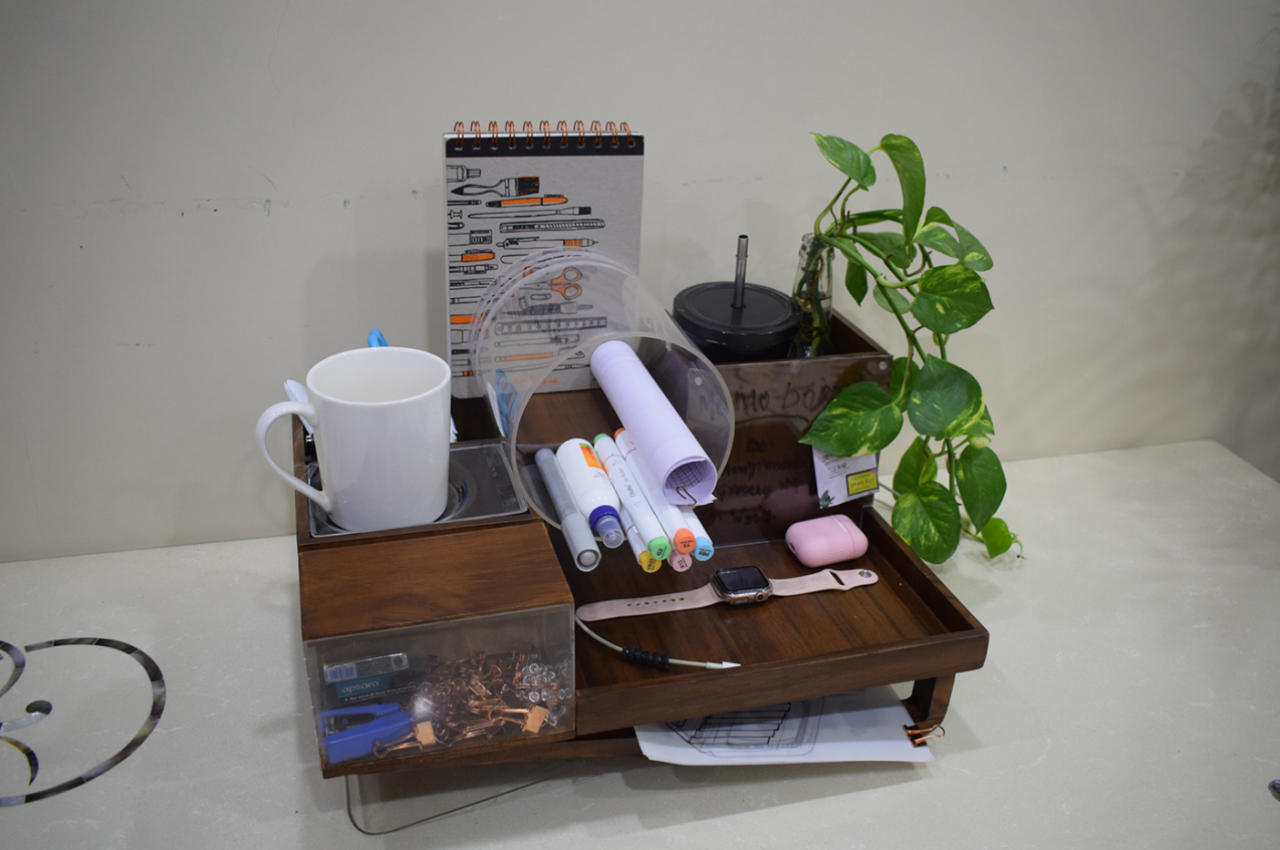
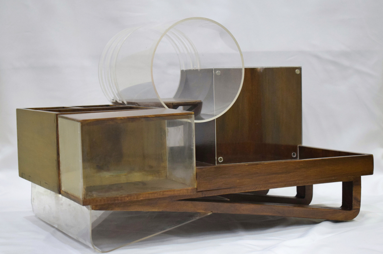
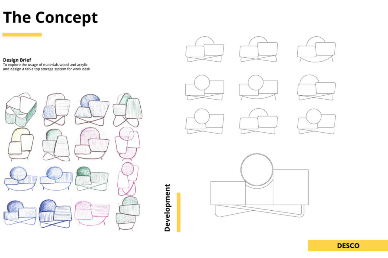
It’s almost difficult to see Desco as an organizer, given how it visually looks disorganized on its own. It utilizes different shapes that seem to be haphazardly thrown together, as well as lines that cut through each other at odd angles. And unlike traditional desk organizers, you almost have to stop and think which items go where because, despite its seemingly random design, each nook and cranny of the Desco actually serves a specific purpose.
That large acrylic circle in the middle, for example, has slits that are designed to hold notebooks, while the space going through the pipe shape can hold pens and even rolls of paper. The slanted foot has space for a few sheets of paper, while the acrylic surface of one of the wooden boxes can be used as a tiny wall for sticky notes. There is also plenty of space for all kinds of tools and knick-knacks, including a tray for your phone, earbuds, or smartwatch. There’s even a surface that can be used to keep your favorite mug within arm’s reach.
Despite its jumble of shapes, Desco still adheres to minimalism as far as the surfaces themselves go. The smooth wooden parts give it a clean look, while transparent acrylic gives an illusion of floating in the air. There’s also a bit of sustainability in its design, though using something more biodegradable than acrylic would be ideal. More importantly, Desco carries with it some character compared to most desk organizers, looking more like a battle station that’s ready to give you the tools you need to survive your workday.